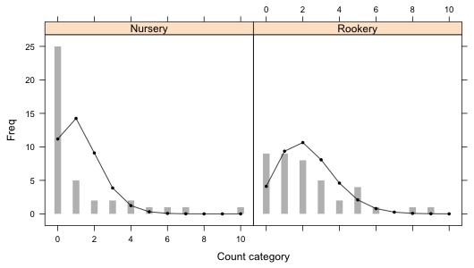
Fig. 1 Bar plots with the superimposed predictions from a separate means Poisson model.
See HW 6 solutions.
I reload the slugs data set from lecture 16 and refit both the common means and separate means Poisson regression models.
Fig. 1 Bar plots with the superimposed predictions from a separate means Poisson model.
There are 22 count categories displayed in Fig. 1. Of these only six of the predicted Poisson counts exceed five. So 73% of the expected counts are smaller than five which is far greater than the 20% value that is recommended in order for the chi-squared distribution of the Pearson statistic to hold. It's pretty clear that trying to meet this criterion here by merging categories would completely distort the distribution. Thus taking a simulation-based approach is the only reasonable option.
To assess the overall fit of the model we need to consider the fit in both field types simultaneously. This is not possible to do with the simulation-based goodness of fit test as implemented by chisq.test because this function requires a single model probability vector whose elements sum to one. Instead we have two probability vectors, one for each field type. We could multiply the probabilities by one-half and concatenate the results to meet the "sum to one" criterion, but then the simulated results will not fully correspond to the way the experiment was designed. In the experiment 40 slugs were obtained from each habitat type so the sample size of 40 is fixed by design and is not a random quantity. What we need here is a conditional test. Conditional on there being 40 rocks in each field type how likely is it to obtain the observed count distribution if two Poisson models with different rate parameters were truly generating the distributions? A simulation-based test of this is possible but we'll need to construct it ourselves.
The basic idea behind the simulation-based test is that once we obtain the predicted probabilities for individual categories, including lumping the tail probability into a single category, we essentially have separate multinomial distributions (the multivariate generalization of the binomial distribution) for each field type. Using the model probabilities and a random number function we can generate new count frequencies separately by habitat, compare them to the expected counts, and calculate the Pearson statistic using all 22 categories at once. Doing this repeatedly yields a null distribution for the Pearson statistic, a set of reasonable values of the Pearson statistic when the model is known to fit. We then examine where the observed value of the Pearson statistic falls in this distribution to determine how similar it is to a typical model result. This is exactly what the chisq.test function does when there is a single population.
I segregate the predicted probabilities by field type into the components of a list object.
$Rookery
[1] 0.1027969084 0.2338629667 0.2660191246 0.2017311695 0.1147346027 0.0522042442
[7] 0.0197941093 0.0064330855 0.0018294087 0.0004624339 0.0001319466
We've discussed lists before. They generalize data frames and matrices in that the different components can have different sizes and be of different types. In the above example we have a list consisting of two components each of which is a vector of length 11. To access portions of a list we need to use single bracket notation, [ ]. To access an individual component of a list we need to use double bracket notation, [[ ]].
So although slug.p[1] and slug.p[[1]] return the same elements of the bigger list, slug.p[1] is still a list, this time with one element, a vector. On the other hand slug.p[[1]] is a vector, the object that is the first component of the list slug.p. One use for the single bracket notation is to extract portions of a list. This is not possible to do with the double bracket notation.
$Rookery
[1] 0.1027969084 0.2338629667 0.2660191246 0.2017311695 0.1147346027 0.0522042442
[7] 0.0197941093 0.0064330855 0.0018294087 0.0004624339 0.0001319466
Next I tabulate the number of observations by field type and save the result.
The first step in the simulation-based test is to generate random data using the model. The rmultinom function generates observations from a categorical variable based on the specified probabilities of each category. The output of rmultinom is a vector recording the simulated counts for each category. The help screen for rmultinom is shown in Fig. 2.
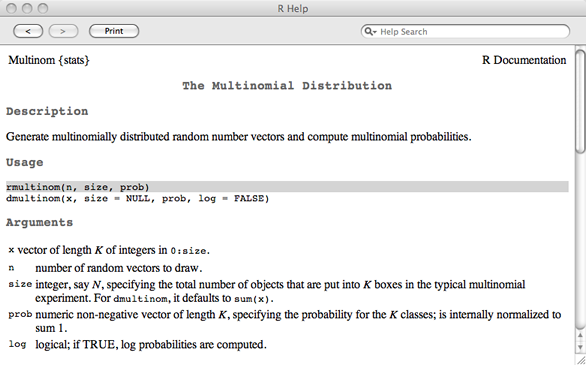
Fig. 2 Portions of the rmultinom help screen
The first argument n is the number of realizations from the multinomial distribution we want. The second argument size is the total number of counts that should be allocated to the various categories, and the third argument prob is a vector of probabilities of the categories. So, the call below generates a single a realization of 40 observations using the estimated Poisson probabilities for field = 'Nursery'.
Similarly we can obtain 40 observations using the Poisson probabilities for the 'Rookery' field type.
We can obtain both of these at once using sapply to generate all 80 observations (40 from each field type). For each field referenced by x rmultinom draws a single multinomial sample of size 40, n[x], based on the probabilities contained in the vector slug.p[[x]]. Here x indicates the field type, x = 1 or 2.
Each column corresponds to a multinomial realization from one of the field types. I stack these two columns using the as.vector function so in the end I have a single vector.
We next use the simulated data as if they were the observed data and we calculate the Pearson goodness of fit statistic comparing the simulated data Oi against the expected counts Ei. The Pearson statistic for these data takes the following form.
The result should be a typical value of a Pearson statistic when the model actually fits the data. To get a full sense of what such typical values look like we need to repeat these steps enough times to get a good estimate of the null distribution of Pearson statistics. So, I construct a function that contains these two lines of code. Although the function has no arguments we still need to include the parentheses in the definition of the function.
To get a reasonable null distribution of Pearson statistics I carry this out 9,999 times using the replicate function. The first argument of replicate is the number of replications; the second argument contains the steps to replicate, in this case the steps contained in the function created above. Notice that in using the function we need to include the parentheses with nothing inside them. I first set the random seed explicitly with the set.seed function so that I can reproduce the results if needed.
Finally we need to calculate the Pearson statistic using the observed data and then append the result to the vector of simulated Pearson statistics for a total of 10,000 Pearson statistics.
The p-value of the simulation-based test is defined as the total number of Pearson statistics that are as large or larger than the observed Pearson statistic divided by the total number of simulations.
Our p-value is 1 out of 10,000 telling us that the observed value of the Pearson statistic was larger than any of the simulated values. We already knew this because the actual value was 25,515.36 while the largest Pearson statistic from the simulated values is 3,656.468. The null hypothesis of the Pearson goodness of fit test is the following.
H0: fit is adequate
H1: fit is inadequate
Thus we reject the null hypothesis and conclude there is a significant lack of fit. It's interesting to find out what's driving the lack of fit. To do that we can examine the individual terms being summed together to form the actual Pearson statistic.
The 11th observation is clearly driving much of the lack of fit. This is the category X = 10 for the nursery slugs.
From the expected counts we see that under the Poisson model we would expect to see a value of 10 or larger in a sample of size 40 only once every 25,000 times. So either we observed a very rare event or the Poisson model doesn't fit. (In truth, a number of the other expected counts also clearly fail to match the observed data.)
Because the likelihood of the separate means Poisson model is a function of two variables, we need three dimensions to effectively display it. Just as we need a sequence of values to plot a curve in two-dimensions, we need a two-dimensional grid of values to plot a surface. R provides a number of functions for generating a grid of which expand.grid is perhaps the most useful. The expand.grid function takes as its arguments two vectors and then generates all possible combinations of the components of these two vectors.
For the separate means Poisson model the log-likelihood function was called pois2.LL and is a function of a single vector parameter p. We minimized the negative log-likelihood and obtained the following results.
$estimate
[1] 1.2749997 0.9999997
$gradient
[1] 1.125723e-05 -1.506351e-06
$code
[1] 1
$iterations
[1] 8
Because the reported MLEs are b0 = 1.275 and b1 = 1, I use expand.grid to obtain ordered pairs of values in the vicinity of these values.
Next we need to evaluate the log-likelihood function on the points listed in each row of the matrix g. Because pois2.LL takes a vector-valued argument we can use the apply function and apply pois2.LL to the output from expand.grid one row at a time. The first argument of apply is the matrix to which the function should be applied, the second argument is either 1 or 2 indicating rows or columns of the matrix, and the third argument is the function written in such a way that it can accept a vector as input.
The persp function of R can be used to make a serviceable surface graph. A portion of the help screen for persp is shown in Fig. 3.
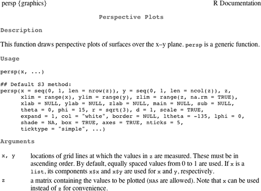
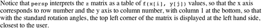
Fig. 3 Portions of persp help screen
Observe that persp expects the z-coordinates to be arranged in a matrix whose dimensions match the dimensions of the grid we've created. The rows of the matrix should correspond to the x-values and the columns to the y-values. We can obtain this format using the matrix command. The first argument to matrix is the vector that is to be converted to a matrix. I use the nrow= argument to specify how many distinct x-values there are (equal to the number of rows in the matrix). By default the matrix function fills the matrix one column at a time, which is what we want for our data.
I next create the 3-dimensional plot. The persp function does not support mathematical characters.
By default tick marks are not displayed. I can add them with the ticktype='detailed' argument.
The spatial orientation of the graph can be changed by specifying values for the viewing angle arguments theta= and phi=. The finished result is shown in Fig. 4.
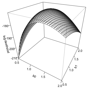
Fig. 4 3-D plot of log-likelihood using persp
We can add the location of the maximum likelihood estimate to the surface. For this we need to use the trans3d function that converts the three-dimensional coordinates of the point to a 2-dimensional representation that is consistent with what was used to produce the figure. The general syntax is trans3d(x, y, z, persp.object), so we first need to assign the output of persp to an object. The x- and y-coordinates of the MLE are contained in the $estimate component of the nlm output while the z-coordinate is the negative of the $minimum component of the nlm output
$y
[1] 0.2406278
We can now use the points function to add this location to the graph.
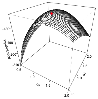
Fig. 5 3-D plot of log-likelihood showing MLE
The lattice graph equivalent to persp is a function called wireframe. First we need to load the lattice package.
Unlike persp, wireframe expects the z-coordinates to fill a vector, not a matrix. To plot the surface we need to use formula notation in which the variable of z-coordinates is on the left side of the formula followed by the formula symbol, ~, followed by the variables defining the x- and y-coordinates separated by an asterisk. The wireframe function has a data argument so I don't need to reference the data frame as part of the variable names in the formula.
The screen argument can be used to change the view point.
Unlike persp, the wireframe function does support math symbols so we can use subscripts in the axis labels. To get tick marks to display we need to use the scales= argument in the manner shown below.
To get the z-label to display without running off the screen I use the return code \n inside the text string to tell R to start a new line at this point. Note: this is why in the read.table command path names were specified with forward slashes / or double backslashes \\. Single backslashes are reserved for specifying special formatting within text strings.
To obtain color shading of the surface include drape=TRUE.
Finally I reduce the font size of the z-axis label and z-axis tick marks in order that the entire label can be displayed. I do this with the par.settings= argument that allows general graphic settings to be set in lattice graphs. I also suppress the color key with colorkey=FALSE. The final result is shown in Fig. 6.
Fig. 6 3-D plot using wireframe
It is possible to add points to a wireframe graphic but for that we would need to write our own panel function making use of the panel.3dwire and panel.3dscatter panel functions.
I begin by fitting two negative binomial models that are completely analogous to the two Poisson models fit in lecture 16: a common means and a separate means negative binomial regression model. The major modification we need to make is to replace dpois in the negative log-likelihood functions with dnbinom. The dnbinom function has two arguments, mu and size. mu is the mean and size is what we've been calling θ, the dispersion parameter. So I add a line that identifies the variable theta as one of the components of the parameter vector p.
Our two models are the following.
Model 1: μ = β0
Model 2: μ = β0 + β1*(field='Rookery')
The first model is a two-parameter model (the intercept plus the size parameter) while the second is a three-parameter model (the two regression parameters plus the size parameter). To obtain the MLEs we have to provide initial values for the parameters. For the parameters for the mean I use values close to the Poisson estimates.
These two models are nested in that out.NB2 contains one additional parameter—the coefficient of the field type dummy variable that causes the mean to be different in the two field types. By comparing these two models with a likelihood ratio test we can test whether the negative binomial means are the same in the two field types, i.e., H0 : β1 = 0.
The test statistic is not significant at the α = .05 level. Contrary to what we found with Poisson regression, we don't find evidence that the means are different when we assume the response has a negative binomial distribution. To obtain the Wald test we need to refit the model and extract the Hessian. The inverse of the Hessian matrix is the variance-covariance matrix of the parameter estimates. (See lecture 13.) The square root of the second diagonal entry of this matrix is the standard error of the field effect.
As is typically the case, the Wald test and likelihood ratio test yield different p-values although in this case not substantively different conclusions. We can fit these same two models using the glm.nb function from the MASS package.
The glm.nb function uses a log link so the coefficients aren't directly comparable to the estimates we obtained with nlm without first back-transforming the means (the means, not the individual coefficient estimates).
The likelihood ratio test for two nested models tests whether the values of the parameters found in the bigger model but not found in the smaller model are different from zero. To carry out a likelihood-ratio test of the field effect we can use the anova function to compare the two nested glm.nb models, model 1 and model 2.
Response: slugs
Model theta Resid. df 2 x log-lik. Test df LR stat. Pr(Chi)
1 1 0.7155672 79 -288.7961
2 field 0.7859313 78 -285.3500 1 vs 2 1 3.446124 0.06340028
The Wald test of the field effect appears in the summary table of the model.
Notice that the Wald test does not match the nlm results above. That's because we're using a log link and the rookery effect estimate we've obtained is on a log scale. To match the nlm results we can refit the glm.nb model specifying an identity link.
A compact collection of all the R code displayed in this document appears here.
| Jack Weiss Phone: (919) 962-5930 E-Mail: jack_weiss@unc.edu Address: Curriculum for the Environment and Ecology, Box 3275, University of North Carolina, Chapel Hill, 27599 Copyright © 2012 Last Revised--October 23, 2012 URL: https://sakai.unc.edu/access/content/group/3d1eb92e-7848-4f55-90c3-7c72a54e7e43/public/docs/lectures/lecture17.htm |