I reload the tadpoles data set and refit the analysis of variance model from last time.
Response: response
Df Sum Sq Mean Sq F value Pr(>F)
fac1 2 18.4339 9.2169 151.7899 < 2.2e-16 ***
fac2 1 1.5013 1.5013 24.7238 1.304e-06 ***
fac3 1 2.2771 2.2771 37.5007 3.984e-09 ***
fac1:fac2 2 0.3926 0.1963 3.2328 0.04127 *
fac1:fac3 2 0.0838 0.0419 0.6900 0.50263
fac2:fac3 1 0.3503 0.3503 5.7693 0.01711 *
fac1:fac2:fac3 2 0.0695 0.0347 0.5723 0.56505
Residuals 227 13.7838 0.0607
---
Signif. codes: 0 ‘***’ 0.001 ‘**’ 0.01 ‘*’ 0.05 ‘.’ 0.1 ‘ ’ 1
Response: response
Sum Sq Df F value Pr(>F)
fac1 18.0783 2 148.8618 < 2.2e-16 ***
fac2 1.6498 1 27.1702 4.184e-07 ***
fac3 2.2300 1 36.7243 5.609e-09 ***
fac1:fac2 0.2997 2 2.4681 0.08702 .
fac1:fac3 0.0550 2 0.4525 0.63659
fac2:fac3 0.3503 1 5.7693 0.01711 *
fac1:fac2:fac3 0.0695 2 0.5723 0.56505
Residuals 13.7838 227
---
Signif. codes: 0 ‘***’ 0.001 ‘**’ 0.01 ‘*’ 0.05 ‘.’ 0.1 ‘ ’ 1
Based on the above output we chose to drop the three-factor interaction and the fac1:fac3 two-factor interaction. Refitting the model without those terms yielded the following.
Response: response
Df Sum Sq Mean Sq F value Pr(>F)
fac1 2 18.4339 9.2169 153.0824 < 2.2e-16 ***
fac2 1 1.5013 1.5013 24.9343 1.169e-06 ***
fac3 1 2.2771 2.2771 37.8201 3.382e-09 ***
fac1:fac2 2 0.3926 0.1963 3.2603 0.04015 *
fac2:fac3 1 0.3792 0.3792 6.2973 0.01278 *
Residuals 231 13.9083 0.0602
---
Signif. codes: 0 ‘***’ 0.001 ‘**’ 0.01 ‘*’ 0.05 ‘.’ 0.1 ‘ ’ 1
Response: response
Sum Sq Df F value Pr(>F)
fac1 18.0783 2 150.1294 < 2.2e-16 ***
fac2 1.6319 1 27.1043 4.258e-07 ***
fac3 2.2300 1 37.0370 4.777e-09 ***
fac1:fac2 0.3017 2 2.5057 0.08384 .
fac2:fac3 0.3792 1 6.2973 0.01278 *
Residuals 13.9083 231
---
Signif. codes: 0 ‘***’ 0.001 ‘**’ 0.01 ‘*’ 0.05 ‘.’ 0.1 ‘ ’ 1
At this point the Type I and Type II tests have a minor disagreement about the importance of the fac1:fac2 interaction when we use the arbitrary cut-off of α = .05 for decision making. Because the primary research question involved the relationships between factor 1 and factor 2 we elected to retain both of these interactions and explore their substantive roles further through graphical displays of the model.
The anova function carries out Type I tests whereas the Anova function carries out Type II tests (by default). In Type I tests terms are tested in the order that they are shown in the output table. These tests generally make sense because the table has been sorted so that the main effects precede the two-factor interactions, which precede the three-factor interactions, etc. Type II tests are calculated according to the principle of marginality. Each term is tested in the presence of all the others after first removing that term's higher-order relatives. Type II tests are especially useful when comparing terms of the same type (for instance the two-factor interactions) for which there is no natural way to order them. The Anova function also carries out something called Type III tests. These are "term-added-last" tests. They violate the principle of marginality and are rarely of interest.
The Type I and Type II tests differ for this analysis of variance model because the treatment groups are unbalanced, i.e., there are different numbers of observations assigned to each treatment, some of which was due to random attrition during the course of the experiment. We can exhibit the imbalance by tabulating the data by treatment.
The table function lists the number of observations in the data frame that correspond to each treatment. Recall though that some of these observations have missing values (NA) for the response, so the above tabulation is overcounting the number of actual observations that are available. To get the correct count we need to remove those observations that having missing values for the response. The logical function is.na returns TRUE if the value of its argument is missing, FALSE otherwise. The logical "Not" operator of R is the exclamation point. So, !is.na returns TRUE if the value of its argument is not missing, FALSE if it is missing.
We can use the above output to select the non-missing values of a variable. For instance, suppose we have a vector of length 10 that contains three missing values. The c function below is the catenation function that allows you to assemble a set of values into a single vector.
To select elements of a vector we use bracket notation much like we did last time for data frames. Because R treats vectors as having a single dimension no comma appears within the brackets to separate rows from columns.
Replacing numerical values inside the brackets with a vector of TRUEs and FALSEs causes R to retain the elements of the vector that correspond to the TRUEs and discard the elements that correspond to the FALSEs.
Using this we can get a count of the number of observations with non-missing values for the response variable as follows.
So the imbalance is fairly severe with some treatments having only half as many observations as others. This imbalance carries over to the individual factors.
When the treatments in analysis of variance models are balanced, the Type I and Type II tests end up being the same. To demonstrate this I generate some random data using an experimental design modeled after the tadpoles experiment in which the twelve treatments have ten observations each. The levels function of R displays the unique values of a factor.
The expand.grid function of R takes the values of two or more categorical vectors and combines them in all possible ways. I use it to create the treatment design of the current experiment.
The above display corresponds to one full replication of each treatment. For the final experiment we need to repeat each column of the expand.grid output ten times. The rep function of R can be used to replicate a vector a prescribed number of times. For instance, the call below repeats the vector 1:3 a total of four times.
To obtain the response variable I randomly generate 120 values from a standard normal distribution using the rnorm function of R. To assemble things in a single data frame I use the data.frame function and provide meaningful names for each of the variables.
Finally I fit a full three-factor analysis of variance model to these data and compare the Type I and Type II tests provided by the anova and Anova functions. Because the data are balanced (10 observations for each treatment combination), the reported tests are exactly the same.
Response: y
Df Sum Sq Mean Sq F value Pr(>F)
fac1 2 12.535 6.2675 5.9631 0.003496 **
fac2 1 3.110 3.1100 2.9590 0.088267 .
fac3 1 0.037 0.0371 0.0353 0.851400
fac1:fac2 2 0.142 0.0709 0.0675 0.934775
fac1:fac3 2 0.124 0.0618 0.0588 0.942930
fac2:fac3 1 0.288 0.2878 0.2738 0.601833
fac1:fac2:fac3 2 1.692 0.8460 0.8049 0.449779
Residuals 108 113.514 1.0511
---
Signif. codes: 0 ‘***’ 0.001 ‘**’ 0.01 ‘*’ 0.05 ‘.’ 0.1 ‘ ’ 1
Response: y
Sum Sq Df F value Pr(>F)
fac1 12.535 2 5.9631 0.003496 **
fac2 3.110 1 2.9590 0.088267 .
fac3 0.037 1 0.0353 0.851400
fac1:fac2 0.142 2 0.0675 0.934775
fac1:fac3 0.124 2 0.0588 0.942930
fac2:fac3 0.288 1 0.2738 0.601833
fac1:fac2:fac3 1.692 2 0.8049 0.449779
Residuals 113.514 108
---
Signif. codes: 0 ‘***’ 0.001 ‘**’ 0.01 ‘*’ 0.05 ‘.’ 0.1 ‘ ’ 1
Last time we generated box plots of the response variable separately by treatment.
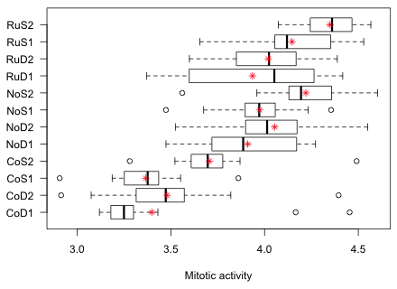
Fig. 1 Graphical summary of the results of the tadpole experiment
Fig. 1 highlights a potential problem with these data. Notice how the variability across the groups varies. In particular look at the RuD1 group. Its interquartile width is two to five times greater than that of any other group. This could mean that the treatment is affecting the variance in addition to the mean. It could also mean that a number of confounding factors have not been properly controlled for in this experiment thus introducing heterogeneity in the groups. In either case the observed heterogeneity of group variances calls into question the constant variance assumption of our model. In the analysis of variance with a normal distribution for the response we assume that the mean response varies by treatment, but that the variance remains the same.
We can get a better sense of how important all of this is by calculating the variances in each group and displaying the results graphically. To do this I again use the tapply function from last time but replacing R's mean function with its variance function, var.
It's hard to judge patterns in a set of numbers such as this. A dot plot on the other hand provides a useful graphical summary. Dot plots are a nice alternative to bar charts because they avoid the visual distraction of the bars, which really provide no additional information. R has a function called dotplot in the lattice package for creating dot plots. The lattice package provides a set of graphics routines that parallel what one can do with the base graphics package of R. Its raison d'etre is to produce conditioning graphs—multi-panel displays of how the relationship between two variables varies as the value of a third variable changes. We will use conditioning graphs extensively when we study multilevel models later in the course, so this is a good time to begin experimenting with some of the capabilities of lattice.
To use the functions in lattice for the first time in an R session, the package needs to be loaded into memory. The lattice package is part of the standard R installation so we don't need to first install it from the CRAN site. As with all R packages lattice is loaded into memory with the library function.
The dotplot function uses the formula conventions of boxplot in which the y-axis variable and x-axis variable are separated by a tilde, ~. In Fig. 2 I place the treatment categories on the y-axis and the group variances on the x-axis. I use the names function to get the treatment labels from the treat.var object created above. I use the xlab argument to add a label to the x-axis .
As Fig. 2a shows, treatment group RuD1 stands out from the rest. In addition the two CoD treatments that exhibited outliers in the box plot of Fig. 1 also have large variances.
(a) 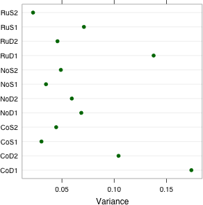 |
(b) 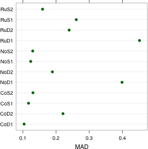 |
| Fig. 2 Dot plots of (a) group variances and (b) group MADs (median absolute deviations) | |
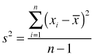
To distinguish the cases of excessive intrinsic variability from those that are outlier-induced, we can replace the sample variance with a more robust measure, one that is less sensitive to extreme outliers. The MAD statistic, for median absolute deviation from the median, is one such measure and is calculated with the mad function in R. Recall that the sample variance is the averaged squared deviation about the mean.
Because the sample mean is sensitive to the presence of outliers and the squaring operation in this formula exacerbates the influence of large deviations, the sample variance is strongly affected by outliers. The MAD statistic replaces the sample mean with the sample median and squaring with taking the absolute value. As a result, outlying observations are less influential on the result.
![]()
I obtain the MAD of the response for each treatment group and display the results in a dot plot (Fig. 2b).
Observe that the two CoD treatments with large variances do not have exceptionally large MADs. This tells us that the outliers in these two groups were probably the cause of the large variances. The RuD1 treatment still stands out. In addition the NoD1 treatment group has an unusually large MAD relative to the others. From the box plots we see that the NoD1 treatment group yielded the second largest interquartile width of the response among the groups.
Based on Figs. 1 and 2 we should conclude that while there is evidence that the group variances are not homogeneous, the problem is not pervasive. It appears that only one or two groups stand out as intrinsically more variable than the rest. In two other groups with large variances the cause appears to be the presence of one or two outlying observations. Variance heterogeneity due to outliers is easy to deal with. We just do the analysis twice, once with and once without the outliers, and see if our results change at all. If they do then we have to make a decision about what to do about the outliers. If the results don't change then the effect of the outliers is unimportant.
Intrinsic variance heterogeneity on the other hand is a more complicated problem with which to deal. Still, the boxplot display suggests that the variance heterogeneity is not having a large effect on the values of the means. If we were to rank groups based on treatment means or on treatment medians, we would get essentially the same ranking.
While I find that graphical methods for examining the assumption of homogeneity of variance are usually adequate, there do exist formal statistical tests of this assumption. In fact it was one of these tests that got the researcher who sent me these data worried about her analysis in the first place. The reason I prefer a graphical approach is that the formal tests tend to be overly sensitive to the problem. Bartlett's test, for instance, is known to yield spurious results if the data are non-normal in distribution.
But in a more general sense the problem with using these tests is that if you have enough data then these tests will always reject the null hypothesis of variance homogeneity. This follows from the fact that things are never exactly equal, a fact that will eventually be demonstrated with sufficient data. Thus when you use these tests not only do you have to hope that your groups really are homogeneous, but you also have to hope that you don't have too much data and hence too much power. What matters in the end is whether the differences are substantive rather than statistically significant. Because substantive differences in variance are best detected visually, this brings us back to examining the problem graphically.
Still, it is common to see formal tests of homogeneity of variance for ANOVA models carried out in the literature, so I briefly outline what's available in R: Bartlett's test, the Fligner-Killeen test, and two versions of Levene's test. There are others. Each is a test of variance homogeneity hence a significant result from these tests suggests that the within-treatment variability varies by treatment.
Bartlett's test is a parametric k-sample test of homogeneity of variances. It is apparently fairly sensitive to the normality of the data. It uses formula notation, y ~ x, where x is a factor indicating the groups.
data: tadpoles$response by tadpoles$treatment
Bartlett's K-squared = 35.0428, df = 11, p-value = 0.0002438
The Fligner-Killeen test is a nonparametric alternative to Bartlett's test. It has the same syntax.
data: tadpoles$response by tadpoles$treatment
Fligner-Killeen:med chi-squared = 21.1, df = 11, p-value = 0.03235
Levene's test is a robust alternative and uses a MAD-like statistic. One implementation of Levene's test is found in the car package that we've used previously. The function for doing Levene's test in the car package is leveneTest and it supports formula notation. It has an additional center argument that allows specification of "mean" or "median", the latter for the robust test. The default is center="median".
Summarizing the results of these tests we find the following.
| Homogeneity of Variance Test | p-value |
| Bartlett's test | 0.0002 |
| Fligner-Killeen test | 0.0323 |
| Levene's test I (mean) | 0.0016 |
| Levene's test II (median) | 0.0497 |
There is a little bit of ambiguity in the results. Non-parametric tests based on the median appear to downplay the differences in variability, while tests based on the mean seem to enhance them. This is more or less consistent with what we saw graphically in Fig. 2.
As a final assessment of variance heterogeneity we can look at a normal probability plot of the residuals. The response or raw residuals are the observed values of the response minus their predicted means under the model. These are the default residuals produced by the residuals function of R or by specifying type='response'. In a normal probability plot residuals are plotted against the corresponding quantiles of a standard normal distribution. Marked deviations from linearity can indicate problems with one more assumptions of the model. The qqPlot function of the car package is especially nice for producing normal probability plots because it superimposes a 95% confidence band around the estimated linear relationship making it easy to assess fit (Fig. 3a).
(a) 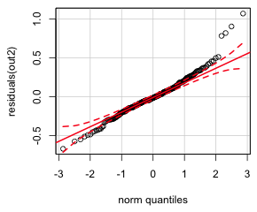 |
(b)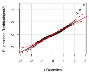 |
| Fig. 3 Normal quantile plot of the (a) raw response residuals and (b) studentized residuals | |
Notice that there are a group of residuals lying outside the confidence bands at both ends of the distribution but on opposite sides creating an S-shaped pattern. This is referred to as a heavy-tailed residual pattern and indicates that the distribution of the residuals have longer upper and lower tails than what is predicted for a normal distribution. One easy way to generate a heavy-tailed pattern like this is to combine two normal distributions with the same mean but different variances, a simple case of variance heterogeneity. So, the residual pattern of the raw residuals agrees with the tests and graphs we examined above. If we just feed the qqPlot function an lm regression object, it plots the studentized residuals instead of the raw residuals. Studentized residuals are a standardized version of the raw residuals (Fig 3b).
When we use studentized residuals much of the heavy-tailed pattern disappears. Only three outliers are apparent.
When the constant variance or independence assumptions of the residuals appears to be violated in a regression model that assumes a normal probability distribution for the response, one solution is to include a model for the residuals. Generalized least squares, as its name implies, is a generalization of least squares that allows one to relax the constant variance assumption and/or allow the residuals to be correlated. The nlme package provides the gls function for this purpose. The gls function follows the syntax of lm but requires a couple of additional options.
The new arguments are na.action=na.omit and method="ML". Unlike lm, the gls function does not automatically delete observations that have missing values for the response or any of the predictors in the model. The default action of gls is to fail if missing values are encountered. The argument na.action=na.omit causes observations with missing values to be dropped from the analysis. The option method="ML" produces maximum likelihood estimates which are needed if we wish to compare gls models with different sets of predictors. To match the F-statistics from the anova function when applied to the lm model out2 above, we would instead need to use the default method which is denoted 'REML'.
To specify a variance model for the residuals we include the weights argument along with a model for the variance. To allow each treatment group to have its own variance we enter the weights argument as follows: weights=varIdent(form=~1|treatment).
The Anova function doesn't have a method for gls objects and yields an error message. Instead the anova method for gls objects has an additional argument called type that allows one to specify Type I tests (type="sequential") or Type II tests (type="marginal")
The p-value for the fac1:fac2 interaction is larger than it was before. If we use REML estimation instead the Type II test of the fac1:fac2 interaction still fails to be statistically significant.
The point estimates for the effects in the weighted versus unweighted analyses are different but not greatly so.
The modeled variance function for the residuals provided by varIdent is given by ![]() where i denotes the treatment group. The estimates of δi for each treatment are displayed in the summary output of the model.
where i denotes the treatment group. The estimates of δi for each treatment are displayed in the summary output of the model.
Variance function:
Structure: Different standard deviations per stratum
Formula: ~1 | treatment
Parameter estimates:
CoD1 RuS1 NoD1 NoS1 RuD1 CoS1 RuS2 RuD2
1.0000000 0.6561063 0.6359648 0.4547943 0.8880739 0.4295989 0.3654052 0.5216573
CoD2 NoD2 NoS2 CoS2
0.7806614 0.5951819 0.5413518 0.5224996
Coefficients:
Value Std.Error t-value p-value
(Intercept) 3.373731 0.07507843 44.93610 0.0000
fac1No 0.552437 0.07452406 7.41286 0.0000
fac1Ru 0.534125 0.07604298 7.02399 0.0000
fac2S 0.017273 0.08137390 0.21227 0.8321
fac32 0.116970 0.05796235 2.01804 0.0447
fac1No:fac2S 0.016791 0.08487896 0.19783 0.8434
fac1Ru:fac2S 0.156236 0.08740228 1.78755 0.0752
fac2S:fac32 0.160640 0.06867040 2.33930 0.0202
Correlation:
(Intr) fac1No fac1Ru fac2S fac32 f1N:2S f1R:2S
fac1No -0.766
fac1Ru -0.645 0.710
fac2S -0.923 0.706 0.595
fac32 -0.527 0.071 -0.130 0.486
fac1No:fac2S 0.672 -0.878 -0.623 -0.728 -0.063
fac1Ru:fac2S 0.561 -0.617 -0.870 -0.590 0.113 0.648
fac2S:fac32 0.444 -0.060 0.110 -0.508 -0.844 0.045 -0.200
Standardized residuals:
Min Q1 Med Q3 Max
-3.11585527 -0.59959599 -0.03483211 0.59692465 3.92245612
Residual standard error: 0.4012648
Degrees of freedom: 239 total; 231 residual
From the output we see that treatment group CoD1 was assigned the largest variance and RuS2 the smallest. This corresponds to what we saw in Fig. 2a. It also means that the variance estimates are being strongly influenced by the outlying values that we saw in Fig. 1.
The gls function models the heterogeneity in the residuals; it doesn't remove it. To see if the variance model has been effective in capturing the variance heterogeneity we can examine a normal probability plot of the normalized residuals, obtained by specifying type='normalized' as an argument to residuals.
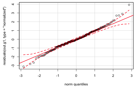
Fig. 4 Normal quantile plot of the normalized residuals from generalized least squares
While there is still some indication of a heavy tailed pattern, the plot is much improved over what it was for the raw residuals from the ordinary least squares model. Further documentation for the gls function can be found in Pinheiro and Bates (2000), available as an e-book through the UNC library system.
An important step before using a statistical model for inference is to verify that the model provides an adequate fit to the data. For normal probability models there are many diagnostics based on the residuals of the model, such as the normal probability plot above, that can be used for this purpose. When we turn to statistical models based on other probability distributions, residual analysis will prove to be less useful. To prepare ourselves for this we need a general method for assessing fit that can be applied to any statistical model. One such method is predictive simulation, also known as Monte Carlo simulation.
The logic behind predictive simulation is that the regression model coupled with the probability distribution for the response is treated as a data-generating mechanism, a protocol by which the data we observed might have arisen. In predictive simulation we use the fitted model to generate new data and then compare the data generated by the model (which by construction will be well-fit by the model) with the data we actually collected. If the simulated data and the actual data strongly resemble each other, we take this as evidence that the model provides a good fit. In practice we adopt a Popperian approach and try to falsify the model. We search for characteristics of the data that are never or rarely seen in the simulations and/or features of the simulated data sets that don't match what we see in the data. Because the simulations are random we need to carry out this comparison a large number of times using many simulated data sets. To facilitate this we typically look at the distributions of statistics calculated from the simulated data sets to see if the same statistic when calculated on the observed data looks like it could have come from this distribution.
For regression models based on a normal distribution obtaining a Monte Carol simulation is fairly simple. Let ![]() denote the estimated mean for observation i and let
denote the estimated mean for observation i and let ![]() be the estimated standard deviation of the normal distribution based on the model. (Typically we estimate σ using the square root of the reported mean squared error, which is the average sum of the squared deviations of the observed values from their mean.) We then use a function such as rnorm from R to generate a random value from a normal distribution with this mean and standard deviation. This is repeated for each observation yielding a single simulated data set. We then calculate some statistic from this simulated data set and then repeat this process, say 1000 times, to yield a simulation-based distribution of the statistic.
be the estimated standard deviation of the normal distribution based on the model. (Typically we estimate σ using the square root of the reported mean squared error, which is the average sum of the squared deviations of the observed values from their mean.) We then use a function such as rnorm from R to generate a random value from a normal distribution with this mean and standard deviation. This is repeated for each observation yielding a single simulated data set. We then calculate some statistic from this simulated data set and then repeat this process, say 1000 times, to yield a simulation-based distribution of the statistic.
R makes this easy by providing a function simulate that generates the simulated data sets automatically from a specified regression model. Because simulate does not have a method for gls objects, but does have a method for lm objects we will work with the analysis of variance model out2 that we fit using lm. In order to make the results reproducible, I use the set.seed function to first set the seed for the random number generator. The argument for set.seed should be a positive integer. Choosing different values for this integer yields different random seeds and samples. This way we can generate the same set of "random" values again if desired. To generate six simulated data sets using the model out2 we proceed as follows.
The simulate function generates a data frame in which each simulated data set occupies a column. The rows correspond to the observations and appear in the same order as they do in the original data set. If we compare the reported dimensions of the simulated data frame to that of the original data set, we see that simulate has only returned values for observations that had non-missing values of the response. The length function counts the number of elements in a vector, including the missing elements.
To illustrate how we might use the simulated data sets to assess fit, I take the data frame of simulated data and unstack the columns into one long vector. I then construct a second vector that identifies the simulation from which the observation comes. For that I use the rep function. We previously saw that when the first argument of rep is a vector and the second argument is a number (scalar) n, rep repeats the vector n times. If instead the second argument of rep is a vector, then rep matches up the two vector arguments and repeats the individual elements of the first vector the number of times indicated in the second vector. Here is an illustration of the two different ways of using rep.
Rather than writing out the second vector as c(4,4,4) we could have instead used the rep function to have created it.
So, for example, the following use of rep repeats the number of observations produced by each simulation six times.
Finally we use this to repeat each of the numbers one through six 239 times with: rep(1:6,rep(nrow(junk),6)). Putting this altogether we create a data frame in which the simulated values are in column 1 and the simulation number is in column 2. To stack the data frame columns from the simulation in a single column we use the unlist function.
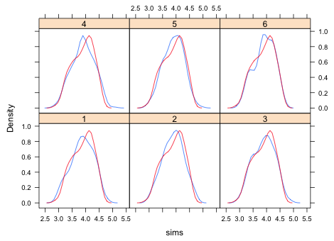
Next we compare the distribution of the simulated data with the observed data. A convenient way to compare distributions is with a kernel density plot, a smoothed version of a histogram. The densityplot function from the lattice package will produce multiple kernel density plots in a single panel graph. The syntax is ~x|grp where x is the variable whose density plot we want and grp is the variable that identifies the different groups. The group variable should be a factor so that the panels are labeled properly. To prevent the raw data from also being displayed in a rug plot at the bottom of the graph we add the option plot.points=F
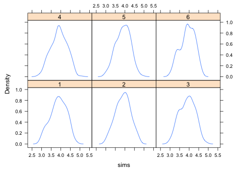
Fig. 5 Kernel density estimates of six different simulated data sets
To compare the simulated data with the original data we need to superimpose a kernel density plot of the actual data on each of the panels. To do this we have to write a panel function, a function that tells lattice what to draw in each panel. User-defined panel functions are specified in a panel argument. The panel functions of lattice have their own names and typically start with the word panel followed by a period. The panel function for density plots is panel.densityplot. We need to invoke this function twice: once to draw the kernel density plot of a simulated data set and a second time to draw the kernel density plot of the observed data. The panel function itself starts with the keyword function followed by parentheses containing one or more variable names. The different lines comprising the panel function are enclosed by curly braces { }. In the panel function shown below, the first line produces the kernel density estimate of the simulated data. The variable x represents the simulated values of a different group each time a new panel is drawn. The second line of the panel function produces the kernel density estimate of the observed data. This doesn't change from panel to panel.
 |
|
| Fig. 6 Kernel density estimates of the distributions of six different simulated data sets (—) compared with the kernel density estimate of the observed data distribution (—). | |
Based on Fig. 6 the simulated and observed data distributions look fairly close. Admittedly lumping the data into a single distribution is rather crude. The actual model assumes the data come from multiple normal distributions, one for each treatment, so it might be better to examine the fit separately by treatment. Collapsing the data as we did in Fig. 6 allows discrepancies in different treatments to cancel out.
In the box plots of Fig. 1 we saw that treatment CoD1 has a couple of very extreme observations. It would be interesting to see if observations this extreme can ever be generated by the fitted model. If not, then we have some evidence of lack of fit, at least for this treatment. To simplify the calculations I first create a treatment vector and a response vector in which the observations that have missing values for the response have been removed.
To select the values of the response that correspond to treatment CoD1 we need a Boolean expression that evaluates to TRUE when the treatment is CoD1. The double equals symbol, ==, is the logical equals sign in R and is used for this purpose. I use it to select the response values for treatment CoD1 and then calculate their maximum.
To obtain a good estimate of the distribution of the maxima I generate 1000 simulated data sets based on the model.
To access the individual columns of the data frame that is produced we can specify the entries by name, by column number, or by using a double brackets notation, [[ ]], sometimes called list notation.
To obtain the maximum value of the responses for a particular simulation we need to select those values and then take their maximum. The following line of code calculates the maximum of treatment CoD1 for the first simulation.
To do this separately for each column, not just column 1 we just need to loop over all the columns. A vectorized version of looping is carried out by the sapply function of R. In the call below I create a generic function, indicated by the keyword function(x), in which x plays the role of the column number. The first argument of sapply is the set of values that x is permitted to take, in this case the 1000 different column numbers.
The variable sim.max contains the maximum response values for treatment CoD1 from each of the 1000 simulated data sets. If we take the maximum of the simulation maxima we see that the observed maximum for this treatment exceeds the maximum of all 1000 of the simulated data sets. Thus we have evidence that the model cannot generate a value this large for treatment CoD1.
To get a sense of how badly the model is doing at recreating this data value, we can graph the distribution of the simulated maxima and see where in this distribution the actual maximum lies. This time I use the density function from base R to calculate the kernel density estimate of the maxima and then use the plot function to draw it.
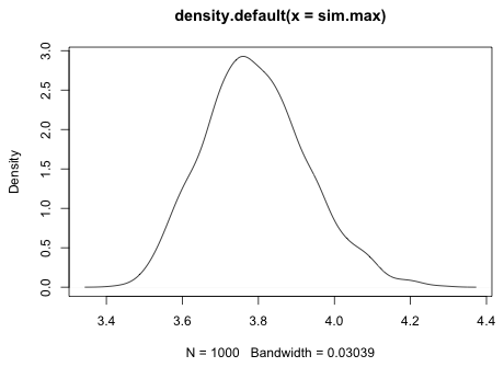 |
| Fig. 7 Distribution of simulated maxima for treatment CoD1 |
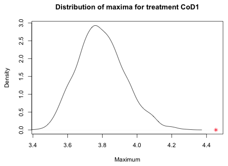
To make room for the actual maximum I need to extend the x-axis to include the actual maximum. For this I use the xlim argument followed by a vector that lists the minimum value to plot followed by the maximum value to plot. For the minimum I take the minimum of the simulated values. For the maximum I take the maximum of the simulated values and the observed maximum.
I use the xlab argument to add a more appropriate label for the x-axis and I use the main argument of plot to change the title.
The plot function is what's called a higher-level graphics function. It by default erases the current graphics window and creates a new graph. There are lower-level graphics functions in R that can be used to add things to the graph that is currently displayed in the active graphics window. One such function is points which plots points based on their the x- and y-coordinates. I want to plot the observed maximum on the x-axis so I specify the y-coordinate as 0. I use an asterisk for the print character, pch=8, and color it red, col=2.
 |
|
| Fig. 8 Distribution of simulated maxima for treatment CoD1 with the observed maximum ( |
|
From the graph we see that the observed maximum is a long way away from distribution of simulated maxima. If we were to write our own predictive simulation function and use it on out.g1, the generalized least squares model with a variance model for the residuals, this problem goes away. The observed maximum of the CoD1 treatment group is regularly obtained by the gls model (details not shown).
Pinheiro, J. C. & Bates, D. M. (2000) Mixed-Effects Models in S and S-Plus. (Springer-Verlag, New York).
A compact collection of all the R code displayed in this document appears here.
| Jack Weiss Phone: (919) 962-5930 E-Mail: jack_weiss@unc.edu Address: Curriculum for the Environment and Ecology, Box 3275, University of North Carolina, Chapel Hill, 27599 Copyright © 2012 Last Revised--September 3, 2012 URL: https://sakai.unc.edu/access/content/group/3d1eb92e-7848-4f55-90c3-7c72a54e7e43/public/docs/lectures/lecture3.htm |