Fig. 1 Negative binomial distributions with the same mean but different dispersions
If you examine the help screen for the dnbinom function, ?dnbinom, the following syntax for the function is displayed.
dnbinom(x, size, prob, mu, log = FALSE)
The dnbinom function can be used to calculate probabilities using the classical definition of the negative binomial (Pascal) or the ecological definition of the negative binomial (Polya). For the ecological parameterization the relevant parameters are size and mu, corresponding to the dispersion parameter and the mean, respectively. Notice that mu is the 4th listed argument and appears after an argument we will not be using, prob. Thus we'll always need to specify the value of mu by name when we use the dnbinom function. For consistency I also specify the size argument by name so that I don't have to remember to list it second.
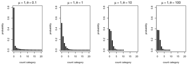
As a first illustration of various negative binomial distributions I fix the mean of the negative binomial distribution to be 1 (μ = 1) and I vary the dispersion parameter from small (θ = 0.1) to relatively large (θ = 100).
|
|---|
Fig. 1 Negative binomial distributions with the same mean but different dispersions |
What we see is that as θ gets small the fraction of zeros increases and the distribution becomes more spread out. Observe that with θ = 0.1 almost 80% of the observations are zero yet there is a non-negligible probability of obtaining a count of 20 or more. On the other hand when θ = 100 less than 40% of the observations are zero and the probability of obtaining a count beyond 10 is negligible.
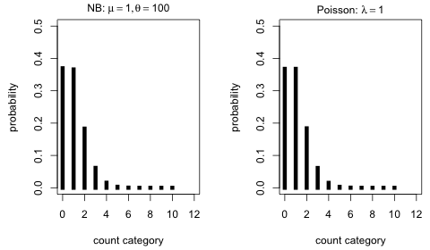
When θ = 100 in Fig. 1 the distribution looks very Poisson-like. We can investigate this by comparing it to a Poisson distribution with the same mean.
 |
|---|
Fig. 2 Comparing a negative binomial and Poisson distribution with the same mean (μ = 1) and θ relatively large (θ = 100) |
The distributions are nearly identical. In retrospect this should be expected. As θ → ∞, the negative binomial distribution with mean μ becomes a Poisson distribution with mean μ.
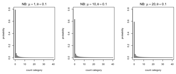
Finally I fix the dispersion parameter of the negative binomial distribution at a small value and vary the mean.
 |
|---|
Fig. 3 Negative binomial distributions with the same dispersion but different means |
What's striking about Fig. 3 is that other than a slight shrinkage in the zero fraction, the distributions look about the same. In truth the right tails of the distribution also become more prominent as the mean increases. Still the primary consequence of increasing the mean is to reduce the number of zeros. A negative binomial distribution with a small dispersion parameter will still have a sizeable zero fraction even if it has a very large mean.
I reload the aphid count data, fit the Poisson model, and display the data and the fit of the Poisson model using the code from last time.
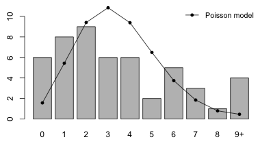
Fig. 4 Fit of the Poisson model
Following an argument that is completely analogous to the one presented for the Poisson distribution, the log-likelihood for a negative binomial distribution applied to these data is the following.
Translating this into an R function yields the following.
As you can see the only difference from the Poisson function is that we need to specify two arguments, the mean and the dispersion parameter. Instead of specifying the two arguments as separate variables, we can specify them as components of a vector.
The next few lines contrast how these two versions of the negative binomial log-likelihood function differ.
The nlm function does minimization, not maximization, so our function needs to return the negative of the log-likelihood. The nlm function also requires that the function have a single vector argument of parameters, i.e., it requires the second version of the log-likelihood function given above. I use the function NB.LL2 created above to define a negative log-likelihood negative binomial function.
I use the nlm function and the negative log-likelihood function created above to numerically approximate the MLEs. I supply initial guesses for ![]() and
and ![]() .
.
$estimate
[1] 3.459995 2.645024
$gradient
[1] -2.251151e-05 1.317917e-05
$hessian
[,1] [,2]
[1,] 6.2589597977 0.0002248452
[2,] 0.0002248452 0.9535296142
$code
[1] 1
$iterations
[1] 8
From the output we see the algorithm converged (code = 1) and both components of the gradient are close to zero. The estimated value of μ is 3.460 while that of θ is 2.645.
A simpler way to fit the negative binomial distribution to the aphids data is as regression model using the glm.nb function from the the MASS package. (MASS is part of the standard installation of R and does not need to be downloaded first.) To estimate the two parameters we fit a regression model with only an intercept. The glm.nb function only fits negative binomial regressions so there is no family argument. There is a link argument and like Poisson regression the default link is a log link.
Deviance Residuals:
Min 1Q Median 3Q Max
-2.1035 -1.1302 -0.1688 0.6997 1.4722
Coefficients:
Estimate Std. Error z value Pr(>|z|)
(Intercept) 1.2413 0.1155 10.75 <2e-16 ***
---
Signif. codes: 0 ‘***’ 0.001 ‘**’ 0.01 ‘*’ 0.05 ‘.’ 0.1 ‘ ’ 1
(Dispersion parameter for Negative Binomial(2.645) family taken to be 1)
Null deviance: 57.073 on 49 degrees of freedom
Residual deviance: 57.073 on 49 degrees of freedom
AIC: 233.4
Number of Fisher Scoring iterations: 1
Theta: 2.65
Std. Err.: 1.02
2 x log-likelihood: -229.402
The reported intercept is for the mean model, log μ = β0. Therefore to obtain the estimate of the mean we need to exponentiate this value.
The dispersion parameter is returned as the model component called theta.
The estimates of μ and θ are identical to what we obtained using the nlm function.
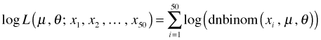
I produce a graph that compares the fit of the negative binomial and Poisson models. First I examine the predicted probabilities and counts (by summing over all 50 observations).
I combine the counts 9 and above into the last category using the pnbinom function.
I rename the last category so that it correctly indicates 9 and above.
I next produce a bar graph that compares the fit of the Poisson and negative binomial models.
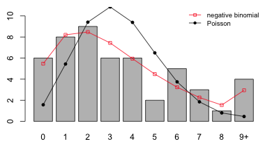
Fig. 5 Fit of the Poisson and negative binomial models
Based on the plot the fit of the negative binomial model appears to be a big improvement over that of the Poisson.
If we examine the expected counts we see that a number of them are below 5.
As was noted in lecture 15 if too many of the expected counts are small (5 being a guideline for smallness) then the chi-squared distribution of the Pearson statistic becomes questionable. To deal with this I combine categories. One way to do this would be to leave the first five categories alone, combine the next two, and combine the last three. A good strategy is to start with the tail and work backwards.
I merge these same categories for the observed counts and carry out the test. The degrees of freedom for the chi-squared statistic is m – 1 – p where m is the number of categories (after merging) and p is the number of estimated parameters. We have two estimated parameters: μ and θ so p = 2.
We can also use the output from the chisq.test function to obtain the Pearson statistic and then calculate the p-value ourselves (to properly account for the two parameters we estimated).
The p-value is large so we fail to reject the fit of the negative binomial model.
By pooling categories we have distorted the negative binomial distribution. Failing to find a significant lack of fit with the pooled categories does not guarantee that the model would still fit if we didn't pool the categories. We can obtain a better measure of fit by using a randomization test.
Chi-squared test for given probabilities with simulated p-value
(based on 9999 replicates)
data: num.stems
X-squared = 3.5113, df = NA, p-value = 0.9459
The result is nearly identical to what we obtained with the parametric test using the combined categories.
A skeptic might argue that the way we're handling the last category is overly favorable to our model. The empirical distribution of the raw data does not decrease to zero; the last observed category has four observations. By lumping the tail of the negative binomial distribution into the last observed category we force the expected results to more closely resemble the observed data. To satisfy such a skeptic I create a new category, X = 10+, for both the observed and expected counts and redo the randomization test. This category represents stems with aphid counts of 10 or more. Of course, the observed frequency of this new category is 0.
Chi-squared test for given probabilities with simulated p-value
(based on 9999 replicates)
data: new.numstems
X-squared = 13.5113, df = NA, p-value = 0.1923
So even after creating a separate final category in which the observed count is zero, we still fail to find a significant lack of fit (although the p-value of our test has been reduced substantially).
Warning. I should point out one deficiency of the simulation-based test. There is no penalty for overfitting. In the Pearson chi-squared test the degrees of freedom of the chi-squared distribution used for assessing the significance of the test statistic gets reduced by the number of parameters that were estimated. This has the effect of reducing the threshold (critical value) for lack of fit. As a result, models that use more parameters are forced to meet a higher goodness of fit standard than are models using fewer parameters. This makes it harder for complicated models to pass the test. Thus the parametric version of the chi-squared test has a built-in protection against over-fitting. With the simulation-based version of the test there is no such protection.
We use a data set that appears on Michael Crawley's web site for his text Statistical Computing (Crawley 2002) and is also used in The R Book (2007).
Crawley describes these data as follows (Crawley 2002, p. 542). "Count data were obtained on the number of slugs found beneath 40 tiles placed in a stratified random grid over each of two permanent grasslands. This was part of a pilot study in which the question was simply whether the mean slug density differed significantly between the two grasslands." My interpretation of this is that the experiment was extraordinarily simple. Rocks of standard shape and size were laid out in two fields and at some point later in time the fields were revisited and the number of slugs under each rock was recorded. The data we are given are the raw counts, i.e., the individual slug counts for each rock. Thus we have a total of 80 observations, 40 from each field type. A value of 0 means no slugs were found under that rock.We can verify this by tabulating the data by field type.
Crawley then spends a chapter of his textbook trying one statistical test after another to test the hypothesis of no mean difference in slugs between the two field types. In the end his conclusion is ambiguous. Some tests say there is a difference, some say there isn't.
I submit that the problem posed by Crawley is essentially an uninteresting one. Any two populations in nature will typically differ with respect to whatever characteristic we care to measure. Whether that difference can be deemed statistically significant is not a statement about nature, but instead is a statement about the sample size used in the study. With enough data any difference, no matter how small, will achieve "statistical significance". A far more useful approach is to determine some way to characterize the differences in slug distribution that exist and then assess whether that characterization tells us anything interesting about slugs and/or nature in general.
First we summarize the distribution of slugs under rocks in the two field types.
Nursery Rookery
0 25 9
1 5 9
2 2 8
3 2 5
4 2 2
5 1 4
6 1 1
7 1 0
8 0 1
9 0 1
10 1 0
A bar plot of the two distributions would be useful. One problem with using a bar plot with ordinal data such as count categories is that it treats the categories as nominal, so if there are any gaps (missing categories) they won't show up in the plot unless we insert the zero categories ourselves beforehand. This is not a problem here because each of the eleven count categories are present in at least one of the field types, so the table function has inserted the zero values when needed.
The output of the table function can be used as input to the barplot function to produce a bar plot. When we generate separate frequency distributions for one variable (slugs) by the levels of a second variable (field), the barplot default is to generate a stacked bar plot (Fig. 6a). If we add the beside=T argument we get two separate bar plots, one for each category of field.
(a) 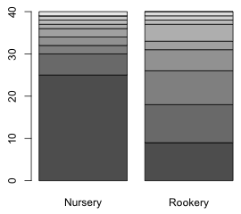 |
(b)  |
| Fig. 6 Distribution of slugs counts using (a) a stacked bar plot and (b) separate bar plots | |
Because our goal is to superimpose predictions from a model onto the observed distribution of slug counts, the stacked bar plot is of no use to us. Although it appears that there are two separate graphs in Fig 1b in fact this is a single graph with a single set of coordinates on the x-axis. We can see this by assigning a name to the output of the barplot function and printing the object.
The columns contain the x-coordinates of the bars with each column corresponding to a different field type. Notice that the top of the second column continues where the bottom of the first column left off.
Notice that the categories aren't labeled in the separate bar plots. We can add labels with the names.arg argument in which we specify a single vector of names for both graphs. When we do so the field type labels under the graphs disappear so we need to add those with the mtext function. To position the labels at the center of each display I use the values in row 6 of the matrix of bar coordinates contained in the object coord1. The cex.names argument can be used to reduce the size of the bar labels so that more are displayed.
Fig. 7 Separate bar plots of the two slug distributions with labels for the bars
When there are only two groups to display in a bar plot, another option is to use a side by side bar plot in which the distributions of the two groups are interwoven. This can be accomplished with barplot and the beside=T option if we first transpose the table of counts with the t function so that the rows of the matrix correspond to the groups and the columns correspond to the separate count categories. There is a legend.text argument which if set to TRUE will add a legend indicating which bar corresponds to which group.
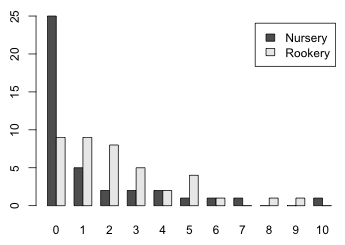
Fig. 8 Side by side bar plots of the two slug distributions with labels
The coordinates of the bars now are contained in a 2 × 11 matrix.
When the goal is to produce separate graphs according to the levels of another variable (such as the field variable here) lattice is usually a better choice than base graphics. In order to use lattice we need to organize the table of counts into a data frame. This can be accomplished with the data.frame function applied directly to the output from the table function.
The count categories have been converted to a factor. It will be useful to have the actual numerical values when we try to add model predictions. If we try to convert them to numbers with the as.numeric function we see that we don't get what we want.
The problem is that factor levels are always numbered starting at 1. The trick to getting the actual numeric labels back is to first convert the factor levels to character data with the as.character function and then convert the character data to numbers.
The bar plot function in lattice is called barchart. The default arrangement is a horizontal bar plot if the x-variable is numeric and a vertical bar chart if the x-variable is a factor. To get a vertical bar plot under all circumstances we can add the horizontal = F argument. The graph is shown in Fig. 9a.
(a) 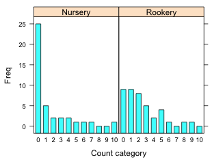 |
(b) 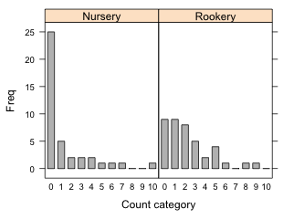 |
Fig. 9 Bar plots using the lattice barchart function with (a) default settings and (b) with the origin=0 argument. |
|
We see that the graph is not ideal.
The following produces the graph shown in Fig. 9b.
We can get almost the same display with the xyplot function by using the type='h' option to draw vertical lines from the plotted points to the x-axis with lwd (line width) set to a large value to produce bars. To get square ends on the bars I use lineend=1. For xyplot we need the numerical version of Var1 rather than the factor version. Fig. 10 shows the result.
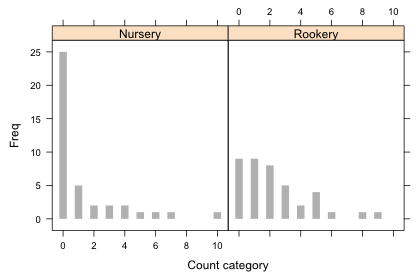
Fig. 10 Bar plots using the lattice xyplot function
The differences from barchart are that we don't get the dark borders around the bars and the missing categories are just missing and not indicated by horizontal lines as they are in Fig. 4. More importantly, if there had been gaps in the data (count categories with a frequency of zero that were not recorded) then xyplot would display the gaps whereas barchart would not. The barchart function uses the levels of the factor function to construct the categories.
I start by fitting a single Poisson distribution to the data that ignores the field type from the which the slug data were obtained. The negative log-likelihood function we need is the same one we used in lecture 15 except modified to use the slug counts rather than the aphid counts we analyzed there.
This is a single mean model, one mean for both field types. The parameter λ in the Poisson distribution is the mean and its maximum likelihood estimate is the sample mean. For the initial estimate required by the nlm function I choose a value close to the sample mean.
$estimate
[1] 1.774999
$gradient
[1] 1.056808e-06
$code
[1] 1
$iterations
[1] 5
The iterations converged (the gradient is approximately zero and code = 1) and as expected the function returns the sample mean as the point estimate of λ. The warning messages indicate that during the iterations we obtained an illegal value for dpois, probably because lambda had become negative. The function did recover and it appears we have sensible estimates.
We can easily generalize this function to fit a separate mean to each field. I begin by defining a 0-1 dummy variable that indicates the field type. For this we can use a Boolean expression that tests whether the field type is equal to "Rookery".
I next rewrite the negative Poisson log-likelihood function using this so that the mean varies by field type. We don't need to explicitly convert the Boolean expression to numeric because using it in an arithmetic expression will cause the conversion to happen automatically.
The first line of the function creates a variable called mu that is defined in terms of the Boolean expression. Since the Boolean expression returns a vector, mu will also be a vector. As the value of the Boolean expression changes from observation to observation, the value of mu will also change. For nursery slugs the Boolean expression returns 0. Thus for nursery slugs mu has the value
mu = p[1] + p[2]*0 = p[1]
For rookery slugs the Boolean expression returns 1. Thus for rookery slugs mu has the value
mu = p[1] + p[2]*1 = p[1] + p[2]
In summary we have the following.
So we see that p[1] is the value of the mean λ for nursery slugs. Since the value of λ for rookery slugs is p[1] + p[2] we see that p[2] represents the difference in the value of λ between nursery and rookery slugs. So, p[2] is the mean slug count difference between nursery and rookery slugs.
To obtain starting values for the elements of p I calculate the mean in each field type.
So the sample mean for nursery slugs is 1.275 and the mean difference is 1. I use p = c(1.2,1) as initial estimates.
$estimate
[1] 1.2749997 0.9999997
$gradient
[1] 1.125723e-05 -1.506351e-06
$code
[1] 1
$iterations
[1] 8
The iterations converged (both elements of the gradient vector are near zero and code = 1). The estimates nlm returns are the values we predicted they would be.
The two models we've fit for the mean are the following.
where z is the dummy variable defined above that indicates the rookery slugs. We wish to test

The use of the likelihood ratio test in comparing models was discussed in lecture 13. The $minimum component of the nlm object is the negative log-likelihood evaluated at the maximum likelihood estimate. The likelihood ratio statistic is twice the difference in these values for the two models ordered in such a way that the difference is positive.
This statistic has an asymptotic chi-squared distribution with degrees of freedom equal to the difference in the number of parameters estimated in the two models, which is 1 for these two models.
The likelihood ratio test is a one-tailed upper-tailed test. We reject the null hypothesis at α = .05 if ![]() . I obtain the p-value for this test next.
. I obtain the p-value for this test next.
So using the likelihood ratio test I reject the null hypothesis and conclude that the Poisson rate constants (means) of slug occurrence are different in the two field types.
The Wald test is an alternative to the likelihood ratio test and was also discussed in lecture 13. In order to use it we only need to fit the second of the two models, but we do need to compute the Hessian matrix to obtain the standard errors of the parameter estimates. For that we need to include hessian=T as an argument of the nlm function.
$estimate
[1] 1.274999 1.000001
$gradient
[1] 1.337493e-07 5.996976e-06
$hessian
[,1] [,2]
[1,] 48.94677 17.58066
[2,] 17.58066 17.58087
$code
[1] 1
$iterations
[1] 9
From lecture 8 we learned that the inverse of the negative of the Hessian yields the variance-covariance matrix of the parameters. Because we're working with the negative log-likelihood, the negative sign has already been taken care of. To carry out matrix inversion we use the solve function of R. The variances occur on the diagonal of the inverted matrix and can be extracted with the diag function. Finally we take their square root to obtain the standard errors of the parameter estimates.
Individual 95% Wald confidence intervals are obtained from the formula
![]()
Using R we obtain the following.
The 95% Wald confidence interval for β0 is (0.95, 1.63) while that for β1 is (0.42, 1.58). Because 0 is not contained in the confidence interval for β1, we reject the null hypothesis and conclude that β1 ≠ 0.
As an alternative to constructing confidence intervals we can carry out the Wald test formally. The Wald statistic for our null hypothesis is the following.
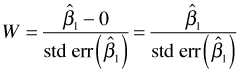
We reject H0 if ![]() . Because 3.356 > 1.96, we reject the null hypothesis and conclude that the Poisson rate constants are different in the two field types. The p-value of the test statistic is just the probability under the null model that
. Because 3.356 > 1.96, we reject the null hypothesis and conclude that the Poisson rate constants are different in the two field types. The p-value of the test statistic is just the probability under the null model that ![]() . We obtain this by calculating this probability for one tail and then doubling the result.
. We obtain this by calculating this probability for one tail and then doubling the result.
Observe that this p-value is very close to what we obtained from the likelihood ratio test above.
As we've seen regression models can be fit to a response variable that has a Poisson distribution by using the glm function with family=poisson. The default link function is the log link thus using glm we actually fit the following two models:
Model 1: log μ = β0
Model 2: log μ = β0 + β1*(field=='Rookery')
To obtain the likelihood ratio test of H0: β1 = 0, we use the anova function and list the reduced model followed by the full model. Adding the argument test='Chisq' produces the test.
Model 1: slugs ~ 1
Model 2: slugs ~ field
Resid. Df Resid. Dev Df Deviance Pr(>Chi)
1 79 224.86
2 78 213.44 1 11.422 0.000726 ***
---
Signif. codes: 0 ‘***’ 0.001 ‘**’ 0.01 ‘*’ 0.05 ‘.’ 0.1 ‘ ’ 1
We can also get the likelihood ratio test by specifying only the full model in the anova function along with test='Chisq'. This time anova returns sequential likelihood ratio tests, much like the sequential F-tests it returns with normal models.
Model: poisson, link: log
Response: slugs
Terms added sequentially (first to last)
Df Deviance Resid. Df Resid. Dev Pr(>Chi)
NULL 79 224.86
field 1 11.422 78 213.44 0.000726 ***
---
Signif. codes: 0 ‘***’ 0.001 ‘**’ 0.01 ‘*’ 0.05 ‘.’ 0.1 ‘ ’ 1
The summary table of the full model reports the Wald test of H0: β1 = 0.
Deviance Residuals:
Min 1Q Median 3Q Max
-2.1331 -1.5969 -0.9519 0.4580 4.8727
Coefficients:
Estimate Std. Error z value Pr(>|z|)
(Intercept) 0.2429 0.1400 1.735 0.082744 .
fieldRookery 0.5790 0.1749 3.310 0.000932 ***
---
Signif. codes: 0 ‘***’ 0.001 ‘**’ 0.01 ‘*’ 0.05 ‘.’ 0.1 ‘ ’ 1
(Dispersion parameter for poisson family taken to be 1)
Null deviance: 224.86 on 79 degrees of freedom
Residual deviance: 213.44 on 78 degrees of freedom
AIC: 346.26
Number of Fisher Scoring iterations: 6
Notice that the reported p-values for the Wald test (p = 0.000932) and the likelihood ratio test (p = 0.000726) are similar but different. This will always be the case. The likelihood ratio test is based on the full log-likelihood while the Wald test uses only the curvature of the log-likelihood surface.
If we use the predict function on a glm model we get the predictions on the scale of the link function. For Poisson regression that means the predictions are of the log mean.
To get predictions on the scale of the response variable we need to add the type='response' argument.
With only two groups it's easy to calculate the probabilities we need. I do things a bit more systematically in order to be able to generalize to more complicated situations. We need the Poisson probabilities for the categories 0 through 10. The Poisson mean varies depending on the field type the slugs inhabit so we'll need to account for this. I elect to add the tail probability, P(X > 10) to the last category, P(X = 10). The slugtable data frame variable Var1 contains the different count categories while Var2 contains the field variable. I begin by using the predict function with the newdata argument to obtain the predicted means for each observation in the slugtable data frame.
Next I calculate the Poisson probabilities for categories 0 through 10 (Var1.num) using the mean recorded in each row.
Finally I add the tail probability, P(X > 10) to the X = 10 category. For this I use a Boolean expression to select only the X = 10 category: slugtable$Var1.num==10. Recall that P(X > 10) = ppois(10, lambda, lower.tail=F). To make sure I've done this correctly I create a new variable and calculate all of the probabilities again adding the tail probability only to the X = 10 category.
Checking we see that the Nursery and Rookery probabilities now sum to 1.
If we sum the probabilities separately for each count category over all rocks of that field type, we get the predicted counts for that field. For our simple model the predicted probabilities are the same for each rock that comes from the same field type. So a simpler way to get the predicted counts is to multiply the probability distribution for one rock by the total number of rocks, which is 40 for each field type.
In general the situation could be more complicated so I handle this more generally. I tabulate the counts by field type and then use the Var2 variable to select which entry of this table I should use to multiply the individual probabilities.
To add the predicted counts to a lattice bar plot of the observed counts we need to use the subscripts variable in a panel function to select the appropriate predicted counts for each panel. Here's an example where I use the panel.xyplot function to draw the bar chart and then use a panel.points function to superimpose the predicted counts on top of the bars.
In a lattice graph the formula expression Freq~Var1.num|Var2 defines the x- and y-variables for the panel function. In the panel function x and y correspond to the values of Var1.num and Freq respectively for the subset of observations whose value of variable Var2 matches the the value for the panel currently being drawn. For all other variables not included in the formula we have to do the subsetting by panel explicitly ourselves. That's what the subscripts variable is for. It acts like a dummy variable that selects the current panel observations. So in the panel.points function slugtable$exp[subscripts] selects the predicted counts for the current panel while x represents the already subsetted values of Var1.num.
There's a barchart panel function, panel.barchart, that can be used instead of panel.xyplot to generate the observed counts. This time I use the factor version of Var1.
The two versions of the lattice bar plot are shown in Fig. 11.
(a) 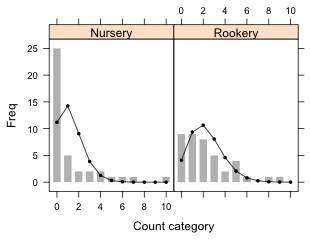 |
(b) 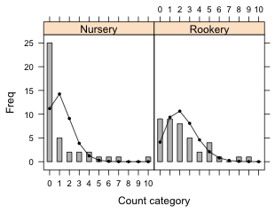 |
Fig. 11 Bar plots with superimposed predictions from a Poisson model. (a) uses the panel.xyplot function to draw the bars while (b) uses the panel.barchart function to draw the bars. |
|
A compact collection of all the R code displayed in this document appears here.
| Jack Weiss Phone: (919) 962-5930 E-Mail: jack_weiss@unc.edu Address: Curriculum for the Environment and Ecology, Box 3275, University of North Carolina, Chapel Hill, 27599 Copyright © 2012 Last Revised--October 19, 2012 URL: https://sakai.unc.edu/access/content/group/3d1eb92e-7848-4f55-90c3-7c72a54e7e43/public/docs/lectures/lecture16.htm |