Lecture 5—Monday, September 10, 2012
Topics
R functions and commands demonstrated
- barplot produces a bar plot.
- cbind appends vectors and matrices together by their columns creating a new object with the same number of rows.
- nchar counts the number of character elements of a text string.
- order returns the indices of the elements of a vector that would sort the elements of that vector.
- pairwise.t.test carries out a sequence of independent samples t-tests for a group of means.
- seq generates a vector of equally spaced elements.
- sort places the elements of a vector in sorted order.
- substr extracts contiguous text from character strings.
- text places text at specified locations in the active graph.
R function options
- confidence.level= (argument to effect function) specifies the level for confidence intervals.
- level= (argument to predict) specifies the level for confidence intervals.
- lty= (argument to graphics functions) controls the type of line displayed.
- lwd= (argument to graphics functions) controls the thickness of lines and line segments.
- names.arg= (argument to barplot) specifies the names that barplot places below individual bars in a bar plot.
- pos= (argument to text) specifies the position of the text relative to the specified coordinates: 1, 2, 3, and 4 for below, to the left, above, and to the right of the coordinates.
Additional R packages used
Discussion of Assignment 1
See Assignment 1 solutions.
Creating an interaction graph with confidence intervals for the mean
I reload the tadpoles data set and refit the analysis of variance models from last time. I then reproduce the graph of the two-way interaction between fac1 and fac2. For an explanation of the code see lecture 4.
tadpoles <- read.table("ecol 563/tadpoles.csv", header=T, sep=',')
tadpoles$fac3 <- factor(tadpoles$fac3)
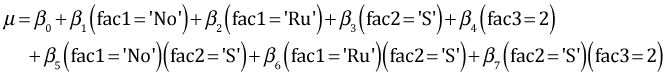
out1 <- lm(response~fac1 + fac2 + fac3 + fac1:fac2 + fac1:fac3 + fac2:fac3 + fac1:fac2:fac3, data=tadpoles)
out2 <- lm(response~fac1 + fac2 + fac3 + fac1:fac2 + fac2:fac3, data=tadpoles)
#calculate means and their confidence intervals
myvec <- function(fac1, fac2, fac3) c(1, fac1=='No', fac1=='Ru', fac2=='S', fac3==2, (fac1=='No')*(fac2=='S'), (fac1=='Ru')*(fac2=='S'), (fac2=='S')*(fac3==2))
fac.vals2 <- expand.grid(fac1=c('Co','No','Ru'), fac2=c('D','S'), fac3=1:2)
#contrast matrix
cmat <- t(apply(fac.vals2, 1, function(x) myvec(x[1],x[2],x[3])))
#treatment means
ests <- cmat%*%coef(out2)
#variance-covariance matrix of treatment means
vmat <- cmat %*% vcov(out2) %*% t(cmat)
# std errs of means
se <- sqrt(diag(vmat))
# 95% confidence intervals
low95 <- ests + qt(.025,out2$df.residual)*se
up95 <- ests + qt(.975,out2$df.residual)*se
#assemble results in data frame
results.mine <- data.frame(fac.vals2, ests, se, low95, up95)
results.mine$fac1.num <- as.numeric(results.mine$fac1)
#sibship 1
plot(c(.8,3.2), range(results.mine[,c("up95", "low95")]), type='n', xlab="Hormonal treatment", ylab='Mean mitotic activity', axes=F)
axis(1, at=1:3, labels=levels(results.mine$fac1))
axis(2)
box()
results.mine.sub1 <- results.mine[results.mine$fac3==1,]
#first food group
cur.dat <- results.mine.sub1[results.mine.sub1$fac2=='D',]
#amount of shift
myjitter <- -.05
arrows(cur.dat$fac1.num+myjitter, cur.dat$low95, cur.dat$fac1.num+myjitter, cur.dat$up95, angle=90, code=3, length=.05, col=1)
lines(cur.dat$fac1.num+myjitter, cur.dat$ests, col=1)
points(cur.dat$fac1.num+myjitter, cur.dat$ests, col=1, pch=16)
#second food group
cur.dat <- results.mine.sub1[results.mine.sub1$fac2=='S',]
myjitter <- .05
arrows(cur.dat$fac1.num+myjitter, cur.dat$low95, cur.dat$fac1.num+myjitter, cur.dat$up95, angle=90, code=3, length=.05, col=2)
lines(cur.dat$fac1.num+myjitter, cur.dat$ests, col=2)
points(cur.dat$fac1.num+myjitter, cur.dat$ests, col='white', pch=16, cex=1.1)
points(cur.dat$fac1.num+myjitter, cur.dat$ests, col=2, pch=1)
mtext(side=3, line=.5, 'Sibship 1', cex=.9)
legend('topleft',c('Detritus','Shrimp'), col=1:2, pch=c(16,1), cex=.8, pt.cex=.9, title=expression(bold('Food Type')), bty='n')
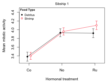
Fig. 1 Mean profile plot for sibship 1
Interpreting 95% confidence intervals in an interaction plot
We've discussed interaction plots like Fig. 1 previously. The only new additions are the 95% confidence intervals for the means. A 95% confidence interval denotes a set of likely values for the treatment mean in the population that generated our sample. With a 95% confidence interval we can be 95% confident that our interval has captured the true population value of the mean.
A popular alternative to displaying 95% confidence intervals is to just display ± 1 standard error. This choice is popular predominantly because it yields a shorter interval than a 95% confidence interval. As a result a naive reader thinks the results are more precise than they are while a more sophisticated reader is forced to go through the mental gymnastics of multiplying the standard errors by an appropriate multiplier to obtain a confidence interval. Another reason ±1 stan dared error displays are sometimes preferred is because of the confusion that using confidence intervals can cause. Consider again Fig. 1. Except for the two Co 95% confidence intervals which are obviously distinct from both the No and Ru 95% confidence intervals, all the remaining ways we could pair up the six means in Fig. 1 lead to 95% confidence intervals that overlap. In particular notice that the 95% confidence intervals of the two Ru treatment means overlap. This may seem surprising because we know from the summary table that the food treatment (fac2) effect significantly deviates from additivity when fac1 = 'Ru'. The summary table of the model is shown below in which with this particular significant interaction effect is highlighted.
round(summary(out2)$coefficients,3)
Estimate Std. Error t value Pr(>|t|)
(Intercept) 3.383 0.052 64.499 0.000
fac1No 0.547 0.058 9.376 0.000
fac1Ru 0.537 0.061 8.825 0.000
fac2S 0.017 0.067 0.256 0.798
fac32 0.108 0.048 2.234 0.026
fac1No:fac2S 0.013 0.077 0.174 0.862
fac1Ru:fac2S 0.164 0.082 2.000 0.047
fac2S:fac32 0.163 0.065 2.509 0.013
The analysis of variance model that corresponds to the coefficient estimates in the table above is the following.
For sibship 1 the terms involving fac3 drop out and we're left with the following.
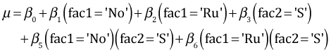
According to the model the difference between the two Ru treatments for sibship 1 (shrimp diet minus detritus diet) is given by β3 + β6. From the summary table the point estimates of both β3 and β6 are greater than zero. Furthermore β6 is significantly greater than zero. Therefore it follows that the Ru treatment mean when the diet is shrimp (fac2 = 'S') is significantly greater than the Ru mean when the diet is detritus (fac2 = 'D') at α = .05. Why is this not reflected in the 95% confidence interval shown in Fig. 1?
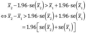
You should recall from your elementary statistics course that a one-sample α-level significance test that tests whether the true value of a parameter is equal to zero is equivalent to determining if zero is in the (1 – α)%-level confidence interval for that parameter. Similarly a test of whether the difference in two means is equal to zero is equivalent to determining if zero is in the (1 – α)%-level confidence interval for the mean difference. But determining if the confidence interval of the difference of two means includes zero is not equivalent to deciding whether the individual confidence intervals of the two means overlap. While it is always true that if the confidence intervals of two parameters do not overlap then the parameters are significantly different, the converse is not true. It is incorrect to assume that two parameters are not significantly different just because their individual 95% confidence intervals overlap.
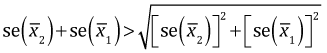
Fig. 2 shows the individual normal-based 95% confidence intervals for two means. ( The notation "se" in Fig. 2 denotes standard error.)
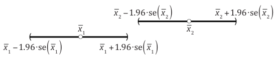
Fig. 2 Non-overlapping 95% normal-based confidence intervals for two means
In the picture  and in general the two confidence intervals will fail to overlap if the lower 95% confidence limit of the larger mean exceeds the upper 95% confidence limit of the smaller mean.
| 
|
(1) |
On the other hand, the 95% confidence interval for the difference of two independent means is given by the following expression. (See any elementary statistics text for a derivation.)
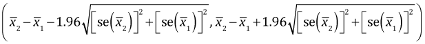
This 95% confidence interval will fail to include zero (and be strictly positive) if the lower limit is positive.
| 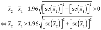
|
(2) |
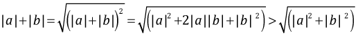
Observe that the term being multiplied by 1.96 is different in the final lines of eqns (1) and (2). In eqn (1) it is the sum of the standard errors. In eqn (2) it is the square root of the sum of the squares of the standard errors. Because the the sum of two positive numbers always exceeds the square root of the sum of squares of those two numbers,
it follows that
Therefore if the difference between two means that are not significantly different is increased (everything else being held constant), the confidence interval for their difference will stop containing zero before the two individual confidence intervals stop overlapping.
Difference-adjusted confidence intervals
Because of this lack of equivalence using individual confidence intervals to carry out a two-sample hypothesis test leads to overly conservative results. We will fail to reject the null hypothesis too often. The individual 95% confidence intervals can overlap even when a hypothesis test for the difference would conclude that the parameter values are significantly different at α = .05. The bottom line is that error bar displays of individual parameter estimates based on 95% confidence intervals cannot reliably be used to assess the statistical significance of differences between pairs of parameters. This issue is well-known and has been discussed frequently in the applied literature (Cumming 2009, Schenker and Gentleman 2001).
There is a solution to this "problem". We just need to choose a confidence level for the individual confidence intervals so that a non-overlapping pairs of confidence intervals does indicate statistically significant differences at α = .05. Finding the value for this confidence level is just a problem in algebra. For independent parameters with roughly the same standard errors, the correct normal-based confidence level is 83.5% (Goldstein and Healy 1995, Payton et al. 2000, 2003). The more general case of possibly correlated parameters has been discussed by Afshartous and Preston (2010). For a derivation of the general result see their paper or see my explanation at the following web site.
The psychologist Thom Baguley has called these new confidence intervals "difference-adjusted confidence intervals". He recommends producing diagrams for parameters that show both their difference-adjusted confidence intervals as well as 95% confidence intervals. He refers to these diagrams as two-tiered displays (Baguley 2012a, 2012b). The following function, ci.func, calculates the difference-adjusted confidence levels needed to make comparisons between a set of possibly correlated means where analysis of variance was carried out using the lm function.
# function to calculate difference-adjusted confidence intervals
ci.func <- function(rowvals, lm.model, glm.vmat) {
nor.func1a <- function(alpha, model, sig) 1-pt(-qt(1-alpha/2, model$df.residual) * sum(sqrt(diag(sig))) / sqrt(c(1,-1) %*% sig %*%c (1,-1)), model$df.residual) - pt(qt(1-alpha/2, model$df.residual) * sum(sqrt(diag(sig))) / sqrt(c(1,-1) %*% sig %*% c(1,-1)), model$df.residual, lower.tail=F)
nor.func2 <- function(a,model,sigma) nor.func1a(a,model,sigma)-.95
n <- length(rowvals)
xvec1b <- numeric(n*(n-1)/2)
vmat <- glm.vmat[rowvals,rowvals]
ind <- 1
for(i in 1:(n-1)) {
for(j in (i+1):n){
sig <- vmat[c(i,j), c(i,j)]
#solve for alpha
xvec1b[ind] <- uniroot(function(x) nor.func2(x, lm.model, sig), c(.001,.999))$root
ind <- ind+1
}}
1-xvec1b
}
The ci.func function requires three inputs:
- The vector 1:n where n is the number of means being compared
- The name of the lm object that contains the estimated analysis of variance model.
- The variance-covariance matrix of the n means being compared
As an illustration in the analysis of variance problem we've been considering there are twelve means, the final lm model was called out2, and we previously created vmat, the variance-covariance matrix for the means. The following call to ci.func returns the difference-adjusted confidence levels needed for the 66 different pairwise comparisons between the means.
ci.func(1:12, out2, vmat)
[1] 0.7557282 0.7478099 0.8378421 0.8372399 0.8351857 0.6472930 0.8814099 0.8710937 0.8378421
[10] 0.8377497 0.8369402 0.7355839 0.8356254 0.8353756 0.8354773 0.8789031 0.7118236 0.8737951
[19] 0.8356254 0.8355841 0.8352713 0.8376375 0.8370585 0.8351494 0.8809514 0.8880105 0.6763009
[28] 0.8376375 0.8375484 0.8367716 0.7616431 0.7572021 0.8366178 0.8351460 0.8352397 0.6982728
[37] 0.8812142 0.8679364 0.7546114 0.8361737 0.8350890 0.8351244 0.8837162 0.6907152 0.8683282
[46] 0.8351006 0.8363257 0.8360214 0.8879769 0.8859777 0.6415844 0.7851825 0.7996714 0.8366178
[55] 0.8365483 0.8359619 0.7915143 0.8351460 0.8351328 0.8350908 0.8352397 0.8352180 0.8350942
[64] 0.7671156 0.7927713 0.7950208
The above output is a bit daunting. Let's simplify the situation by looking at only the six means being displayed in the mean profile plot of Fig. 1. These are the means corresponding to sibship 1 and listed in order are the following.
fac.vals2[1:6,]
fac1 fac2 fac3
1 Co D 1
2 No D 1
3 Ru D 1
4 Co S 1
5 No S 1
6 Ru S 1
To obtain the difference-adjusted confidence levels this time we need just the first six rows and first six columns of vmat.
ci.func(1:6, out2, vmat[1:6,1:6])
[1] 0.7557282 0.7478099 0.8378421 0.8372399 0.8351857 0.7355839 0.8356254 0.8353756 0.8354773
[10] 0.8376375 0.8370585 0.8351494 0.7616431 0.7572021 0.7546114
The output displays the 15 possible comparisons of the means taken two at time starting with mean 1 (CoD1) pitted against means 2, 3, 4 and 5, then mean 2 (NoD1) pitted against means 3, 4, and 5, etc. Fig. 3 reorganizes the output from ci.func and displays the confidence levels according to the means that are being compared.
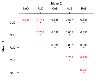
Fig. 3 Confidence levels for pairwise mean comparisons
Notice that the displayed confidence levels fall into two groups, nine values that are close to 0.835 and six values that are close to 0.75. The six values around 0.75 all involve comparisons between treatments that have different hormonal levels (fac1) but the same food level (fac2). In Fig. 1 these are comparisons between means that lie on the same food profile. The nine confidence levels around 0.835 are comparisons between means that lie on different food profiles. This suggests a way to proceed. We need to add two more confidence bands to Fig. 1 one with confidence level 75% for comparing means within a profile and the second one with confidence level 83.5% for comparing means on different profiles.
If CL = 1 – α is the confidence level, then α = 1 – CL. Thus the quantiles for our confidence interval are α/2 = (1 –CL)/2 and 1 – α/2 = 1 – (1 –CL)/2.
low75 <- ests + qt((1-.75)/2,out2$df.residual)*se
up75 <- ests + qt(1-(1-.75)/2,out2$df.residual)*se
low83 <- ests + qt((1-.835)/2,out2$df.residual)*se
up83 <- ests + qt(1-(1-.835)/2,out2$df.residual)*se
Alternatively we can use the level argument of the predict function and obtain the confidence intervals from predict.
fac.vals2$fac3 <- factor(fac.vals2$fac3)
out.75 <- predict(out2, newdata=fac.vals2[1:6,], se.fit=T, interval="confidence", level=.75)
out.83 <- predict(out2, newdata=fac.vals2[1:6,], se.fit=T, interval="confidence", level=.835)
Or, we can use the confidence.level argument of the effect function in the same way.
library(effects)
effect.75 <- effect('fac1:fac2', out2, given.values=c(fac32=0), confidence.level=0.75)
effect.83 <- effect('fac1:fac2', out2, given.values=c(fac32=1), confidence.level=0.835)
I add these confidence limits as new columns in our results matrix. The cbind function combines data frames and vectors by column to produce a new data frame.
# add new confidence limits to the data frame
results.mine <- cbind(results.mine, low75, up75, low83, up83)
results.mine
fac1 fac2 fac3 ests se low95 up95 fac1.num low75 up75 low83 up83
1 Co D 1 3.383238 0.05245374 3.279889 3.486587 1 3.322746 3.443731 3.310177 3.456299
2 No D 1 3.930537 0.04606953 3.839767 4.021307 2 3.877407 3.983667 3.866368 3.994706
3 Ru D 1 3.920225 0.05198867 3.817792 4.022657 3 3.860269 3.980181 3.847812 3.992638
4 Co S 1 3.400387 0.04162371 3.318376 3.482398 1 3.352384 3.448389 3.342411 3.458363
5 No S 1 3.961099 0.04277330 3.876824 4.045375 2 3.911771 4.010428 3.901522 4.020677
6 Ru S 1 4.100877 0.05022518 4.001919 4.199835 3 4.042955 4.158799 4.030920 4.170834
7 Co D 2 3.490818 0.04941952 3.393447 3.588188 1 3.433825 3.547811 3.421983 3.559652
8 No D 2 4.038116 0.04304455 3.953306 4.122927 2 3.988475 4.087758 3.978161 4.098072
9 Ru D 2 4.027804 0.04393244 3.941245 4.114364 3 3.977139 4.078469 3.966612 4.088996
10 Co S 2 3.671196 0.04162371 3.589186 3.753207 1 3.623194 3.719199 3.613220 3.729173
11 No S 2 4.231909 0.04178987 4.149571 4.314247 2 4.183715 4.280103 4.173701 4.290116
12 Ru S 2 4.371686 0.04341654 4.286143 4.457229 3 4.321616 4.421757 4.311213 4.432160
Adding difference-adjusted confidence intervals to an interaction plot
To add the difference-adjusted confidence intervals to the interaction plot we use the segments function in which each new error bar is given a different thickness (using the lwd= argument) and a different color. I also change some of the original plotting symbols and use different line types for the two mean profiles. Fig. 4 shows the symbol types, numeric colors, and line types that are available in R. In addition to the 8 numeric colors R provides over 600 named colors as well as colors represented by both hexadecimal and RGB notation. To see a full list of the available colors go to http://research.stowers-institute.org/efg/R/Color/Chart/index.htm.
(a) 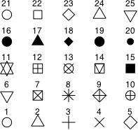 |
(b) 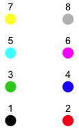 |
(c)  |
| Fig. 4 (a) R plotting characters, pch =, (b) numeric color codes, col =, and (c) line types, lty =. |
The modified interaction plot code is shown below. Text highlighted in blue indicates additions or modifications to the code that was used to produce Fig. 1.
par(lend=1)
plot(c(.8,3.2), range(results.mine[results.mine$fac3==1, c("up95", "low95")]), type='n', xlab="Hormonal treatment", ylab='Mean mitotic activity', axes=F)
axis(1, at=1:3, labels=levels(results.mine$fac1))
axis(2)
box()
results.mine.sub1 <- results.mine[results.mine$fac3==1,]
#first food group
cur.dat <- results.mine.sub1[results.mine.sub1$fac2=='D',]
#amount of shift
myjitter <- -.05
arrows(cur.dat$fac1.num+myjitter, cur.dat$low95, cur.dat$fac1.num+myjitter, cur.dat$up95, angle=90, code=3, length=.05, col=2)
#difference-adjusted confidence intervals
segments(cur.dat$fac1.num+myjitter, cur.dat$low83, cur.dat$fac1.num+myjitter, cur.dat$up83, col='red4', lwd=5)
segments(cur.dat$fac1.num+myjitter, cur.dat$low75, cur.dat$fac1.num+myjitter, cur.dat$up75, col='lightpink3', lwd=8)
lines(cur.dat$fac1.num+myjitter, cur.dat$ests, col=2)
points(cur.dat$fac1.num+myjitter, cur.dat$ests, col='white', pch=15, cex=1.2)
points(cur.dat$fac1.num+myjitter, cur.dat$ests, col=2, pch=22, cex=1.2)
#second food group
cur.dat <- results.mine.sub1[results.mine.sub1$fac2=='S',]
myjitter <- .05
arrows(cur.dat$fac1.num+myjitter, cur.dat$low95, cur.dat$fac1.num+myjitter, cur.dat$up95, angle=90, code=3, length=.05, col=4)
#difference-adjusted confidence intervals
segments(cur.dat$fac1.num+myjitter, cur.dat$low83, cur.dat$fac1.num+myjitter, cur.dat$up83, col='dodgerblue4', lwd=5)
segments(cur.dat$fac1.num+myjitter, cur.dat$low75, cur.dat$fac1.num+myjitter, cur.dat$up75, col='lightblue', lwd=8)
lines(cur.dat$fac1.num+myjitter, cur.dat$ests, col=4, lty=2)
points(cur.dat$fac1.num+myjitter, cur.dat$ests, col='white', pch=16, cex=1.2)
points(cur.dat$fac1.num+myjitter, cur.dat$ests, col=4, pch=1, cex=1.2)
mtext(side=3, line=.5, 'Sibship 1', cex=.9)
legend('topleft',c('Detritus','Shrimp'), col=c(2,4), pch=c(22,1), cex=.9, pt.cex=1, lty=c(1,2), title=expression(bold('Food Type')), bty='n')
# add grid lines to graph
abline(h=seq(3.3,4.5,.05), col='grey70', lty=3)
The last line adds a system of horizontal grid lines to facilitate comparing the different error bars from different means. The seq function generates a vector of values at a specified distance apart. Thus seq(3.3, 4.5, .05) creates a vector of values that start at 3.3, end at 4.5, and that are .05 units apart.
# the seq function generates a vector of equally spaced values
seq(3.3,4.5,.05)
[1] 3.30 3.35 3.40 3.45 3.50 3.55 3.60 3.65 3.70 3.75 3.80 3.85 3.90 3.95 4.00 4.05 4.10
[18] 4.15 4.20 4.25 4.30 4.35 4.40 4.45 4.50
Fig. 5 shows the plot.
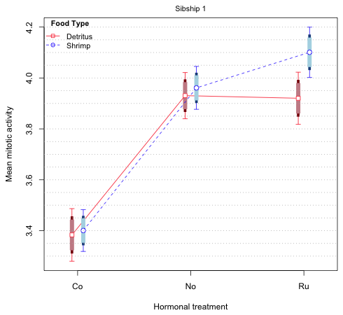
Fig. 5 Mean profile plot with 75% and 83.5% difference-adjusted confidence intervals
The thickest, shortest bars (75% intervals) are for comparing means on the same profile while the middle-length skinnier bars (83% intervals) are for comparing means on different profiles. If we compare the means on the red (Detritus) profile it's clear that we will reach the same conclusions regardless of which of the two intervals we use. This is also true for the blue (Shrimp) profile. The only close call is in comparing 'No' versus 'Ru' on the same profile but even here neither the 73% nor the 83.5% intervals overlap. When we compare means on different profiles we are supposed to use the longer 83.5% intervals, but again it doesn't matter. Even when comparing the two 'Ru' means we see that although the 95% intervals overlap, neither the 83.5% nor the 73% intervals do.
The bottom line is that in Fig. 5 we don't really need all three intervals to draw correct inferences. We can just display one of the 75% and 83.5% intervals of our choosing. (Remember this is just a graphical attempt to summarize the results of the experiment. The 75% and 83.5% intervals have no intrinsic interest beyond this.) Fig. 6 repeats the display of Fig. 5 but this time only shows 95% and 83.5% confidence intervals.
# add difference-adjusted cis to the graph
par(lend=1)
plot(c(.8,3.2), range(results.mine[results.mine$fac3==1, c("up95", "low95")]), type='n', xlab="Hormonal treatment", ylab='Mean mitotic activity', axes=F)
axis(1, at=1:3, labels=levels(results.mine$fac1))
axis(2)
box()
results.mine.sub1 <- results.mine[results.mine$fac3==1,]
#first food group
cur.dat <- results.mine.sub1[results.mine.sub1$fac2=='D',]
#amount of shift
myjitter <- -.05
arrows(cur.dat$fac1.num+myjitter, cur.dat$low95, cur.dat$fac1.num+myjitter, cur.dat$up95, angle=90, code=3, length=.05, col=2)
#difference-adjusted confidence intervals
segments(cur.dat$fac1.num+myjitter, cur.dat$low83, cur.dat$fac1.num+myjitter, cur.dat$up83, col='red4', lwd=5)
lines(cur.dat$fac1.num+myjitter, cur.dat$ests, col=2)
points(cur.dat$fac1.num+myjitter, cur.dat$ests, col='white', pch=15, cex=1.1)
points(cur.dat$fac1.num+myjitter, cur.dat$ests, col=2, pch=22, cex=1.1)
#second food group
cur.dat <- results.mine.sub1[results.mine.sub1$fac2=='S',]
myjitter <- .05
arrows(cur.dat$fac1.num+myjitter, cur.dat$low95, cur.dat$fac1.num+myjitter, cur.dat$up95, angle=90, code=3, length=.05, col=4)
#difference-adjusted confidence intervals
segments(cur.dat$fac1.num+myjitter, cur.dat$low83, cur.dat$fac1.num+myjitter, cur.dat$up83, col='dodgerblue4', lwd=5)
lines(cur.dat$fac1.num+myjitter, cur.dat$ests, col=4, lty=2)
points(cur.dat$fac1.num+myjitter, cur.dat$ests, col='white', pch=16, cex=1.1)
points(cur.dat$fac1.num+myjitter, cur.dat$ests, col=4, pch=1, cex=1.1)
mtext(side=3, line=.5, 'Sibship 1', cex=.9)
legend('topleft',c('Detritus','Shrimp'), col=c(2,4), pch=c(22,1), cex=.9, pt.cex=1, lty=c(1,2), title=expression(bold('Food Type')), bty='n')
# add grid lines to graph
abline(h=seq(3.3,4.5,.05), col='grey70', lty=3)
Fig. 6 Mean profile plot with only 83.5% difference-adjusted confidence intervals
The interaction plot for sibship 2
Turning to sibship 2, its means occupy positions 7 through 12 of the results matrix. Once again there are six means but this time we need to extract the entries from rows 7 through 12 and columns 7 through 12 of the variance-covariance matrix.
# confidence levels for the second set of means
ci.func(1:6, out2, vmat[7:12,7:12])
[1] 0.7851825 0.7996714 0.8366178 0.8365483 0.8359619 0.7915143 0.8351460 0.8351328
[9] 0.8350908 0.8352397 0.8352180 0.8350942 0.7671156 0.7927713 0.7950208
The pattern is similar to what we saw for sibship 1, two sets of confidence levels that vary depending upon whether the comparison is between means on the same mean profile (confidence level 0.77 to 0.80) or between means on different profiles (confidence level 0.835). If you examine Fig. 9 from lecture 4, the interaction plot for sibship 2, you will see that none of 95% confidence intervals overlap for any of the comparisons of means on different mean profiles. If the 95% intervals fail to overlap, then the 83.5% intervals (being shorter) will also fail to overlap. Thus we need only consider the confidence levels for the within profile comparisons. The code below plots 79% difference-adjusted confidence intervals for the sibship 2 means.
low79 <- ests + qt((1-.79)/2,out2$df.residual)*se
up79 <- ests + qt(1-(1-.79)/2,out2$df.residual)*se
results.mine <- cbind(results.mine,low79,up79)
# add difference-adjusted cis to the graph
par(lend=1)
plot(c(.8,3.2), range(results.mine[results.mine$fac3==2, c("up95", "low95")]), type='n', xlab="Hormonal treatment", ylab='Mean mitotic activity', axes=F)
axis(1, at=1:3, labels=levels(results.mine$fac1))
axis(2)
box()
results.mine.sub1 <- results.mine[results.mine$fac3==2,]
#first food group
cur.dat <- results.mine.sub1[results.mine.sub1$fac2=='D',]
#amount of shift
myjitter <- -.05
arrows(cur.dat$fac1.num+myjitter, cur.dat$low95, cur.dat$fac1.num+myjitter, cur.dat$up95, angle=90, code=3, length=.05, col=2)
#difference-adjusted confidence intervals
segments(cur.dat$fac1.num+myjitter, cur.dat$low79, cur.dat$fac1.num+myjitter, cur.dat$up79, col='red4', lwd=5)
lines(cur.dat$fac1.num+myjitter, cur.dat$ests, col=2)
points(cur.dat$fac1.num+myjitter, cur.dat$ests, col='white', pch=15, cex=1.1)
points(cur.dat$fac1.num+myjitter, cur.dat$ests, col=2, pch=22, cex=1.1)
#second food group
cur.dat <- results.mine.sub1[results.mine.sub1$fac2=='S',]
myjitter <- .05
arrows(cur.dat$fac1.num+myjitter, cur.dat$low95, cur.dat$fac1.num+myjitter, cur.dat$up95, angle=90, code=3, length=.05, col=4)
#difference-adjusted confidence intervals
segments(cur.dat$fac1.num+myjitter, cur.dat$low79, cur.dat$fac1.num+myjitter, cur.dat$up79, col='dodgerblue4', lwd=5)
lines(cur.dat$fac1.num+myjitter, cur.dat$ests, col=4, lty=2)
points(cur.dat$fac1.num+myjitter, cur.dat$ests, col='white', pch=16, cex=1.1)
points(cur.dat$fac1.num+myjitter, cur.dat$ests, col=4, pch=1, cex=1.1)
mtext(side=3, line=.5, 'Sibship 2', cex=.9)
legend('topleft',c('Detritus','Shrimp'), col=c(2,4), pch=c(22,1), cex=.9, pt.cex=1, lty=c(1,2), title=expression(bold('Food Type')), bty='n')
# add grid lines to graph
abline(h=seq(3.4,4.5,.05), col='grey70', lty=3)
Fig. 7 Mean profile plot with 79% difference-adjusted and 95% confidence intervals for sibship 2
This time we see that all the treatments are significantly different from each other except hormonal treatments 'No' and 'Ru' when the food is "Detritus". The difference-adjusted intervals are needed for comparing hormonal treatments 'No' and 'Ru' on the shrimp profile and technically these same treatments on the detritus profile.
Dynamite plots
In the ecological and biological literature whenever analysis of variance is the primary mode of analysis one typically sees another kind of graphical summary different from what we've discussed so far: the dreaded dynamite plot. Typically dynamite plots are constructed to summarize a post hoc analysis in which, having carried out an analysis of variance, it was felt necessary to then make all possible pairwise comparisons of treatment means. A dynamite plot is just a bar plot (the blasting box) in which the heights of the bars represent the means and typically an error bar is shown sticking out of the top of each bar (the plunger of the blasting box). The plunger is usually chosen to represent one standard error of the mean. Labels are often place on the error bars to identify the treatments that are not significantly different from each other. The term "dynamite plot" stems from the graphic's resemblance to a blasting box and from the fact that by choosing to summarize your work with such a graphic you've exploded your credibility as a serious scientist. For some of the criticisms of dynamite plots see Magnusson 2000 or pp. 7–11 of Donahue 2010.
I illustrate constructing a dynamite plot from scratch but without too much commentary about the code. I start with a function I found on the web. It takes the output from the function pairwise.t.test, which produces a set of p-values for all pairwise comparisons between a group of means, and generates a matrix of zeros (not different) and ones (different) from this. It then arranges the results in increasing mean order.
p.table = function(x, g, p.adjust.method = "none", ..., level = 0.05) {
## fill out p-value table
p = pairwise.t.test(x, g, p.adjust.method, ...)$p.value
p[is.na(p)] = 0
p = rbind(0, cbind(p, 0))
p = p + t(p)
## 0 = no difference, 1 = difference
p = 1 * (p <= level)
diag(p) = 0
## get means and find their order
m = tapply(x, g, mean)
o = order(m)
p = p[o, o]
dimnames(p) = list(names(m[o]), names(m[o]))
cbind(mean = m[o], p)
}
The function fails to sort the means correctly if there are any missing values for the response so we need to remove the missing values from the tadpoles data frame first.
# remove missing values first
tadpoles2 <- tadpoles[!is.na(tadpoles$response),]
out.ptable <- p.table(tadpoles2$response, tadpoles2$treatment)
out.ptable
mean CoS1 CoD1 CoD2 CoS2 NoD1 RuD1 NoS1 RuD2 NoD2 RuS1 NoS2 RuS2
CoS1 3.366042 0 0 0 1 1 1 1 1 1 1 1 1
CoD1 3.398462 0 0 0 1 1 1 1 1 1 1 1 1
CoD2 3.479176 0 0 0 1 1 1 1 1 1 1 1 1
CoS2 3.705542 1 1 1 0 1 1 1 1 1 1 1 1
NoD1 3.910263 1 1 1 1 0 0 0 0 0 1 1 1
RuD1 3.935833 1 1 1 1 0 0 0 0 0 1 1 1
NoS1 3.973682 1 1 1 1 0 0 0 0 0 0 1 1
RuD2 4.020000 1 1 1 1 0 0 0 0 0 0 1 1
NoD2 4.054167 1 1 1 1 0 0 0 0 0 0 1 1
RuS1 4.146500 1 1 1 1 1 1 0 0 0 0 0 1
NoS2 4.220375 1 1 1 1 1 1 1 1 1 0 0 0
RuS2 4.348875 1 1 1 1 1 1 1 1 1 1 0 0
The zeros indicate means that are not significantly different; the ones indicate pairs of means that are significantly different. By default no correction has been made for multiple testing. (Recall that each time a test is conducted at α = .05 there is a 5% chance of rejecting the null hypothesis when in fact the null hypothesis is true. The more tests you carry out the more likely it is that you will declare a chance result to be statistically significant.)
The next steps could be automated but I'll just do them by hand. Locate the first zero in each row (highlighted in the output above) and assign it a letter. First zeros in a row that occupy the same column should be assigned the same letter. Each time you have to jump to the right to a new column to find the first zero in a row, choose a different letter.
out.ptable[,2:ncol(out.ptable)]
CoS1 CoD1 CoD2 CoS2 NoD1 RuD1 NoS1 RuD2 NoD2 RuS1 NoS2 RuS2
CoS1 a 0 0 1 1 1 1 1 1 1 1 1
CoD1 a 0 0 1 1 1 1 1 1 1 1 1
CoD2 a 0 0 1 1 1 1 1 1 1 1 1
CoS2 1 1 1 b 1 1 1 1 1 1 1 1
NoD1 1 1 1 1 c 0 0 0 0 1 1 1
RuD1 1 1 1 1 c 0 0 0 0 1 1 1
NoS1 1 1 1 1 c 0 0 0 0 0 1 1
RuD2 1 1 1 1 c 0 0 0 0 0 1 1
NoD2 1 1 1 1 c 0 0 0 0 0 1 1
RuS1 1 1 1 1 1 1 d 0 0 0 0 1
NoS2 1 1 1 1 1 1 1 1 1 e 0 0
RuS2 1 1 1 1 1 1 1 1 1 1 f 0
Highlight the diagonal elements of the matrix only in those columns in which a letter also appears somewhere.
CoS1 CoD1 CoD2 CoS2 NoD1 RuD1 NoS1 RuD2 NoD2 RuS1 NoS2 RuS2
CoS1 a 0 0 1 1 1 1 1 1 1 1 1
CoD1 a 0 0 1 1 1 1 1 1 1 1 1
CoD2 a 0 0 1 1 1 1 1 1 1 1 1
CoS2 1 1 1 b 1 1 1 1 1 1 1 1
NoD1 1 1 1 1 c 0 0 0 0 1 1 1
RuD1 1 1 1 1 c 0 0 0 0 1 1 1
NoS1 1 1 1 1 c 0 0 0 0 0 1 1
RuD2 1 1 1 1 c 0 0 0 0 0 1 1
NoD2 1 1 1 1 c 0 0 0 0 0 1 1
RuS1 1 1 1 1 1 1 d 0 0 0 0 1
NoS2 1 1 1 1 1 1 1 1 1 e 0 0
RuS2 1 1 1 1 1 1 1 1 1 1 f 0
If the highlighted entry is a zero assign it the letter that appears in that column. Fill in that same letter for any zeros that occur below the highlighted entry.
CoS1 CoD1 CoD2 CoS2 NoD1 RuD1 NoS1 RuD2 NoD2 RuS1 NoS2 RuS2
CoS1 a 0 0 1 1 1 1 1 1 1 1 1
CoD1 a 0 0 1 1 1 1 1 1 1 1 1
CoD2 a 0 0 1 1 1 1 1 1 1 1 1
CoS2 1 1 1 b 1 1 1 1 1 1 1 1
NoD1 1 1 1 1 c 0 0 0 0 1 1 1
RuD1 1 1 1 1 c 0 0 0 0 1 1 1
NoS1 1 1 1 1 c 0 d 0 0 0 1 1
RuD2 1 1 1 1 c 0 d 0 0 0 1 1
NoD2 1 1 1 1 c 0 d 0 0 0 1 1
RuS1 1 1 1 1 1 1 d 0 0 e 0 1
NoS2 1 1 1 1 1 1 1 1 1 e f 0
RuS2 1 1 1 1 1 1 1 1 1 1 f 0
Finally record all the letters that appear in each row of the matrix and assemble the results as a single vector with one entry per row. Means that share a common letter are not significantly different from each other (at α = .05 but after having conducted 66 tests).
#classify means into groups based on pairwise diffs table
diffs <- c('a', 'a', 'a', 'b', 'c', 'c', 'cd', 'cd', 'cd', 'de', 'ef', 'f')
Next we need to obtain the means and the standard errors of the means for each of the treatments. We could calculate treatment means and standard errors directly using one of the three methods described in lecture 4 but it's also possible to trick the lm function to return these values for us. I illustrate the trick here. If we fit the ordinary regression model with the factor variable treatment as a predictor we obtain the following.
out0 <- lm(response ~ treatment, data=tadpoles2)
coef(out0)
(Intercept) treatmentCoD2 treatmentCoS1 treatmentCoS2 treatmentNoD1 treatmentNoD2 treatmentNoS1
3.39846153 0.08071494 -0.03241986 0.30708014 0.51180160 0.65570514 0.57522029
treatmentNoS2 treatmentRuD1 treatmentRuD2 treatmentRuS1 treatmentRuS2
0.82191347 0.53737180 0.62153847 0.74803846 0.95041347
As we've seen the intercept represents the mean of the reference group treatment, CoD1, and the others are effect estimates for the remaining treatments—deviations from the reference group. If we fit the following model instead we obtain the individual treatment means.
out0a <- lm(response ~ treatment-1, data=tadpoles2)
coef(out0a)
treatmentCoD1 treatmentCoD2 treatmentCoS1 treatmentCoS2 treatmentNoD1 treatmentNoD2 treatmentNoS1
3.398462 3.479176 3.366042 3.705542 3.910263 4.054167 3.973682
treatmentNoS2 treatmentRuD1 treatmentRuD2 treatmentRuS1 treatmentRuS2
4.220375 3.935833 4.020000 4.146500 4.348875
The notation ~ treatment-1 removes the intercept from the model which causes R to return an estimate for each of the 12 treatment levels rather than an estimate for the intercept plus eleven effect estimates. Note: we can obtain the same 12 treatment means by fitting a model with a three-factor interaction but without any of the two-factor interactions, main effects, or an intercept. The displayed order is slightly different.
out0b <- lm(response ~ fac1:fac2:fac3-1, data=tadpoles2)
coef(out0b)
fac1Co:fac2D:fac31 fac1No:fac2D:fac31 fac1Ru:fac2D:fac31 fac1Co:fac2S:fac31 fac1No:fac2S:fac31
3.398462 3.910263 3.935833 3.366042 3.973682
fac1Ru:fac2S:fac31 fac1Co:fac2D:fac32 fac1No:fac2D:fac32 fac1Ru:fac2D:fac32 fac1Co:fac2S:fac32
4.146500 3.479176 4.054167 4.020000 3.705542
fac1No:fac2S:fac32 fac1Ru:fac2S:fac32
4.220375 4.348875
The standard errors of the means are contained in the summary table.
se.mean <- summary(out0a)$coefficients[,2]
In the standard dynamite display the means are sorted in increasing order, just like they were ordered in the pairwise comparison table output above. For that we can use the sort function.
my.means <- sort(coef(out0a))
We need the standard errors sorted in the same order. For that we can use the order function. The order function returns the numeric position of the elements of a vector that when used as indices would sort the elements in increasing order.
order(coef(out0a))
[1] 3 1 2 4 5 9 7 10 6 11 8 12
We then use this vector as the set of indices in the standard error vector to sort the elements in mean sorted order.
# sort std errs in same order as the means
se.mean.sort <- se.mean[order(coef(out0a))]
I use the barplot function of R to create the display.
dat1 <- my.means-3
# create bar plot and save coordinates of bars
bp <- barplot(dat1, axes=F, ylim=c(0,1.6), names.arg=substr(names(my.means), 10, nchar(names(my.means))), cex.names=0.8, ylab='Mean mitotic activity', xlab='Treatment')
# add correct labels on y-axis (because of rescaling)
axis(2, at=seq(0,1.4,.2), labels=seq(0,1.4,.2)+3)
# add handles to dynamite plot
arrows(x0=bp, y0=dat1, x1=bp, y1=dat1+se.mean.sort, angle=90, length=0.1)
# add labels to the handles
text(bp, dat1+se.mean.sort, diffs, pos=3, cex=.9)
- First I subtract 3 from the means and place the origin of the graph at y = 3. Because of the scale of the graph if I don't do this the standard errors are barely visible.
- I assign the output of barplot to an object. The barplot object contains the x-coordinates of the center of the bars, which we'll need for plotting the plungers of the blasting boxes.
- I use axes=F to suppress the y-axis labels on the tick marks. Otherwise R would display the rescaled mean values rather than the original values.
- The argument names.arg in barplot specifies labels for the bars. The names of the treatments are contained in the names used for the elements of the my.means vector.
names(my.means)
[1] "treatmentCoS1" "treatmentCoD1" "treatmentCoD2" "treatmentCoS2" "treatmentNoD1" "treatmentRuD1"
[7] "treatmentNoS1" "treatmentRuD2" "treatmentNoD2" "treatmentRuS1" "treatmentNoS2" "treatmentRuS2"
I use the substr function to extract just that portion of the name that corresponds to the treatment. The call substr(x,m,n) extracts the characters in x starting at position m and ending at position n. Because each name begins with the string "treatment" the actual treatment name starts at character position 10 and then extends to the end of the character string which is position 13. So, substr(names(my.means), 10, 13) would select these values. In general though the names could have varying lengths. A more flexible approach is to use the nchar function to count the number of characters in each text string.
nchar(names(my.means))
[1] 13 13 13 13 13 13 13 13 13 13 13 13
substr(names(my.means), 10, nchar(names(my.means)))
[1] "CoS1" "CoD1" "CoD2" "CoS2" "NoD1" "RuD1" "NoS1" "RuD2" "NoD2" "RuS1" "NoS2" "RuS2"
- I use axis to add the correct numeric labels, the plotted values + 3, to the y-axis.
- The arrows function by default puts an arrow only on one end. I start the arrow at the top of the bar and extend it out a distance equal to the standard error.
- I use the text function to place the group assignment of each mean at the end of the error bar. The first two arguments to text are the coordinates of the text and the third argument is the text value itself. The argument pos takes values 1, 2, 3, and 4. These correspond to a position below, left, above, and to the right of the specified coordinates.
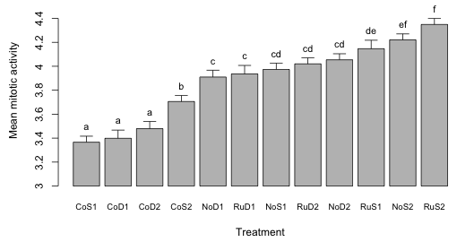
Fig. 8 Dynamite plot for the tadpole experiment
The major criticism of the dynamite plot as a graph is that it is lame. Why bother with the bars? Why not just plot a point at the bar end rather than the whole bar? The bar itself obscures the lower end of the error bar (sometimes both ends of the plunger are shown in a dynamite plot) making it difficult to compare the means. What purpose are the error bars supposed to serve? They can't be used to compare means directly because for that we would need to multiply them by an appropriate constant. Furthermore we've already told the reader which means are different from the rest by including group labels at the top of the bars.
I find it instructive to compare Fig. 8 with Figs. 6 and 7. Figs. 6 and 7 contain all the information contained in Fig. 8 (the difference-adjusted confidence intervals allow one to carry out any pairwise comparison of interest) but the organization is much more informative. Not only do we see which means differ but we also see how the factors that comprise the treatments directly and together affect the mean response.
Cited references
- Afshartous, D. and R. A. Preston. 2010. Confidence intervals for dependent data: Equating non-overlap with statistical significance. Computational Statistics and Data Analysis 54: 2296–2305.
- Baguley, T. 2012a. Calculating and graphing within-subject confidence intervals for ANOVA. Behavior Research Methods 44: 158–175.
- Baguley, T. 2012b. Serious stats: A guide to advanced statistics for the behavioral sciences. Basingstoke: Palgrave.
- Cumming, G. 2009. Inference by eye: Reading the overlap of independent confidence intervals. Statistics in Medicine 28: 205–220.
- Donahue, R. M. J. 2010. Fundamental Statistics Concepts in Presenting Data: Principles for Constructing Better Graphics. Version 1.6 http://biostat.mc.vanderbilt.edu/wiki/pub/Main/RafeDonahue/fscipdpfcbg_currentversion.pdf
- Goldstein, H. and Healy, M. 1995. The graphical presentation of a collection of means. Journal of the Royal Statistical Society, Series A 159: 175–177.
- Magnusson, W. E. 2000. Error bars: are they the king's clothes? Bulletin of the Ecological Society of America 81: 147–150. http://www.esajournals.org/doi/pdf/10.1890/0012-9623%282000%29081%5B147%3AC%5D2.0.CO%3B2
- Payton M. E., Miller, A. E. , and Raun, W. R. 2000. Testing statistical hypotheses using standard error bars and confidence intervals. Communications in Soil Science and Plant Analysis 31: 547–552.
- Payton, M. E., Greenstone, M. H., and Schenker N. 2003. Overlapping confidence intervals or standard error intervals: What do they mean in terms of statistical significance? 6pp. Journal of Insect Science 3: 34.
- Schenker, N. and J. F. Gentleman. 2001. On judging the significance of differences by examining overlap between confidence intervals. The American Statistician. 55: 182–186.
R Code
A compact collection of all the R code displayed in this document appears here. Additional R code that was used to produce some of the figures in this document appears here.
Course Home Page