Lecture 4—Wednesday, September 5, 2012
Topics
R functions and commands demonstrated
- abline is a low-level graphics command that adds vertical lines (v= ), horizontal lines (h= ), or regression lines to a plot.
- apply is used to apply functions to the rows or columns of a matrix.
- arrows draws an arrow between a pair of points on a plot.
- as.numeric converts its argument to numeric data. We used it to obtain the numeric levels of a factor.
- axis is a low-level graphics function for customizing the features of the axes of the currently displayed graph. Its first argument, 1, 2, 3, or 4, specifies the location of the axis: bottom, left, top, or right.
- bold when used in combination with expression can be used to display text in bold face
- box is a low-level graphics command that draws a box around a plot.
- coef extracts the regression coefficients from an lm object.
- confint calculates confidence intervals for the regression parameters of an lm object.
- data.frame constructs a data frame from a collection of vectors of the same length (or matrices with the same number of rows).
- diag extracts the diagonal entries from a matrix.
- dotchart is a base graphics function for producing dot plots.
- dotplot is a graphics function from the lattice package for producing dot plots.
- expression defines an R expression and is typically used to add mathematical text expressions to graphs.
- function is a keyword that begins the definition of a user-defined function.
- grid is a low-level graphics command that adds a grid of horizontal and/or vertical lines to a plot.
- legend is a low-level graphics command that adds a legend to a base graphics plot.
- lines is a low-level graphics command that draws lines between plotted points on the currently active plot.
- list concatenates objects of diverse types together as a single object.
- mtext is a low-level graphics command that can be used to add text to any one of the four margins of a graph.
- names extracts the names of the elements comprising an object.
- panel.abline (from lattice) is the panel function that draws vertical lines (v= ), horizontal lines (h= ), or regression lines.
- panel.dotplot (from lattice) is the panel function that produces a dot plot.
- panel.segments (from lattice) is the panel function that connects a pair of points with a line segment.
- panel.xyplot (from lattice) is the panel function that plots points.
- par sets global graphics parameters for base graphics.
- points is a low-level graphics command that adds individual points to the currently active plot.
- predict is used to obtain predictions (means) from a regression model for specified values of the predictors. It can also return standard errors and confidence intervals for those predictions.
- qnorm is the quantile function of a normal distribution.
- qt is the quantile function of a t-distribution.
- range calculates the minimum and maximum values of its argument and returns the result as a vector.
- rbind appends one data frame or matrix to another. The rows of the second data frame are placed after the rows of the first data frame. The column names in the two data frames must match.
- segments connects a pair of points with a line segment.
- sqrt is the square root function.
- t is the transpose function. It swaps the rows and columns of a matrix.
- vcov when applied to a regression model (lm object) returns the variance-covariance matrix of the parameter estimates.
- %*% is the matrix multiplication operator in R.
R function options
- angle= (argument to arrows function) specifies the angle of arrowhead edge; angle=90 is the appropriate setting for error bars.
- at= (argument to axis) is used to specify the locations of tick marks.
- axes= (argument to plot and other base graphics functions) can be used to prevent the x-axis and y-axis with their default settings from being drawn (by specifying axes=F).
- cex= (argument to many graphics functions) specifies the amount of character expansion to be used for plotting symbols, cex=1 is the default.
- code= (argument to arrows function) specifies the type of arrow to draw; code=3 places arrowheads on both ends.
- given.values= (argument to the effect function of the effects package) is used to specify values of model predictors that aren't part of the specified effect. Without this effect uses the mean of the remaining predictors.
- interval= (argument to predict function) specifies the type of prediction interval desired, e.g., interval="confidence".
- labels= (argument to axis and factor) specifies a vector of values to appear at the tick mark locations specified by at= in axis OR the labels for the levels defined by the factor function.
- las= (argument for many graphics text functions) controls the orientation of printed text. We chose las=2 to display tick mark labels perpendicular to the axis on which they occur.
- lend= (argument to par function) specifies the terminal ends of line segments; lend=1 yields butted ends.
- length= (argument to arrows function) specifies the size of the arrowhead.
- lineend= (argument to panel.segments function of lattice) specifies the endpoint of line segments; lineend=1 yields butted ends.
- lty= (argument to many plot functions) specifies the type of line to draw. Specifying lty=1 yields a solid line, lty=2 is a dashed line, and lty=3 is a dotted line.
- mar= (argument to par function) specifies the width of the four outer margins of plots in line units.
- mfrow= (argument to par function) specifies the arrangement of graphs in the graphics window for base graphics. For instance, mfrow=c(1,2) arranges the graphs in one row and two columns.
- newdata= (argument to predict function) specifies the values of the predictors at which to obtain predictions of a regression model.
- panel= (argument to xyplot) used to define a panel function that describes what is to be plotted in each panel.
- pch= stands for "print character" and is used to designate the plotting symbol to be used in various plotting functions: plot, points, etc.
- pt.cex= defines the size of plotting symbols in legends (overriding the value of cex).
- scales= (argument to xyplot and other lattice functions) defines characteristics of the axis—the number of tick marks, position and labels of the ticks, etc.
- se.fit= (argument to predict function) when set to TRUE causes predict to return the standard error of the predictions.
- type= (argument to most plotting functions) indicates the type of graphical display to produce. We used type='n' (where 'n' stands for 'nothing) to suppress the plotting of any data. Another option is type='b' to plot both points and line segments connecting those points.
- xlab= (argument of all plotting functions) specifies the label for the x-axis.
- xlim= (argument of all plotting functions) a vector of length 2 that specifies the minimum and maximum values to display on the x-axis.
- ylab= (argument of all plotting functions) specifies the label for the y-axis.
Additional R packages used
- effects for the effect function and its plot.eff method to generate plots of interaction effects.
- lattice for panel graphics functions.
Graphical displays of analysis of variance models
I reload the tadpoles data set and refit the analysis of variance models from last time.
tadpoles <- read.table("ecol 563/tadpoles.csv", header=T, sep=',')
tadpoles$fac3 <- factor(tadpoles$fac3)
out1 <- lm(response~fac1 + fac2 + fac3 + fac1:fac2 + fac1:fac3 + fac2:fac3 + fac1:fac2:fac3, data=tadpoles)
out2 <- lm(response~fac1 + fac2 + fac3 + fac1:fac2 + fac2:fac3, data=tadpoles)
We will use the second of these models, out2, to illustrate how to generate graphical displays of ANOVA models. R has three major graphics packages: base graphics, lattice, and ggplot2. The last one is a relatively new R package that is based on Leland Wilkinson's (of SYSTAT fame) "grammar of graphics". Today we focus on using base graphics and lattice to summarize ANOVA models. The plots we consider are graphs of effect estimates with error bars and interaction plots with error bars.
Obtaining parameter estimates, standard errors, and confidence intervals
ANOVA models are regression models in which all the regressors are dummy variables. This means that the regression coefficients are multiplying terms that either have value zero or one. Hence all the regression coefficients are measured on the scale and either represent means or deviations from means. Thus it makes sense to present the coefficient estimates together in the same graph. When confidence intervals are also included the magnitudes of the different effects can be compared and their relative importance assessed.
The coefficient estimates of a regression model can be extracted with the coef function.
coef(out2)
(Intercept) fac1No fac1Ru fac2S fac32 fac1No:fac2S fac1Ru:fac2S
3.38323831 0.54729873 0.53698650 0.01714866 0.10757945 0.01341375 0.16350360
fac2S:fac32
0.16322994
The intercept is the mean of the reference group while the rest of the terms correspond to effects, i.e., deviations from means. To ensure that we're only comparing effects I remove the intercept from the list of estimates to plot.
ests <- coef(out2)[2:8]
ests
fac1No fac1Ru fac2S fac32 fac1No:fac2S fac1Ru:fac2S fac2S:fac32
0.54729873 0.53698650 0.01714866 0.10757945 0.01341375 0.16350360 0.16322994
To obtain the standard errors of these estimates we can extract them from the summary table of the model. They are found in column 2 of the $coefficients component of the summary object.
summary(out2)$coefficients
Estimate Std. Error t value Pr(>|t|)
(Intercept) 3.38323831 0.05245374 64.4994720 1.024057e-149
fac1No 0.54729873 0.05837246 9.3759750 6.582616e-18
fac1Ru 0.53698650 0.06084917 8.8248782 2.755469e-16
fac2S 0.01714866 0.06696214 0.2560949 7.981054e-01
fac32 0.10757945 0.04814860 2.2343214 2.641948e-02
fac1No:fac2S 0.01341375 0.07727544 0.1735836 8.623448e-01
fac1Ru:fac2S 0.16350360 0.08174704 2.0001164 4.665860e-02
fac2S:fac32 0.16322994 0.06504617 2.5094473 1.277781e-02
std.errs <- summary(out2)$coefficients[,2]
std.errs
(Intercept) fac1No fac1Ru fac2S fac32 fac1No:fac2S fac1Ru:fac2S
0.05245374 0.05837246 0.06084917 0.06696214 0.04814860 0.07727544 0.08174704
fac2S:fac32
0.06504617
As was the case with the estimates I remove the intercept from the vector of standard errors.
std.errs <- std.errs[2:8]
Alternatively we can extract the standard errors from the variance-covariance matrix of the parameter estimates obtained with the vcov function. The variances lie on the diagonal which we can extract with the diag function. The standard errors are then obtained by taking their square roots with the sqrt function.
#using variance-covariance matrix
vcov(out2)
(Intercept) fac1No fac1Ru fac2S fac32 fac1No:fac2S
(Intercept) 0.002751394 -2.018169e-03 -0.0018755968 -0.002751394 -1.313697e-03 2.018169e-03
fac1No -0.002018169 3.407344e-03 0.0020049896 0.002018169 1.976835e-05 -3.407344e-03
fac1Ru -0.001875597 2.004990e-03 0.0037026214 0.001875597 -2.318288e-04 -2.004990e-03
fac2S -0.002751394 2.018169e-03 0.0018755968 0.004483928 1.313697e-03 -3.251732e-03
fac32 -0.001313697 1.976835e-05 -0.0002318288 0.001313697 2.318288e-03 -1.976835e-05
fac1No:fac2S 0.002018169 -3.407344e-03 -0.0020049896 -0.003251732 -1.976835e-05 5.971493e-03
fac1Ru:fac2S 0.001875597 -2.004990e-03 -0.0037026214 -0.002970558 2.318288e-04 3.266274e-03
fac2S:fac32 0.001313697 -1.976835e-05 0.0002318288 -0.002270055 -2.318288e-03 -2.181245e-05
fac1Ru:fac2S fac2S:fac32
(Intercept) 0.0018755968 1.313697e-03
fac1No -0.0020049896 -1.976835e-05
fac1Ru -0.0037026214 2.318288e-04
fac2S -0.0029705578 -2.270055e-03
fac32 0.0002318288 -2.318288e-03
fac1No:fac2S 0.0032662738 -2.181245e-05
fac1Ru:fac2S 0.0066825785 -5.506149e-04
fac2S:fac32 -0.0005506149 4.231005e-03
sqrt(diag(vcov(out2)))
(Intercept) fac1No fac1Ru fac2S fac32 fac1No:fac2S fac1Ru:fac2S
0.05245374 0.05837246 0.06084917 0.06696214 0.04814860 0.07727544 0.08174704
fac2S:fac32
0.06504617
Using the estimates and their standard errors I next obtain 95% confidence intervals of the effects. Technically we should use a t-distribution for this, but the sample size used in our analysis is so large that the relative difference between using a t-distribution or a normal distribution is trivial. The degrees of freedom for the t-distribution are obtained in the $df.residual component of the model object.
names(out2)
[1] "coefficients" "residuals" "effects" "rank" "fitted.values"
[6] "assign" "qr" "df.residual" "na.action" "contrasts"
[11] "xlevels" "call" "terms" "model"
out2$df.residual
[1] 231
To construct 95% confidence intervals we need the .025 and .975 quantiles of a t-distribution with 231 degrees of freedom. The t quantile function in R is qt.
c(qt(.025,out2$df.residual), qt(.975,out2$df.residual))
[1] -1.970287 1.970287
These are barely different from the corresponding normal quantiles obtained with qnorm.
c(qnorm(.025),qnorm(.975))
[1] -1.959964 1.959964
A (1 – α)% confidence interval is obtained in the usual fashion.
low95 <- ests + qt(.025,out2$df.residual)*std.errs
up95 <- ests + qt(.975,out2$df.residual)*std.errs
R provides easier ways of obtaining confidence intervals than calculating them by hand. The confint function when applied to an lm object returns confidence intervals (95% by default) for all the regression parameters in the model.
confint(out2)
2.5 % 97.5 %
(Intercept) 3.279889409 3.4865872
fac1No 0.432288251 0.6623092
fac1Ru 0.417096197 0.6568768
fac2S -0.114785940 0.1490833
fac32 0.012712904 0.2024460
fac1No:fac2S -0.138841019 0.1656685
fac1Ru:fac2S 0.002438494 0.3245687
fac2S:fac32 0.035070334 0.2913895
These match what we calculated by hand.
cbind(low95, up95)
low95 up95
fac1No 0.432288251 0.6623092
fac1Ru 0.417096197 0.6568768
fac2S -0.114785940 0.1490833
fac32 0.012712904 0.2024460
fac1No:fac2S -0.138841019 0.1656685
fac1Ru:fac2S 0.002438494 0.3245687
fac2S:fac32 0.035070334 0.2913895
Finally I assemble everything in a data frame. We will need a column of labels for the effects. These can be obtained with the names function which extracts the labels from the vector of coefficient estimates. At the same time I make the result a factor and specify the desire3d order of the factor levels explicitly with the levels argument of factor. This prevents the data.frame function of R from putting the levels in alphabetical order.
new.data <- data.frame(var.labels=factor(names(ests), levels=names(ests)), ests, low95, up95)
new.data
var.labels ests low95 up95
fac1No fac1No 0.54729873 0.432288251 0.6623092
fac1Ru fac1Ru 0.53698650 0.417096197 0.6568768
fac2S fac2S 0.01714866 -0.114785940 0.1490833
fac32 fac32 0.10757945 0.012712904 0.2024460
fac1No:fac2S fac1No:fac2S 0.01341375 -0.138841019 0.1656685
fac1Ru:fac2S fac1Ru:fac2S 0.16350360 0.002438494 0.3245687
fac2S:fac32 fac2S:fac32 0.16322994 0.035070334 0.2913895
levels(new.data$var.labels)
[1] "fac1No" "fac1Ru" "fac2S" "fac32" "fac1No:fac2S"
[6] "fac1Ru:fac2S" "fac2S:fac32"
Graphical display of the summary table
To display and compare simple point estimates such as means we can use a dot plot. A bare-bones dot plot can be obtained with the dotchart function of base graphics or the dotplot function of lattice. The syntax is slightly different for the two functions as shown below.
dotchart(new.data$ests, labels=new.data$var.labels, xlab='ests')
library(lattice)
dotplot(var.labels~ests, data=new.data)
(a) 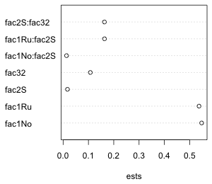 |
(b) 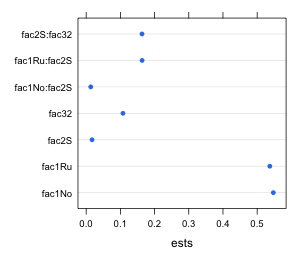 |
| Fig. 1 Default dot plots as generated by (a) the dotchart function of base graphics and (b) the dotplot function of lattice |
We will want to add error bars to these displays. I illustrate how to do this for lattice and base graphics separately.
Effects graphs using the lattice package
Lattice graphs are generated with a single line of code. Each lattice plotting function has a default panel function that identifies the features that will be displayed in the graph. If you want additional features beyond the default you will need to construct your own panel function. The panel function must identify everything that is to be plotted including what you would otherwise get by default. When using your own panel function it doesn't really matter what basic lattice plot function you use because the default panel function for that plot function is ignored anyway.
Panel functions can be created with the keyword panel=function(x,y) followed by a pair of curly braces { }. Special lattice panel graphing functions are then listed on separate lines within the curly braces. Each panel graphing function adds a specific feature to the graph. Typically the names of these functions begin with the word panel followed by the operation they are to perform, e.g., panel.xyplot, panel.lines, panel.points, etc., although recently lattice has been moving away from this convention.
The following lattice call uses a panel function to plot the point estimates with panel.xyplot, add a vertical line at 0 with panel.abline, and add the 95% confidence intervals with panel.segments. The xlim argument is needed to make enough room for the error bars. For this I use the minimum value of the lower 95% intervals and the maximum of the 95% confidence intervals to define the plot range. I subtract and add .02 to these values to increase this range a little bit. The x and y that appear in the declaration of the panel function correspond to the x and y-variables in the original dotplot call, in this case ests and var.labels respectively.
library(lattice)
dotplot(var.labels~ests, data=new.data, xlim=c(min(new.data$low95)-.02, max(new.data$up95)+.02), panel=function(x,y){
panel.xyplot(x, y, pch=16, cex=1)
panel.abline(v=0, col=2, lty=2)
panel.segments(new.data$low95, as.numeric(y), new.data$up95, as.numeric(y))})
- panel.xyplot plots the points using filled circles, pch=16. The argument cex stands for "character expansion" and is the magnification ratio for changing the size of what's being plotted. The choice cex=1 is the default size.
- panel.abline draws a vertical line at 0, v=0, using a dashed line, lty=2, colored red, col=2.
- The syntax for panel.segments is panel.segments(x1,y1,x2,y2) where (x1, y1) and (x2, y2) are the two endpoints of the line segment to be drawn. Here the y-coordinate corresponds to the factor variable var.labels. Because the panel.segments function expects a number, not a factor, to plot, I convert the factor to a number with the as.numeric function, as.numeric(y). Fig. 2 shows the result.
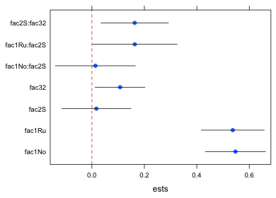
Fig. 2 Dot plot with error bars (95% confidence intervals)
I redo the graph with the following improvements.
- Lattice uses a default color for the points that turns out to be col="#0080ff" in hex notation. We can make the confidence intervals this same color by including this as an argument to the panel.segments function.
- Although it's not obvious from Fig. 2, the default way that R draws line segments is to place a round cap at the end. The presence of the cap causes the line segment to extend beyond the coordinates that we specified. This is a problem with confidence intervals if we want to use them for hypothesis testing by determining if they cross the zero line. To override this behavior we can add the argument lineend=1 in panel.segments to obtained "butted" endpoints: line segments without caps.
- As another cosmetic improvement we can add grid lines like those of Fig. 1. The panel.dotplot function adds grid lines by default so I could use this function first and let the rest of the function calls cover up what it plots. I color the points that panel.dotplot produces 'white' and make them small.
- I also improve the labeling on the y-axis. I replace the hybrid names created by R that combines the factor name and the level with names that just specify the levels. I also take advantage of the mathematical typesetting abilities of R to include the multiplication symbol of arithmetic, ×, in the interaction terms. This is denoted %*% in R and requires the use of the expression function. To see other examples of mathematical typesetting in R enter demo(plotmath) at the command prompt in the console window. The R code and the mathematical expression it produces are shown in the graphics window.
#formatted labels
mylabs<-c('Normal', 'Ru486', 'Shrimp', 'Sibship2', expression('Normal' %*% 'Shrimp'), expression('Ru486' %*% 'Shrimp'), expression('Shrimp' %*% 'Sibship2'))
To use these labels in the dotplot function we need to include the scales argument. The basic format of scales is
scales=list(x=list( ), y = list( ))
where x and y denote the x- and y-axes and we specify the features we want to modify on the respective axes inside the list function separated by commas. For instance, the following will cause the y-axis tick marks to be labeled using the new labels. By not specifying the x-axis I keep the default settings.
scales=list(y=list(at=1:7, labels=mylabs))
Here's the complete function call.
dotplot(var.labels~ests,data=new.data, xlim=c(min(new.data$low95)-.02, max(new.data$up95)+.02), xlab='Estimated effect', panel=function(x,y){
panel.dotplot(x, y, col='white', cex=.01)
panel.segments(new.data$low95, as.numeric(y), new.data$up95, as.numeric(y), col="#0080ff")
panel.xyplot(x, y, pch=16, cex=1)
panel.abline(v=0, col=2, lty=2)
}, scales=list(y=list(at=1:7, labels=mylabs)))
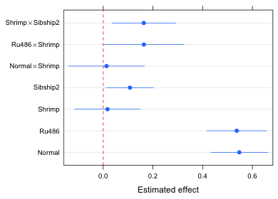
Fig. 3 An "improved" version of Fig. 2
So what do we learn from Fig. 3?
- The effects graph is a graphical representation of the coefficient summary table for the model (minus the intercept term). Using Fig. 3 we can visually carry out significance tests at α = .05 by determining if the displayed confidence intervals intersect the red dashed vertical line at 0.
- We can use Fig. 3 to assess the relative importance of the various effects in the model. This is especially useful if an appropriate reference group was chosen. In the current model the reference group is hormone treatment = corticosterone, diet = detritus, and sibship = 1. It probably would have made more sense to have made hormone treatment = normal the reference group because it serves as the control in this experiment. Putting that aside for the moment we can observe the following from Fig. 3.
- The hormone treatment alone produces the biggest change in the response. Both normal and Ru486 have roughly the same effect relative to the reference group corticosterone. Because normal is the control group it tells us that Ru486 has essentially no effect while corticosterone has a very large negative effect.
- There is no diet effect unless it is combined with Ru486. In this case switching to the shrimp diet has a weak positive effect, enough of an effect to make the Ru486 treatment significantly different from the corticosterone group.
- For tadpoles given a shrimp diet the increased response that is obtained by switching to Ru486 is of the same order of magnitude as the effect gained by switching from sibship 1 to sibship 2. This implies that the diet × Ru486 effect is no larger than effects attributable to ordinary background genetic variation.
- If desired, we can also use the graph to estimate the effect attributable to any treatment combination of interest just by adding the corresponding displayed effects. For example, for a tadpole with sibship=1, diet=detritus, and hormone=Ru486 the effect is given by the single labeled estimate Ru486. For a tadpole with sibship=1, diet=shrimp, hormone=Ru486 we would need to add together the displayed effects for Ru486, Shrimp, and Ru486 × Shrimp. If we want the treatment mean instead of the effect we have to add the effect just obtained to the model intercept value which is 3.38.
Effects graphs using base graphics
With base graphics a minimal plot is created using a higher-level graphics command; we then add to that plot using lower level graphics commands. the basic strategy is to build the graph incrementally with multiple function calls. This contrasts with lattice where we create the entire graph all at once. The individual function calls in base graphics correspond exactly to the different panel functions we used in generating the lattice graph, so almost everything we did there carries over.
The lower level graphics functions of base graphics that we will use require the numeric values of the seven effect categories for plotting, so I create a new variable that numbers them 1 through 7.
new.data$num.labels <- 1:7
When the goal is to build a modular graph, I generally use the first higher-level graphics command only to set up axis limits and labels, while generating the rest of the graph using lower-level graphics commands. Here I use the plot function to set up the y-limits and x-limits explicitly and define labels for the axes.
plot(range(new.data[,2:4]), c(1-.3,7+.3), type='n', xlab='Effect estimates', ylab='', axes=F)
- In the first argument I use the range function to return the minimum and maximum x-limits (using the numerical columns of the data frame). The second argument sets the limits for the y-axis. I set these limits so that they are just beyond the plotted endpoints of 1 and 7 in order to add a little buffer around the display.
range(new.data[,2:4])
[1] -0.1380433 0.6617067
c(1-.3,7+.3)
[1] 0.7 7.3
- The result is that we have only two pairs of points to plot. By specifying type='n' , 'n' for nothing, I suppress the display of any points, so we end up only defining the x- and y-limits of the plot.
- The ylab='' argument, with nothing between the two single quotes, suppresses the printing of a label on the y-axis.
- The axes=F argument prevents the display of the x- and the y-axes. I include it because I want to add my own labels to the y-axis.
The axis functions are used to add axes to an existing plot. The first argument of axis is the desired axis. The axes are numbered 1 (bottom), 2 (left), 3 (top), and 4 (right). If you want to use default settings for the axis just enter the number and nothing more. To specify locations and labels for tick marks, add the at= and labels= argument just as was done in the scales argument of lattice graphs.
axis(1)
axis(2, at=1:7, labels=mylabs, las=2, cex.axis=.8)
I specify las=2 to rotate the labels so that they are perpendicular to the axis. The cex.axis=.8 option reduces the size of the labels to 80% of the default size. When we look at the graph this generates we see there is a problem (Fig. 4).
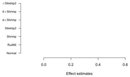
Fig. 4 Graph with default margin settings
The left margin is not wide enough to accommodate the labels so they are being truncated. We need to expand the left margin beyond its default value. Margins are set with the mar argument of the par function.
par("mar")
[1] 5.1 4.1 4.1 2.1
The reported values are in line units and are given in the order bottom, left, top, right. I try doubling the left margin, but first I save the original settings so they can be restored later.
par("mar") -> oldmar
par(mar=c(5.1,8.1,4.1,2.1))
plot(range(new.data[,2:4]), c(1-.3,7+.3), type='n', xlab='Effect estimates', ylab='', axes=F)
axis(1)
axis(2, at=1:7, labels=mylabs, las=2, cex.axis=.8)
box()
The box function with no arguments connects the axes and draws a box around the graph. Generating the rest of the graph is easy. I take the various panel functions from the previous section and remove the lead word "panel.". The segments function draws the confidence intervals, points adds the point estimate, and abline draws a vertical line at zero. Where an x or a y appear as the arguments in the lattice panel functions I replace them with the actual variable names. To obtain the "butted" ends on line segments requires the use of the par function again this time to set the option lend=1.
par(lend=1)
segments(new.data$low95, new.data$num.labels, new.data$up95, new.data$num.labels, col="#0080ff")
points(new.data$ests, new.data$num.labels, pch=16, cex=1, col="#0080ff")
abline(v=0, lty=2, col=2)

Fig. 5 Effects graph using base graphics
We can add grid lines, if desired, with the grid function. The call needed here is
grid(nx=NA, ny=NULL)
The arguments nx and ny denote the number of grid lines perpendicular to the x- and y-axes respectively. If we specify nx=NA we get no grid lines. If we specify nx=NULL we get grid lines at the tick marks. Below I redo the entire graph drawing the grid lines first so they don't overwrite what has already been plotted. I then reset the margins to their default values.
plot(range(new.data[,2:4]), c(1-.3,7+.3), type='n', xlab='Effect estimates', ylab='', axes=F)
axis(1)
axis(2, at=1:7, labels=mylabs, las=2, cex.axis=.8)
box()
grid(nx=NA, ny=NULL)
segments(new.data$low95, new.data$num.labels, new.data$up95, new.data$num.labels, col="#0080ff")
points(new.data$ests, new.data$num.labels, pch=16, cex=1, col="#0080ff")
abline(v=0, lty=2, col=2)
par(mar=oldmar)
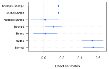
Fig. 6 Effects graph with grid lines using base graphics
Obtaining the treatment means and their confidence intervals
Using the effects package
The treatment means based from an analysis of variance model can be extracted with the effect function from the effects package. In the call below I request the treatment means needed to display the fac1:fac2 interaction. In the first call the fac3 variable is set at its first level, fac32=0, using the given.values argument. In the second run I request the same treatment means at the second level of fac3. Notice that given.values expects a value for the dummy variable in the model using the name that appears in the summary table of the model, not a value for the original factor. Therefore I specify fac32=0 and fac32=1 rather than fac3=1 and fac3=2.
library(effects)
effect1a <- effect('fac1:fac2', out2, given.values=c(fac32=0))
effect1b <- effect('fac1:fac2', out2, given.values=c(fac32=1))
names(effect1a)
[1] "term" "formula" "response" "variables"
[5] "fit" "x" "model.matrix" "data"
[9] "discrepancy" "se" "lower" "upper"
[13] "confidence.level" "transformation"
The component $x identifies the levels of the factors that were used to obtain the estimated means, standard errors, and confidence interval endpoints.
effect1a$x
fac1 fac2
1 Co D
2 No D
3 Ru D
4 Co S
5 No S
6 Ru S
The components $fit, $se, $lower, and $upper contain the estimates, standard errors, and lower and upper endpoints of the 95% confidence intervals.
I assemble the output from the two effect calls in separate data frames, one for each level of fac3. In each data frame I add one more variable to indicate the level of fac3, fac3=1 or fac3=2. Finally I use the rbind function (bind by rows) to append one data frame to the other.
part1 <- data.frame(effect1a$x, fac3=1, ests=effect1a$fit, se=effect1a$se, low95=effect1a$lower, up95=effect1a$upper)
part1
fac1 fac2 fac3 ests se low95 up95
2401 Co D 1 3.383238 0.05245374 3.279889 3.486587
2411 No D 1 3.930537 0.04606953 3.839767 4.021307
2421 Ru D 1 3.920225 0.05198867 3.817792 4.022657
2431 Co S 1 3.400387 0.04162371 3.318376 3.482398
2441 No S 1 3.961099 0.04277330 3.876824 4.045375
2451 Ru S 1 4.100877 0.05022518 4.001919 4.199835
part2 <- data.frame(effect1b$x, fac3=2, ests=effect1b$fit, se=effect1b$se, low95=effect1b$lower, up95=effect1b$upper)
part.eff <- rbind(part1, part2)
part.eff
fac1 fac2 fac3 ests se low95 up95
2401 Co D 1 3.383238 0.05245374 3.279889 3.486587
2411 No D 1 3.930537 0.04606953 3.839767 4.021307
2421 Ru D 1 3.920225 0.05198867 3.817792 4.022657
2431 Co S 1 3.400387 0.04162371 3.318376 3.482398
2441 No S 1 3.961099 0.04277330 3.876824 4.045375
2451 Ru S 1 4.100877 0.05022518 4.001919 4.199835
24011 Co D 2 3.490818 0.04941952 3.393447 3.588188
24111 No D 2 4.038116 0.04304455 3.953306 4.122927
24211 Ru D 2 4.027804 0.04393244 3.941245 4.114364
24311 Co S 2 3.671196 0.04162371 3.589186 3.753207
24411 No S 2 4.231909 0.04178987 4.149571 4.314247
24511 Ru S 2 4.371686 0.04341654 4.286143 4.457229
Using the predict function
The predict function can also be used to obtain estimates from regression models. I start by creating a data frame that contains the desired values of the predictors by using the expand.grid function to generate observations representing the levels of fac1, fac2, and fac3 in all possible combinations.
fac.vals2 <- expand.grid(fac1=c('Co','No','Ru'), fac2=c('D','S'), fac3=1:2)
fac.vals2
fac1 fac2 fac3
1 Co D 1
2 No D 1
3 Ru D 1
4 Co S 1
5 No S 1
6 Ru S 1
7 Co D 2
8 No D 2
9 Ru D 2
10 Co S 2
11 No S 2
12 Ru S 2
The first argument of the predict function is the regression model. The newdata argument specifies the data frame that contains the observations whose predictions we desire. I add the additional arguments se.fit=T to get standard errors and interval="confidence" to get confidence intervals. Because fac3 is currently a numeric variable in the newdata data frame, the predict function returns an error message.
#we need to convert fac3 to a factor or we get an error message
out.p <- predict(out2, newdata=fac.vals2, se.fit=T, interval="confidence")
Error: variable 'fac3' was fitted with type "factor" but type "numeric" was supplied
In addition: Warning message:
In model.frame.default(Terms, newdata, na.action = na.action, xlev = object$xlevels) :
variable 'fac3' is not a factor
I declare fac3 to be a factor and try predict again.
fac.vals2$fac3 <- factor(fac.vals2$fac3)
out.p <- predict(out2, newdata=fac.vals2, se.fit=T, interval="confidence")
names(out.p)
[1] "fit" "se.fit" "df" "residual.scale"
The $fit component of the predict object contains the estimate of the mean and the confidence interval. The $se.fit component contains the standard errors.
#estimated means and CIs
out.p$fit
fit lwr upr
1 3.383238 3.279889 3.486587
2 3.930537 3.839767 4.021307
3 3.920225 3.817792 4.022657
4 3.400387 3.318376 3.482398
5 3.961099 3.876824 4.045375
6 4.100877 4.001919 4.199835
7 3.490818 3.393447 3.588188
8 4.038116 3.953306 4.122927
9 4.027804 3.941245 4.114364
10 3.671196 3.589186 3.753207
11 4.231909 4.149571 4.314247
12 4.371686 4.286143 4.457229
#standard error of means
out.p$se.fit
1 2 3 4 5 6 7
0.05245374 0.04606953 0.05198867 0.04162371 0.04277330 0.05022518 0.04941952
8 9 10 11 12
0.04304455 0.04393244 0.04162371 0.04178987 0.04341654
I assemble the results in a data frame and then rename columns 4 through 7 to match the names we used above.
results.pred <- data.frame(fac.vals2, out.p$fit, out.p$se.fit)
results.pred
fac1 fac2 fac3 fit lwr upr out.p.se.fit
1 Co D 1 3.383238 3.279889 3.486587 0.05245374
2 No D 1 3.930537 3.839767 4.021307 0.04606953
3 Ru D 1 3.920225 3.817792 4.022657 0.05198867
4 Co S 1 3.400387 3.318376 3.482398 0.04162371
5 No S 1 3.961099 3.876824 4.045375 0.04277330
6 Ru S 1 4.100877 4.001919 4.199835 0.05022518
7 Co D 2 3.490818 3.393447 3.588188 0.04941952
8 No D 2 4.038116 3.953306 4.122927 0.04304455
9 Ru D 2 4.027804 3.941245 4.114364 0.04393244
10 Co S 2 3.671196 3.589186 3.753207 0.04162371
11 No S 2 4.231909 4.149571 4.314247 0.04178987
12 Ru S 2 4.371686 4.286143 4.457229 0.04341654
#rename columns 4 through 7
names(results.pred)[4:7] <- c('ests', 'low95', 'up95', 'se')
results.pred
fac1 fac2 fac3 ests low95 up95 se
1 Co D 1 3.383238 3.279889 3.486587 0.05245374
2 No D 1 3.930537 3.839767 4.021307 0.04606953
3 Ru D 1 3.920225 3.817792 4.022657 0.05198867
4 Co S 1 3.400387 3.318376 3.482398 0.04162371
5 No S 1 3.961099 3.876824 4.045375 0.04277330
6 Ru S 1 4.100877 4.001919 4.199835 0.05022518
7 Co D 2 3.490818 3.393447 3.588188 0.04941952
8 No D 2 4.038116 3.953306 4.122927 0.04304455
9 Ru D 2 4.027804 3.941245 4.114364 0.04393244
10 Co S 2 3.671196 3.589186 3.753207 0.04162371
11 No S 2 4.231909 4.149571 4.314247 0.04178987
12 Ru S 2 4.371686 4.286143 4.457229 0.04341654
Using matrix multiplication
The regression equation can be viewed as a vector dot product between a vector of values for the dummy variables and a vector of coefficient estimates. The dummy variables in the current model are defined as follows.
 ,
,  ,
,  ,
, 
Using these our final regression model out2 with two two-factor interactions can be written as follows.
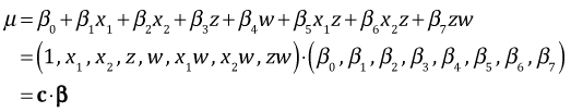
where the vector c is a vector of zeros and ones and β is the parameter vector whose estimates are obtained with coef(out2). I write a function, myvec, to calculate the vector c as a function of the values of fac1, fac2, and fac3.
#function to create dummy vector
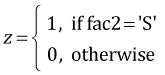
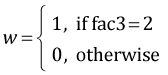
myvec <- function(fac1, fac2, fac3) c(1, fac1=='No', fac1=='Ru', fac2=='S', fac3==2, (fac1=='No')*(fac2=='S'), (fac1=='Ru')*(fac2=='S'), (fac2=='S')*(fac3==2))
By plugging in values for fac1, fac2, and fac3 I obtain different values for the vector c.
myvec('Co','D',1)
[1] 1 0 0 0 0 0 0 0
myvec('Co','S',1)
[1] 1 0 0 1 0 0 0 0
To obtain treatment means I form the dot product between the vector c and the coefficient vector coef(out2). The dot product is obtained via matrix multiplication in R using the matrix multiplication operator %*%.
# means for different treatments
myvec('Co','D',1) %*% coef(out2)
[,1]
[1,] 3.383238
myvec('No','S',1) %*% coef(out2)
[,1]
[1,] 3.961099
The matrix fac.vals2 that was created above contains all the possible combinations of the values of fac1, fac2, and fac3.
fac.vals2
fac1 fac2 fac3
1 Co D 1
2 No D 1
3 Ru D 1
4 Co S 1
5 No S 1
6 Ru S 1
7 Co D 2
8 No D 2
9 Ru D 2
10 Co S 2
11 No S 2
12 Ru S 2
To obtain all possible c vectors I just need to evaluate the function myvec on each row of this matrix separately. The apply function of R is an easy way to do this. The apply function takes three arguments.
- First argument: the matrix to act on
- Second argument: the number 1 or 2. The number 1 signifies that we want to act on the rows of the matrix. The number 2 signifies that we want to act on the columns of the matrix.
- Third argument: the function that should be applied to the rows or columns of the matrix.The function needs to be defined so that it has a single argument.
The function myvec currently takes three arguments. We need to rewrite it so that it has a single argument x with components labeled x[1], x[2], x[3]. I do this on the fly using the generic function, function(x) myvec(x[1],x[2],x[3]) when I invoke the apply function.
#obtain dummy vectors for each treatment
apply(fac.vals2, 1, function(x) myvec(x[1],x[2],x[3]))
[,1] [,2] [,3] [,4] [,5] [,6] [,7] [,8] [,9] [,10] [,11] [,12]
1 1 1 1 1 1 1 1 1 1 1 1
fac1 0 1 0 0 1 0 0 1 0 0 1 0
fac1 0 0 1 0 0 1 0 0 1 0 0 1
fac2 0 0 0 1 1 1 0 0 0 1 1 1
fac3 0 0 0 0 0 0 1 1 1 1 1 1
fac1 0 0 0 0 1 0 0 0 0 0 1 0
fac1 0 0 0 0 0 1 0 0 0 0 0 1
fac2 0 0 0 0 0 0 0 0 0 1 1 1
The results of applying myvec to the different rows of fac.vals2 appear as the columns in the output of apply. To arrange the result in the same manner as the original matrix, I transpose it using R's t function.
#make dummy vectors the rows of a matrix
t(apply(fac.vals2, 1, function(x) myvec(x[1],x[2],x[3])))
fac1 fac1 fac2 fac3 fac1 fac1 fac2
[1,] 1 0 0 0 0 0 0 0
[2,] 1 1 0 0 0 0 0 0
[3,] 1 0 1 0 0 0 0 0
[4,] 1 0 0 1 0 0 0 0
[5,] 1 1 0 1 0 1 0 0
[6,] 1 0 1 1 0 0 1 0
[7,] 1 0 0 0 1 0 0 0
[8,] 1 1 0 0 1 0 0 0
[9,] 1 0 1 0 1 0 0 0
[10,] 1 0 0 1 1 0 0 1
[11,] 1 1 0 1 1 1 0 1
[12,] 1 0 1 1 1 0 1 1
#contrast matrix
cmat <- t(apply(fac.vals2, 1, function(x) myvec(x[1],x[2],x[3])))
To obtain the treatment means for all eight treatments we form the matrix product Cβ where C is the matrix cmat just created.
#treatment means
ests <- cmat%*%coef(out2)
ests
[,1]
[1,] 3.383238
[2,] 3.930537
[3,] 3.920225
[4,] 3.400387
[5,] 3.961099
[6,] 4.100877
[7,] 3.490818
[8,] 4.038116
[9,] 4.027804
[10,] 3.671196
[11,] 4.231909
[12,] 4.371686
Algebraically it turns out that the variance-covariance matrix of the means can be obtained with the matrix product  , where Σβ is the variance covariance matrix of the parameter estimates obtained with vcov(out2). The second appearance of C in the product is the matrix transpose of the first. To obtain the standard errors of the means we extract the diagonal of the final matrix and take its square root.
#variance-covariance matrix of treatment means
vmat <- cmat %*% vcov(out2) %*% t(cmat)
dim(vmat)
[1] 12 12
# std errs of means
se <- sqrt(diag(vmat))
se
[1] 0.05245374 0.04606953 0.05198867 0.04162371 0.04277330 0.05022518 0.04941952
[8] 0.04304455 0.04393244 0.04162371 0.04178987 0.04341654
The 95% confidence intervals for the mean can now be obtained in the usual fashion in which we use the residual degrees of freedom from the model for the degrees of freedom of the t-distribution.
# 95% confidence intervals
low95 <- ests + qt(.025,out2$df.residual)*se
up95 <- ests + qt(.975,out2$df.residual)*se
I assemble the results in a data frame.
#assemble results in data frame
results.mine <- data.frame(fac.vals2, ests, se, low95, up95)
results.mine
fac1 fac2 fac3 ests se low95 up95
1 Co D 1 3.383238 0.05245374 3.279889 3.486587
2 No D 1 3.930537 0.04606953 3.839767 4.021307
3 Ru D 1 3.920225 0.05198867 3.817792 4.022657
4 Co S 1 3.400387 0.04162371 3.318376 3.482398
5 No S 1 3.961099 0.04277330 3.876824 4.045375
6 Ru S 1 4.100877 0.05022518 4.001919 4.199835
7 Co D 2 3.490818 0.04941952 3.393447 3.588188
8 No D 2 4.038116 0.04304455 3.953306 4.122927
9 Ru D 2 4.027804 0.04393244 3.941245 4.114364
10 Co S 2 3.671196 0.04162371 3.589186 3.753207
11 No S 2 4.231909 0.04178987 4.149571 4.314247
12 Ru S 2 4.371686 0.04341654 4.286143 4.457229
Interaction plots with confidence intervals
I illustrate plotting the fac1 × fac2 interaction separately for different levels of fac3. Each graph will consist of the mean profiles of fac1 separately by the levels of fac2 for a single value of fac3. This yields two graphs, one for each value of fac3. The goal is to produce the following two graphs, here generated using the effects package, but with confidence intervals displayed for each of the means.
plot(effect1a, multiline=T)
plot(effect1b, multiline=T)
(a) 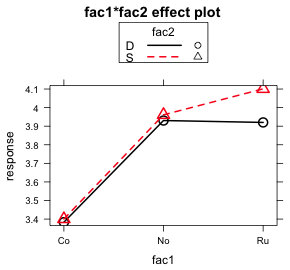 |
(b) 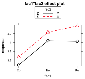 |
| Fig. 7 Interaction plots of the fac1:fac2 interaction as produced by the effects package |
Because fac1 is to appear on the x-axis I need the numerical values of the three factor levels. I obtain them by using the as.numeric function on the factor variable.
results.mine$fac1.num <- as.numeric(results.mine$fac1)
results.mine
fac1 fac2 fac3 ests se low95 up95 fac1.num
2401 Co D 1 3.383238 0.05245374 3.279889 3.486587 1
2411 No D 1 3.930537 0.04606953 3.839767 4.021307 2
2421 Ru D 1 3.920225 0.05198867 3.817792 4.022657 3
2431 Co S 1 3.400387 0.04162371 3.318376 3.482398 1
2441 No S 1 3.961099 0.04277330 3.876824 4.045375 2
2451 Ru S 1 4.100877 0.05022518 4.001919 4.199835 3
24011 Co D 2 3.490818 0.04941952 3.393447 3.588188 1
24111 No D 2 4.038116 0.04304455 3.953306 4.122927 2
24211 Ru D 2 4.027804 0.04393244 3.941245 4.114364 3
24311 Co S 2 3.671196 0.04162371 3.589186 3.753207 1
24411 No S 2 4.231909 0.04178987 4.149571 4.314247 2
24511 Ru S 2 4.371686 0.04341654 4.286143 4.457229 3
As I did with the effects graph, I start by setting up the graph but plotting nothing. I use the minimum of the low95 values and the maximum of the up95 values to establish the y-limits. The plotted x-values are numbered 1, 2, 3, so I set the x-limits to begin just a little before 1 and to end just a little after 3. I then use the axis function to add labels to the tick marks on the x-axis. I use the levels function to extract the labels from the factor variable fac1.
plot(c(.8,3.2), range(results.mine[,c("up95", "low95")]), type='n', xlab="Hormonal treatment", ylab='Mean mitotic activity', axes=F)
axis(1, at=1:3, labels=levels(results.mine$fac1))
axis(2)
box()
Next I subset the rows of the data frame so that we first plot only the means corresponding to fac3 = 1.
results.mine.sub1 <- results.mine[results.mine$fac3==1,]
I want to draw the mean profile for each diet (fac2) group separately. So I subset the data again by the first diet, fac2 = 'D'.
#first food group
cur.dat <- results.mine.sub1[results.mine.sub1$fac2=='D',]
To prevent the error bars of the two mean profiles from lying on top of each other I shift one profile a little bit to the left and the other profile a little bit to the right. The variable myjitter contains the amount of the shift for the first profile.
#amount of shift
myjitter <- -.05
The arrows function is used to draw the confidence intervals. Its basic syntax is the same as the segments function from before but it supports the additional arguments angle, code, and length.
- The angle argument controls the shape of the arrowhead; angle=90 yields flat ends.
- The code argument determines where the arrowheads should appear; code=3 puts arrowheads on both ends.
- The length argument controls the length of the arrowhead. This will typically need adjustment but for these data length=.05 works well.
arrows(cur.dat$fac1.num+myjitter, cur.dat$low95, cur.dat$fac1.num+myjitter, cur.dat$up95, angle=90, code=3, length=.05, col=1)
I follow this up with the lines function to draw the mean profile and the points function to plot the estimates at the middle of the confidence intervals. They each use the same syntax, x-variable followed by the y-variable. Just like the confidence intervals each has to shifted the same amount.
lines(cur.dat$fac1.num+myjitter, cur.dat$ests, col=1)
points(cur.dat$fac1.num+myjitter, cur.dat$ests, col=1, pch=16)
I next repeat these same lines of code for the second diet, fac2 = 'S', with the following changes.
- I change the subsetting level so I select observations for which fac2 = 'S'.
- I use a positive value of myjitter so that the points and error bars are moved slightly to the right.
- I change the color of the profile to red, col=2, and change the symbol type to open circles, pch=1. First I plot the points using filled white circles, col='white' and pch=16, to cover up the drawn lines. Then I add red open circles on top.
#second food group
cur.dat <- results.mine.sub1[results.mine.sub1$fac2=='S',]
myjitter <- .05
arrows(cur.dat$fac1.num+myjitter, cur.dat$low95, cur.dat$fac1.num+myjitter, cur.dat$up95, angle=90, code=3, length=.05, col=2)
lines(cur.dat$fac1.num+myjitter, cur.dat$ests, col=2)
points(cur.dat$fac1.num+myjitter, cur.dat$ests, col='white', pch=16, cex=1.1)
points(cur.dat$fac1.num+myjitter, cur.dat$ests, col=2, pch=1)
Finally I add a small header on top of the graph with the mtext (for margin text) function to indicate the level of fac3 that was plotted, fac3 = 1.
mtext(side=3, line=.5, 'Sibship 1', cex=.9)
Lastly I add a legend to identify which diet corresponds to which mean profile.
legend('topleft', c('Detritus','Shrimp'), col=1:2, pch=c(16,1), cex=.8, pt.cex=.9, title=expression(bold('Food Type')), bty='n')
- The first argument of legend is the location of the legend in the plot. The nine allowable key words that identify the position are "bottomright", "bottom", "bottomleft", "left", "topleft", "top", "topright", "right" and "center". It is also possible to specify the location of the legend by explicitly giving the x- and y-coordinates of the top left corner of the legend.
- The second argument of legend is the vector of text labels that are to appear in the legend.
- I specify the remaining arguments by name. They include the colors, col, and symbols, pch, used in the plot. These are listed in an order that corresponds to the order of the text labels.
- The cex argument controls the size of text and symbols in the legend. It is possible to make the text and symbols different sizes in the legend. The argument pt.cex can be used to control the symbol size in which case cex controls the size of everything else.
- I add a title to the legend with the title argument. I make the title bold face by using a mathematical expression and the bold function.
- The argument bty='n' suppresses the drawing of a box around the legend.
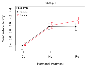
Fig. 8 Mean profile plot for sibship 1
To plot the mean profiles for sibship 2 I make only three changes to the code listed above.
- I subset the original data frame so sibship 2 (fac3=2) is selected instead of sibship 1.
- I change the header on top of the graph to indicate that sibship 2 was plotted.
- I drop the legend because it already appears in the first graph.
Notice that in the initial plot function I use all of the data to set the y-limits, not just the data for sibship 2. This ensures that the scale is the same in both graphs.
plot(c(.8,3.2), range(results.mine[,c("up95", "low95")]), type='n', xlab="Hormonal treatment", ylab='Mean mitotic activity', axes=F)
axis(1, at=1:3, labels=levels(results.mine$fac1))
axis(2)
box()
results.mine.sub1 <- results.mine[results.mine$fac3==2,]
#first food group
cur.dat <- results.mine.sub1[results.mine.sub1$fac2=='D',]
#amount of shift
myjitter <- -.05
arrows(cur.dat$fac1.num+myjitter, cur.dat$low95, cur.dat$fac1.num+myjitter, cur.dat$up95, angle=90, code=3, length=.05, col=1)
lines(cur.dat$fac1.num+myjitter, cur.dat$ests, col=1)
points(cur.dat$fac1.num+myjitter, cur.dat$ests, col=1, pch=16)
#second food group
cur.dat <- results.mine.sub1[results.mine.sub1$fac2=='S',]
myjitter <- .05
arrows(cur.dat$fac1.num+myjitter, cur.dat$low95, cur.dat$fac1.num+myjitter, cur.dat$up95, angle=90, code=3, length=.05, col=2)
lines(cur.dat$fac1.num+myjitter, cur.dat$ests, col=2)
points(cur.dat$fac1.num+myjitter, cur.dat$ests, col='white', pch=16, cex=1.1)
points(cur.dat$fac1.num+myjitter, cur.dat$ests, col=2, pch=1)
mtext(side=3, line=.5, 'Sibship 2', cex=.9)
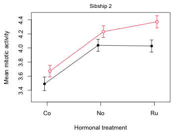
Fig. 9 Mean profile plot for sibship 2
Finally I display both plots in the same graphics window side by side. For this I use the mfrow argument of par to divide the graphics window into one row and two columns.
par(mfrow=c(1,2))
#sibship 1
plot(c(.8,3.2), range(results.mine[,c("up95", "low95")]), type='n', xlab="Hormonal treatment", ylab='Mean mitotic activity', axes=F)
axis(1, at=1:3, labels=levels(results.mine$fac1))
axis(2)
box()
results.mine.sub1 <- results.mine[results.mine$fac3==1,]
#first food group
cur.dat <- results.mine.sub1[results.mine.sub1$fac2=='D',]
#amount of shift
myjitter <- -.05
arrows(cur.dat$fac1.num+myjitter, cur.dat$low95, cur.dat$fac1.num+myjitter, cur.dat$up95, angle=90, code=3, length=.05, col=1)
lines(cur.dat$fac1.num+myjitter, cur.dat$ests, col=1)
points(cur.dat$fac1.num+myjitter, cur.dat$ests, col=1, pch=16)
#second food group
cur.dat <- results.mine.sub1[results.mine.sub1$fac2=='S',]
myjitter <- .05
arrows(cur.dat$fac1.num+myjitter, cur.dat$low95, cur.dat$fac1.num+myjitter, cur.dat$up95, angle=90, code=3, length=.05, col=2)
lines(cur.dat$fac1.num+myjitter, cur.dat$ests, col=2)
points(cur.dat$fac1.num+myjitter, cur.dat$ests, col='white', pch=16, cex=1.1)
points(cur.dat$fac1.num+myjitter, cur.dat$ests, col=2, pch=1)
mtext(side=3, line=.5, 'Sibship 1', cex=.9)
legend('topleft',c('Detritus','Shrimp'), col=1:2, pch=c(16,1), cex=.8, pt.cex=.9, title=expression(bold('Food Type')), bty='n')
#sibship 2
plot(c(.8,3.2), range(results.mine[,c("up95", "low95")]), type='n', xlab="Hormonal treatment", ylab='Mean mitotic activity', axes=F)
axis(1, at=1:3, labels=levels(results.mine$fac1))
axis(2)
box()
results.mine.sub1 <- results.mine[results.mine$fac3==2,]
#first food group
cur.dat <- results.mine.sub1[results.mine.sub1$fac2=='D',]
#amount of shift
myjitter <- -.05
arrows(cur.dat$fac1.num+myjitter, cur.dat$low95, cur.dat$fac1.num+myjitter, cur.dat$up95, angle=90, code=3, length=.05, col=1)
lines(cur.dat$fac1.num+myjitter, cur.dat$ests, col=1)
points(cur.dat$fac1.num+myjitter, cur.dat$ests, col=1, pch=16)
#second food group
cur.dat <- results.mine.sub1[results.mine.sub1$fac2=='S',]
myjitter <- .05
arrows(cur.dat$fac1.num+myjitter, cur.dat$low95, cur.dat$fac1.num+myjitter, cur.dat$up95, angle=90, code=3, length=.05, col=2)
lines(cur.dat$fac1.num+myjitter, cur.dat$ests, col=2)
points(cur.dat$fac1.num+myjitter, cur.dat$ests, col='white', pch=16, cex=1.1)
points(cur.dat$fac1.num+myjitter, cur.dat$ests, col=2, pch=1)
mtext(side=3, line=.5, 'Sibship 2', cex=.9)
#reset the graphics window
par(mfrow=c(1,1))
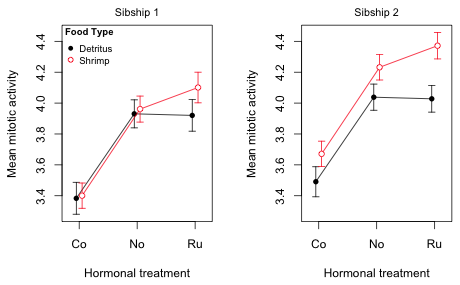
Fig. 10 Mean profile plots for the tadpole experiment
Notice that although we have explicitly plotted only the fac1 × fac2 interaction, both interactions are clearly on display. The fac1 × fac2 interaction is obvious because in each panel the red and black profiles are not parallel, but we also can see evidence of the fac2 × fac3 interaction. If fac3 was a purely additive effect then the right panel would be identical to the left panel except for the fact that the profiles would be shifted up or down (the main effect of fac3). Instead what we see is that the two diet profiles (fac2) are further apart in the right panel (sibship 2) than in the left panel (sibship 1). Thus sibship (fac3) is modifying the effect of diet. It has modified it sufficiently that now in the left panel the diet effect is significantly different from zero at all three hormonal treatments (the confidence intervals fail to overlap).
R Code
A compact collection of all the R code displayed in this document appears here.
Course Home Page