Lecture 28—Monday, December 3, 2012

Topics

R functions and commands demonstrated

Fitting the models from last time

I reload the wells data set, collapse the landscape categories, and fit the final models from last time.

wells <- read.csv("ecol 563/wells.txt")
out1 <- glm(cbind(y, n-y)~ land.use + sewer, data=wells, family=binomial)
wells$land.use2 <- factor(ifelse(wells$land.use %in% c('agri','undev'), 'rural', as.character(wells$land.use)))
wells$land.use3 <- factor(ifelse(wells$land.use2 %in% c('inst','recr','resL','resM','trans'), 'mixed', as.character(wells$land.use2)))
wells$land.use4 <- factor(ifelse(wells$land.use3 %in% c('resH','comm','indus'), 'high.use', as.character(wells$land.use3)))
out2d <- glm(cbind(y,n-y)~land.use4+sewer, data=wells, family=binomial)
out2i <- glm(cbind(y,n-y)~land.use4+sewer+nitrate, data=wells, family=binomial)

Confidence intervals for probabilities from a logistic regression model

The logistic regression model with dummy variables for sewer (z) and land use (w1 and w2) is the following.

logit

The usual convention in generalized linear models is to use the Greek letter η to denote the linear predictor in a model.

eta

Letting η denote the linear predictor in the model, I solve the logistic regression equation for p, the probability of contamination.

probability

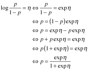
The function of η on the right hand side of the last expression is the inverse logit. It's also called the logistic function. Suppose we want a point estimate for the probability of contamination for a well in a mixed land use area in which sewers are present. This corresponds to w1 = 1, w2 = 0, and z = 1 in our model. Thus η is the following.

eta example

The inverse logit of this expression is the desired probability.

inv.logit <- function(eta) exp(eta)/(1+exp(eta))
inv.logit(coef(out2d)[1] + coef(out2d)[2] + coef(out2d)[4])
(Intercept)
   0.225459

If all we need are the predicted probabilities associated with individual observations we don't need to do this calculation ourselves. The predict function with type='response' when applied to a logistic regression model returns probabilities. We can even include the se.fit = T option to obtain standard errors of the probabilities.

phat <- predict(out2d, type='response', se.fit=T)
phat
$fit
          1           2           3           4           5           6
0.041926959 0.009287411 0.041926959 0.009287411 0.225459017 0.058695598
          7           8           9          10          11          12
0.225459017 0.058695598 0.454018448 0.151200397 0.225459017 0.058695598
         13          14          15          16          17          18
0.225459017 0.058695598 0.225459017 0.058695598 0.454018448 0.151200397
         19          20
0.454018448 0.151200397

$se.fit
          1           2           3           4           5           6
0.029363994 0.006720644 0.029363994 0.006720644 0.033727179 0.014394246
          7           8           9          10          11          12
0.033727179 0.014394246 0.039023551 0.038406497 0.033727179 0.014394246
         13          14          15          16          17          18
0.033727179 0.014394246 0.033727179 0.014394246 0.039023551 0.038406497
         19          20
0.039023551 0.038406497

If we could assume that the probabilities are normally distributed then we could use the output from predict to obtain 95% normal-based confidence intervals for the probabilities with the usual formula:

phat

The general guideline for when this formula is appropriate was mentioned previously. Typically we need both np and nq. Checking this for these data we find

sum(wells$n*(1-phat$fit)>5 & wells$n*phat$fit>5)
[1] 8

So only 8 of the 20 wells satisfy this criterion. Thus the normal approximation is suspect here. We can see that there is a problem if we use this formula to calculate a confidence interval for the first observation.

phat$fit[1] + c(qnorm(.025), qnorm(.975))*phat$se.fit[1]
[1] -0.01562541  0.09947933

The interval has a negative left hand endpoint so negative probabilities are included in the confidence interval. This is clearly silly.

A better approach is to parallel what we did to obtain confidence intervals for odds ratios. Because maximum likelihood estimates have an asymptotic normal distribution, so do linear combinations of maximum likelihood estimates. So we start by obtaining a 95% confidence interval for the linear combination η (on the logit scale). We then apply the inverse logit function separately to the endpoints of the interval to obtain a confidence interval for the probability. To obtain the confidence intervals on the logit scale we have two choices: we can construct Wald-type confidence intervals or profile likelihood confidence intervals.

Wald-type confidence intervals for probabilities

We start by creating a data frame containing all possible combinations of sewer and land.use4.

new.dat <- expand.grid(land.use4=levels(wells$land.use4), sewer=levels(wells$sewer))
new.dat
  land.use4 sewer
1  high.use    no
2     mixed    no
3     rural    no
4  high.use   yes
5     mixed   yes
6     rural   yes

Next we use this in the newdata argument of predict to obtain the predicted logits and their standard errors and add them to the data frame.

out.p <- predict(out2d, se.fit=T, newdata=new.dat)
out.p
$fit
         1          2          3          4          5          6
-1.7252170 -2.7749018 -4.6697646 -0.1844474 -1.2341322 -3.1289950

$se.fit
        1         2         3         4         5         6
0.2992586 0.2605273 0.7304131 0.1574256 0.1931381 0.7310097

$residual.scale
[1] 1

# create data frame of logits, standard errors, and categories
new.dat2 <- data.frame(new.dat, logit=out.p$fit, se=out.p$se)
new.dat2
  land.use4 sewer      logit        se
1  high.use    no -1.7252170 0.2992586
2     mixed    no -2.7749018 0.2605273
3     rural    no -4.6697646 0.7304131
4  high.use   yes -0.1844474 0.1574256
5     mixed   yes -1.2341322 0.1931381
6     rural   yes -3.1289950 0.7310097

Next we calculate normal-based 95% confidence intervals for the predicted logits.

new.dat2$low95 <- new.dat2$logit + qnorm(.025)*new.dat2$se
new.dat2$up95 <- new.dat2$logit + qnorm(.975)*new.dat2$se
new.dat2
  land.use4 sewer     logit       se     low95      up95
1  high.use    no -1.725217 0.299259 -2.311753 -1.138681
2     mixed    no -2.774902 0.260527 -3.285526 -2.264278
3     rural    no -4.669765 0.730413 -6.101348 -3.238181
4  high.use   yes -0.184447 0.157426 -0.492996  0.124101
5     mixed   yes -1.234132 0.193138 -1.612676 -0.855588
6     rural   yes -3.128995 0.731010 -4.561748 -1.696242

Finally we apply the inverse logit function to the logit column and the columns containing the endpoints of the confidence intervals.

inv.logit <- function(eta) exp(eta)/(1+exp(eta))
apply(new.dat2[,c(3,5:6)], 2, inv.logit)
       logit      low95      up95
1 0.15120040 0.09015424 0.2425626
2 0.05869560 0.03607108 0.0941250
3 0.00928741 0.00223484 0.0377539
4 0.45401845 0.37918808 0.5309855
5 0.22545902 0.16621743 0.2982619
6 0.04192696 0.01033585 0.1549567

Assembling everything in a data frame yields the following.

p.dat <- data.frame(new.dat2[,1:2], apply(new.dat2[,c(3,5:6)], 2, inv.logit))
p.dat
  land.use4 sewer      logit      low95      up95
1  high.use    no 0.15120040 0.09015424 0.2425626
2     mixed    no 0.05869560 0.03607108 0.0941250
3     rural    no 0.00928741 0.00223484 0.0377539
4  high.use   yes 0.45401845 0.37918808 0.5309855
5     mixed   yes 0.22545902 0.16621743 0.2982619
6     rural   yes 0.04192696 0.01033585 0.1549567
names(p.dat)[3] <- 'prob'
p.dat
  land.use4 sewer       prob      low95      up95
1  high.use    no 0.15120040 0.09015424 0.2425626
2     mixed    no 0.05869560 0.03607108 0.0941250
3     rural    no 0.00928741 0.00223484 0.0377539
4  high.use   yes 0.45401845 0.37918808 0.5309855
5     mixed   yes 0.22545902 0.16621743 0.2982619
6     rural   yes 0.04192696 0.01033585 0.1549567

Profile likelihood confidence intervals for probabilities

The function confint calculates profile likelihood confidence intervals for the parameters estimated by a glm model. To make use of it here we need to reparameterize the glm model so that the returned parameter estimates correspond to individual categories of sewer and land use, rather than effects. We can accomplish this in two stages. First we obtain the logits for the three land.use4 categories when sewer = 'no' by refitting the model without an intercept.

out2d1 <- glm(cbind(y,n-y)~land.use4+sewer-1, data=wells, family=binomial)
coef(out2d1)
land.use4high.use    land.use4mixed    land.use4rural          seweryes
        -1.725217         -2.774902         -4.669765          1.540770
# obtain confidence intervals
out.c1 <- confint(out2d1)
out.c1
                       2.5 %    97.5 %
land.use4high.use -2.3386647 -1.160706
land.use4mixed    -3.3206147 -2.294385
land.use4rural    -6.4933077 -3.481457
seweryes           0.9950944  2.130452

To get the predicted land use logits when sewer = 'yes' we redefine the levels of the sewer factor so that sewer = 'yes' is the reference group and then refit the model without an intercept.

# define new sewer factor with sewer=yes the reference group
wells$sewer2 <- factor(wells$sewer, levels=rev(levels(wells$sewer)))
levels(wells$sewer)
[1] "no"  "yes"
levels(wells$sewer2)
[1] "yes" "no"
# refit model using new sewer variable
out2d2 <- glm(cbind(y,n-y)~land.use4+sewer2-1, data=wells, family=binomial)
coef(out2d2)
land.use4high.use    land.use4mixed    land.use4rural          sewer2no
       -0.1844474        -1.2341322        -3.1289950        -1.5407697
out.c2 <- confint(out2d2)
out.c2
                       2.5 %     97.5 %
land.use4high.use -0.4952175  0.1230656
land.use4mixed    -1.6247168 -0.8657053
land.use4rural    -4.9519386 -1.9329523
sewer2no          -2.1304522 -0.9950944

Finally we assemble the logits and confidence intervals in a matrix and add the land use and sewer identifiers.

# collect results in a matrix
out.profile <- data.frame(est=c(coef(out2d1)[1:3], coef(out2d2)[1:3]), rbind(out.c1[1:3,], out.c2[1:3,]))
# obtain probabilities
p.dat.profile <- data.frame(new.dat, inv.logit(out.profile))
names(p.dat.profile)[3:5] <- c('prob', 'low95', 'up95')
p.dat.profile
  land.use4 sewer        prob       low95       up95
1  high.use    no 0.151200397 0.087970986 0.23853896
2     mixed    no 0.058695598 0.034870716 0.09158910
3     rural    no 0.009287411 0.001511247 0.02984448
4  high.use   yes 0.454018448 0.378665237 0.53072762
5     mixed   yes 0.225459017 0.164555398 0.29614872
6     rural   yes 0.041926959 0.007020060 0.12642417

Graphing the probabilities and their confidence intervals

We start by creating a unique identifier for each combined sewer and land use category. The numeric version of this variable defines the tick marks on the y-axis of the plot.

p.dat$both <- factor(paste(p.dat$sewer, p.dat$land.use4, sep='.'))
p.dat$num <- as.numeric(p.dat$both)
p.dat
  land.use4 sewer        prob       low95      up95         both num
1  high.use    no 0.151200397 0.090154244 0.2425626  no.high.use   1
2     mixed    no 0.058695598 0.036071083 0.0941250     no.mixed   2
3     rural    no 0.009287411 0.002234841 0.0377539     no.rural   3
4  high.use   yes 0.454018448 0.379188080 0.5309855 yes.high.use   4
5     mixed   yes 0.225459017 0.166217426 0.2982619    yes.mixed   5
6     rural   yes 0.041926959 0.010335845 0.1549567    yes.rural   6

The rest of the code for this is very much like what we used in lecture 4 for a similar graph.

oldmar <- par("mar")
par(mar=c(4.1,8.1,1.1,1.1))
plot(num~prob, data=p.dat, xlab='Probability of contamination', ylab='', xlim=c(0, 0.55), ylim=c(0.75,6.25), type='n', axes=F)
axis(1)
axis(2, at=1:6, labels=rep(c('high use', 'mixed use', 'rural'),2), las=2, cex.axis=.9)
box()
par(lend=1)
segments(p.dat$low95, p.dat$num, p.dat$up95, p.dat$num, col='dodgerblue1', lwd=4)
points(p.dat$prob, p.dat$num, pch='|', lwd=1, cex=1.25, col='dodgerblue4')
mtext(side=2, at=c(2,5), text=c('Sewers absent','Sewers present'), line=5.5, cex=1.2)
abline(h=3.5, lty=2)
par(mar=oldmar)

fig. 1
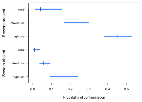
Fig. 1  Estimated sewer and land use category probabilities along with 95% confidence intervals

This is analogous to the interaction plots we did for a two-factor ANOVA. Notice that the probability profiles are not parallel on a probability scale even though there is no interaction between sewer and land use in the model. This happens because even though on a logit scale we have an additive model in sewer and land use type, the inverse logit is a nonlinear transformation from the logit scale to the probability scale.

Plotting a logit model with a single continuous predictor

If there are continuous predictors in a model then we can't produce diagrams of probabilities such as Fig. 1 unless we choose specific values for the continuous predictors (the mean is often a good choice). If after stratifying the continuous predictors by the categorical predictors there is no overlap in the range of the continuous predictors then this approach is not appropriate. It doesn't make sense to obtain a predicted probability for a value of a predictor if that value doesn't occur within the range of the data for a particular category.

Consider the model we fit that contained land.use4, sewer, and nitrate. When we stratify the continuous variable nitrate by the categorical variables land.use4 and sewer, we see that the nitrate values in the land.use4 = 'rural' and sewer = 'yes' category only overlap two of the other five categories.

# there are no common values of nitrate for all six categories
tapply(wells$nitrate, list(wells$land.use4, wells$sewer), max)
          no yes
high.use 4.2 5.2
mixed    3.5 4.0
rural    7.0 1.0
tapply(wells$nitrate, list(wells$land.use4, wells$sewer), min)
          no yes
high.use 1.1 3.7
mixed    0.9 1.6
rural    0.8 0.9

When there is a single continuous predictor in a logistic regression model there is another way of summarizing the results—plot the fitted model against the continuous variable on a probability scale. Combinations of levels of categorical variables in the model correspond to separate logistic curves. When there are two or more continuous variables in the model then plotting the model on a probability scale is not possible unless we are willing to plot the probability as a function of one of the continuous variables while holding the other continuous variables fixed at some values. Three-dimensional graphs and contour plots are often difficult to interpret in logistic regression.

I plot the model out2i that contains the continuous predictor nitrate and the categorical predictors land.use4 with three levels and sewer with two levels. The categorical variables combine to yield six different logit curves as functions of nitrate. I construct a function for the fitted logistic regression model that returns the value of the logit as a function of nitrate and the three dummy variables in the model.

coef(out2i)
   (Intercept) land.use4mixed land.use4rural       seweryes        nitrate
    -2.6565063     -0.7293304     -2.8422741      1.2309213      0.2707348
# regression function
logit.mod <- function(mixed, rural, sewer,x) coef(out2i)[1] + coef(out2i)[2]*mixed + coef(out2i)[3]*rural + coef(out2i)[4]*sewer + coef(out2i)[5]*x
logit.mod(0,0,0,3)
(Intercept)
  -1.844302

Using the inverse logit function we can construct a function that returns probabilities as a function of nitrate and the three dummy variables in the model.

inv.logit <- function(eta) exp(eta)/(1+exp(eta))
# probability function
inv.logit(logit.mod(0, 0, 0, 3))
(Intercept)
  0.1365433

Finally I determine the overall range of the continuous variable in the data set as well as separately by category and use this in determining the domain for each curve.

# graph over the range of the data
range(wells$nitrate)
[1] 0.8 7.0
out.range <- tapply(wells$nitrate, list(wells$land.use4, wells$sewer), range)

I use the individual ranges to restrict the curve function so that the curve is only drawn over an interval of nitrate values that were actually observed for that category.

plot(c(0.8,7),c(0,0.65), xlab='Nitrate concentration', ylab='Probability of contamination', type='n')
curve(inv.logit(logit.mod(0,0,0,x)), add=T, xlim=out.range[1,]$no , lwd=2)
curve(inv.logit(logit.mod(1,0,0,x)), add=T, col=2, xlim=out.range[2,]$no, lwd=2)
curve(inv.logit(logit.mod(0,1,0,x)), add=T, col=3, xlim=out.range[3,]$no, lwd=2)
curve(inv.logit(logit.mod(0,0,1,x)), add=T, lty=2, xlim=out.range[1,]$yes, lwd=2)
curve(inv.logit(logit.mod(1,0,1,x)), add=T, col=2, lty=2, xlim=out.range[2,]$yes, lwd=2)
curve(inv.logit(logit.mod(0,1,1,x)), add=T, col=3, lty=2, xlim=out.range[3,]$yes, lwd=2)
legend('topleft', rep(c('high use', 'mixed use', 'rural'),2), col=rep(1:3,2), lty=rep(1:2,each=3), lwd=2, cex=.9, bty='n', ncol=2, title='Sewers absent     Sewers present')

Fig. 2
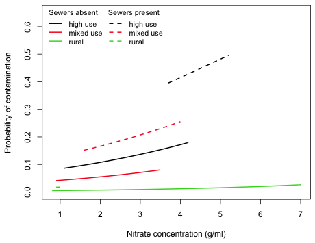
Fig. 2  Plot of the individual predicted logistic functions (inverse logits) as a function of nitrate concentration separately by land use category and sewer

We would need to extend the curves beyond the range of the data to see the sigmoid shape that characterizes the logistic function.

Graphs of (log) odds ratios

A useful way to graphically display the summary table of the model is to plot odds ratios (or log odds ratios) corresponding to the various terms in the model along with their confidence intervals. This can be done with both categorical and continuous variables although with continuous variables we will need to choose an appropriate increment in order to make the display comparable with the rest.

To optimize the use of space in the graph, it is useful when possible to arrange the coding of factors so that all of the log odds ratios have the same sign. For the current model we can accomplish this by reordering the land.use4 factor so that the "rural" category is the reference group.

wells$land.use4a <- factor(wells$land.use4, levels=rev(levels(wells$land.use4)))
out2m <- glm(cbind(y,n-y) ~ land.use4a + sewer + nitrate, data=wells, family=binomial)
coef(out2m)
       (Intercept)    land.use4amixed land.use4ahigh.use           seweryes            nitrate
        -5.4987804          2.1129438          2.8422741          1.2309213          0.2707348

Next we obtain the confidence intervals on the logit scale and assemble things in a data frame.

out.conf <- confint(out2m)
out.conf
                         2.5 %     97.5 %
(Intercept)        -7.69928241 -3.9704879
land.use4amixed     0.79433505  4.0561107
land.use4ahigh.use  1.56133569  4.7241666
seweryes            0.59782220  1.8862507
nitrate             0.01944393  0.5413637

# log odds ratios and confidence intervals
out.mod <- data.frame(var=1:4, est=coef(out2m)[2:5], out.conf[2:5,])
out.mod
                   var       est     X2.5..   X97.5..
land.use4amixed      1 2.1129438 0.79433505 4.0561107
land.use4ahigh.use   2 2.8422741 1.56133569 4.7241666
seweryes             3 1.2309213 0.59782220 1.8862507
nitrate              4 0.2707348 0.01944393 0.5413637
names(out.mod)[3:4] <- c('low95', 'up95')
out.mod
                   var       est      low95      up95
land.use4amixed      1 2.1129438 0.79433505 4.0561107
land.use4ahigh.use   2 2.8422741 1.56133569 4.7241666
seweryes             3 1.2309213 0.59782220 1.8862507
nitrate              4 0.2707348 0.01944393 0.5413637

The variable var denotes the locations on the y-axis for the individual confidence intervals. In constructing labels for the log odds ratios I use the escape character, \n, inside the text string to force the labels to break over two lines.

# create labels for log odds ratios
mylabs <- c('land use:\nmixed use vs rural', 'land use:\nhigh use vs rural','sewer:\nyes vs no', 'nitrate:\n1 mg/l increase')

The rest of the code resembles work we've done previously. A prepanel function is used to ensure that the x-limits of the graph are determined from the confidence intervals, not from the point estimates of the log odds ratios.

# prepanel function
myprepanel.ci <- function(x,y,lx,ux,subscripts,...){
list(xlim=range(x, ux[subscripts], lx[subscripts], finite=T,...))}
library(lattice)
xyplot(factor(var, labels=mylabs)~est, xlab='Log odds ratio', ylab='', lx=out.mod$low95, ux=out.mod$up95, data=out.mod, prepanel=myprepanel.ci, panel=function(x,y){
panel.segments(out.mod$low95, y, out.mod$up95, y, lwd=5, col='dodgerblue1', lineend=1)
panel.xyplot(x, y, pch='|', cex=1.75, col='dodgerblue4', lwd=2)
panel.abline(v=0, lty=2, col=2)})

fig. 3
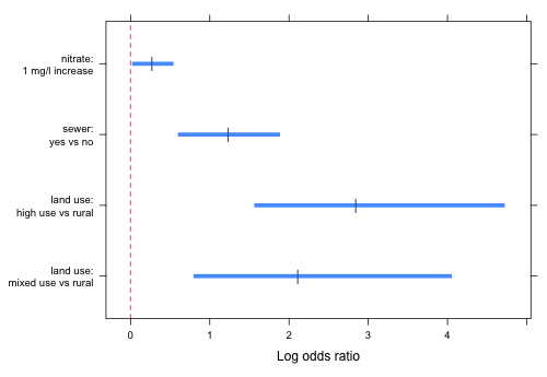
Fig. 3  Log odds ratios and 95% confidence intervals corresponding to all of the individual estimated effects.

It's generally a better choice to display odds ratios than log odds ratios because they're more interpretable. For this problem I chose log odds ratios because the confidence intervals for the odds ratios are so wide for the two land use effects that they would swamp the rest of the graph making it difficult to even see the remaining estimates.

Mixed effects logistic regression models

Consider the following data set that contains the results of a binomial experiment with a two-level treatment that was administered in blocks.

Block_Number Treatment killed
           1         1      4
           1         2      6
           2         1      5
           2         2      6
           3         1      6
           3         2      0
           4         1      4
           4         2      6
           5         1      0
           5         2      6
           6         1      6
           6         2      0
           7         1      2
           7         2      5
           8         1      6
           8         2      3
           9         1      0
           9         2      1
          10         1      5
          10         2      5
          11         1      0
          11         2      1
          12         1      0
          12         2      6
          13         1      2
          13         2      2
          14         1      1
          14         2      2
          15         1      3
          15         2      6
          16         1      6
          16         2      2

The last column reports the number of crabs killed in a total of 6 trials for two different treatments numbered 1 and 2. The treatments are arranged in 16 blocks, so we can presume that the observations coming from the same block are more similar to each other than they are to observations from different blocks. We can copy the displayed data to the clipboard and read the data directly into R. The syntax for doing this is different for Windows and Mac OS X.

# read data from clipboard: Windows OS
crabs <- read.table('clipboard', header=T)
# read data in from clipboard: Mac OS
crabs <- read.table(pipe("pbpaste"), header=T)

One way to analyze a randomized block design is to treat the blocks as fixed effects and include them in a logistic regression model as a factor.

# fixed effects randomized block design
out1 <- glm(cbind(killed,6-killed)~factor(Treatment) + factor(Block_Number), data=crabs, family=binomial)
summary(out1)
Call:
glm(formula = cbind(killed, 6 - killed) ~ factor(Treatment) +
    factor(Block_Number), family = binomial, data = crabs)

Deviance Residuals:
     Min        1Q    Median        3Q       Max 
-3.09746  -0.93741  -0.00829   1.33889   3.09746 

Coefficients:
                         Estimate Std. Error z value Pr(>|z|)  
(Intercept)             1.421e+00  7.907e-01   1.797  0.07241 .
factor(Treatment)2      4.050e-01  3.420e-01   1.184 
0.23629  
factor(Block_Number)2   7.918e-01  1.303e+00   0.608  0.54336  
factor(Block_Number)3  -1.623e+00  9.699e-01  -1.674  0.09423 .
factor(Block_Number)4  -1.708e-15  1.099e+00   0.000  1.00000  
factor(Block_Number)5  -1.623e+00  9.699e-01  -1.674  0.09423 .
factor(Block_Number)6  -1.623e+00  9.699e-01  -1.674  0.09423 .
factor(Block_Number)7  -1.283e+00  9.747e-01  -1.317  0.18799  
factor(Block_Number)8  -5.142e-01  1.025e+00  -0.502  0.61598  
factor(Block_Number)9  -4.038e+00  1.304e+00  -3.097  0.00196 **
factor(Block_Number)10  1.275e-10  1.099e+00   0.000  1.00000  
factor(Block_Number)11 -4.038e+00  1.304e+00  -3.097  0.00196 **
factor(Block_Number)12 -1.623e+00  9.699e-01  -1.674  0.09423 .
factor(Block_Number)13 -2.323e+00  9.915e-01  -2.343  0.01912 *
factor(Block_Number)14 -2.732e+00  1.026e+00  -2.663  0.00776 **
factor(Block_Number)15 -5.142e-01  1.025e+00  -0.502  0.61600  
factor(Block_Number)16 -9.231e-01  9.909e-01  -0.932  0.35157  
---
Signif. codes:  0 ‘***’ 0.001 ‘**’ 0.01 ‘*’ 0.05 ‘.’ 0.1 ‘ ’ 1

(Dispersion parameter for binomial family taken to be 1)

    Null deviance: 155.692  on 31  degrees of freedom
Residual deviance:  97.612  on 15  degrees of freedom
AIC: 164.58

Number of Fisher Scoring iterations: 4

While the fixed effects model has successfully tested for a treatment effect (and found it to be not significant), we're left with a mess of uninteresting block effects to sort through. Furthermore if we want to estimate the probability that a particular treatment kills a crab, we can only do so for individual blocks. For instance an inverse logit applied to the intercept in the current model yields the probability that treatment 1 kills crabs, but only in block 1.

The solution to this as we saw in lecture 6 is to treat blocks as a random effect in which we view the individual blocks as deviations from an average block, which hopefully represents the average in the population from which the blocks were drawn. The lmer function of the lme4 package will fit a random intercepts model with a binomial response.

# random effects randomized block design
library(lme4)
out1.lmer <- lmer(cbind(killed,6-killed)~factor(Treatment) + (1|Block_Number), data=crabs, family=binomial)
summary(out1.lmer)
Generalized linear mixed model fit by the Laplace approximation
Formula: cbind(killed, 6 - killed) ~ factor(Treatment) + (1 | Block_Number)
   Data: crabs
 AIC   BIC logLik deviance
 141 145.4  -67.5      135
Random effects:
 Groups       Name        Variance Std.Dev.
 Block_Number (Intercept) 1.1445   1.0698 
Number of obs: 32, groups: Block_Number, 16

Fixed effects:
                   Estimate Std. Error z value Pr(>|z|)
(Intercept)         0.08411    0.34819   0.242    0.809
factor(Treatment)2  0.36983    0.31710   1.166   
0.244

Correlation of Fixed Effects:
            (Intr)
fctr(Trtm)2 -0.446

As before we fail to find a difference in the two treatments. Unlike the fixed effects model where the intercept represented the log odds of death for treatment 1 in block 1 now it represents the log odds of death for treatment 1 for an average block. Note: to say that a log odds of death is not significantly different from zero is equivalent to saying that the probability of death is not different from 0.5.

R Code

A compact collection of all the R code displayed in this document appears here.

Course Home Page


Jack Weiss
Phone: (919) 962-5930
E-Mail: jack_weiss@unc.edu
Address: Curriculum for the Environment and Ecology, Box 3275, University of North Carolina, Chapel Hill, 27599
Copyright © 2012
Last Revised--December 5, 2012
URL: https://sakai.unc.edu/access/content/group/3d1eb92e-7848-4f55-90c3-7c72a54e7e43/public/docs/lectures/lecture28.htm