Grouped binary data is not the norm in ecology. When it does arise it typically does so in an experimental setting. As an example we look at a toxicity data set first analyzed by Bliss (1935). Bliss reported the number of beetles dying (dead) after five hours of exposure at various levels of gaseous carbon disulfide (conc) measured on a log base 2 scale. The data are available in the file bliss.txt and are also shown below.
"dead" "alive" "conc"
2 28 0
8 22 1
15 15 2
23 7 3
27 3 4
We could read this data into R from the file but because the data set is so small it's easier to copy it to the clipboard and then read it into R from there. The protocol for doing this is different on Windows and Mac OS X. With the data copied to the clipboard enter the appropriate line shown below.
These are grouped binary data because what is recorded are not the 0-1 outcomes for individual beetles but the summarized result, the number of dead beetles and alive beetles at various dosage levels. In R we analyze these data by using a matrix as the response in which the number of successes appears as the first column and the number of failures occurs as the second column. We can create this matrix on the fly with the cbind function. The argument family=binomial is used to specify the binomial random component. We model the number of dead beetles as a function of concentration as follows.
Deviance Residuals:
1 2 3 4 5
-0.4510 0.3597 0.0000 0.0643 -0.2045
Coefficients:
Estimate Std. Error z value Pr(>|z|)
(Intercept) -2.3238 0.4179 -5.561 2.69e-08 ***
conc 1.1619 0.1814 6.405 1.51e-10 ***
---
Signif. codes: 0 ‘***’ 0.001 ‘**’ 0.01 ‘*’ 0.05 ‘.’ 0.1 ‘ ’ 1
(Dispersion parameter for binomial family taken to be 1)
Null deviance: 64.76327 on 4 degrees of freedom
Residual deviance: 0.37875 on 3 degrees of freedom
AIC: 20.854
Number of Fisher Scoring iterations: 4
In the summary table the column Pr(>|z|) contains the p-values for individual Wald tests. The row labeled conc is a test of whether the regression coefficient of concentration is significantly different from zero. Since the p-value is small we conclude that there is a significant linear relationship on the log odds scale between the proportion dying and the log concentration of carbon disulfide
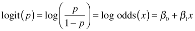
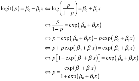
A more intuitive way to interpret the regression coefficients of a logistic regression is in terms of odds ratios. The logistic regression model we've fit, written generically, is the following.
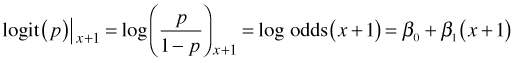
If we increment the value of the predictor by 1 in this equation we obtain the following.
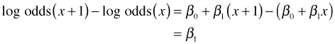
Subtracting the first equation from the second equation yields the following.
Using properties of logarithms, the left hand side of this equation can be written as the log of a ratio.
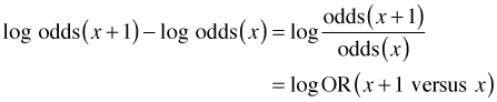
where OR is used to denote an odds ratio, a ratio of odds, in this case the odds of death at x + 1 over the odds of death at x. Exponentiating this expression yields
![]()
So, when we exponentiate the regression coefficient of a continuous variable in a logistic regression we obtain an odds ratio. An odds ratio tells us the factor by which the odds of dying changes when the continuous variable is increased by one unit.
To obtain the odds ratio for concentration in the current model we exponentiate the coefficient of conc.
The odds ratio is 3.196. It is the multiplicative increase in the odds of dying due to a one unit increase (on a log scale) in carbon disulfide Since the log scale is base two, each one unit increase corresponds to a doubling of the concentration. Thus when the concentration is doubled, the odds of dying increases by a factor of 3.196.
To obtain a likelihood ratio test of the concentration effect we can use the anova function with the test='Chisq' option.
Model: binomial, link: logit
Response: cbind(dead, alive)
Terms added sequentially (first to last)
Df Deviance Resid. Df Resid. Dev Pr(>Chi)
NULL 4 64.763
conc 1 64.385 3 0.379 1.024e-15 ***
---
Signif. codes: 0 ‘***’ 0.001 ‘**’ 0.01 ‘*’ 0.05 ‘.’ 0.1 ‘ ’ 1
The LR test finds a statistically significant effect on the log odds of death due to concentration. Although this result is consistent with the Wald test above, the reported significance level is very different.
As was explained in lecture 13, the residual deviance from a generalized linear model fit to grouped binary data can be used as a goodness of fit statistic if the expected cell frequencies meet certain minimum cell size requirements. Specifically, no more than 20% of the expected counts should be less than 5. We examine this requirement for the current model.
The predict function returns predictions on the scale of the link function while the fitted function returns predictions on the scale of the raw response. For a logistic regression model, predict returns the estimated logits while fitted returns the estimated probabilities.
The number of trials is the same at each concentration value.
The expected counts are np for successes and n(1 – p) for failures.
From the output we see that two of the expected counts are less than 5. With 10 total categories, 2 out of 10 is 20% so we meet the minimum cell size criterion. The residual deviance and its degrees of freedom are stored as components of the model object.
The null hypothesis is the following.
H0: model fits the data
H1: model does not fit the data
The residual deviance has a chi-squared distribution with out1$df.residual degrees of freedom. We reject the null hypothesis if the residual deviance is too big (a one-sided, upper-tailed test).
The calculated p-value is large so we fail to reject the null hypothesis. The model is not significantly different from a saturated model. Because a saturated model fits the data perfectly, we have no evidence of lack of fit.
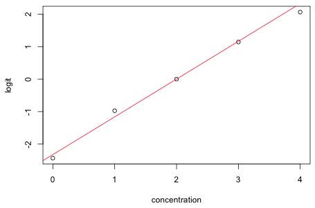
To examine the assumption of linearity on the log odds scale we can plot the logit against the predictor, in this case concentration. Let pi denote the observed success probability in group i, let ni be the total number of observations in group i, and let yi be the observed number of successes in group i. Then the logit can be written as follows.
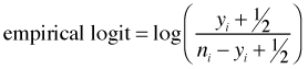
If it turns out that any of the groupings yield 100% successes or 100% failures then the logit is undefined. To correct for this possibility the empirical logit is usually defined as follows.
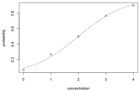
The empirical logit is plotted (as points) below and the estimated logit from the regression model is superimposed. The fit is clearly outstanding.
 |
|
| Fig. 1 Estimated (line) and empirical logits (points) | |
Another way to graphically assess fit is to plot the logistic curve superimposed on a scatter plot of the observed probabilities of dying as a function of concentration. The probability function is obtained by inverting the logit function as follows.
 |
|
| Fig. 2 Estimated (curve) and raw probabilities (points) | |
We can calculate Wald confidence intervals or profile likelihood confidence intervals for odd ratios. The point estimate of the odds ratio for concentration is 3.20.
Maximum likelihood theory tells us that maximum likelihood estimates have an asymptotic normal distribution. The formula for a 95% normal-based confidence interval for a parameter θ is the following.
![]()
Using this we can construct a normal-based confidence interval for the coefficient of concentration using the point estimate and its standard error as reported in the summary table of the model.
To obtain 95% confidence intervals for the odds ratio, exp(β1), we just exponentiate the 95% confidence interval for β1.
The Wald 95% confidence interval for the odds ratio is (2.24, 4.56).
We can also obtain confidence intervals based on the likelihood ratio statistic. The confint function applied to a glm model returns profile likelihood confidence intervals for all the regression parameters in our model.
To obtain a 95% profile likelihood confidence interval for the odds ratio with respect to concentration, we just exponentiate the 95% confidence interval for the concentration regression parameter.
The profile likelihood 95% confidence interval for the odds ratio is (2.29, 4.69). The Wald and profile likelihood confidence intervals are quite close.
Chapters 6 and 21 of Zuur et al. (2007) analyze some presence-absence data for the flatfish Solea solea. Their goal is to characterize the habitat requirements of the species. I download the data into the ecol 562 folder of my computer, read the data into R, and examine the first few observations.
The variable Solea_solea is a binary variable that records whether the species is present (Solea_solea = 1) or absent (Solea_solea = 0) at a location. Our goal today is not to find a best model but just to use these data to illustrate some of the issues that arise when fitting a regression model to binary data. Having said that I do want to point out a bit of silliness on the part of the authors in the way that they treat four of the variables in this data set. The variables occurring in columns 9 through 12 are obviously related. If we sum over their values in a row they sum to 100 (ignoring round off error).
Zuur et al. (2007) treat these as ordinary variables that just happened to be highly correlated. This is completely inappropriate. Variables that act to partition a whole into components are called compositional data. While rare in most disciplines, compositional data are extremely common in geology and statistical geologists have developed a rigorous protocol called log-ratio analysis for dealing with them. I don't wish to get into the details except to say that the best way to think of compositional data is as the continuous analog of a factor (categorical) variable. When we work with factors in regression models we don't treat the individual dummy regressors as variables in their own right, but instead view them as part of a single construct. Similarly the variables that define the components of compositional data should be treated in concert, not separately. Their values have relative not absolute meaning. Just as with categorical data the proper approach with compositional data is to choose a baseline level and then measure everything relative to that level. The main reference for the analysis of compositional data is Aitchison (1986). For applications of his approach in ecology see Elston et al. (1996).
We start by fitting a logistic regression to the presence-absence data using the single predictor salinity. We fit the model using the glm function and specifying binomial for the family argument.
Deviance Residuals:
Min 1Q Median 3Q Max
-2.0674 -0.7146 -0.6362 0.7573 1.8996
Coefficients:
Estimate Std. Error z value Pr(>|z|)
(Intercept) 2.66071 0.90167 2.951 0.003169 **
salinity -0.12985 0.03494 -3.716 0.000202 ***
---
Signif. codes: 0 ‘***’ 0.001 ‘**’ 0.01 ‘*’ 0.05 ‘.’ 0.1 ‘ ’ 1
(Dispersion parameter for binomial family taken to be 1)
Null deviance: 87.492 on 64 degrees of freedom
Residual deviance: 68.560 on 63 degrees of freedom
AIC: 72.56
Number of Fisher Scoring iterations: 4
The summary display reports parameter estimates, their standard errors, and Wald tests. The default link function for logistic regression is the logit link, also called the log odds. Let p denote the probability that Solea solea is present at a given location. Then the displayed coefficient estimate for salinity indicates how much logit(p) is expected to change for a one unit change in the salinity variable. We see that the logit is expected to decrease by 0.12985 units. Like log, the logit function is a monotone increasing function, hence the direction of the change for p is the same as the direction of change for logit(p). Because the coefficient of salinity is negative, the model predicts that as salinity increases it becomes less likely that Solea solea will be present.
For the current data set we can calculate the odds ratio for a one unit increase in salinity as follows.
Thus a one unit increase in salinity decreases the odds of finding Solea solea present by a factor of 0.878. Alternatively we can flip the odds over by changing the sign of the coefficient.
So a one unit decrease in salinity makes the odds of Solea solea being present 1.14 times greater.
To obtain confidence intervals for odds ratios we calculate normal-based confidence intervals for the regression parameters on the scale of the logit and exponentiate the result. The standard errors of the estimates are located in the coefficient table of the summary output. The formula for a 95% normal-based confidence interval for a parameter θ is ![]() .
.
The residual deviance statistic from a logistic regression with a binary response is not an appropriate lack of fit statistic, but we can still use the anova function to carry out a likelihood ratio test to compare nested models. When we give a single generalized linear model object to the anova function of R, it carries out sequential likelihood ratio tests.
Model: binomial, link: logit
Response: Solea_solea
Terms added sequentially (first to last)
Df Deviance Resid. Df Resid. Dev P(>|Chi|)
NULL 64 87.492
salinity 1 18.932 63 68.560 1.355e-05
The likelihood ratio statistic is 18.932 and compares the current model with a model containing only an intercept. Observe that the reported p-value, while significant, differs from the p-value reported in the summary table for salinity. The p-value in the summary table is from a Wald test and the Wald and likelihood ratio tests are only approximately equivalent.
Method 1: Plotting the individual fitted values
As with any regression model, a logistic regression model with only one continuous predictor can be plotted in two dimensions. When there are no other regressors in the model, we can use model predictions to draw the graph. We've already seen that the predict function can be used to return predictions on the scale of the link function. Hence
will return the estimated logits for individual observations. The fitted function can be used to return predictions on the scale of the raw response, in this case the probabilities p.
To be useful in plotting we need to sort these probabilities by salinity. The way to do this in R is with the order function.
The output tells us that if salinity were to be sorted then observation 13 would appear first, followed by observation 12, then 23, etc. We can use this vector of positions to reorder the fitted values in salinity order.
All that's left to do is to plot these values against sorted salinity values and connect the points with line segments. With enough observations spread out over the range of the predictor, the resulting curve should be reasonably smooth.
Method 2: Use the formula for the invert logit
The logit is an invertible function so that we can solve for p algebraically.
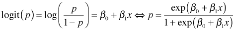
This expression for p can be written as a function in R and then plotted using the curve function.
The observed response values are zeros and ones. To see at what salinities they occur we can use the rug function to add a rug plot at the bottom and top of the graph, corresponding to the zeroes and ones respectively. The side argument of rug takes the numbers 1 (bottom), 2 (left side), 3 (top), and 4 (right side).
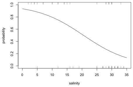 |
Fig. 3 Fitted logistic curve obtained using either methods 1 or 2 |
Method 3: Function published in the Bulletin of the ESA
One problem with the rug plot is that only unique values of salinity are displayed. We can't see the frequencies of the displayed observations. A function, plot.logi.hist, due to de la Cruz Rot (2005) adds some additional distributional information to the plot we just produced. It has two required arguments: the predictor variable followed by the response variable. I've modified some of the defaults of his function and use it below to plot the current model.
 |
Fig. 4 Logistic plot using code due to de la Cruz Rot (2005). In addition to the logistic curve the separate marginal distributions of salinity for the presence and absence observations are shown. |
One of the final models considered by Zuur et al. (2007) includes salinity, temperature, and month treated as a factor. Rather than re-enter all the details of the model again, we can use the update function. The first argument to update is the model to be modified. The expression .~. in the second argument means that we want both the response and the predictor set to be the same as in that model. After this we add the new terms that we desire.
Deviance Residuals:
Min 1Q Median 3Q Max
-1.7874 -0.7212 -0.3118 0.6137 2.3357
Coefficients:
Estimate Std. Error z value Pr(>|z|)
(Intercept) 20.85344 8.70430 2.396 0.016586 *
salinity -0.22497 0.06054 -3.716 0.000202 ***
temperature -0.78950 0.38382 -2.057 0.039690 *
factor(month)6 1.82657 1.16532 1.567 0.117011
factor(month)7 2.95498 1.96393 1.505 0.132420
factor(month)8 3.53542 1.89188 1.869 0.061659 .
factor(month)9 -1.87826 1.25102 -1.501 0.133256
---
Signif. codes: 0 ‘***’ 0.001 ‘**’ 0.01 ‘*’ 0.05 ‘.’ 0.1 ‘ ’ 1
(Dispersion parameter for binomial family taken to be 1)
Null deviance: 87.492 on 64 degrees of freedom
Residual deviance: 57.081 on 58 degrees of freedom
AIC: 71.08
Number of Fisher Scoring iterations: 5
If we exponentiate the coefficients of salinity and temperature we obtain the corresponding odds ratios. I take the negative of the coefficients so that the odds ratios are for decreasing temperature and salinity.
Thus for each increment in salinity the odds of finding Solea solea present is decreased by a factor 0.80. Similarly a one unit increase in temperature causes the odds of finding Solea solea to fall by more than half. Flipping things around, a one unit decrease in salinity increases the odds of finding Solea solea by 1.25 times, while a one unit decrease in temperature increases the odds of finding Solea solea by 2.20 times.
The coefficients of the dummy variables require a more careful interpretation. Consider the log odds for two locations that happen to have the same values of salinity and temperature, but one was observed in month 5 and the other in month 6.
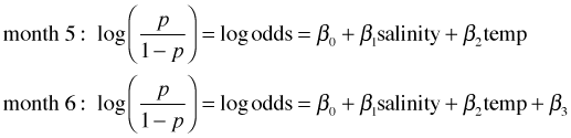
I subtract the log odds for month 5 from the log odds for month 6.
Exponentiating we have
![]()
A similar formula holds for the other dummy effects. Month 5 is always the baseline group. If we exponentiate a month coefficient we obtain an odds ratio that compares the odds of finding Solea solea in that month relative to month 5. Applying this to the model we find the following.
So, the odds of finding Solea solea in month 6 is six times the odds of finding it in month 5. This grows to 19 times in month 7 and 34 times in month 8. On the other hand in month 9 the odds of finding the sole present is only 15% of what it was in month 5.
We can construct Wald confidence intervals for the parameters and then exponentiate them to obtain confidence intervals for the odds ratios. The profile likelihood confidence intervals for the odds ratios are constructed below.
Notice that the confidence intervals for the odds ratios for the month comparisons are extremely wide indicating that this effect has not been very accurately measured in the model.
If we use R's anova function on a single logistic regression model it carries out sequential likelihood ratio tests testing the terms in the order they were entered in the model.
Model: binomial, link: logit
Response: Solea_solea
Terms added sequentially (first to last)
Df Deviance Resid. Df Resid. Dev P(>|Chi|)
NULL 64 87.492
salinity 1 18.932 63 68.560 1.355e-05
temperature 1 0.584 62 67.976 0.445
factor(month) 4 10.895 58 57.081 0.028
The column labeled "Deviance" contains the likelihood ratio statistics. Reading from the top down we see that when salinity is added to a model with only an intercept, the new model is a significant improvement over the old. Thus salinity is a significant predictor of presence-absence. If we then add temperature to a model that already has salinity in it we see that temperature is not significant. Finally when month treated as a factor is added to a model that already contains temperature and salinity, month is a significant predictor of presence-absence.
Based on the sequential likelihood ratio tests we might conclude that temperature is not important, but we've already seen from the summary table above that the Wald test for temperature indicates that its coefficient is significantly different from zero. Is this just a case of the likelihood ratio test and the Wald test disagreeing? No, it's a matter of context. The Wald test is a test of the "importance" of temperature given that salinity and factor(month) are already in the model. In the sequential likelihood ratio test above, the reference model was one that contained salinity, but not month. If we change the order the variables are entered into the model, the sequential likelihood ratio tests will change.
Model: binomial, link: logit
Response: Solea_solea
Terms added sequentially (first to last)
Df Deviance Resid. Df Resid. Dev P(>|Chi|)
NULL 64 87.492
salinity 1 18.932 63 68.560 1.355e-05
factor(month) 4 6.350 59 62.210 0.175
temperature 1 5.130 58 57.081 0.024
Now the Wald tests and the likelihood ratio test for temperature agree, but notice that our conclusion about month has changed. When month is added to a model containing only salinity month is not significant, but when temperature is in the model too then month becomes significant. This too agrees with the Wald test results. To convince ourselves that a model with month and temperature together is a better model, we can compare this model to a model with salinity and month (but no temperature) and a model with salinity and temperature (but no month) using AIC.
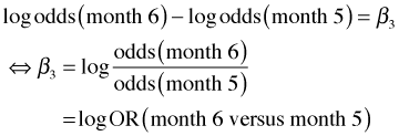
Fig. 5 Temperatures by month
The new models actually rank worse than a model with just salinity alone, but when month and temperature are present together with salinity the resulting model ranks better than a model with salinity alone.
If we examine the coefficient estimates of temperature and month in models where they occur alone (out3a and out3b) to a model in which they appear together (out2), we see that they change markedly. When the presence of one variable in a model affects our interpretation of another, we say that the first variable is a confounder of the second. The situation is slightly more complicated here in that both month and temperature are confounders of each other. Confounding is a common occurrence with observational data. When present it may indicate that a more complicated causal mechanism is present, but it could also mean that some important causal variable is missing from the analysis, one that is associated with temperature and month.
Not too surprisingly the variables temperature and month show a strong relationship with each other in these data.
plot(jitter(temperature)~jitter(month), xlab='month', data=solea, ylab='temperature')
Coefficient estimates from the model tell us that the odds of finding sole decrease with temperature. On the other hand the coefficients for the month categories tell us that the odds of finding sole are highest in the warmest months of the study, apparently contradicting the overall temperature results. The model results if taken literally mean that in each month there is a negative relationship with temperature (like the pattern shown for salinity in Fig. 3) but that the entire relationship is shifted up as we move from month 5 to 6 to 7 and to 8. Clearly these results requires additional investigation. The "month effect" may be a natural seasonality pattern that has little to do with temperature. The "temperature effect" could simply reflect nocturnal activity patterns if samples happened to be taken both at night and during the day.
Model comparison protocols such as significance testing and AIC allow us to rank models but tell us nothing about how good the final model is. If two models differ in AIC it will usually not be clear what the practical gains are in choosing the model with the lower AIC. For general model assessment we can carry out predictive simulation in which we use the model to generate pseudo-data to see whether the model is able to produce data that are similar to the data that were actually observed. (See lecture 7 for an example of doing this for a normal model and lecture 8 for a Poisson model.) With logistic regression there are many additional tools available for assessing model quality.
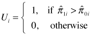
A common use of logistic regression is to classify new observations as successes or failures based on the values of their predictors. Because logistic regression estimates a probability (through the logit), we need to choose a cut-off value c such that if ![]() we classify the observation to be a success,
we classify the observation to be a success, ![]() , otherwise we classify it as a failure,
, otherwise we classify it as a failure, ![]() . Here
. Here ![]() is the probability estimated by the logistic regression model. Once we decide on a cut-off, the results can be organized into what's called a classification table (also called a confusion matrix). It records the number of observations that were correctly classified (true negatives and true positives) as well as the number of observations that were misclassified (false negatives and false positives). The fraction of true positives (out of the total number of observed positives) is called the sensitivity of the classification rule, while the fraction of true negatives (out of the total number of observed negatives) is called the specificity of the rule.
is the probability estimated by the logistic regression model. Once we decide on a cut-off, the results can be organized into what's called a classification table (also called a confusion matrix). It records the number of observations that were correctly classified (true negatives and true positives) as well as the number of observations that were misclassified (false negatives and false positives). The fraction of true positives (out of the total number of observed positives) is called the sensitivity of the classification rule, while the fraction of true negatives (out of the total number of observed negatives) is called the specificity of the rule.
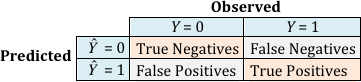
Fig. 6 Classification table for a logistic regression model
One obvious choice for a cut-off is c = 0.5. This essentially treats the false positives and false negatives as being equally bad. I use c = 0.5 as a cut-off and obtain the classification table for a logistic regression model with salinity as the only predictor, out1, and the classification table for a logistic regression model with salinity, temperature, and factor(month) as predictors, out2. The R output is arranged to match what is shown in Fig. 6. (The vector out1$y that appears in the code contains the response, but I could just as well have used solea$Solea_solea here.)
The two models return the same number of true negatives and false positives. They differ in how they classify the positives (locations where Solea solea was found to be present). The more complicated model has three fewer false negatives than does the simpler model.
One problem with using a classification table to compare models is that we have to specify a choice for the cut-off c. Choosing a value other than c = 0.5 means you're willing to treat one misclassification error as being more important than the other. It's ordinarily the case that the conclusions will change when a different choice is made for c. The standard way around this is to use all possible cut-offs c simultaneously by generating what's called a ROC curve. ROC stands for "receiver operating characteristic" and is a concept derived from signal detection theory. In a ROC curve we plot a model's true positive rate (TPR), the number of observations correctly classified positive divided by the observed number of positives, against its false positive rate (FPR), the number of observations incorrectly classified as positive divided by the observed number of negatives. This is a plot of sensitivity versus 1 – specificity. Even though c is not plotted directly, its presence is implicit in the plot and it varies continuously from 0 to 1.
There are many ways to produce a ROC curve in R. I've chosen to use functions from the ROCR package. The ROCR package is not part of the standard R installation and so it must first be downloaded from the CRAN site on the web. Various functions in the ROCR package can be used to draw ROC curves. The process begins by creating what's called a prediction object. For this the prediction function in the ROCR package should be supplied with the fitted values from the model and a vector of presence/absence information.
The performance function is then used to extract the statistics of interest from the prediction object. For a ROC curve we need 'tpr', the true positive rate, and 'fpr', the false positive rate.
If you print the contents of the performance object perf1 you'll see that the elements occupy locations called "slots" and the elements of the slots are actually list elements. The ROCR package is written using the conventions of the S4 language. All of the functions we've dealt with in the course up until this point were written using the S3 language. A major difference manifests itself in the way we need to access information from S4 objects. For instance, the names function no longer lists the list components of the object created by the function. Instead we need to use the slotNames function.
The slotNames function returns the names of the slots. To access the elements of the slots of an S4 object you need to use R's @ notation. I examine each component in turn.
From the printout we see the slots are called @x.values, @y.values, and @alpha.values referring respectively to "False positive rate", "True positive rate", and "Cutoff". The cut-off begins at 1 (denoted Inf in the output) and decreases to zero. The FPR and TPR at the reported cut-offs are shown. The only cut-offs that are displayed are those that correspond to a change in the confusion matrix.
To access the individual elements of the slots you need to use R's @ notation and then to extract the list elements of each slot you need to use the double bracket notation. For example, to access the false positive rates we need to specify the following.
perf1@x.values[[1]]
I obtain the false positive rate and true positive rate of the more complicated model, out2, and then generate the ROC curves for both models.
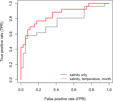 |
| Fig. 8 ROC curves from two logistic regression models |
The cut-off c = 1 corresponds to the bottom left corner of the graph while c = 0 corresponds to the top right corner of the graph. A ROC curve that lies near the 45° line corresponds to a model that is no better than random guessing. Better models have ROC curves that are closer to the left and top edges of the unit square. If one curve always lies above or to the left of another, then the model that generated that curve is the better model in a classification sense. If the ROC curves of models cross then the ranking can be ambiguous depending on the choice of c. In Fig. 8 we see that out2, the model that corresponds to the red curve, does as well as or better than out1 everywhere except in one place in the top right corner of the plot. It turns out that this reversal occurs approximately with the cut-off c = 0.2.
Even though the ROC curves of these two models do reverse themselves briefly, it would be reasonable to conclude that out2, the more complicated model, does an overall better job of classifying observations. In other cases the situation could be far more ambiguous. Typically the ROC curves of different models will cross repeatedly making it difficult to say which model is best. A solution to this problem lies in the observation that better models have ROC curves that are closer to the left and top edges of the unit square. Put another way, the area under a ROC curve for a good model should be close to 1 (the area of the unit square). So, the area under the ROC curve (AUC) is a useful single number summary for comparing the ROC curves of different models. Although the ROC curves may cross, the ROC curve of the better model will enclose on average a greater area.
AUC can also be given a probabilistic interpretation. Suppose we have a data set in which the presence-absence variable consists of n1 ones and n0 zeros. Imagine constructing all possible n1 × n0 pairs of zeros and ones. Define the random variable Ui as follows.
Here ![]() and
and ![]() are the estimated probabilities (obtained from the logistic regression model) for the "presence" and "absence" observations in the ith pair. Thus Ui = 1 if the model assigns a higher probability to the current "presence" observation than it does to the current absence observation of the pair. When this happens the observations are said to be concordant, i.e., the ranking based on the model matches the data. From this we can calculate the concordance index of the model.
are the estimated probabilities (obtained from the logistic regression model) for the "presence" and "absence" observations in the ith pair. Thus Ui = 1 if the model assigns a higher probability to the current "presence" observation than it does to the current absence observation of the pair. When this happens the observations are said to be concordant, i.e., the ranking based on the model matches the data. From this we can calculate the concordance index of the model.
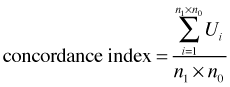
It turns out the concordance index is equal to the AUC. Thus the AUC can be interpreted as giving the fraction of 0-1 pairs correctly classified by the model. If AUC = 0.5 then our model is doing no better than random guessing.
The ROCR package can be used to obtain AUC. We can extract the AUC from a predict object using the performance function and specifying 'auc' as the desired statistic.
From the output we see that the AUC value is stored in the @y.values slot.
The AUC for model out2, 0.859 exceeds that of model out1, 0.795, suggesting that out2 is the better model in terms of its ability to correctly classify observations.
| Jack Weiss Phone: (919) 962-5930 E-Mail: jack_weiss@unc.edu Address: Curriculum for the Environment and Ecology, Box 3275, University of North Carolina, Chapel Hill, 27599 Copyright © 2012 Last Revised--February 14, 2012 URL: https://sakai.unc.edu/access/content/group/2842013b-58f5-4453-aa8d-3e01bacbfc3d/public/Ecol562_Spring2012/docs/lectures/lecture14.htm |