In lecture 5 we saw that our final regression model for richness yielded nonsensical predictions. Using the predicted means for the observations and the assumed normal distribution of the response the model predicted negative richness values with a high probability for at least some observations. To get a better sense of why this is happening we next construct a 3-dimensional graph that clearly demonstrates the relationship of the regression model to the probability model. To make the construction of the graph easier I use a simpler regression model than our final model, one that relates richness to NAP but does not include the effect of week.
The three-dimensional picture that we'll generate will show the regression line lying in the x-y plane. At various points along this line we'll draw the corresponding normal distribution for the response. Each curve is centered on the regression line with the z-axis defining the normal probability density at that point.
We start by calculating the predicted normal means at four different values of the predictor NAP. For this we use the predict function (used previously in lecture 5) with the newdata argument. In the newdata argument we specify values for all of the predictors appearing in the regression model. The new values have to be organized in the form of a data frame created here with the data.frame function.
Next we construct a vector of richness values at which to evaluate the normal density function. The seq function generates a vector of equally spaced values over a specified range. The call below creates a vector that begins at –10 and ends at 20 in which each value is separated by a distance of 0.10. This calculation produces 301 different values. To determine the number of elements in a vector one can use the length function.
Next we use the dnorm function to calculate the probability density at each of the values specified in the vector y1. The three arguments of dnorm are the value at which to compute the density, the mean of the normal distribution, and the standard deviation of the normal distribution. We carry out this calculation separately for each of the four predicted means. The standard deviation is stored in the $sigma component of the object created by the summary function when applied to a regression model.
Finally we need a vector of the individual x-values that correspond to the values of NAP used to predict the normal mean. These are the same for each normal mean so we use the rep function to create a vector of repeated values of the same length as the y1 vector.
The individual vectors of x-, y-, and z-values are then concatenated together to produce single x-, y-, and z-vectors. The y-vector is just the y1 vector copied four times.
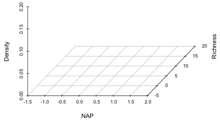
Next load the scatterplot3d package. This package is not part of the standard R installation so it first needs to be downloaded from the CRAN site. The first three arguments of the scatterplot3d function are the x-, y-, and z-coordinates of the points to be plotted. The call below specifies limits for the three axes (these were determined by first using the function without specifying limits) and labels for the three axes. The option type='n' is used so that no points are actually displayed in the graph and box=FALSE is used to prevent a default box from being drawn around the plot.
|
|
| Fig. 1 Axes and labels set up by the scatterplot3d function. | |
The scatterplot3d function is unusual in that its return values are functions that can then be used to add additional features to a plot. A function is needed here because the scatterplot3d function represents a three-dimensional figure as a parallel projection and we need the formulas that were used to map three-dimensional coordinates on a projected two-dimensional space. Using the names function on the object created by scatterplot3d reveals the names of the functions that are returned.
To use these functions we have to specify the object name, here q1, followed by a dollar sign as part of the function name. Notice that the scatterplot3d function doesn't rotate the y-axis label and place it next to the axis. We can do this ourselves but in order to proceed we need to know the coordinates of the projected values at the location where we want to place the label. In Fig. 1 it appears the location (2.4, 5, 0) might work for the y-axis label. The xyz.convert function component returned by scatterplot3d will calculate the projected 2-D coordinates of this location.
$y
[1] 0.8888889
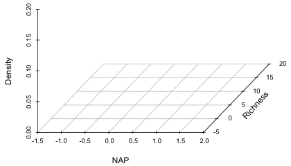
To redo the graph without the y-axis label, the ylab argument should be set to an empty string, so that nothing is displayed: ylab=' '. Depending on the size of your graphics window the "20" tick mark label on the y-axis may have been truncated. By default R clips all text to the plot region of the graph. We can cause it to clip to the entire figure region instead by changing the setting of the global graphics parameter xpd to xpd=T.
Next the text function is used to place the axis label at the desired location. To rotate the text we need to set the global string rotation parameter to a nonzero angle with the srt argument and then add the text at the projected coordinates. Trial and error suggested that 48 degrees was a good choice. The text function arguments are the x- and y-coordinates first, followed by the text to be displayed in quotes, followed by any additional graphics parameters that control how the text is to be displayed.
 |
|
| Fig. 2 Adding a rotated text label to the y-axis. | |
After adding the text the global graphics parameters need to be set back to their default values.
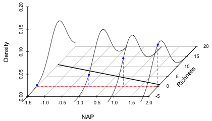
The points3d function is used to add four normal curves to the plot at the coordinates calculated earlier. Specifying type='l', where 'l' denotes line, causes the points to be connected with line segments. As was the case with the xyz.convert function, the name of the scatterplot3d object that contains these functions makes up part of the name of the function, here q1$points3d.
Next we draw the regression line in the xy-plane. A vector of the four different NAP values cooresponds to the x-coordinates and a vector of zeros corresponds to the z-coordinates. The y-coordinates are contained in the previously created vector mu. These are are then connected with thick line segments, lwd=2, again using the points3d function.
To indicate the zero boundary for richness in the xy-plane, we add a dashed red line at y = 0.
Finally to make it clear that some of the normal curves are extending past y = 0, we can drop a perpendicular form the normal curve at y = 0 down onto the xy-plane. The dnorm function is used to calculate the density at y = 0 at each of the four means and the points3d function with type='h', where 'h' denotes height, is used to drop a perpendicular to the xy-plane.
Fig. 3 shows the finished graph. Observe that three of the normal curves clearly extend past y = 0 into the region of negative richness. The curve at NAP = 2 shows that the probability of obtaining a negative value there under the model is quite large.
 |
|
| Fig. 3 Graph of the regression line along with the predicted normal distributions of the response at four different values of NAP. The plot shows that the probability of obtaining a negative value for richness increases as the value of NAP increases. | |
Fig. 3 shows one actual problem and one potential problem with the model. The potential problem is that at NAP values that are only slightly larger than what are displayed in the graph, the regression line is going to cross the x-axis and predict negative values for the mean richness of a site. (We saw in lecture 5 that this actually happens for the more complicated model that included an interaction of NAP and week.) The reason this problem arises is because of the way we've chosen to set up the regression model. The current model is
![]()
and because the estimate of β1 is not zero, this line will eventually cross the x-axis (NAP-axis) at some point. For some data sets this might occur only for impossible values of x or at values of x that are beyond the range of the data, so in these cases the problem doesn't arise. In the current data set we are not so lucky. Fortunately there is an easy fix: we need to model an appropriate function of the mean rather than the mean itself. For example if we were to fit the regression equation
![]()
to the data, then we would obtain the following equation for μ.
![]()
Because the exponential function is never negative we can never get negative predictions for the mean and the problem is solved! The function of the mean that appears in the regression equation is called a link function and here we are using a log link function. In the original equation where we model the mean directly the link function is called the identity link. We'll make use of link functions extensively in this course.
The other problem revealed in Fig. 3 is that the normal probability model that we're using, when viewed as a data-generating mechanism, can generate negative values for richness. Now if the purpose of the model is to describe only the data that we collected then this is not a problem. But if we want to view the model as a description of nature and to use it to predict richness for values of NAP that were not actually observed, then this model is seriously deficient. Fortunately, there is a fix for this too. We need to abandon the normal probability distribution as a model for the response and choose instead a probability model that can only take on non-negative values and is more appropriate for describing count data. We tackle this problem next.
In order to fit regression models to response variables drawn from probability distributions other than the normal distribution, we need to find an alternative to least squares for parameter estimation. Least squares is extremely popular because it's easy to understand, easy to implement, and has good properties. In ordinary linear regression,
![]()
and our goal is to fit a line to a scatter plot. ε denotes the observed deviation from that line. The method of least squares obtains values for β0 and β1 that minimize the sum of the squared deviations about that line.
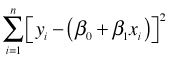
The quantity being minimized is called the objective function. The standard tools of calculus can be used to minimize this objective function analytically and there exist well-defined algorithms for finding solutions numerically in both linear and nonlinear settings. Least squares makes no assumption about the underlying probability model for the response. Typically, a normal model is assumed for ε (and hence for y), but this is tacked on at the end and is not formally part of the least squares solution.
A normal probability model is a natural choice for least squares because the basic formulation involving squared deviations requires that the errors are symmetrically disposed about the regression surface. Symmetry is also a characteristic of the normal distribution. For asymmetric probability models least squares solutions don't make much sense. In some of the alternatives to least squares the probability model is incorporated directly into the objective function at the beginning, rather than tacking it on at the end as an afterthought. Two such approaches are maximum likelihood estimation and Bayesian estimation. In this course we'll consider only maximum likelihood estimation.
In maximum likelihood estimation the probability model for the data takes center stage and is used to define a quantity called the likelihood. For discrete data the likelihood has a very simple interpretation. When the parameters of the probability model are given specific values, the likelihood is the probability of obtaining the data we actually obtained. To motivate this interpretation I start with a generic example.
Suppose we obtain a random sample of size m from a target population. For each element in our sample we measure some quantity of interest. In a regression setting this quantity would typically be called the response variable. Denote this quantity by the symbol X. Statistically we think of each observation in our random sample as being an independent random draw from the target population. Accordingly X is called a random variable to reflect the fact that its value is uncertain and its realized value is a function of its distribution in the underlying population. So, before we observe the different values of X in our sample we can think of those values as corresponding to m random variables, X1, X2, ... , Xm, one for each potential observation in our sample. It's conventional to use a capital letter such as X to denote a random variable and a lower case letter x to denote an observed value of that random variable. Following this convention (X1, X2, ... , Xm) represents the set of all the possible samples of size m that could be drawn from the population while (x1, x2, ... , xm) represents the specific random sample that was actually obtained.
What is the probability of obtaining this particular random sample? Formally we would write the probability as
![]()
This is an example of a joint probability, the probability of simultaneously observing all m events. Another way of writing this is as follows.
Because we have a random sample, each of the individual events is independent of the others. From elementary probability theory, if events A and B are independent then it follows that
![]()
Applying this to our data we have
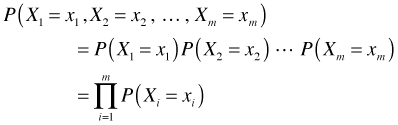
where the capital Π symbol denotes a product (just as a capital Σ denotes a sum). The next step is to choose a probability model for P(Xi = xi), a process that we'll begin next time.
| Jack Weiss Phone: (919) 962-5930 E-Mail: jack_weiss@unc.edu Address: Curriculum for the Environment and Ecology, Box 3275, University of North Carolina, Chapel Hill, 27599 Copyright © 2012 Last Revised--Jan 30, 2012 URL: https://sakai.unc.edu/access/content/group/2842013b-58f5-4453-aa8d-3e01bacbfc3d/public/Ecol562_Spring2012/docs/lectures/lecture7.htm |