Today we look at some other graphical displays to summarize regression results. One popular choice is an error bar graph in which parameter estimates plus some measure of their precision, a standard error or a 95% confidence interval, are displayed. A 95% confidence interval contains likely values for the parameter and can be used to carry out a hypothesis test that H0: β = b, for some fixed value b, typically zero. Pairs of 95% confidence intervals are not useful for testing whether two different parameter estimates are equal because the tests they yield are too conservative: they fail to reject the null hypothesis too often. An adjustment to the confidence level can be made that does allow the use of confidence intervals for this purpose, a topic we'll explore in lecture 6.
To illustrate we'll construct error bar graphs for the slopes and intercepts of the NAP × week interaction model we fit last time to the rikz data set. I begin by refitting this model.
Because the estimates and standard errors of the slopes and intercepts for all four weeks are not part of the standard regression output, we first explore various methods to obtain them.
Recall from matrix algebra that the dot product of two vectors is obtained by multiplying the corresponding entries together and then adding.
![]()
The interaction regression model fit last time can also be written as a vector dot product.

To obtain the slopes for different weeks we need to choose values for the dummy regressors and then sum the coefficients of NAP. This is equivalent to forming a different dot product for each week.
slope week 1:
slope week 2:
slope week 3:
slope week 4:
In general each of these sums is a vector dot product of the form ![]() where c is a vector of zeros and ones and x is the vector of coefficient estimates, coef(mod3). A vector dot product can also be written as matrix multiplication where the first vector is treated as a row matrix (a matrix with a single row) and the second vector is treated as a column matrix (a matrix with a single column). Because the convention in matrix algebra is to treat vectors as column matrices, row vectors are written as transposed vectors.
where c is a vector of zeros and ones and x is the vector of coefficient estimates, coef(mod3). A vector dot product can also be written as matrix multiplication where the first vector is treated as a row matrix (a matrix with a single row) and the second vector is treated as a column matrix (a matrix with a single column). Because the convention in matrix algebra is to treat vectors as column matrices, row vectors are written as transposed vectors.
![]()
In our example the first vector, c, is used to select the appropriate coefficients depending on the week and can be written as a function with that tests the value of week.
The matrix multiplication operator in R is %*%. R isn't pedantic about treating vectors as column matrices so we don't need to explicitly transpose the first vector when calculating the dot product as a matrix product.
Notice that R reports the result as a 1 × 1 matrix. The drop function can be used to delete the displayed dimensions of this object.
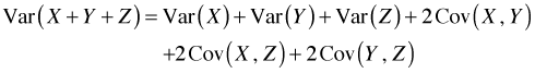
To obtain the standard errors of the slopes and intercepts in different weeks we need to appeal to some basic results from elementary probability theory. If X and Y are two random variables then the variance of their sum is the sum of their individual variances plus two times their covariance.
![]()
(For independent random variables the covariance is zero and the variance of their sum is the sum of their variances.) With three random variables the variance of a sum formula is more complicated.
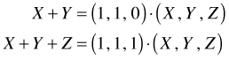
Fortunately there is a simple formula that underlies these seemingly different results. The original sum can be written as a dot product as was explained above. The two sums, X + Y and X + Y + Z, can be written as dot products as follows.
In general then any sum of random variables can be written as a vector dot product of the form ![]() where c is a vector of zeros and ones and x is a vector of random variables. When the sum is written in the form
where c is a vector of zeros and ones and x is a vector of random variables. When the sum is written in the form ![]() , the formula for the variance of a sum of random variables can be written as follows.
, the formula for the variance of a sum of random variables can be written as follows.
![]()
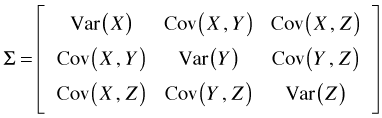
The expression ![]() is an example of a mathematical object called a quadratic form and Σ is the variance-covariance matrix of the elements of x. For our three variable example the variance-covariance matrix is organized as shown below.
is an example of a mathematical object called a quadratic form and Σ is the variance-covariance matrix of the elements of x. For our three variable example the variance-covariance matrix is organized as shown below.
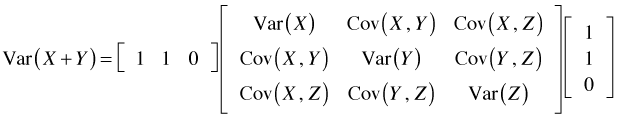
So in this case Var(X + Y) could be computed as follows.
The vcov function of R can be used to extract the variance-covariance matrix of the regression coefficients from an lm object and then construct a quadratic form whose square root is the desired standard error. For example, here is how we can use these formulas to calculate the estimates of the slopes and their standard errors for weeks 2, 3, and 4.
As we saw last time, the dummy variable parameterization used for factor(week) hardwires a number of statistical tests into the regression output. For instance, in the interaction model the parameter estimates of β5, β6, and β7 can be used to test whether the slopes in weeks 2, 3, and 4 respectively are different from the slope in week 1 (the reference group). To obtain tests of other comparisons we would need to choose a different reference group and refit the model. Alternatively we can use the output from the model we've fit to carry out these tests as is demonstrated next.
For example, suppose we want to test if the slope in week 3 is different from the slope in week 2. According to our regression model the two slopes are parameterized as follows.
From R the point estimate of this difference and its standard error are the following.
To test whether this difference is equal to zero we take the ratio of the estimate to its standard error and compare it to a t-statistic with degrees of freedom equal to the residual degrees of freedom of the model. Since this ratio is negative, the p-value of the statistic is
where pt is the cumulative probability distribution function for a t-distribution. Because the p-value is large we conclude that the slopes in weeks 2 and 3 are not different. More generally we can disregard the sign of the test statistic and use absolute values to calculate the p-value as follows.
For each probability distribution in R there are four basic probability functions available. A probability function begins with one of four prefixes—d, p, q, or r—followed by a root name that identifies the probability distribution. For the normal distribution the root name is "norm". For the t-distribution the root name is "t". Thus the t-distribution probability functions are dt, pt, qt, and rt. The meaning attached to the prefixes is as follows.
The long-hand R notation for the interaction model we've been fitting is the following.
richness ~ 1 + NAP + factor(week) + NAP:factor(week)
The intercept, denoted by a 1, is always included so it doesn't have to be explicitly specified. We are allowed to remove it though. When there is a factor variable in the model, removing the intercept causes R to estimate a parameter for each level of the factor. Similarly when there is an interaction between a continuous variable and a factor, removing the continuous variable term from the model causes R to estimate an interaction coefficient for each level of the factor variable. To remove NAP from the model we just leave it out of the formula. To remove the intercept we have to do so explicitly by subtracting it off.
Residuals:
Min 1Q Median 3Q Max
-6.3022 -0.9442 -0.2946 0.3383 7.7103
Coefficients:
Estimate Std. Error t value Pr(>|t|)
factor(week)1 11.4056 0.7773 14.673 < 2e-16 ***
factor(week)2 3.3653 0.7136 4.716 3.38e-05 ***
factor(week)3 5.0341 0.6784 7.421 7.85e-09 ***
factor(week)4 12.7828 1.3989 9.138 5.05e-11 ***
factor(week)1:NAP -1.9002 0.8700 -2.184 0.03537 *
factor(week)2:NAP -1.4746 0.7055 -2.090 0.04353 *
factor(week)3:NAP -1.9136 0.5743 -3.332 0.00197 **
factor(week)4:NAP -8.9002 1.4456 -6.157 3.85e-07 ***
---
Signif. codes: 0 ‘***’ 0.001 ‘**’ 0.01 ‘*’ 0.05 ‘.’ 0.1 ‘ ’ 1
Residual standard error: 2.442 on 37 degrees of freedom
Multiple R-squared: 0.9138, Adjusted R-squared: 0.8951
F-statistic: 49 on 8 and 37 DF, p-value: < 2.2e-16
This is the same model we fit before, just parameterized differently so that now we get the estimates for each week. In the new parameterization the first four lines test whether individual intercepts are equal to zero, while the last four lines test whether individual slopes are equal to zero. If we compare the estimate of the slope in week 2 and its reported standard error in the table to what we obtained previously we see that they match.
We next display the point estimates of the slopes for each week along with 95% confidence intervals for those estimates in an error bar plot. We can calculate the confidence intervals by hand or use the R confint function on the model mod3a, the re-parameterized version of mod3. The default is to calculate 95% confidence intervals.
The confidence intervals for the slopes are in rows 5 through 8. The point estimates can be extracted from the lm object with the coef function where we see that the slopes occupy positions 5 through 8.
I begin by collecting the information needed to create the error bar plot in a single data frame using the data.frame function. We are allowed to name the elements as we assemble them.
I use the names function to rename columns 2 and 3 and I add a week identifier as an additional column.
The general strategy with base graphics is to create a minimal plot using a higher-level graphics command, and then add to that plot using lower level graphics commands building up the graph incrementally with multiple function calls. I generally use the first higher-level graphics command to set up axis limits and labels but use lower-level graphics commands to plot the points. I want the error bars to be horizontal so I set up the formula using week as the y-variable and est as the x-variable.
The plot function uses the values of the observations specified in the formula to set up limits on the x- and y-axes. Because the error bars will extend beyond the estimates, we will need to specify the x-limits explicitly ourselves. The xlim argument expects a two-element vector giving the minimum and maximum values for the limits on the x-axis. I use the range function of R to calculate these limits from the confidence interval columns. I also use the xlab and ylab arguments to specify names for the axes.
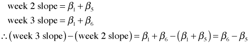
The labeling on the y-axis is not ideal (Fig. 1a). Because week is a numerical variable, the plot function treats it as continuous, displaying a decimal point as well as secondary tick marks. To override this we need to set up the axes ourselves. I add two additional arguments: type = 'n' and axes = F.
The axis functions are used to add axes to a plot. The first argument of axis is the desired axis. The axes are numbered 1 (bottom), 2 (left), 3 (top), and 4 (right). If you want to use default settings for the axis just enter the number and nothing more. To specify locations and labels for tick marks, add the at= and labels= arguments. I use the default settings for the x-axis, but I specify my own locations for the tick marks on the y-axis.
The box function with no arguments connects the axes and draws a box around the graph (Fig. 1b).
(a) 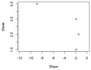 |
(b) 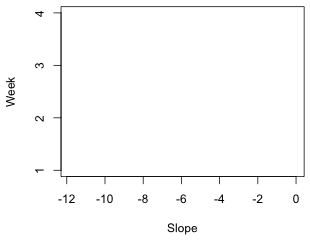 |
| Fig. 1 (a) Default axes treating the variable week as continuous. (b) Customized axes treating week as categorical | |
With the limits and labels for the graph set up we're ready to add points and line segments. I start by drawing the error bars using the segments function. The syntax for segments is segments(x1,y1,x2,y2) where (x1, y1) and (x2, y2) are the two endpoints of the line segment to be drawn. I draw line segments from the lower 95% limits to the upper 95% limits. The segments function works with vectors so I give it entire columns from the data frame. The segments function does not have a data argument so I have to specify the data frame name as part of the variable name. I include the lwd argument to make the segments thicker than normal (the default setting is lwd=1) and color them 'gray70' which is 70% of the way from black to white.
The default setting when drawing lines is to given them rounded tips. These tips are added to the end of the line segments and have the effect of making the 95% confidence intervals appear wider than they should. A better choice here is "butted" which draws a straight edge exactly at the end of the line. This choice is controlled by the lend argument of the par function. The par function assigns values to global graphics parameters. The default setting is par(lend=0) whereas to get butted we need par(lend=1). In order for this to have an effect I have to issue the par command before I use the segments function, so I need to first redraw the graph.
(a)  |
(b)  |
| Fig. 2 Error bars with (a) round ends and (b) butted ends | |
Finally I use the points function to add the point estimates on top of the error bars. I use it twice, first to draw a filled white circle, pch=16 and col='white', and second to give the white circle a black circumference, pch=1. I use the cex argument to control the size of the plotted points. The default value is cex=1.
Next I add a vertical line at x = 0 with the abline function so that we can visually assess whether a given confidence interval includes the value 0.
We can add grid lines, if desired, with the grid function.
The arguments nx and ny denote the number of grid lines perpendicular to the x- and y-axes respectively. If we specify nx=NA we get no grid lines. If we specify nx=NULL we get grid lines at the tick marks. I redo the entire graph drawing the grid lines first so they don't overwrite what has already been plotted.
The final result appears in Fig. 3. Observe that none of the 95% confidence intervals include 0. This is consistent with the summary table for this model that we saw earlier. The reported p-values for the four hypothesis tests for the slopes all are less than .05.
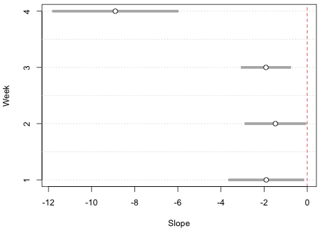
Fig. 3 Final error bar graph for the slopes using base graphics
Lattice graphs are generated with a single line of code. Each lattice plotting function has a default panel function that controls the features that will be displayed in the graph. If you want additional features beyond the default you need to construct your own panel function like we did in lecture 3. The panel function must identify everything that is to be plotted including what you would otherwise get by default. When you write your own panel function it doesn't really matter what basic lattice plot function you use because the default panel function for that plot function is not used. Panel functions are begun with the keyword panel=function(x,y) followed by a pair of curly braces { }. Special lattice panel graphing functions are then listed on separate lines within the curly braces. Each panel graphing function adds a specific feature to the graph. Typically the names of these functions begin with the word "panel" followed by the operation they are to perform, e.g., panel.xyplot, panel.abline, panel.points, etc., although recently lattice has been moving away from this convention.
Each of the functions we used to draw the graph using base graphics has a lattice panel function equivalent. The lattice call shown below uses a panel function and plots the point estimates with panel.points, adds a vertical line at 0 with panel.abline, adds the 95% confidence intervals with panel.segments, and draws grid lines with panel.dotplot. The xlim argument is needed to make enough room for the error bars. It uses the minimum value of the lower 95% intervals and the maximum of the 95% confidence intervals to define the plot range. I then subtract and add .5 to these values to increase this range a little bit. The x and y that appear in the declaration of the panel function correspond to the x and y-variables in the original dotplot call, in this case est and week respectively. Although I use the dotplot function as the main function call, I could just as well have used xyplot.
Fig. 4 shows the result.
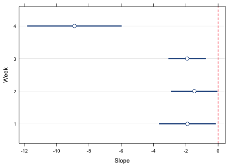
Fig. 4 Lattice graph with error bars (95% confidence intervals)
The primary use of the lattice package is to produce panel graphs, a set of graphs that repeat the same elements using different subsets of the data set that are selected according to the values of a conditioning variable. With lattice it is easy to produce side-by-side error bar plots for both the slopes and intercepts.
I collect the estimates and confidence intervals again, create a variable identifying the week, and add another variable that indicates if the observation corresponds to a slope or an intercept.
I use two variations of the rep function to create the week and parm variables.
To produce the desired lattice graph requires four modifications of the code we've already used.
I first produce a graph without using a prepanel function highlighting the changes that were made to the code from before (Fig. 5a).
The main new feature in this code is the use of the subscripts in the list of arguments of the panel function. When the panel function is called upon to draw a panel the variable subscripts indicates the value of parm (the variable that defines the panels) that is being used for the current panel. It takes the form of a Boolean vector of TRUEs and FALSEs. So, in the above code the expressions out.mod$low95[subscripts] and out.mod$up95[subscripts] extract a vector of lower 95% endpoints and a vector of upper 95% endpoints corresponding to the level of parm that is currently being plotted. This is the same role the arguments x and y have in the function. By default each time a panel is drawn the correct set of est and week values (the x and y variables) are selected. Because low95 and up95 were not part of the original function call we have to extract the correct set of observations for the panel ourselves explicitly.
Currently the xlim argument is overriding the scales argument and forcing the x-limits to be the same in both panels. If we remove it then the scales argument kicks in but now the error bars are truncated because the x-limits in the panels are controlled by the variables that appear in the formula week~est|parm rather than the confidence limits low95 and up95 (Fig. 5b).
(a) 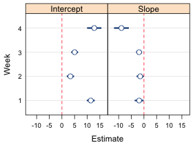 |
(b) 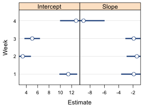 |
| Fig. 5 Panel graph using (a) the xlim argument which causes the x-limits to be the same in both panels, and (b) the scales argument and x='free'. In (b) the x-limits are different in each panel but the error bars are truncated because the x-limits are chosen using the point estimates rather than the confidence limits. | |
The way to get the limits right is to write a prepanel function. According to the documentation on lattice,"The prepanel function is responsible for determining a minimal rectangle big enough to contain the graphical encoding of a given packet." (Sarkar, 2008, p. 140) The function we need here is quite simple. It takes the same arguments as the panel function plus additionally the lower and upper confidence limit variables, denoted in the function as lx and ux. The use of ... as an argument in the prepanel function is so that any additional arguments are passed to the prepanel function if they are needed when the function is called. The main body of the function uses the range function to obtain the minimum and maximum values of the confidence limits for the panel currently being plotted and stores them as the variable xlim which it then returns to the plotting function.
To use it we need to specify a prepanel argument set equal to this function and also define the variables lx and ux, the arguments of the prepanel function. This produces the desired plot (Fig. 6).
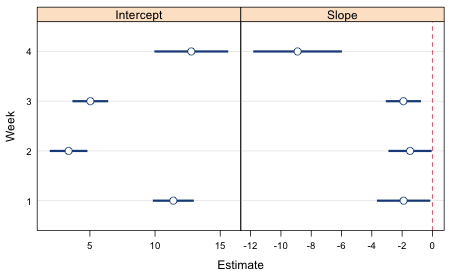
Fig. 6 Lattice graph with error bars (95% confidence intervals) for slopes and intercepts
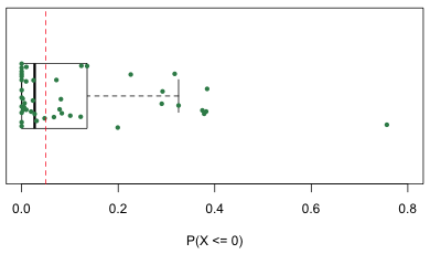
Using the predict function we can obtain the mean response as predicted by the regression model for each observation in the data set.
Observation 24 is predicted to have a negative mean richness, an impossible value. But things are even worse than this. As was explained in lecture 4 once we assume a probability distribution for the response the regression model becomes a data-generating mechanism. In ordinary regression the probability distribution used is normal with a mean given by the regression model and a standard deviation estimated from the mean squared error of the model, stored in summary(mod3)$sigma. Using a normal distribution with this mean and standard deviation we can calculate the probability that the observed response is predicted to take on any set of values. Species richness is an inherently non-negative quantity so if our model is any good, negative values should be nearly impossible to obtain. We can check this by calculating the probability of a negative value using the predicted mean for each observation in the data set. A function call of the form pnorm(0, mu, sigma) returns the P(X ≤ 0) if X has a normal distribution with mean mu and standard deviation sigma.
For one observation, the one with a predicted negative mean, this probability is 0.76! To get a better sense of how severe the problem is I generate a box plot of the probabilities using the R boxplot function. Because there are only 45 observations I also superimpose the individual values on top of the box plot jittering them vertically to minimize overlap. I orient the box plot horizontally, horizontal=T, and turn off display of the outliers using outline=F so that they don't get plotted twice. The points function then plots the data on top of the box plot. Numerically the y-coordinate of the midline of the box plot is y = 1 so I use the rep function to generate 45 values of one to serve as the y-coordinates of the probabilities. The a= argument in jitter controls the absolute amount of the jitter.
 |
|
| Fig. 7 Box plot of the probabilities of obtaining a negative value according to the regression model. | |
A vertical line is placed at a probability of .05. Observe that for many observations the probability of obtaining a negative richness value is not negligible (and is greater than .05).
Sarkar, Deepayan. 2008. Lattice: Multivariate Data Visualization with R. Springer, New York. UNC e-book
| Jack Weiss Phone: (919) 962-5930 E-Mail: jack_weiss@unc.edu Address: Curriculum of the Environment and Ecology, Box 3275, University of North Carolina, Chapel Hill, 27599 Copyright © 2012 Last Revised--Jan 23, 2012 URL: https://sakai.unc.edu/access/content/group/2842013b-58f5-4453-aa8d-3e01bacbfc3d/public/Ecol562_Spring2012/docs/lectures/lecture5.htm |