Binary data are a special case of binomial data when the number of trials for each observation is 1. As a result most (but not all) of what we discussed in lectures 26 through 28 on logistic regression applies here. Because binary data arise in many different kinds of applications, a number of model assessment tools have been developed specifically for binary data. To illustrate the fitting of logistic regression models to binary data I use a data set that appears in Chapter 21 of Crawley (2007). As is the case with much of the data used in his book, very little background information is given. All we are told is that the binary response denotes whether an individual organism is observed to be parasitized (infection = "present") or not (infection = "absent"). We are given additional information about the sex, weight, and age of the host, presumably. I'll assume that the goal is to determine the manner in which these variables affect the probability that a potential host is parasitized.
In logistic regression with binary data, the binary variable appears as the lone response variable in the formula argument of the glm function. There is no need for the cbind construction that we used with binomial data proper. The levels of the factor variable infection are "absent" and "present" and by default are ordered alphabetically. So, glm will model the log odds of infection being "present". I fit a logit model that is additive in sex and the continuous control variables, weight and age and examine the summary table.
Both sex and weight are statistically significant. The Wald test for age (a variables-added last test) would seem to indicate that with sex and weight already in the model, age is not statistically significant. Wald tests and likelihood ratio tests often disagree. I next drop age from the model and compare the two models with a likelihood ratio test.
Model 1: infection ~ sex + weight
Model 2: infection ~ sex + age + weight
Resid. Df Resid. Dev Df Deviance P(>|Chi|)
1 78 63.785
2 77 59.859 1 3.9268 0.04752 *
---
Signif. codes: 0 ‘***’ 0.001 ‘**’ 0.01 ‘*’ 0.05 ‘.’ 0.1 ‘ ’ 1
Contrary to the Wald test, the likelihood ratio test we allows us to conclude that age is statistically significant. Of course to argue that the difference between p = 0.047 and p = 0.062 has any substantive significance would be silly.
As with binomial data we can calculate an odds ratio for individual predictors by exponentiating their coefficients.
So we conclude that the odds of infection for males is 21% the odds of infection for females, the odds of infection increases by 1% for each one unit increment in age, and a unit increment in weight leads to an odds that is 80% of what it was.
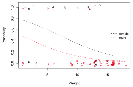
The notion of fitting a regression model to a response variable that consists solely of zeros and ones should seem rather strange. To better understand this I plot the regression model with the data. This can be done for the simpler model out2 that has a single continuous predictor weight and a categorical predictor sex. Because there are multiple observations with the same value of weight and infection, I jitter the data slightly both in the x-direction and the y-direction. The a= argument of jitter controls the absolute amount of jitter of the points.
The linear predictor of our model is a function of weight and sex.
I determine the range of weights for each sex and plot the logistic function separately for each sex over that range.
$male
[1] 1 18
|
| Fig. 1 Estimated probability of infection as a function of weight shown separately for males and females |
At every weight (i.e., controlling for weight) we see that the probability of infection is less for males than it is for females. This is essentially an analysis of covariance model. On a logit scale the curves shown in Fig. 1 would parallel; on a probability scale they are not because the inverse logit transformation is nonlinear. This is unavoidable in a model that assumes that weight has a monotonic effect on the probability of infection that is constrained to lie between 0 and 1.
It is imperative with any regression model to verify that a predictor has been entered in the model properly, i.e., to check that the response is truly proportional to the predictor (having controlled for the effects of the other predictors) or whether some other functional form is more appropriate. With ordinary regression this usually involves examining residuals, plotting them against the predictors, and determining if there still remains a systematic pattern. Checking the linearity assumption is perhaps even more important with logistic regression because we typically don't have an intuitive sense of how a predictor should vary with a logit. Unfortunately the residuals from logistic regression are not especially useful for this.
The default residual returned by glm is called a deviance residual. This is the signed contribution of the current observation to the model's residual deviance. Another choice is the Pearson residual—the signed square root of that observation's contribution to the Pearson statistic, i.e., the Pearson deviance. Fig. 2 shows both of these residuals for the analysis of covariance model plotted against age with a lowess curve superimposed.
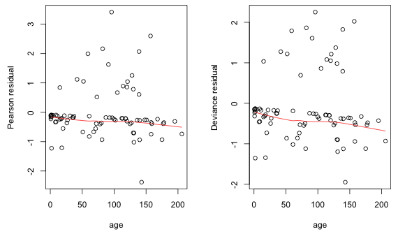
Fig. 2 Residual plots (Pearson and deviance residuals) against age
The pattern shown in Fig. 2 is typical for logistic regression with binary data. One generally gets two bands of points: one band corresponds to the zeros (and consists of negative residuals) and the second band corresponds to the ones (and consists of positive residuals). If the regression coefficient of the variable plotted on the x-axis is positive the bands show a decline from left to right. So we get the negative trend exhibited by the lowess curve in Fig. 2. This occurs because of the S-shaped logistic curve—it is closer to the zero observations on the left but becomes closer to the ones on the right. Because of all of the spurious patterns going on in these residual plots, they don't shed much light on regressor mis-specification.
A good alternative to residual plots is to fit a generalized additive model (GAM) to the data and then examine the form of the functions of the predictors it estimates. A generalized additive model replaces the linear regression model with a sum of nonparametric smoothers. GAMs are stand-alone models and so can be used as a replacement for generalized linear models. I view GAMs as exploratory tools and generally will use them to help suggest a parametric form when biological theory is not very helpful. I will even occasionally include a nonparametric smooth in a model in an attempt to account for a complicated correlation structure. But as a general rule I avoid them because they make it too easy to overfit data. Some recent textbook introductions to generalized additive models are Wood (2006) and Keele (2008). Some authors who often use GAMs as their primary source of inference are Zuur et al. (2008).
For our logistic regression model, the analogous generalized additive model would be the following.
The functions f1 and f2 are nonparametric smooths and in the context of the model represent partial regression functions. We don't obtain explicit formulas for these smooths, but we can plot them and if we're fortunate we'll see that they can be approximated by a simple function whose parametric form we recognize and can then estimate. In R a number of packages can fit GAMs. I prefer the gam function in the mgcv package. The mgcv package is part of the standard installation of R and does not have to be specially downloaded. Here's how we would fit the generalized additive model shown above. The nonparametric smooths are obtained with the s function.
Family: binomial
Link function: logit
Formula:
infection ~ sex + s(age) + s(weight)
Parametric coefficients:
Estimate Std. Error z value Pr(>|z|)
(Intercept) -1.4763 0.5716 -2.583 0.0098 **
sexmale -1.3099 0.7279 -1.800 0.0719 .
---
Signif. codes: 0 ‘***’ 0.001 ‘**’ 0.01 ‘*’ 0.05 ‘.’ 0.1 ‘ ’ 1
Approximate significance of smooth terms:
edf Ref.df Chi.sq p-value
s(age) 2.150 2.715 6.663 0.06740 .
s(weight) 1.957 2.446 11.442 0.00548 **
---
Signif. codes: 0 ‘***’ 0.001 ‘**’ 0.01 ‘*’ 0.05 ‘.’ 0.1 ‘ ’ 1
R-sq.(adj) = 0.359 Deviance explained = 40.3%
UBRE score = -0.23574 Scale est. = 1 n = 81
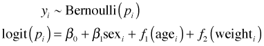
Useful information can be obtained from the column labeled edf (estimated degrees of freedom) in the table of the smooth terms. Values very different from 1 in this column indicate possible deviations from linearity. A better assessment is provided by plots of the smooths. These can be obtained by using the plot function on the model object. There are two smooths in this model so I arrange the graph window so that they appear side by side.
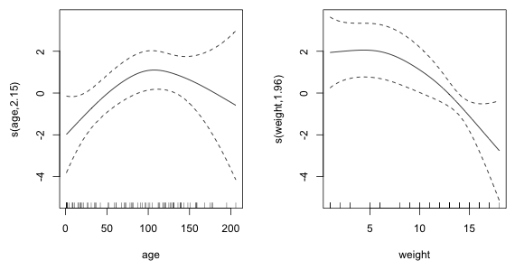
Fig. 3 Estimated nonparametric smooths from the generalized additive model
The smooth of age indicates that the true relationship between the logit and age (after controlling for sex and weight) might be quadratic. On the other hand the relationship with weight may be linear but perhaps not initially. It appears that for low weights the effect on the log odds is constant and positive but after passing a threshold value of weight the log odds begins to decreases at a constant rate with weight.
We can examine the plots individually by adding the select argument to the plot function and choosing by number which smooth to display. I plot the smooth of age and add a horizontal line at log odds = 0.
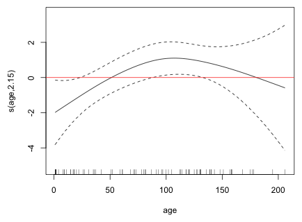
Fig. 4 Estimated nonparametric smooth for age
Places where the confidence bands enclose the horizontal line indicate age values where the overall pattern is not significant. From this we see that the initial positive linear trend is significant but the region where the trend turns back may not be. Thus evidence for the quadratic pattern is somewhat weak. The rug plot displayed at the bottom of the graph indicates that the downturn in the graph may be driven by only a few observations. Still I try adding a quadratic term to the model and test whether it's statistically significant.
To carry out arithmetic on model terms within the regression model itself requires the use of the I function, I for identity. Without the I function, R would ignore the arithmetic and just treat the term age as appearing in the model twice. An alternative to using the I function would be to create a variable that is the square of age in the data frame containing the data. After fitting the model I carry out a likelihood ratio test to test the need for the quadratic term and then examine the summary table of the model.
Model 1: infection ~ sex + age + weight
Model 2: infection ~ sex + age + weight + I(age^2)
Resid. Df Resid. Dev Df Deviance P(>|Chi|)
1 77 59.859
2 76 53.091 1 6.7672 0.009285 **
---
Signif. codes: 0 ‘***’ 0.001 ‘**’ 0.01 ‘*’ 0.05 ‘.’ 0.1 ‘ ’ 1
Both the likelihood ratio test and the Wald test agree that the quadratic term is statistically significant.
I next turn to the structural form of the predictor weight.
Fig. 5 Estimated nonparametric smooth for weight
The graph and the estimated degrees of freedom indicate a slight deviation from linearity. The graph suggests that there may be two regions where weight has different effects: an initial region in which the logit is constant with respect to weight followed by a second region in which the logit is decreasing. A simple parametric model that displays such a pattern is a breakpoint (segmented) regression model. This is a model that consists of two separate linear pieces that meet at the breakpoint. Define
This is called a linear spline. A breakpoint regression model for the mean that resembles the graph in Fig. 5 is the following.
![]()
Based on the graph a value of c = 6 might be appropriate. A breakpoint regression model for weight that also includes sex and quadratic age can be fit in R as follows.
Deviance Residuals:
Min 1Q Median 3Q Max
-1.8685 -0.4735 -0.2044 -0.0422 2.4295
Coefficients:
Estimate Std. Error z value Pr(>|z|)
(Intercept) -2.2951147 1.4048274 -1.634 0.102315
sexmale -1.4591063 0.7601672 -1.919 0.054927 .
age 0.0824861 0.0355678 2.319 0.020388 *
I(age^2) -0.0003886 0.0001951 -1.992 0.046404 *
I((weight >= c) * (weight - c)) -0.3592856 0.1044614 -3.439 0.000583 ***
---
Signif. codes: 0 ‘***’ 0.001 ‘**’ 0.01 ‘*’ 0.05 ‘.’ 0.1 ‘ ’ 1
(Dispersion parameter for binomial family taken to be 1)
Null deviance: 83.234 on 80 degrees of freedom
Residual deviance: 50.001 on 76 degrees of freedom
AIC: 60.001
Number of Fisher Scoring iterations: 6
The reported AIC of 60.001 is not correct because it doesn't account for c which we estimated ourselves by inspecting the graph. We should add 2 to the reported AIC to account for this.
The AIC of the breakpoint regression model indicates that this model is a slight improvement over the linear weight model that we fit above. I graph the estimated breakpoint model for weight in Fig. 6 (using sex = 0 and age = 0).
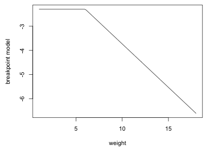
Fig. 6 Estimated breakpoint model with breakpoint c = 6
We selected c = 6 by inspection but there may be a better choice for the breakpoint. To investigate this systematically I write a function that for a given c fits the model and returns the log-likelihood of the model. The only candidates for c that can affect the likelihood are the values of weight that occur in the data set.
The following function fits the breakpoint regression model and returns the log-likelihood.
I sapply this function on the vector of potential breakpoints.
[,1] [,2] [,3] [,4] [,5] [,6] [,7]
[1,] 1.00000 2.00000 3.00000 5.00000 6.00000 8.00000 9.00000
[2,] -26.54572 -26.33032 -26.22076 -25.42467 -25.00047 -24.80258 -25.05273
[,8] [,9] [,10] [,11] [,12] [,13] [,14]
[1,] 10.00000 11.00000 12.00000 13.00000 14.00000 15.00000 16.00000
[2,] -24.99888 -25.05888 -24.34345 -25.87872 -25.79176 -28.55724 -32.57559
[,15] [,16]
[1,] 17.00000 18.00000
[2,] -32.78470 -32.84746
The warning messages indicate that there was complete or quasi-complete separation when fitting one or more of the models. The largest log-likelihood was achieved using a breakpoint of c = 12. It's useful to plot the log-likelihood as a function of c yielding what's called a profile log-likelihood.
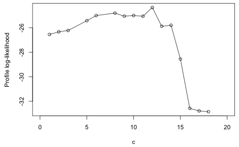
Fig. 7 Profile log-likelihood for the breakpoint
Based on the figure there are clearly quite a few values of c that yield roughly the same log-likelihood. I fit the breakpoint regression model with c = 12.
So, the logistic regression model with quadratic age and a breakpoint model for weight yields the lowest AIC.
The residual deviance of a binary regression model deserves special comment. The residual deviance is defined as being –2 times a difference in two log-likelihoods, the log-likelihood of the current model minus the log-likelihood of the saturated model. Observe that if we multiply the log-likelihood of the current model by –2 we obtain the residual deviance reported for the model
So, the deviance of the saturated model is apparently zero. This is always the case for binary data. A saturated model is one in which each observation gets its own parameter so that we fit the data perfectly. For binary data the likelihood takes the following form.
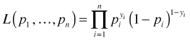
where yi for observation i is either 0 or 1, so only one of the two terms shown appears for a given observation. Typically we would model the individual pi as a function of predictors and a small set of parameters, but in the saturated model each observation gets a value of pi unconstrained by the rest of the data. In order to reproduce the observed values exactly we must assign pi = 1 if observation i is a success and pi = 0 if it's a failure. This yields a likelihood of one and hence a log-likelihood of zero.
The problem with using the residual deviance as a goodness of fit statistic for binary data is that we have no metric of "nearness" like we have for binomial data. The probabilistic argument that the residual deviance has an asymptotic chi-squared distribution applies to binomial (grouped binary) and Poisson data, but not to binary data. Its derivation requires that the number of parameters can be held fixed in the saturated model as the sample size is allowed to become infinite. With binary data as the sample size increases the number of parameters in the saturated model does also and the a limiting chi-squared distribution does not arise. Without a distribution to appeal to, the residual deviance is of no value in assessing model fit with binary data.
One popular use of logistic regression is to classify future observations as successes or failures based on measured characteristics. In addition to logistic regression there are many other ways to classify observations. Popular methods such as classification trees and support vector machines are inherently non-statistical and originated in the machine learning community. These newer approaches are not likelihood-based so they can't appeal to log-likelihood and AIC for model selection. Instead they rate models based on their classification accuracy, an approach that is called model calibration. Model calibration, for reasons that will be made clear below, is a good tool for assessing model performance, but is less useful as a way to select models. Model calibration methods can be used with logistic regression if we're willing to view our model as a way to classify observations as being either zeros or ones. If doing so does not make sense, then model calibration should not be used.
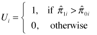
Because logistic regression estimates a probability, to classify observations we need to choose a cutoff value c such that if ![]() we classify the observation to be a success, otherwise we classify it as a failure. Here
we classify the observation to be a success, otherwise we classify it as a failure. Here ![]() is the probability estimated by the logistic regression model. For a given choice of c we can measure how well the logistic regression model predicts the data that went into fitting the model. A decision rule for classifying observations as zeros or ones using the cutoff c is the following.
is the probability estimated by the logistic regression model. For a given choice of c we can measure how well the logistic regression model predicts the data that went into fitting the model. A decision rule for classifying observations as zeros or ones using the cutoff c is the following.
Results obtained using such a decision rule can be organized into what's called a classification table (also called a confusion matrix). A generic version of a confusion matrix is shown in Fig. 8. Consistent with the conventions of model calibration ones are referred to as "positives" and zeros are referred to as "negatives".
Observed |
|||
| Yi = 0 | Yi = 1 | ||
Predicted |
True negatives |
False negatives |
|
False positives |
True positives |
||
Fig. 8 Confusion matrix for a classification rule with labeled cell outcomes
The diagonal entries correspond to observations that were classified correctly whereas the off-diagonal entries are misclassifications. False negatives are observations that were classified as zeros but turned out to be ones. False positives are observations that were classified as ones but turned out to be zeros. Fig. 9 repeats the confusion matrix of Fig. 8 but this time with numeric values populating the cells.
Observed |
||||
| Yi = 0 | Yi = 1 | |||
Predicted |
A |
C |
A+C |
|
B |
D |
B+D |
||
A+B |
C+D |
A+B+C+D |
||
Fig. 9 Confusion matrix for a classification rule with numeric cell frequencies
From the confusion matrix a number of quantities of interest can be defined. They include the following.
We encountered the terms sensitivity and specificity previously when discussing Bayes rule. The Wikipedia page for ROC curve lists many other statistics that are commonly calculated from a confusion matrix. Obtaining a confusion matrix from a logistic regression model and calculating specificity and sensitivity for a decision rule are easy to do in R. To construct the confusion matrix we just tabulate the predicted values that exceed a cutoff c against the observed 0 and 1 counts.
From this we can readily calculate the sensitivity and specificity.
We can collect these calculations in a function that returns the confusion matrix, sensitivity, and specificity for any choice of cutoff c.
[[2]]
specificity sensitivity
0.9375000 0.5294118
[[2]]
specificity sensitivity
0.8125000 0.8235294
There are problems with attempting to use a decision rule to evaluate the quality of logistic regression models.
If we think of specificity and sensitivity as functions of c, the cutoff, then a couple of things are obvious.
Based on these considerations we expect sensitivity to be a monotone non-increasing function of c, while specificity should be a monotone non-decreasing function of c.
Various functions in the ROCR package can be used to compute model sensitivity and specificity as well as plot them as a function of c. The process begins by creating what's called a prediction object. To do this the prediction function in the ROCR package is supplied the fitted values from the model and a vector of presence/absence information.
Having constructed the prediction object the performance function is then used to extract the statistics of interest. To obtain sensitivity and specificity, respectively, we need to specify 'tpr', for true positive rate, and 'tnr', for true negative rate.
If you print the contents of the performance object just created, stats1, you'll see that the elements occupy locations called "slots" and the elements of the slots are actually list elements. The ROCR package is written using the conventions of the S4 language. Other than the functions from the lme4 package, all of the functions we've dealt with in the course up until this point were written using the S3 language. A major difference in the two languages manifests itself in the way we have to access information from objects. For instance, the names function will not list the components of an object created by an S4 function. To see what's going on we instead need to use the slotNames and str functions.
The slotNames function returns the names of the slots and the str function (str for structure) describes what the slots contain. From the printout we see the numeric slots are called @x.values, @y.values, and @alpha.values referring respectively to "True negative rate", "True positive rate", and "Cutoff". Furthermore we see that these last three elements are lists. To access the elements of slots you need to use R's @ notation and then to extract the list elements from each slot you need to use double bracket notation. So to access, for example, the vector of cutoffs we would need to specify the following.
The displayed cutoffs are all the choices of c for which there has been some change in the assignment of observations to the cells of the confusion matrix. Notice that the first cutoff is labeled as infinite. I change that value to 1.
The following code plots specificity and sensitivity against the cutoffs. I use type='s' to obtain a step function (because the confusion matrix does not change except at the reported values of c).
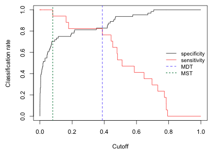
Fig. 10 Plot of model sensitivity and specificity for various cutoffs
The value of c where the sensitivity and specificity functions cross is the value of c that jointly maximizes sensitivity and specificity. This is sometimes called the minimized difference threshold or MDT (Jiménez-Valverde and Lobo 2007). We can estimate this value of c approximately as the value of c that minimizes the absolute difference between the sensitivity and specificity curves. I use the which.min function to identify where in the vector of absolute differences the minimum occurs.
When we add this value to the graph (Fig. 10) we see that it's not selecting the exact location of the crossing point but the value does correspond to a c where the two step functions are the closest.
[[2]]
specificity sensitivity
0.8281250 0.8235294
Using the MDT we see from the confusion matrix that we misclassified 3 actual infections as being absent (false negatives), and we classified 11 individuals as being parasitized when in fact they're not (false positives).
Another commonly used criterion for choosing the cutoff c is MST (maximized sum threshold), the threshold value that maximizes the sum of specificity and sensitivity. We can estimate this from the sensitivity and specificity values by using the which.max function.
A plot of the sum of specificity and sensitivity suggests that there may be a number of cutoffs that do nearly as well.
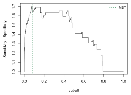
Fig. 11 Plot of the sum of sensitivity and specificity for various cutoffs
I generate the confusion matrix associated with the MST.
[[2]]
specificity sensitivity
0.703125 1.000000
So with this choice we have no false negatives but we mistakenly classify 19 individuals as being parasitized when in fact they are not.
We can avoid the loss of information that results from dichotomizing a probability with a single cutoff value c by using all possible values of c simultaneously. The standard way to do this is with a ROC curve. ROC stands for "receiver operating characteristic" and is a concept derived from signal detection theory. It's early use was in assessing the quality of radar operators who were faced with the task of differentiating noise from signals, and friend from foe.
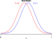
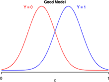
Suppose logistic regression is used to construct a habitat suitability model in which the goal is to distinguish good habitat from bad habitat for a species of interest. Effectively the model takes what appears to be a single population of data values and divides it statistically into two populations: one representing good habitats and the other bad habitats. Fig. 12 is a caricature of such a habitat suitability model and is a graphical representation of the confusion matrix of three different models. Each panel depicts the model-generated probability distributions of good and bad habitat as a function of c, the cut-off value of our decision rule. The closer the two bell-shaped curves are to each other, the more "confused" we are as to what constitutes good and bad habitat. Better models are those that completely separate the two populations so that the two curves have minimal overlap. In the panel labeled "great model" there is a value of c that allows us to distinguish the two populations almost perfectly.
 |
 |
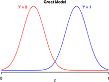 |
Fig. 12 Discriminating Y = 0 from Y =1
The ROC curve is used to display how changing c in the decision rule affects the TPR (true positive rate or sensitivity) and the FPR (false positive rate = 1 – specificity) of a given model. In the graph of the ROC curve all reference to c is suppressed. TPR is plotted directly against FPR.
To understand how the ROC curve is constructed, lets's focus on middle panel of Fig. 12, the so-called "good" model. Because the two depicted curves are probability densities, the area under each curve is one. In Fig. 13 things are color-coded to make it clear that TNR + FPR = 1 (red) and that TPR + FNR = 1 (blue). In addition, the color coding tells us that TNR and FPR depend solely on the Y = 0 distribution, while TPR and FNR depend solely on the Y = 1 distribution.
(a) 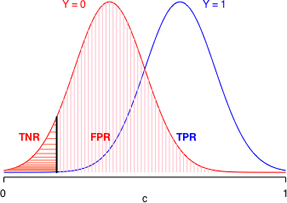 (b)
(b) 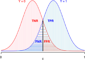
Fig. 13 The effect of changing c on model calibration statistics. The area under each curve is a probability.
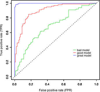
Fig. 14 ROC curves for the different models of Fig. 13
Using the relationships depicted in Fig. 13 we can construct the red ROC curve ("good model") shown in Fig. 14 as follows.
If you repeat the above steps for the models labeled "bad" and "great" in Fig. 14 you'll see that the only things that change are the relative rates at which the TPR and FPR decrease to zero. In the "bad" model they decrease at nearly the same rate. In the "great" model, the FPR decreases almost to zero long before the TPR even begins to decrease. The curves shown in Fig. 14 were artificially generated to match the displays of Fig. 13. As a result the ranking of the models in Fig. 14 is unambiguous. The ROC curve of the "great" model always lies entirely above the ROC curves of the "good" and "bad" models. With real data the results are almost always more ambiguous.
A number of functions in different R packages can be used to produce ROC curves. One of these is the ROCR package that we previously used to calculate sensitivity and specificity. To generate a ROC curve we need to extract the sensitivity ('tpr') and 1 – specificity, which is the same as the false positive rate 'fpr'. Again we use the performance function to obtain these statistics from the variable pred1 that was created above. If we then plot this performance object we get a ROC curve by default. ROC curves can be used to compare models. In Fig. 15 I display the ROC curve for out6 and superimpose on top of it the ROC curve for the model that is only additive in weight, age, and sex.
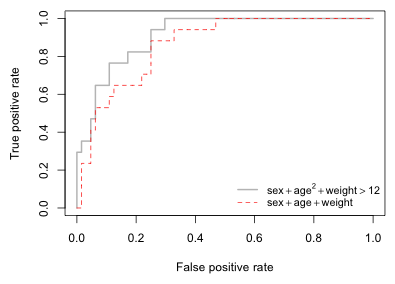
Fig. 15 The ROC curves of two different models
Fig. 15 is the typical pattern for the ROC curves of nested models. The bigger model performs as well as or better than the smaller model. In Fig. 15 the ROC curve of out6 (depicted in light gray) lies above the ROC curve of out1 (red dashed line) for nearly all choices of c. The models are distinguishable everywhere except for very small values of c (right side of the graph) where both models have a sensitivity of 1. This makes ranking the models easy.
Typically and especially when the models are not nested, the ranking of the ROC curves from different models will be less clear cut. It is normal for the ROC curves from different models to cross repeatedly making it difficult to say which model is best. A partial resolution of this difficulty lies in the following observation: better models have ROC curves that are closer to the left and top edges of the unit square (Fig. 14). Said differently the area under a ROC curve for a good model should be close to 1 (the area of the unit square). This suggests that the area under the ROC curve (AUC) might be a reasonable single number summary to use to compare the ROC curves of different models. Although the ROC curves of two models may cross each other, the ROC curve of the better model will on average enclose a greater area.
AUC can also be given an additional probabilistic interpretation. Suppose we have a data set in which a tabulation of the presence-absence variable yields n1 ones and n0 zeros. Imagine forming all possible n1 × n0 pairs of these ones and zeros. Define the random variable Ui as follows.
Here ![]() and
and ![]() are the estimated probabilities (obtained from the logistic regression model) for the "presence" and "absence" observations in the ith pair using the model. So for a given pair of observations Ui = 1 if the model assigns a higher probability to the "presence" observation than it does to the "absence" observation. When this happens the observations are said to be concordant, i.e., the ranking based on the model matches the ranking based on the data. From this we can calculate the concordance index of the model.
are the estimated probabilities (obtained from the logistic regression model) for the "presence" and "absence" observations in the ith pair using the model. So for a given pair of observations Ui = 1 if the model assigns a higher probability to the "presence" observation than it does to the "absence" observation. When this happens the observations are said to be concordant, i.e., the ranking based on the model matches the ranking based on the data. From this we can calculate the concordance index of the model.
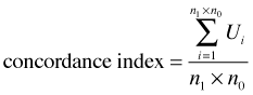
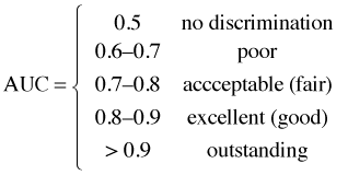
It turns out that the concordance index is equal to the AUC. Thus AUC can be interpreted as giving the fraction of 0-1 pairs that are correctly classified by the model. If AUC = 0.5 then our model is doing no better than random guessing. A fairly arbitrary scale for interpreting AUC values has been proposed to assist in model calibration.
Note: a wonderful online resource for visualizing ROC curves and their relationship to underlying population models is a site called The Magnificent ROC. Figures like those shown above can be found there along with applets that allow you to dynamically alter c in the decision rule and watch how the corresponding ROC curve changes.
To calculate AUC using the ROCR package we just use the keyword 'auc' as an argument to the performance function.
So for out6 we see that 91.3% of the possible pairwise matchings of zeros and ones are assigned probabilities of infection that are correctly ordered, i.e., the predicted probability of the zero observation is lower than the predicted probability of the "one" observation. If we use the model that is linear in age, sex, and weight this percentage drops to 86.3%.
One concern about the calibration statistics described so far is that the same data set is being used to both fit the model and test the model. Not surprisingly the values of the statistics one obtains in this way are much more favorable towards the current model than they would be if we evaluated the model on a brand new set of data. In particular we'd expect a statistic such as AUC to be much smaller when calculated on data that are different from those that were used to fit the model.
A natural way to handle this problem is to leave out some of the data when fitting the model and use it later to test the model. The dilemma is that we want to use as much of the data as possible to build the model and we'd prefer not to leave out any data at all. A satisfactory resolution of the dilemma is to do cross-validation. In cross-validation a data set is repeatedly divided into parts and one part is used to fit the model while the other part is used to test the model. A popular way of doing this is with 10-fold cross-validation. Here the data set is randomly divided into 10 parts, called folds. Nine of the folds are combined and used for fitting the model and the remaining fold is used for testing the model. This is then repeated a total of 10 times so that each fold gets to be used once for testing. At each iteration a statistic of interest is calculated. Finally the statistics calculated from the different folds are averaged over the 10 runs.
The cv.binary function in the DAAG package carries out 10-fold cross-validation on a specified model.
It reports what it calls an "estimate of accuracy". This is just the fraction of predicted probabilities that round to the observed value of 0 or 1. In terms of a decision rule this is equivalent to using c = 0.5 as a cut-off. Here's how we would calculate the estimate of accuracy by hand for out6.
The partition into folds is random so we will get slightly different results each time we run the cross-validation. In the output above we see that the cross-validation estimate is fairly close, albeit smaller, to the estimate that is obtained when the same data are used to build and test the model. In the output the cv.binary function calls the latter value the internal estimate of accuracy. Notice that out6 appears to exhibit a greater loss of performance than does out1 suggesting that perhaps we may have been guilty of overfitting in constructing out6. On the other hand the breakpoint c = 12 is being held fixed in these calculations and this may be contributing to the poorer performance of this model in cross-validation.
It would be easy to edit the code of cv.binary to force it to perform cross-validation using a different model performance statistic such as AUC. To see the code of the cv.binary function enter the function name cv.binary at the command line without any arguments and press the return key.
A compact collection of all the R code displayed in this document appears here.
| Jack Weiss Phone: (919) 962-5930 E-Mail: jack_weiss@unc.edu Address: Curriculum for the Environment and Ecology, Box 3275, University of North Carolina, Chapel Hill, 27599 Copyright © 2012 Last Revised--December 6, 2012 URL: https://sakai.unc.edu/access/content/group/3d1eb92e-7848-4f55-90c3-7c72a54e7e43/public/docs/lectures/lecture29.htm |