A repeated measures design is just a split plot design where the whole plot unit is an individual and the split plot units are the measurements on that individual at specific times. Thus the analysis of repeated measures designs require no new ideas. Consider the following illustration of a repeated measures design that appears as an exercise in Zar (1999), p. 301. He describes the data set as follows.
Four male and four female turtles had their plasma protein measured (mg/ml) while they were well fed and after ten and 20 days of fasting. Determine the effect of sex and diet on plasma protein levels.
The variable treat denotes the three time measurements: 0, 10, and 20 days of fasting at which point plasma protein levels were measured for individual turtles. Thus treat is a variable that changes within turtles and is a function of the measurement occasion. Sex on the other hand is a characteristic of the turtle (subject) and does not change during the course of the experiment but does vary between turtles. The data are clearly heterogeneous. We have multiple measurements (three each) on the same turtle as well as measurements on different turtles. Using our test for structured data we see that if we were to misclassify the sex of a turtle it would in turn affect the three observations made on that turtle, not a single observation. Thus we don't have a fully crossed design.
Using the language of split plot designs we would call subject (turtle) the whole plot unit and the measurement occasion the split plot unit. In a similar vein sex is the whole plot treatment (it only varies at the whole plot level) and treat is the split plot treatment where the "treatment" per se is the length of time since the turtle was last fed. A parallel language has grown up around repeated measures designs that tends to get used instead split plot and whole plot. Typically split plot treatments are referred to as within-subject treatments whereas the whole plot treatments are referred to as between-subject treatments.
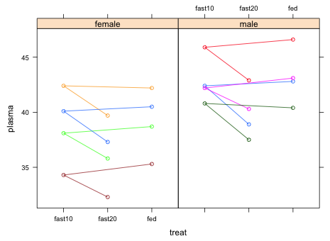
We begin by producing a plot that elucidates the structure of the data set. I use the lattice package in which I plot plasma protein levels against treat conditional on the sex of the turtle. To ensure that the split plot structure is apparent in the graph I group the observations by subject.
|
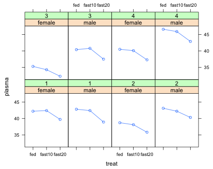
| Fig. 1 Panel graph of turtle plasma protein levels at the three levels of treat stratified by sex |
The saw tooth pattern in the graph is because the data occur in the data frame in natural time order: fed, fast10, fast20 but R created the levels of the factor variable treat in alphabetical order. The alphabetical order is what is shown on the x-axis. We should change the order of the levels of the treat variable so that they match the time order of the experiment.
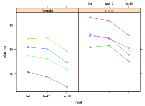 |
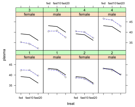
| Fig. 2 Panel graph of turtle plasma protein levels over time stratified by sex |
What can we conclude from Fig. 2?
I analyze this experiment using a mixed effects model. In the mixed effects model I identify the whole plot unit as the grouping variable. There is only a single grouping variable in this experiment unlike the split split plot with blocks design we considered in lecture 10 where there were three grouping variables and four levels to the experiment. The variable subject identifies the whole plot units.
Note: A split plot design is just a randomized block design in which we happen to have a variable measured at the block level. So, we set up the model using lme, just like we did for a randomized block design, with subject denoting the block in the design part of the model signified by the key word random: random=~1|block. We then include the whole plot treatment sex in the treatment part of the model and interact it with the split plot treatment treat.
Because the data are totally balanced we can also fit this model using the aov function. The variable subject is the only variable that needs to appear in the Error term of aov because there are only two levels to the hierarchy and it's unnecessary to specify the lowest level. The levels of subject are recorded as numbers, not character values. The aov function uses the variables that appear in the Error term to construct interactions that it then uses as error terms in the various ANOVA subtables. Therefore we must explicitly declare subject to be a factor otherwise aov will treat it as a continuous variable. It is unnecessary to to do this in random argument of lme (although it doesn't hurt).
Error: Within
Df Sum Sq Mean Sq F value Pr(>F)
treat 2 45.58 22.788 168.97 1.63e-09 ***
treat:sex 2 0.27 0.136 1.01 0.393
Residuals 12 1.62 0.135
---
Signif. codes: 0 ‘***’ 0.001 ‘**’ 0.01 ‘*’ 0.05 ‘.’ 0.1 ‘ ’ 1
The aov and lme function yield identical results except that the aov function separates the within-subject analysis from the between-subject analysis. Using either analysis we would conclude that the interaction between sex and treat is not significant. I try refitting the model with only the main effects of sex and treat.
So, using the α = .05 criterion we would conclude that the effect of sex is not statistically significant, although it's close. This is a bit surprising given the fairly marked effect we see in Fig. 2 but it may be that we just don't have enough data.
Although repeated measures designs are split plot designs, ordered observations coming from the same individual tend to have a different correlation structure than do non-temporal data. This can cause the F-tests being used here to not have an exact F-distribution. The assumption that is required to be able to analyze a repeated measures design as a split plot design is called the sphericity assumption. Under sphericity the split plot units are all equally correlated, a situation that is unlikely to hold when the split plot units are measurements over time. Violation of sphericity assumption usually results in F-tests that are too liberal, causing us to reject the null hypothesis of no effect too often. Because of the small sample size in the current data set the sphericity assumption is difficult to test.
We might consider refitting the model using the lme4 package and then using the mcmcsamp function to obtain posterior credible intervals for the parameters of the model. I carry out 10,000 simulations of MCMC and then obtain highest probability density credible intervals for the parameters.
$ST
lower upper
[1,] 0.3174893 1.239069
attr(,"Probability")
[1] 0.95
$sigma
lower upper
[1,] 1.025411 2.512222
attr(,"Probability")
[1] 0.95
The 95% credible interval for the effect of sex is (1.68, 6.29) and clearly does not include zero. So contrary to the frequentist results, the Bayesian results would lead us to conclude that the effect of sex on plasma protein levels is real with males having higher levels than females.
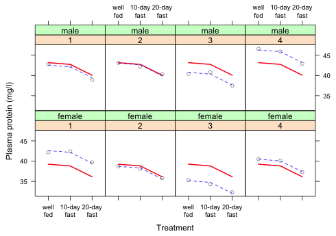
Because a repeated measures design is essentially a split plot design the same sort of graphical summaries we used for split plot designs will work here. One difference is that because one of the factors is time or at least time-ordered it should be placed on the x-axis so that the order is preserved. I produce two plots. The first displays the marginal means along with the underlying data. Displaying the data with the means rather than just the means plus confidence intervals is reasonable here because we have so little data. The second graph displays the predicted marginal means with the conditional means and is a useful way to assess the overall fit of the model.
Because the MCMC results found evidence for a sex effect I choose to display the additive model that includes both the effect of treat and sex on plasma protein levels. I start by generating the basic grouped data graph but do so with a panel function so that we can add the marginal means to the graph.
I next calculate the marginal means for each sex separately using the newdata argument of predict.
I next use a panel.lines function to draw the mean profiles for each sex. Because the sexes are being displayed in separate panels I need to select the correct means for the sex currently being plotted. In the function below I use the line
sex <- turtles$sex[subscripts][1]
This chooses the values for the sex vector that corresponds to the current panel and then selects only the first of them to yield a scalar. I then use a programming if...else statement to draw one mean profile if sex is 'male' and the other mean profile if sex is 'female'.
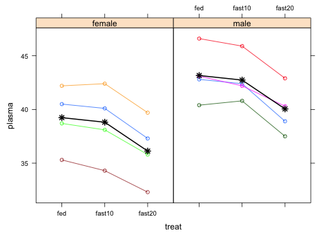 |
| Fig. 3 Adding the marginal means to a profile plot of the raw data |
The different colors of the individual turtle profiles are unnecessary and distracting so I redo the graph and make them all gray.
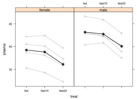 |
| Fig. 4 Repetition of Fig. 3 but without coloring the different subjects |
I start by obtaining the conditional means that can be calculated with the predict function without specifying the levels argument.
The predictions are the marginal means to which are added the individual turtle random effects. I wish to plot individual panels for each turtle organized by sex. For that I need a subject variable that has the same values for both sexes rather than 8 different values that we have now. For this I renumber turtles 5 through 8 so that they are instead numbered 1 through 4.
I start by plotting the basic graph without the treatment means using two conditioning variables, sex and subject2. The subject2 variable needs to be a factor in order to get useful labels, otherwise we get a thermometer display in each panel.
 |
| Fig. 5 Individual turtle data trajectories over time |
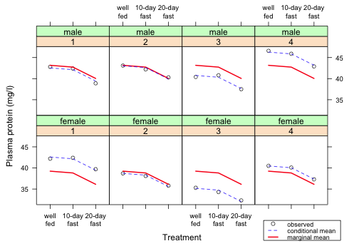
Next I display both the marginal and conditional means. For this I need a panel function. The marginal means can be plotted using the same if...else code we used before. To plot the conditional means I just add a new panel.lines statement.
 |
| Fig. 6 Individual turtle data trajectories over time with conditional and marginal means |
All we have left to do is make some cosmetic improvements to the graph.
To obtain two-line labels I use the R return code \n within the text string. This is the new line return code. It causes the characters of "well\nfed" to be split onto two lines: "well" and "fed". The fact that the back slash symbol identifies return codes in R is why we can't reference file directories on Windows with a single back slash character in the read.table function.
 |
| Fig. 7 Repetition of Fig. 6 but with improved labeling |
Next I add a legend to the graph. There's no room inside the panels so I place it outside the graph on the lower right side. To accomplish this I use a negative coordinate for y.
 |
| Fig. 8 Repetition of Fig. 7 but with a legend |
Finally I use the latticeExtra package to get panel labels on the left and on the top.
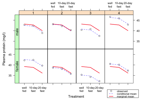 |
| Fig. 9 Final version of the graph |
The way to interpret this graph is that for each turtle the marginal mean profile is displaced up or down a random amount (the random turtle effect) to account for the variability among the individual turtles. We can see that the conditional means do a very good job of matching the observed plasma protein values of the individual turtles indicating that our model fits the data.
A nearly complete collection of all the R code displayed in this document appears here. Additional portions are here and here.
| Jack Weiss Phone: (919) 962-5930 E-Mail: jack_weiss@unc.edu Address: Curriculum for the Environment and Ecology, Box 3275, University of North Carolina, Chapel Hill, 27599 Copyright © 2012 Last Revised--October 12, 2012 URL: https://sakai.unc.edu/access/content/group/3d1eb92e-7848-4f55-90c3-7c72a54e7e43/public/docs/lectures/lecture11.htm |