 |
||
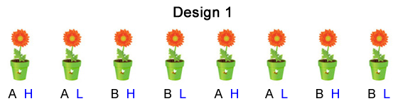
| Fig. 1 A completely randomized design (CRD) with two factors: factor 1 with levels A and B, factor 2 with levels H and L. | ||
Consider an experiment in which we wish to test the effects of two factors on the growth of plants: factor 1 with levels A and B and factor 2 with levels H and L. These two factors combined in all possible ways yield four treatments: AH, AL, BH, and BL. There are eight potted plants available for use as subjects in the experiment.
Fig. 1 shows one experimental design we could use, a completely randomized design (CRD). The four treatment combinations, AH, AL, BH, and BL, are randomly assigned to the eight plants so that each treatment combination is assigned to two plants.
|
||
| Fig. 1 A completely randomized design (CRD) with two factors: factor 1 with levels A and B, factor 2 with levels H and L. | ||
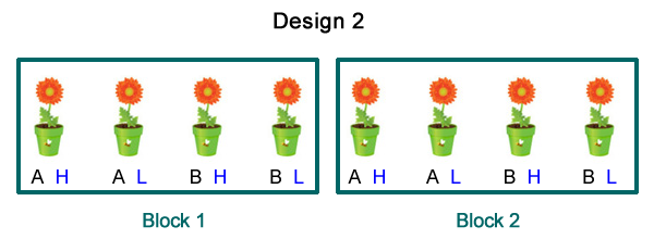
Suppose the potted plants were obtained from cuttings. Four cuttings have been obtained from one parent and four from another. Because we think that the genetics of the parent might affect the results we want to ensure that the progeny from a single parent receives all four treatments. This leads us to carry out a restricted randomization in which the four treatments are randomly assigned to the progeny from parent 1 and then separately randomly assigned to the progeny from parent 2. The result is a completely randomized block design (CRBD) in which the parent of the plants defines the blocks (Fig. 2).
 |
||
| Fig. 2 A completely randomized block design (RCBD) with two factors each with two levels. The four treatments resulting from all combinations of the factors were randomly assigned to plants separately by block. | ||
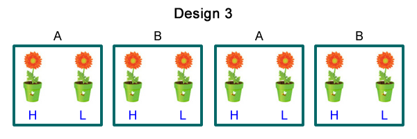
Suppose factor 1 is temperature with levels A and B. In order to control temperature we place the plants in terrariums but we only have four terrariums not the eight that would be necessary to use in either the completely randomized design or the completely randomized block design. We choose to place two plants in each terrarium. We then randomly assign one plant level H of factor 2 and the other plant level L of factor 2. Of the four terrariums two are randomly assigned level A of factor 1 and the other two terrariums are assigned level B of factor 1. Fig. 3 shows the resulting design.
 |
||
| Fig. 3 A split plot design with four whole plots (terrariums) with two split plots (plants) per terrarium. Factor 1 with levels A and B is the whole plot treatment while factor 2 with levels H and L is the split plot treatment. | ||
Design 3 is an example of what's called a split plot design. By definition an experimental unit is the object to which a treatment is randomly applied. What distinguishes the split plot design is that it has two different-sized experimental units each with its own randomization of treatments to experimental units. There is a set of larger units to which one of the factors is randomly assigned. The larger units in turn contains smaller units that are randomly assigned the second factor. Using the language of the split plot design we can describe Fig. 3 as follows.
Because of the different sample sizes that are available at each level of this design, the statistical power for finding a treatment effect is less for whole plot units than it is for split plot units. A proper statistical analysis of the split plot design should reflect this by using different degrees of freedom when testing whole plot treatments than when testing split plot treatments. In addition when assessing treatment effects at different levels our measure of the background variability should also be different. For split plots the background variability is the variability among plants. For the test of the whole plot treatments we have to account for variability among plants as well as variability among whole plots. The classical approach to analyzing a split plot design produces multiple ANOVA tables. For the split plot design in Fig. 3 we would have an ANOVA table for the whole plot factor and a second ANOVA table for testing the split plot factor and the interaction between the whole plot and split plot factors.
Split plot designs were originally developed in agriculture hence the use of the "plot" terminology. In agriculture there are often treatments such as irrigation or method of plowing that can only be applied to large fields. There are other treatments, such as fertilizer or seed type, that can be applied to much smaller fields. A split plot design can have any number of sizes of experimental units. As a result there are split plot designs (2 levels), split-split plot designs (3 levels), and more.
Split plot designs are commonly used in all sorts of biological applications and it's important that you be able to recognize them in your own research and in the research of others. If you analyze a split plot design as if it were a completely randomized design you will be claiming more power than you actually have for assessing the effect of the whole plot treatment. Said differently you would be claiming that you had a greater number of replications of the whole plot treatment than you actually did, a mistake that is called pseudoreplication (Hurlbert 1984). A good way to recognize a split plot design is to ask yourself the following question about the design. "If I were to make a mistake in the application of a single treatment to an experimental unit, how many observations would be affected?" If the answer to this question is more than one, you don't have a completely randomized design. For instance in Fig. 3 if a single application of a single level of factor 2 was messed up only a single potted plant would be affected. On the other hand if a single application of a level of factor 1 was messed up only a single terrarium would be affected but that would in turn lead to two observations (potted plants) being affected.
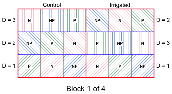
To illustrate the analysis of designs with different-sized experimental units I consider the case of a split-split plot design arranged in blocks. This example appears in Crawley (2002), p. 345. In a split-split plot design there are three different sizes of experimental units and three levels at which treatments are randomly applied.
Fig. 4 shows one of the four blocks from the experiment with the basic layout of the treatment applications.
 |
||
| Fig. 4 One block of the split-split plot design described in the text. The other three blocks (not shown) are replicates of the block shown here. | ||
In this design the “size” of the experimental unit varies, both the physical size of the units and the number of replicates there are for some treatments versus others. We have 2 × 3 × 3 = 18 treatment combinations replicated four times for a total of 72 experimental units. The first thing to recognize is that this is not a full factorial design with a single level of randomization. For instance, for this to be a factorial design we would need to have 72 fields to which the irrigation treatment was randomly applied (at one of its two levels), but we only have 8, two per block. Notice that if we were to mess up one application of the irrigation treatment it would affect nine experimental units, not just one. The bottom line is that if we were to analyze this as a factorial design pretending that n = 72 for the irrigation treatment when in fact n = 8, we would be guilty of pseudoreplication.
I read in the data from Crawley's web site. The first 12 lines of the file contain a portion of the results from the first block, block A.
Because block, irrigation, density, and fertilizer have character-labeled categories, they have all be converted to factors by R. The treatments are perfectly balanced in this experiment with four observations each.
high low medium
control 4 4 4
irrigated 4 4 4
, , = NP
high low medium
control 4 4 4
irrigated 4 4 4
, , = P
high low medium
control 4 4 4
irrigated 4 4 4
Because the treatments are balanced we can use the classical analysis of a split plot design. In the classical analysis the overall ANOVA table is decomposed into ANOVA subtables that test the treatments that are specific to that level using a measure of background variability that is specific to that level. Degrees of freedom for the reported F-tests are calculated using specific rules. The function in R that can be used to carry out the classical analysis of variance for a split plot design is the aov function. NB: the classical analysis is only appropriate if the treatments are perfectly balanced!
The main argument of aov is a regression formula that also includes a term that defines the plot structure of the design. The plots need to be listed in decreasing size starting with the whole plot unit. In the current design there is an additional structural variable, block, that contains pairs of whole plots so we start with that. The following specification correctly describes the current example.
The term Error(block/irrigation/density) describes the design structure. The first term block identifies the randomized block design, the four blocks that replicate the entire split plot design. The variable irrigation is a treatment but it also identifies the two different whole plot units within each block. Finally the variable density is the split plot treatment but it also identifies the three split plot units within each whole plot unit. To see the ANOVA tables produced by aov we need to use the summary function (not the anova function).
Error: block:irrigation
Df Sum Sq Mean Sq F value Pr(>F)
irrigation 1 8278 8278 17.59 0.0247 *
Residuals 3 1412 471
---
Signif. codes: 0 ‘***’ 0.001 ‘**’ 0.01 ‘*’ 0.05 ‘.’ 0.1 ‘ ’ 1
Error: block:irrigation:density
Df Sum Sq Mean Sq F value Pr(>F)
density 2 1758 879.2 3.784 0.0532 .
irrigation:density 2 2747 1373.5 5.912 0.0163 *
Residuals 12 2788 232.3
---
Signif. codes: 0 ‘***’ 0.001 ‘**’ 0.01 ‘*’ 0.05 ‘.’ 0.1 ‘ ’ 1
Error: Within
Df Sum Sq Mean Sq F value Pr(>F)
fertilizer 2 1977.4 988.7 11.449 0.000142 ***
irrigation:fertilizer 2 953.4 476.7 5.520 0.008108 **
density:fertilizer 4 304.9 76.2 0.883 0.484053
irrigation:density:fertilizer 4 234.7 58.7 0.680 0.610667
Residuals 36 3108.8 86.4
---
Signif. codes: 0 ‘***’ 0.001 ‘**’ 0.01 ‘*’ 0.05 ‘.’ 0.1 ‘ ’ 1
The aov function has broken the analysis up into three ANOVA tables corresponding to the three levels of the design. The whole plot analysis has the block sum of squares listed in a separate section. Notice that it doesn't have an F-statistic because there is no replication of treatments withing blocks and so no proper measure of error for blocks. Below I combine these two tables and add a Total line.
Df Sum Sq Mean Sq F value Pr(>F)
block
3 194.4 64.81
irrigation 1 8278 8278 17.59 0.0247 *
Residuals 3 1412 471
Total 7 9884
This is just the ANOVA table for an ordinary randomized blocks design. The reported residual sum of squares is actually the block × irrigation interaction term (because there is no replication of treatment within blocks to generate a real error term.) If we add up the listed degrees of freedom for block, whole plot treatment, and error we get 3 + 1 + 3 = 7 = 8 – 1, the number of whole plot replicates minus one. This is just the usual n – 1 degrees of freedom for the total sum of squares (the minus one corresponding to the overall mean).
The second ANOVA table is the split plot ANOVA table. The sum of the degrees of freedom in this table is 2 + 2 + 12 = 16 that when added to the 7 degrees of freedom from the whole plot analysis gives us 23 = 24 – 1 where 24 is the number of split plot replicates.
Df Sum Sq Mean Sq F value Pr(>F)
density 2 1758 879.2 3.784 0.0532 .
irrigation:density 2 2747 1373.5 5.912 0.0163 *
Residuals 12 2788 232.3
The last table is the split-split plot analysis. The total degrees of freedom shown in the table is 2 + 2 + 4 + 4 + 36 = 48. If we add to this the 16 degrees of freedom from the split plot analysis and the 7 degrees of freedom from the whole plot analysis we get 48 + 16 + 7 = 71 = 72 – 1 where 72 is the total number of plots in the analysis.
Df Sum Sq Mean Sq F value Pr(>F)
fertilizer 2 1977.4 988.7 11.449 0.000142 ***
irrigation:fertilizer 2 953.4 476.7 5.520 0.008108 **
density:fertilizer 4 304.9 76.2 0.883 0.484053
irrigation:density:fertilizer 4 234.7 58.7 0.680 0.610667
Residuals 36 3108.8 86.4
Based on the output there are significant interactions between irrigation and fertilizer as well as between irrigation and density, but not between density and fertilizer. We can try to confirm these results by producing crude interaction plots where we average over the remaining variables and blocks. First I redefine the order of the levels of the density variable to match their natural order.
To generate the plots with interaction.plot I use the with function to avoid having to specify the data frame with each variable. The with function effectively supplies a data argument for functions that don't have one.
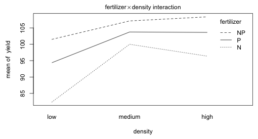
Fig. 5 Plot of the fertilizer × density two-factor interaction
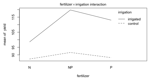
Fig. 6 Plot of the fertilizer × irrigation two-factor interaction
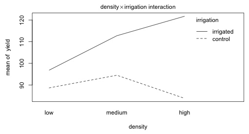
Fig. 7 Plot of the density × irrigation two-factor interaction
The fertilizer profiles for varying density levels in Fig. 5 are roughly parallel. The irrigation profiles for varying levels of fertilizer and for varying levels of density seem far from parallel.
If this had not been a randomized blocks design then we would have needed a variable that identifies the different whole plots. To illustrate such an analysis I first create a variable to identify the eight whole plots.
The plot variables are the new whole plot variable, wp, and the split plot variable within the whole plots that is identified by the levels of density. Thus the error term is specified as Error(factor(wp)/density. (Note: the aov function requires all categorical variables with numeric levels to be declared as factors wherever they appear in the model.) When we fit this model the only change in the output occurs in the first ANOVA table where we now have the analysis of a completely randomized design with n = 8 instead of a randomized block design.
Error: factor(wp):density
Df Sum Sq Mean Sq F value Pr(>F)
density 2 1758 879.2 3.784 0.0532 .
irrigation:density 2 2747 1373.5 5.912 0.0163 *
Residuals 12 2788 232.3
---
Signif. codes: 0 ‘***’ 0.001 ‘**’ 0.01 ‘*’ 0.05 ‘.’ 0.1 ‘ ’ 1
Error: Within
Df Sum Sq Mean Sq F value Pr(>F)
fertilizer 2 1977.4 988.7 11.449 0.000142 ***
irrigation:fertilizer 2 953.4 476.7 5.520 0.008108 **
density:fertilizer 4 304.9 76.2 0.883 0.484053
irrigation:density:fertilizer 4 234.7 58.7 0.680 0.610667
Residuals 36 3108.8 86.4
---
Signif. codes: 0 ‘***’ 0.001 ‘**’ 0.01 ‘*’ 0.05 ‘.’ 0.1 ‘ ’ 1
A major limitation of the aov function and the classical approach to analyzing split plot designs is that it is restricted to perfectly balanced data. If there is any imbalance either by design or due to attrition the sum of squares decomposition of the classical approach breaks down. A more flexible approach that yields the correct analysis with balanced data but also works with unbalanced data is to estimate things using a mixed effects model. Each level of the split plot hierarchy (except the first) gets assigned its own random effect. In the current problem where we have split plots nested in whole plots nested in blocks we end up with three sets of random effects for the three levels of this hierarchy.
For observation l from split plot k in whole plot j of block i we can write down the following expression for the yield yijk.
![]()
where
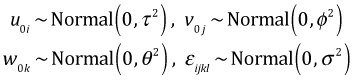
The term μijk is the cell mean, shorthand notation for the treatment structure of the model. Here the treatment structure includes an intercept, the main effects of fertilizer, density, and irrigation, the three two-factor interactions between them, and their three-factor interaction. u0i is the random block effect, v0j is the random whole plot effect, w0k is the random split plot effect, and εijkl is the random error.
To fit this model using the nlme package we can write the grouping variable using the same notation that was used in aov for expressing the nesting of the levels. So we write the following: random = ~1|block/irrigation/density. The ANOVA table is identical to what we obtained with aov except that it is not organized as a series of subtables corresponding to the different levels of the design.
Notice how the reported denominator degrees of freedom (denDF) changes for the different variables depending on the level of the variable (whole plot, split plot, or split split plot). This indicates that we've specified the model correctly. The same notation for the grouping variable works when fitting the model using the lme4 package.
When fitting these models I sometimes find it easier to think in terms of variables that uniquely define the individual structural units rather than to use the nesting of the treatments to define grouping levels. Below I create variables that identify the whole plot and split plot units in terms of the set of treatments that they receive.
For the nlme package regardless of whether we use unique identifiers for each level or nested levels that only identify a unique level when we also reference its containing unit, the exact same nested notation will work when fitting the model.
For the lme4 package when the units at the different levels are uniquely identified we need to split them into individual terms.
I drop the non-significant three-factor interaction and the two-factor interaction between density and fertilizer.
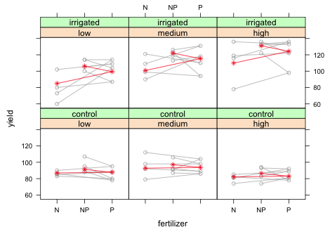
Because our data set is small it makes sense to display all of the data along with the summary statistics for the model. With small data sets displaying only error bars for the means tends to obfuscate rather than explicate things (Magnusson 2000, Donahue 2010). I start by plotting the yield against density separately by fertilizer and irrigation in a panel graph. I place the density variable on the x-axis because density is ordinal and we should take advantage of that order. I use a groups argument to include the results from different blocks in the same panel. I add type='o' so that the observations from the same block but at different densities are connected by line segments.
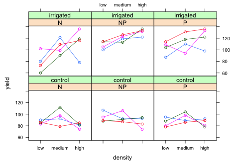 |
| Fig. 8 Panel graph showing the raw data from the split-split design with blocks. |
To add the predicted means to this graph we will need to write our own panel function. To that end I first write a simple panel function that duplicates the graph of Fig. 8. I remove the colors for the groups because there is no need to identify the individual blocks.
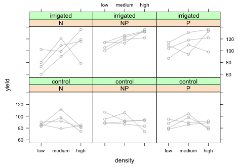 |
| Fig. 9 Panel graph showing the raw data from the split-split design with blocks. |
I obtain predictions of the marginal means from the lme model using the predict function with the level=0 argument.
I add the subscripts argument to the panel function and then plot the means with the panel.xyplot function using subscripts to select only those predicted means that should appear in the panel currently being drawn.
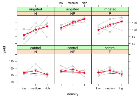 |
| Fig. 10 Panel graph showing the raw data from the split-split design with blocks along with marginal means. Means are being recycled in plot. |
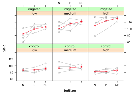
Clearly something went wrong. The line segments connecting the means cross back to connect the last mean with the first. To see what went wrong I extract the observations that are being used in the first panel for which fertilizer = 'N' and irrigation = 'control'.
Now we can see what's going wrong. When we plotted the predicted means we plotted the entire last column because all four blocks are used in this panel. But after the third mean we just start recycling values again. What we need to do is only plot the first three means and stop. We can accomplish this by adding [1:3] after the both the x- and y-variables of panel.xyplot.
 |
| Fig. 11 Panel graph showing the raw data from the split-split design with blocks along with marginal means. |
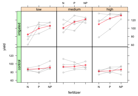
Finally I assign the graph to an object and use the useOuterStrips function from the latticeExtra package to place panel labels on the left and on the top.
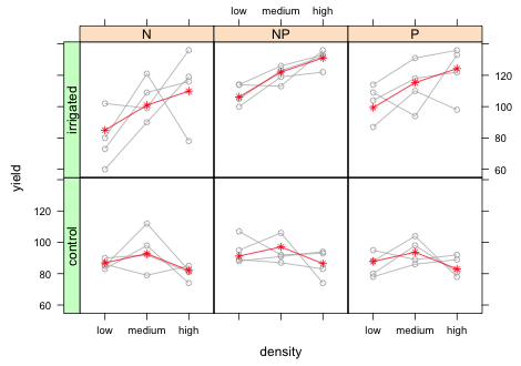 |
| Fig. 12 Panel graph showing the raw data from the split-split design with blocks along with marginal means. |
Let's compare the graph to the summary table to verify that everything makes sense.
Value Std.Error DF t-value p-value
(Intercept) 86.9167 4.9950 44 17.4007 0.0000
irrigationirrigated -1.9444 7.0640 3 -0.2753 0.8010
densitymedium 5.8333 6.2227 12 0.9374 0.3670
densityhigh -4.8333 6.2227 12 -0.7767 0.4524
fertilizerP 0.9167 3.7175 44 0.2466 0.8064
fertilizerNP 4.3333 3.7175 44 1.1657 0.2500
irrigationirrigated:densitymedium 10.0833 8.8002 12 1.1458 0.2742
irrigationirrigated:densityhigh 29.7500 8.8002 12 3.3806 0.0055
irrigationirrigated:fertilizerP 13.5000 5.2573 44 2.5678 0.0137
irrigationirrigated:fertilizerNP 16.8333 5.2573 44 3.2019 0.0025
The density main effects in the summary table correspond to irrigation = 'control' and fertilizer = 'N'. As we can see there is no density effect for this irrigation level. The yield at medium density is not significantly different (albeit slightly higher) than the yield at low density (p = 0.37). Similarly the yield at high density is not significantly different from the yield at low density (p = 0.45). This is represented in the graph by the fairly flat mean profiles in the bottom row of panels. The irrigation main effect corresponds to density = 'low' and fertilizer = 'N'. The fact that it is not significant (p = 0.80) indicates that the mean yields at density = 'low' are roughly the same regardless of whether the plot was irrigated. The interaction effects of irrigation and density correspond to deviations from the additive model at density = 'medium' and density = 'low'. Both terms in the summary table are positive and statistically significant with the effect at high density nearly triple the effect at medium density. In the graph this corresponds to a steep climb in yield from density = 'low' to density = 'medium' and then to density = 'high' in the top row of panels. This is quite a contrast from the flat mean profile we would expect under the additive model without interaction (bottom row of panels). The basic conclusion is the obvious one, there is no effect of seed density on yield unless the plants are also irrigated.
To visualize the irrigation × fertilizer interaction I swap density for fertilizer in the xyplot code.
 |
| Fig. 13 Panel graph showing the raw data from the split-split design with blocks along with marginal means. Means are plotted in the wrong fertilizer order. |
As we can see something went wrong with the graph. The individual points are being connected in the wrong order. If we examine a bit of the data frame being plotted we can see what went wrong.
xyplot plots the points in the order it encounters them in the data frame. Because fertilizer appears in the order 'N', 'P', 'NP', that's the order the points are plotted. This causes a problem because fertilizer is a factor whose levels are 'N', 'NP', and 'P' so that's how they are listed on the x-axis. We can either sort the data frame to match the order on the x-axis or we can change the order of the levels of fertilizer. I choose the latter.
 |
| Fig. 14 Panel graph showing the raw data from the split-split design with blocks along with marginal means. |
Lastly I save the graph as an object and use the useOuterStrips function from the latticeExtra package to place panels on the left and on the top.
 |
| Fig. 15 Panel graph showing the raw data from the split-split design with blocks along with marginal means. |
Let's compare the graph to the summary table to verify that everything makes sense.
Value Std.Error DF t-value p-value
(Intercept) 86.9167 4.9950 44 17.4007 0.0000
irrigationirrigated -1.9444 7.0640 3 -0.2753 0.8010
densitymedium 5.8333 6.2227 12 0.9374 0.3670
densityhigh -4.8333 6.2227 12 -0.7767 0.4524
fertilizerP 0.9167 3.7175 44 0.2466 0.8064
fertilizerNP 4.3333 3.7175 44 1.1657 0.2500
irrigationirrigated:densitymedium 10.0833 8.8002 12 1.1458 0.2742
irrigationirrigated:densityhigh 29.7500 8.8002 12 3.3806 0.0055
irrigationirrigated:fertilizerP 13.5000 5.2573 44 2.5678 0.0137
irrigationirrigated:fertilizerNP 16.8333 5.2573 44 3.2019 0.0025
The fertilizer main effects in the summary table correspond to irrigation = 'control' and density = 'low'. As we can see there is no fertilizer effect for this combination of levels. The yield at fertilizer = 'P' is not significantly different (albeit slightly higher) than the yield at fertilizer = 'N' (p = 0.81). Similarly the yield at fertilizer = 'NP' is not significantly different from the yield at fertilizer = 'N' (p = 0.25). This corresponds to the fairly flat mean profiles in the bottom row of the panel graph. The irrigation main effect corresponds to fertilizer = 'N' and density = 'low'. The fact that it is not significant (p = 0.80) indicates that the yields are roughly the same regardless of whether the plots were irrigated. The interaction effects of irrigation and fertilizer correspond to deviations from additive model at fertilizer = 'P' and fertilizer = 'NP'. In the summary table both terms are positive and statistically significant with the effect at fertilizer = 'NP' being slightly larger than the effect at fertilizer = 'P'. In the graph this corresponds to a nearly constant increase in yield from fertilizer = 'N' to fertilizer = 'P' and then to fertilizer = 'NP'. This is quite a contrast from the flat mean profile we would expect under the additive model with no interaction (lower row of panels). The basic conclusion is fairly obvious, there is no effect of fertilizer on yield unless the plants are irrigated.
A compact collection of all the R code displayed in this document appears here.
| Jack Weiss Phone: (919) 962-5930 E-Mail: jack_weiss@unc.edu Address: Curriculum for the Environment and Ecology, Box 3275, University of North Carolina, Chapel Hill, 27599 Copyright © 2012 Last Revised--October 6, 2012 URL: https://sakai.unc.edu/access/content/group/3d1eb92e-7848-4f55-90c3-7c72a54e7e43/public/docs/lectures/lecture10.htm |