Spatial statistics is a big topic and we'll only scratch its surface today. Specifically we'll learn how to check for spatial correlation in the residuals from a regression model and examine ways to account for that correlation. A large number of packages are available in R for spatial analysis and most of these overlap extensively in their features. We'll focus on two: the geoR package for variogram analysis and the vegan package for its Mantel test. The nlme package that we've used previously for multilevel modeling is also relevant here in that it allows the user to specify a spatial structure for regression models. A good source of information on R packages and what they can do can be found at the CRAN task views site. The spatial section at this site lists over 100 different R packages that can be used to analyze and manipulate spatial data.
The data we'll use for illustration is the Wheat2 data set in the nlme package taken from Stroup et al. (1994). It's described as an agronomic wheat trial in which the yields of 56 varieties of wheat were compared. The trials were arranged in four geographic blocks within which each variety was planted once. Thus the block variable is an attempt to control for heterogeneity in the data due to the large spatial extent of the experiment.
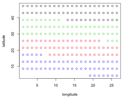
Wheat2 is an example of a groupedData object, a special data structure used by the nlme package. To understand the experimental layout I plot latitude against longitude coloring the points according to their Block assignment.
Fig. 1 Spatial arrangement of plots showing the Block variable
As the figure shows the blocking is an attempt to control for the effect of latitude. It's not clear to me what the units for latitude and longitude represent. If the numbers are interpreted as degrees then the study region would have to be in Africa and encompass nearly half the continent. My understanding from reading Stroup et al. (1994) is that the study was done in Nebraska.
For distant points on the earth's surface the proper way to calculate distances is as great circle distances for which latitude and longitude provide the spherical coordinates of points. For nearby points planar projections are satisfactory approximations of great circle distances. Stroup et al. (1994) provide no further explanation on how latitude and longitude were recorded. The Wheat2 data set is commonly used as an example in the documentation for mixed model software. For example, SAS Proc Mixed and the Splus nlme library both use it. In both cases the latitude and longitude values are treated as raw numbers for calculating distances. Lacking information to do otherwise we will follow their lead.
We can obtain a crude measure of spatial correlation by carrying out a Mantel test, the details of which were given in lecture 31. A Mantel test works with dissimilarity matrices. With n observations there are 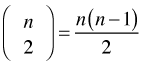 distinct pairs of observations and hence the same number of dissimilarities. For each pair of observations we calculate their dissimilarity in two distinct ways and then compare the results. The Mantel test calculates the Pearson correlation coefficient of the two sets of dissimilarities and uses a permutation test to assess its statistical significance.
Usually one set of dissimilarities is the set of geographic distances between the points. The other set uses the absolute difference in some attribute measured at each location. The permutation test is carried out by simultaneously permuting the rows and columns of one of the dissimilarity matrices. It is necessary to permute both the rows and columns in order to preserve the distance structure of the data. This is equivalent to randomly reassigning attribute values to locations.
To begin we need to calculate the distance matrices. We can use the R function dist for this purpose. The first argument to dist should be a vector or a matrix where each row corresponds to an observation.
The dist function returns an object of class "dist". To see a few of the distances that were generated we need to convert the dist object to a matrix with as.matrix and then specify the rows and columns we wish to see.
The package vegan contains the mantel function for carrying out the Mantel test. By default the mantel function uses 1000 permutations for the permutation test although this can be modified with its permutations argument. (Technically this is 999 permutations plus the value of the Mantel statistic calculated using the unpermuted data.) 1000 is adequate for a crude estimate of statistical significance.
Mantel statistic based on Pearson's product-moment correlation
Call:
mantel(xdis = dist1, ydis = dist2)
Mantel statistic r: 0.2005
Significance: < 0.001
Empirical upper confidence limits of r:
90% 95% 97.5% 99%
0.0338 0.0416 0.0500 0.0596
Based on 1000 permutations
The reported Mantel correlation is 0.20 and the p-value is 0.001. Since this is based on 1000 values it means that the observed Mantel correlation was greater than the Mantel correlation obtained with any of the 999 data permutations.
Of course it's not news that agricultural yield varies with geography. What's important statistically is that such spatial correlation is accounted for in our model, either explicitly or implicitly. To this end we fit a series of models that attempt to relate yield to variety while controlling for geography. The simplest attempt at this is to add Block as a predictor in the regression model. Block has already been declared a factor in the Wheat2 data frame so its numerical values won't cause R to treat it as a continuous predictor.
Mantel statistic based on Pearson's product-moment correlation
Call:
mantel(xdis = dist1, ydis = dist3)
Mantel statistic r: 0.1061
Significance: < 0.001
Empirical upper confidence limits of r:
90% 95% 97.5% 99%
0.0302 0.0415 0.0472 0.0560
Based on 1000 permutations
From the output we see that including Block (and variety) as predictors has accounted for some of the original spatial variation in yield, but the residual spatial correlation is still significantly greater than zero (p < .001).
In lecture 31 we saw that a spatially referenced variable can be decomposed into a spatial mean process plus a spatial error process. One way to account for spatial correlation is to introduce additional spatially referenced predictors into the model. With these data we are limited in this regard but we do have the latitude and longitude of each observation so we could include an observation's latitude and longitude directly in the model for the mean. Here are the results for a model that is additive in latitude and longitude.
Call:
mantel(xdis = dist1, ydis = dist4)
Mantel statistic r: 0.045574
Significance: 0.025
Empirical upper confidence limits of r:
90% 95% 97.5% 99%
0.0325 0.0393 0.0453 0.0531
Based on 999 permutations
This has reduced the correlation even further, although it's still statistically significant (p = .025). Notice that the Mantel correlation is fairly small, 0.045, yet still statistically significant. The statistical significance arises at least in part from the large amount of data we have. The 224 observations translate into 24,976 distances. An ordinary Pearson correlation of 0.045 would never be considered important regardless of its statistical significance. But given that we're looking at the correlation of distances rather than the actual observational values it's unclear how to interpret this small correlation.
Since the additive model was inadequate we could try to include a more complicated function of latitude and longitude. One recommendation is to fit a response surface model of geographic coordinates (Berk and de Leeuw, 2006), a model of the form
![]()
For these data a response surface model is a general second-degree polynomial model in longitude and latitude.
Call:
mantel(xdis = dist1, ydis = dist3)
Mantel statistic r: 0.018915
Significance: 0.221
Empirical upper confidence limits of r:
90% 95% 97.5% 99%
0.0299 0.0384 0.0468 0.0530
Based on 999 permutations
So adding a geographic response surface to the mean process model has removed the spatial correlation in the residuals.
To visualize the response surface we can use the persp function to produce a three-dimensional plot. This function requires that we first evaluate the desired function on a grid of values. To set up the grid I create vectors that contain the sorted unique values of latitude and longitude in the data set.
Next I locate the estimates of the response surface parameters in the coefficient vector of the model and write a function that calculates the value of the response surface. To simplify the specification of the function I use matrix multiplication in which I multiply a matrix of response surface terms by the coefficient vector.
A convenient way to obtain the grid of function values we need is with the outer function. The outer function takes two vectors x and y as its first two arguments and pairs the elements of these vectors in all possible ways. It then evaluates the function that appears in its third argument on each of the ordered pairs.
The rows of the grid are different latitudes while the columns of the grid are different longitudes.
To produce the graph we use the persp function with the two grid vectors as the first two arguments (in the same order as they were specified in the outer function), followed by the grid of z-values. To get tick marks and their values I add the option ticktype="detailed". The arguments theta and phi can be used to define a viewing angle of the surface and have the effect of rotating the surface. They correspond to the θ and φ of the spherical coordinate system from mathematics.
(a) 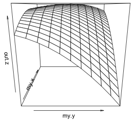 |
(b)
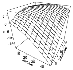 |
| Fig. 2 (a) Default persp plot of the response surface. (b) The same persp plot after changing the viewing perspective and adding tick marks and labels to the graph. | |
Instead of looking for parametric functions of latitude and longitude to account for spatial correlation we can use nonparametric smoothers. Corresponding to the linear model in latitude and longitude, model2, we can instead fit an additive model using smooths of latitude and longitude.
A Mantel test of the residuals from the GAM reveals that the spatial correlation has been removed.
Call:
mantel(xdis = dist1, ydis = dist3)
Mantel statistic r: 0.025553
Significance: 0.16
Empirical upper confidence limits of r:
90% 95% 97.5% 99%
0.0328 0.0412 0.0498 0.0623
Based on 999 permutations
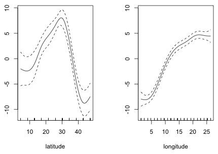
A plot of the smoothers reveals that while the relationship with longitude might be treated as roughly linear, the relationship with latitude is far from linear.
 |
|
| Fig. 3 Partial response functions of latitude and longitude estimated from a GAM |
With regularly spaced observations like this, we might consider replacing the two additive smooths with a single smooth of both variables. Not surprisingly this model also removes the spatial correlation of the residuals.
Call:
mantel(xdis = dist1, ydis = dist3)
Mantel statistic r: 0.014775
Significance: 0.255
Empirical upper confidence limits of r:
90% 95% 97.5% 99%
0.0300 0.0385 0.0515 0.0582
Based on 999 permutations
To visualize the two-dimensional smooth we can create a contour plot or generate a three-dimensional surface plot by specifying scheme=1. Choosing this option calls the persp function to which can be passed additional arguments such as ticktype="detailed".
(a) 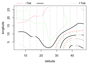 |
(b) 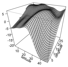 |
| Fig. 4 (a) Default contour plot of the two-dimensional smoother with confidence bands for the contours. (b) The same smoother as in (a) but now viewed as a surface in three dimensions. | |
The graph of the two-dimensional smooth is not all that different from the quadratic response surface shown in Fig. 3. We can compare all the models fit thus far using AIC. For what it's worth the model with the two-dimensional smooth of latitude and longitude ranks best.
Given that the only point of including latitude and longitude in the model was to account for spatial correlation and the last three models all do so, it's a matter of personal taste which of these models one chooses here. When we have data that are evenly distributed spatially without substantial gaps all of these methods are likely to work well. If on the other hand the data are sparse and patchy the GAM results may be unreliable and a parametric model might be preferred.
Instead of trying to account for the spatial correlation by further enhancing the deterministic portion of the model, a perhaps more attractive approach is to modify the random portion of the model. The Mantel test is a crude, all or nothing, sort of tool that does little to help understand the nature of the spatial correlation except to say that it exists. To make further progress we need a way to visualize and model the correlation as a function of inter-observational distances. For geostatistical data the semivariogram is the preferred tool for doing this.
While the nlme package has a Variogram function, for serious modeling I prefer to use dedicated spatial packages such as geoR to develop geostatistical models. The geoR package is a comprehensive spatial analysis package written by a geographer. It works well except when given extremely large data sets. In those cases I've found the more limited gstat package is a good alternative. The variogram functions in gstat can be up to ten times faster at estimating the empirical semivariogram than are the functions in geoR.
To simplify fitting the correlated residual models that will follow, I refit the randomized block design model using the gls function of the nlme package.
The acronym gls stands for "generalized least squares" and it extends ordinary least squares estimation to error structures other than independence. If no structure is specified the model output is identical to that returned by the lm function.
I begin by creating a matrix whose columns contain the latitude, longitude, and normalized residual, type='n', from the regression model for each observation in the data set. This is the order required by geoR. The response variable that will be used in the semivariogram should appear in the third column while the vectors used in calculating the distances should appear in columns 1 and 2. At this point the residuals are assumed to be independent so the only effect of using normalized residuals is to change the scale of the calculated semivariance. I request normalized residuals to be consistent with the later semivariograms we will estimate.
The geoR package like many R packages requires that data frames be converted into specialized objects before analysis. (Recall that the ROCR package had the same requirement in lecture 14. There the first step was to create a prediction object.) In geoR this conversion is done with the as.geodata function.
The geoR function variog is used to estimate the empirical semivariogram. It accepts a large number of arguments of which I illustrate the following.
After some experimentation I settle on the following specifications. The choice of 30 is a little more than one half the maximum distance between points in the data set.
There is a lot of useful information returned by variog. The component $n records the number of distances that contributed to the smoothed estimate in each bin and the component $u records the center of each bin. The estimated semivariances are stored in the $v component.
Notice that although we requested a bin center at 3 it doesn't appear in the list. Apparently our selections can be overruled perhaps when there are no observations in the chosen bins. If we calculate the semivariogram out to a distance of 50, the number of observations in each bin drops off precipitously.
The usual recommendation is that there should be at least 30 observations in each bin. It is also usually recommended that the semivariogram not be estimated beyond half the maximal distance in the data set. These recommendations are the basis of my choice of 30 for the limits. Based on the number of observations in each bin we clearly could choose narrower bins (and more of them), but as we'll see the pattern of correlation is already fairly clear using the output we have.
The variog function has a plot method. Thus if we pass the object created by variog to the plot function it will generate a plot of the list components v (the semivariogram estimates) against u (the distances) with the axes appropriately labeled.
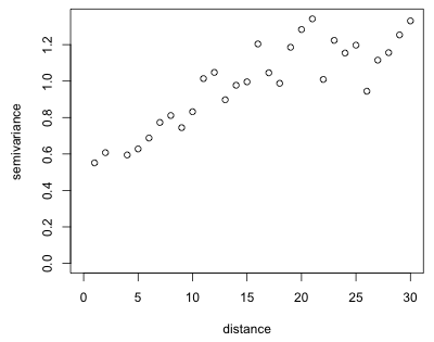
Fig. 5 Empirical semivariogram of the residuals of yield regression model
The plot shows a fairly typical semivariogram. The semivariance increases with distance (meaning that the correlation decreases) and although there is considerable scatter it appears to level off somewhere around a distance of 20 or 25. Observe that the semivariance is nonzero near the origin. Based on the terminology discussed in lecture 31 we would estimate the nugget in Fig. 5 to be 0.4, the sill to be 1.2 (giving a partial sill of 0.8), and the range to be somewhere between 20 and 30.
If we increase the number of bins, the picture barely changes suggesting that the empirical semivariogram shown in Fig. 5 is probably adequate.
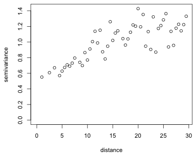
Fig. 6 Empirical semivariogram of the residuals using 52 bins
To incorporate spatial correlation into our regression model we need to estimate a theoretical semivariogram model. The nlme package offers five spatial correlation structures for this purpose: corExp (exponential), corGaus (Gaussian), corLin (linear), corRatio (rational quadratic), and corSpher (spherical). All of these except the rational quadratic can be fit in geoR using its variofit function. We need to specify four arguments to variofit
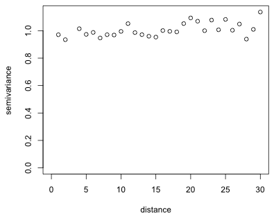
I fit the four covariance models in succession and add them to the empirical semivariogram of Fig. 5 with the lines function. Based on Fig. 5 I choose as initial values 0.8 for the partial sill, 30 for the range, and 0.4 for the nugget.
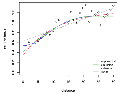
Fig. 7 Semivariogram models fit to the empirical semivariogram of Fig. 5
As is clear from the plot, any of the semivariogram models, even the linear, could be a suitable model. In such a situation it makes sense to fit them all and compare the results using AIC.
Formulas for the five spatial correlation structures available in nlme (with the variance set equal to one) are shown below (Pinheiro and Bates, 2000, p. 232.)
| Model | Formula |
| Exponential | |
| Gaussian | |
| Linear | |
| Rational quadratic | |
| Spherical |
Here I( ) is the indicator function such that  . A nugget effect is introduced into these functions as follows.
The approach in nlme is different than in geoR (where the nugget is an additive term rather than a multiplicative one).
To add a correlation structure to our generalized least squares model we need to include the corr argument in the model specification. A simpler way than respecifying the model in its entirety again is to use the update function. The syntax requires specifying the old model first followed by other arguments that list the additions that should be made. In the call below the additions are all contained in the corr argument.
I next fit models for the remaining four spatial correlation structures that are available in the nlme package.
The linear model failed to converge because the initial estimates were too far off. From our earlier graph it is clear that the range is much greater than 30 for a linear model.
I compare the models to the original model using AIC.
It's clear that all five models containing a spatial correlation structure are a huge improvement over the original model. In truth the rational quadratic correlation structure just edges out the Gaussian structure. We can compare these models to the mean process models where we attempted to account for the spatial correlation by including latitude and longitude as predictors.
The spatial correlation models clearly beat most of these models except for the last model that included a nonparametric smoother of both latitude and longitude.
Finally we need to assess whether the spatial correlation in the residuals that we initially detected has been eliminated by modeling the error process. We could extract the residuals from model out1e, cbind them to the latitude and longitude variables, and run them through geoR again, but we can also use the Variogram function in the nlme package for this purpose. The Variogram function requires a model object, a formula specifying the spatial coordinates, and the type of residual to plot (here specified as resType='n' for normalized residuals that remove the modeled correlation structure from the residuals). The Variogram function has a plot method so I feed the output directly to the plot function.
(a) 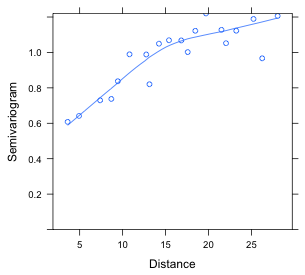 |
(b) 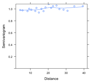 |
| Fig. 8 (a) Semivariogram for residuals from an ordinary regression model in which the residuals are assumed to be uncorrelated. (b) Semivariogram for residuals from a regression model in which the residuals are given a spatial correlation structure (rational quadratic). | |
Alternatively we can generate the same plot in geoR. To obtain the normalized residuals we need to add the type='n' argument to the residuals function.
 |
|
| Fig. 9 Semivariogram (from geoR) for regression residuals from a model with a rational quadratic residual correlation structure |
Finally, we can verify that the Mantel test applied to the normalized residuals does not yield a significant result.
Call:
mantel(xdis = dist1, ydis = dist3)
Mantel statistic r: 0.018497
Significance: 0.211
Empirical upper confidence limits of r:
90% 95% 97.5% 99%
0.0295 0.0382 0.0489 0.0557
Based on 999 permutations
| Jack Weiss Phone: (919) 962-5930 E-Mail: jack_weiss@unc.edu Address: Curriculum for the Environment and Ecology, Box 3275, University of North Carolina, Chapel Hill, 27599 Copyright © 2012 Last Revised--March 31, 2012 URL: https://sakai.unc.edu/access/content/group/2842013b-58f5-4453-aa8d-3e01bacbfc3d/public/Ecol562_Spring2012/docs/lectures/lecture32.htm |