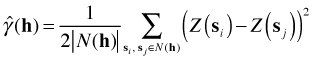
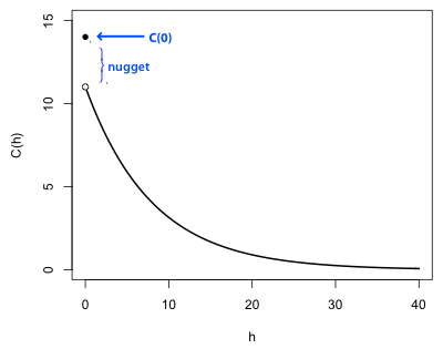
Fig. 1 displays a theoretical (exponential) semivariogram for an isotropic process (so that the displacement vector h is replaced by a scalar h). Some of the standard terminology of semivariograms is shown in the figure.
|
|
| Fig. 1 Typical semivariogram of a stationary spatial process |
Fig. 2 connects the semivariogram of Fig. 1 to its matching covariogram, which exists if the spatial process is both intrinsic and second-order stationary. Using the theoretical formula given last time it follows that C(h) = sill – γ(h). In Fig. 2 the sill corresponds to the variance of the process, C(0). (The sill is the total variance and includes the contribution from the nugget.) As the separation h between points increases, the covariance decreases. Consequently as the semivariogram approaches the sill, the covariogram approaches 0, i.e., C(h) → 0. To generate the graph of the covariogram from the graph of the semivariogram just reflect the semivariogram across the x-axis and then translate the graph vertically a distance equal to the sill.
 |
|
| Fig. 2 Corresponding covariogram for the second-order stationary process of Fig. 1 |
A first step toward constructing a theoretical model of the semivariogram is to calculate the empirical semivariogram defined as follows.
Here N(h) is the set of location pairs that are separated by a lag h and ![]() is the number of unique pairs in that set. Notice that this formula closely resembles the alternative variance formula for non-spatial data given in lecture 30. To calculate the semivariance we bin pairs of observations based on their separation distance and then calculate the variability of the attributes of those observations assigned to that bin.
is the number of unique pairs in that set. Notice that this formula closely resembles the alternative variance formula for non-spatial data given in lecture 30. To calculate the semivariance we bin pairs of observations based on their separation distance and then calculate the variability of the attributes of those observations assigned to that bin.
Typically we plot ![]() versus h (or h for an isotropic process) to assess how the process decays over space. Sometimes we use the empirical semivariogram as a jumping off point for fitting a formal semivariogram model to the data. Generally it is not a good idea to use nonparametric smoothers to fit a curve to a semivariogram scatter plot because of the difficulty in converting a semivariogram smoother curve into a model for the covariance. The covariance model is used to create a covariance matrix of the observations that then gets used in GLS or GEE. Covariance matrices are very special mathematically. They must be both invertible and positive definite, the latter property being the matrix equivalent of being positive. (Note: being positive definite does not mean the entries of the matrix are all positive.) Not every curve that can be fit to a semivariogram scatter plot will yield an invertible, positive definite covariance matrix, but standard semivariogram models will.
versus h (or h for an isotropic process) to assess how the process decays over space. Sometimes we use the empirical semivariogram as a jumping off point for fitting a formal semivariogram model to the data. Generally it is not a good idea to use nonparametric smoothers to fit a curve to a semivariogram scatter plot because of the difficulty in converting a semivariogram smoother curve into a model for the covariance. The covariance model is used to create a covariance matrix of the observations that then gets used in GLS or GEE. Covariance matrices are very special mathematically. They must be both invertible and positive definite, the latter property being the matrix equivalent of being positive. (Note: being positive definite does not mean the entries of the matrix are all positive.) Not every curve that can be fit to a semivariogram scatter plot will yield an invertible, positive definite covariance matrix, but standard semivariogram models will.
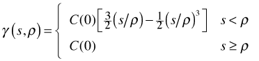
There are many possible semivariogram models but the three models described below generally prove to be adequate for assessing the spatial correlation in regression residuals. To simplify the formulas in each of the models it is assumed the nugget = 0. Different software packages introduce the nugget into these formulas in different ways. In most the nugget contributes an additive term but the nlme package introduces the nugget into these formulas multiplicatively. The notation used here follows the nlme package where s denotes distance, ρ is a model parameter, and C(0) is the variance.
![]()
![]()
Different criteria (least squares, maximum likelihood, etc.) are used to fit these curves to data but in the end we tend to choose between them subjectively by visually judging the fit.
The concepts discussed thus far can be expressed as a single model that attempts to decompose the variability of a spatially-referenced attribute Z(s) into a sum of variance components from various sources.
![]()
The geospatial model is a theoretical construct and is primarily used as an organizing principle. In regression models the last three terms are generally lumped together as the error process which we then describe with a semivariogram.
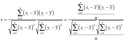
Although a semivariogram can be estimated for lattice data, doing so typically doesn't make theoretical or practical sense because of the shortage of observations at intermediate distances. An alternative measure of spatial association for lattice data is Moran's I. Moran's I generalizes the Pearson correlation to observations with neighborhoods. The usual Pearson formula is shown below.
Let ![]() and let
and let ![]() be the neighborhood connectivity between sites si and sj, such that
be the neighborhood connectivity between sites si and sj, such that ![]() and
and ![]() > 0 if sites si and sj are connected and 0 otherwise. For lattice data arranged in rectangular grids connectivity rules are typically borrowed from the game of chess. Thus we can have rook neighborhoods and queen neighborhoods, referencing the legal moves of these pieces in chess. In truth any neighborhood structure is possible. With a neighborhood of each point defined Moran’s I modifies the Pearson correlation formula as follows.
> 0 if sites si and sj are connected and 0 otherwise. For lattice data arranged in rectangular grids connectivity rules are typically borrowed from the game of chess. Thus we can have rook neighborhoods and queen neighborhoods, referencing the legal moves of these pieces in chess. In truth any neighborhood structure is possible. With a neighborhood of each point defined Moran’s I modifies the Pearson correlation formula as follows.
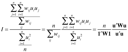
Here 1 is a column vector of ones and W is the connectivity matrix. So we see that Moran's I is just the weighted Pearson correlation of a variable with itself measured at different locations. In the numerator instead of dividing by n we divide by the sum of the weights (which would equal n in the unweighted case).
Moran's I is often expressed in terms of distance classes so that we get a separate value I(d) for each choice of d.
Here
where N(d) is the set of location pairs that are separated by a lag d. Typically I(d) is plotted against d producing a plot very reminiscent of the semivariogram of Fig. 1.
A Mantel test is commonly used as an initial assessment of spatial correlation for both lattice and geostatistical data. The Mantel test is appealing because it works with all kinds of data and is easy to perform. Its limitation is that it is only a significance test. It provides evidence for a spatial association but is incapable of determining the nature of that association.
A Mantel test works directly with distance matrices and tests whether the entries of the two matrices are correlated. Typically one matrix records the absolute value of the difference in attribute values, Z(s), between pairs of points. The second matrix is the geographic distance between the observation locations. Let
be the matrix of all pairwise geographic distances between pairs of observations. Typically this is Euclidean distance. Let
be the pairwise distance matrix based on an attribute of each observation. For instance, the attribute could be the regression residual of an observation in which case ![]() , the absolute value of the difference in residuals between observations i and j. The distances used in the C matrix can be more elaborate, e.g., the Bray Curtis distance in comparing species composition of pairs of sites.
, the absolute value of the difference in residuals between observations i and j. The distances used in the C matrix can be more elaborate, e.g., the Bray Curtis distance in comparing species composition of pairs of sites.
The statistic used in the Mantel test, Mantel's r, is the Pearson correlation coefficient applied to the lower triangles of the distance matrices after stacking the entries to form a single vector. Given this set-up the question of interest is whether the correlation between the pairs of distances
![]()
is unusually large. Because the ![]() elements of each distance matrix are constructed from only n observations they are not independent and the theoretical distribution of the Mantel correlation can only be approximated. Instead of using this approximation, the usual approach is to construct a significance test from the permutation distribution of Mantel's r. A permutation distribution is the set of Pearson correlations of geographic distance and attribute distance obtained after randomly assigning observations to geographic coordinates in all possible ways. Because the number of possible permutations is often prohibitively large we instead draw a large sample from the set of permutations and use that set as the reference distribution for what's called a randomization test.
elements of each distance matrix are constructed from only n observations they are not independent and the theoretical distribution of the Mantel correlation can only be approximated. Instead of using this approximation, the usual approach is to construct a significance test from the permutation distribution of Mantel's r. A permutation distribution is the set of Pearson correlations of geographic distance and attribute distance obtained after randomly assigning observations to geographic coordinates in all possible ways. Because the number of possible permutations is often prohibitively large we instead draw a large sample from the set of permutations and use that set as the reference distribution for what's called a randomization test.
The protocol is as follows. We randomly assign attribute values to geographic locations in the original map, calculate the distance matrix for the random assignment of attributes, and then calculate the Pearson correlation between the randomized attribute distance matrix and the original geographic distance matrix. A shortcut to performing the randomization is to randomly permute the rows and columns of one of the distance matrices. It is important that the same permutation is applied to both the rows and columns so as to preserve the triangle inequality of distance metrics.
As an illustration of carrying out a Mantel test by hand, here's a data set from Manly (2001), p. 224. What's reported are the counts of the shellfish Paphies australis in a 200 m by 70 m stretch of beach divided up into 10 m × 20 m quadrats.
I use the dist function to obtain the pairwise geographic and attribute distances for all pairs of observations and then calculate the correlation of the entries in the lower triangles of the two distance matrices.
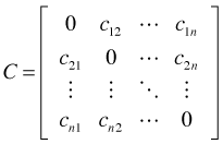
We wish to determine if a correlation of –0.11 is unusual, greater in magnitude than would be expected by chance for these data. The Mantel test functions that are available in various R packages all perform one-sided upper-tailed tests (tests of positive association) and won't work here, so we have to carry out the test by hand. I write a function that permutes the rows and columns of one of the distance matrices and then calculates the Pearson correlation of the permuted matrix with the other unmodified matrix. Because the assignment of observation to geographic location is randomized, any correlation we obtain represents purely chance association.
I repeat this 9999 times each time calculating the Pearson correlation to obtain the randomization distribution of the Mantel statistic under the null hypothesis of no association. I append the actual Mantel correlation to this vector to yield a total of 10,000 correlations. Counting up the number of correlations that are equal to or greater in magnitude than the observed correlation and dividing the result by 10,000 yields the two-tailed p-value for the randomization test.
Since p = 0.0191 < .05 we reject the null hypothesis of no association and conclude that the shellfish counts are spatially correlated (although negatively!).
Fig. 3 is a graphical depiction of the Mantel test just carried out. The histogram (and corresponding kernel density estimate) represent the randomization distribution. The asterisk locates the observed value of the Mantel correlation with respect to the randomization distribution. The shaded area under the kernel density curve is the two-tailed p-value of our test.
 |
|
| Fig. 3 Randomization distribution for the Mantel test. * denotes the observed Mantel correlation. The shaded areas together yield the p-value for a two-tailed test. |
With point process data it is the locations themselves that are random. Thus a typical first step is to examine the distances between pairs of points to look for evidence of clustering. One can examine average distance to nearest neighbors, distance to next nearest neighbors, etc., and compare the statistics calculated to the same values obtained from a known spatial process, such as a spatial Poisson process, which is consistent with the hypothesis of complete spatial randomness (CSR).
A popular and more efficient way of examining clustering at different scales is to calculate a quantity called Ripley's K. Unlike nearest neighbor metrics, Ripley's K can describe point processes at many different scales simultaneously. The quantity K is defined such that
![]()
Here λ is called the intensity of the spatial process and is equal to the mean number of events per unit area, a value that is assumed constant over the region of interest. E is the expectation operator and so the right hand side is the average number of events in the neighborhood of a given event.
If the region in question has area R, we would expect on average λR events to occur in that region. So if there are ![]() additional events within a distance h of each single event and a total of λR events overall, we would expect
additional events within a distance h of each single event and a total of λR events overall, we would expect ![]() to be the number of ordered pairs a distance of at most h apart. Define the indicator function
to be the number of ordered pairs a distance of at most h apart. Define the indicator function ![]() to be
to be
where ![]() is the distance between the ith and jth observed events. If we sum this function over all events i ≠ j we obtain the number of ordered pairs a distance of at most h apart. Thus we have
is the distance between the ith and jth observed events. If we sum this function over all events i ≠ j we obtain the number of ordered pairs a distance of at most h apart. Thus we have
The latter expression is the formula typically used to estimate Ripley's K.
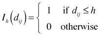
There is one complication not addressed by this formula. For points near the edge of R, the indicator function will underestimate the number of neighbors. Thus the estimator needs to be adjusted in some fashion to account for this. To account for edge effects Ripley's K is modified as follows.
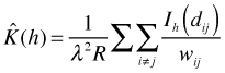
where ![]() is the proportion of the neighborhood of a given event i with radius
is the proportion of the neighborhood of a given event i with radius ![]() that lies within R.
that lies within R.
CSR refers to a homogeneous process with no spatial dependence. A homogeneous Poisson process is an example. Under CSR we expect to see roughly the same number of pairs of events in any region. For a given event the number of additional events within a distance h is proportional to the area of a circle of radius h where the proportionality constant is λ, the intensity. Thus under CSR we expect ![]() . This suggests constructing a statistic L(h) defined as follows.
. This suggests constructing a statistic L(h) defined as follows.
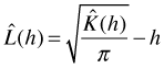
![]() should be equal to zero under CSR. In a plot of
should be equal to zero under CSR. In a plot of ![]() versus h positive peaks will correspond to clustering and negative troughs to uniformity. Statistical significance is assessed by generating data from a process exhibiting CSR and plotting the extremes of the simulated process to generate a probability envelope. Places where
versus h positive peaks will correspond to clustering and negative troughs to uniformity. Statistical significance is assessed by generating data from a process exhibiting CSR and plotting the extremes of the simulated process to generate a probability envelope. Places where ![]() pokes out of the envelope are places where the clustering or uniformity are statistically significant.
pokes out of the envelope are places where the clustering or uniformity are statistically significant.
Manly, Bryan F. J. 2001. Statistics for Environmental Science and Management. Chapman & Hall/CRC Press: Boca Raton, FL
| Jack Weiss Phone: (919) 962-5930 E-Mail: jack_weiss@unc.edu Address: Curriculum for the Environment and Ecology, Box 3275, University of North Carolina, Chapel Hill, 27599 Copyright © 2012 Last Revised--March 29, 2012 URL: https://sakai.unc.edu/access/content/group/2842013b-58f5-4453-aa8d-3e01bacbfc3d/public/Ecol562_Spring2012/docs/lectures/lecture31.htm |