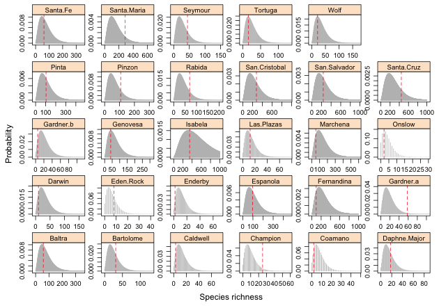
Fig. 1 Predicted negative binomial distributions for individual islands with the location of the observed species richness value superimposed.
See HW 8 solutions.
Last time we fit various regression models of the species-area relationship for data on the vascular flora of the Galapagos islands. The best model according to AIC was a negative binomial regression model with log(Area) as the predictor.
In the count regression models we've considered previously our predictors have all been categorical variables. These categorical variables provided a natural way to group the data values and made carrying out a goodness of fit test easy. We compared the observed distribution of counts in each group against what the negative binomial regression model predicted using either a formal chi-squared test or its simulation-based version (nonparametric bootstrap). In the Galapagos regression model log(Area) is a continuous predictor so this is not possible. Each observation has a different value of area and hence its own individual predicted negative binomial distribution so there are no natural groups.The negative binomial regression model can still be treated as a data-generating mechanism but now we have a different mechanism for each observation.
Given an island's size our negative binomial regression model defines a probability distribution of likely species richness values for that island. This predicted distribution can form the basis for a goodness of fit test. For each observation we can ask whether the observed richness value looks like a typical realization from the estimated probability distribution for that observation. This can be assessed graphically by plotting the predicted probability distributions with the observed richness values superimposed. We can then follow this up analytically by calculating a p-value in which we treat the observed richness as the value of our test statistic and the predicted probability distribution as our null model.
With 29 different distributions to examine for the 29 different islands the most parsimonious way to display things is with a panel graph. The thing that makes producing this graph complicated is that there is a wide range in observed richness values among the different islands ranging from 2 to 444 species.
To obtain a sensible picture we will to need to plot the probability distribution for each island using different settings for the x- and y-axes, cutting off the distributions when the probabilities are too small to be displayed. The fitted function of R returns the predicted mean on the raw scale and is equivalent to using the predict function with type='response'. I add the predicted means as a column to the gala data frame.
I add the predicted probabilities of the observed richness values as another column in the gala data frame.
To get a sense of the range of count values that need to be displayed I calculate the probability of the smallest richness value, 0, and the probability of a fairly large richness value, 1000.
So for some islands the probability of zero counts will be too small to show up on the graph whereas for others counts as large as 1000 will still have a non-negligible probability. With these rough guidelines for the data range I calculate the probability of obtaining richness values between 0 and 1000 for each of the 29 islands. I use the lapply function for this to force the output to take the form of a list. (The lapply function is identical to sapply except that sapply will try to format list output as a vector or a matrix when it can while lapply will always produce list output.)
At least for some of the islands a lot of the calculated probabilities will be too small to show up on the graph. For each island I determine the largest count for which the calculated probability exceeds 1e-5.
For each island the expression out.p[[x]]>1e-5 will evaluate to TRUE or FALSE depending on whether the calculated probability exceeds the given threshold. The expression (0:1000)[out.p[[x]]>1e-5] will then return only those count categories whose probabilities exceed the threshold. Finally max finds the largest of these counts. I store the result as a column ux in the gala data frame.
We can do a similar calculation for each island at the low end, determining the smallest count category that still has a non-negligible probability.
Because these values are barely different from zero it seems reasonable to start all the panel graphs at zero. I create a variable lx that records this minimum value.
Next I determine the maximum calculated probability on each island and store the result. I record the minimum probability as zero.
I write a prepanel function that calculates the x-limits (xlim) and y-limits (ylim) for each panel using the variables lx, ux, ly, and uy.
We're now ready to create the graph.
|
Fig. 1 Predicted negative binomial distributions for individual islands with the location of the observed species richness value superimposed. |
Based on the graph it would appear that the observed richness on Champion and Gardner.a islands may be unusually large at least compared to the model prediction. At the other extreme the richness on Gardner.b may be unusually low.
To get a better sense of the quality of the fit shown in Fig. 1 we can calculate p-values for the observed richness values. A p-value is the probability of obtaining a predicted value that is as extreme or more extreme than the observed richness value. We can calculate both a lower-tailed p-value (for observed richness values that are too low) and an upper-tailed p-value (for observed richness values that are too big). The upper-tailed p-value is of the form P(X ≥ k). The pnbinom function returns P(X ≤ k), so 1 – pnbinom(k) returns P(X > k). Because the negative binomial function is discrete, to obtain the desired upper-tailed p-value using pnbinom we have to subtract 1 from the observed richness value: P(X ≥ k) = P(X > k–1) = 1 – pnbinom(k – 1).
Two of the islands have upper-tailed p-values less than α = .05: Gardner.a and Champion. Having carried out 29 tests (one for each island) we'd expect to obtain 29 × .05 = 1.45 significant results by chance alone, so obtaining two "significant" results here is probably nothing to be alarmed about. In a similar fashion we can calculate lower-tailed p-values: P(X ≤ k) = pnbinom(k). The smallest observed p-value is not less than .05.
We can summarize things using a dot plot with the panels representing the lower-tailed and upper-tailed results.
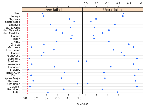 |
Fig. 2 Upper-tailed and lower-tailed p-values measuring the probability of obtaining a richness value as extreme or more extreme than what was observed. Dashed vertical lines in each panel are located at α = .05. |
Much of what's displayed in Fig. 2 is redundant. The left panel is nearly a mirror image of the right half. (It's not a perfect mirror image because P(X = k) is counted in both the lower-tailed and the upper-tailed calculations.) Given that we're interested in observed richness values that are both too small and too large it probably makes sense to carry out a two-tailed test here. For each island I calculate either a lower-tailed or an upper-tailed p-value (but not both) depending on whether P(X ≤ k) is less than or greater than 0.5.
I next place everything in a single graph with lower-tailed p-values displayed on the left and the upper-tailed p-values displayed on the right. I add vertical lines at α = .025 and .975 to identify significant results. The overall rejection region thus corresponds to α = .05. I use the scales argument to relabel the tick marks for the upper-tailed p-values. The use of the page function is just window dressing that allows me to add the identifying text at the bottom of the graph using the grid graphics system.
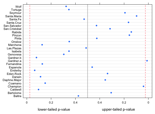 |
Fig. 3 Probabilities of obtaining values more extreme than the observed richness value. Dashed vertical lines are placed at α = .025. |
A compact collection of all the R code displayed in this document appears here.
| Jack Weiss Phone: (919) 962-5930 E-Mail: jack_weiss@unc.edu Address: Curriculum for the Environment and Ecology, Box 3275, University of North Carolina, Chapel Hill, 27599 Copyright © 2012 Last Revised--November 6, 2012 URL: https://sakai.unc.edu/access/content/group/3d1eb92e-7848-4f55-90c3-7c72a54e7e43/public/docs/lectures/lecture21.htm |