
The data set beepollen.txt is taken from Harder and Thompson (1989). As part of a study to investigate reproductive strategies in plants, they recorded the proportions of pollen removed by bumblebee queens and honeybee workers pollinating a species of Erythronium lily and the time they spent at the flower. There are three variables in the data set.
The response variable of interest is removed and the predictor is duration. The variable removed is a proportion, so it normally would offer a special challenge for analysis, but for these data the recorded proportions are far removed from the boundary values of zero and one so it is safe to treat them as being normally distributed.
To help determine the functional form of the relationship between removed and duration we plot the data and superimpose a nonparametric smoother. The lowess function has an argument f that defines the span of the smoother, the fraction of the data that should be included in the window of the smooth. Values of f closer to 1 yield a smoother curve. The default setting is f=2/3.
The lowess function returns two vectors: the sorted values of the x-variable and the lowess predictions of the y-values sorted by the values of the x-variable. As a result the lines function can be used to add the output of lowess to an existing scatter plot.
Fig. 1 Smoothers produced by the lowess function using different spans
The loess function of R is a second implementation of lowess. It has a span argument that controls the span and hence the band width. The loess function is more flexible than lowess in that it has a data argument, can handle missing values, and has a method for the predict function so that new values of the response variable can be predicted using loess. One drawback of loess is that it doesn't automatically sort the fitted values so this needs to be done before the observations can be plotted.
The smoothed values are in the "fitted" component whereas "x" contains the unsorted values of the predictor.
The default settings for loess are different from those of lowess. The default span is 0.75 and the last robust step of lowess is not carried out. To include the final robust step you need to specify the argument family="symmetric".

Fig. 2 Smoothers produced by the loess function
There are many ways to generate spline fits in R. Smoothing splines can be obtained with the smooth.spline function. Like lowess it returns the predictions sorted in order of the x-variable and so the spline fit can be plotted directly with the lines function.
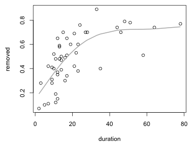
Fig. 3 Smoothing spline
An identical smoothing spline fit can also be obtained by fitting a generalized additive model using the gam function of the mgcv package. The gam function supports ordinary formula notation except that we need to use the s function on those predictors for which we wish to estimate smoothers. The primary reference for the mgcv package is Wood (2006).
To add the spline model to a plot we need to first use the predict function to generate predicted values and then sort the predictions in the order of the x-variable before plotting them.

Fig. 4 Smoothing spline obtained from fitting a GAM
Based on the estimated smoother it appears that an increasing function with an asymptote would be a reasonable model. A simple choice is the two-parameter exponential model.
![]()
Here b is the asymptote and a is a negative number that controls the rate of approach to the asymptote. The nls function can be used to fit nonlinear models to data. (We previously used nls to fit a nonlinear Arrhenius model in Assignment 4.) The nls function requires a formula for the nonlinear function with the variables specified as well as a start argument that provides initial values for the model parameters, here a and b. From the plot we estimate that the asymptote b should be around 0.7. For a I choose a small negative number.
Parameters:
Estimate Std. Error t value Pr(>|t|)
a -0.06858 0.01209 -5.674 9.5e-07 ***
b 0.74021 0.05826 12.705 < 2e-16 ***
---
Signif. codes: 0 ‘***’ 0.001 ‘**’ 0.01 ‘*’ 0.05 ‘.’ 0.1 ‘ ’ 1
Residual standard error: 0.1388 on 45 degrees of freedom
Number of iterations to convergence: 4
Achieved convergence tolerance: 4.353e-06
I use the curve function to add the estimated exponential curve to Fig. 3. The fitted exponential curve provides a close approximation to the smoothing spline (Fig. 5).

Fig. 5 Smoothing spline and nonlinear parametric model
If we use different symbols and colors to denote the kinds of bees (bumblebee or honeybee) in the scatter plot we see that the two kinds of bees are not exhibiting the same pattern.

Fig. 6 Using the code variable to identify the bees
Honeybees appear to be largely responsible for driving the saturation model we've been fitting. Bumblebees may show no saturation at all (if we ignore two outlying values) or at best saturate at a much lower level. To examine these patterns we could fit separate lowess curves to subsets of the data in an obvious way. Alternatively we can interact the smoother with a categorical predictor and fit a GAM. I illustrate the latter approach.
To fit a model in which both bee models have the same basic functional form and only the asymptote is shifted we can include a single smooth of duration as before but include the code variable as a factor. The factor adds to the intercept and acts to shift the curve and asymptote up and down.
To plot the estimated curves I use the predict function and supply it with new data in the newdata argument. The value of newdata must be a data frame with columns that have the same names as the predictors that were used to fit the model. I first determine the range of the x-variable duration for the two bee types and then predict the mean response separately for the two kinds of bees.
$`2`
[1] 3 78
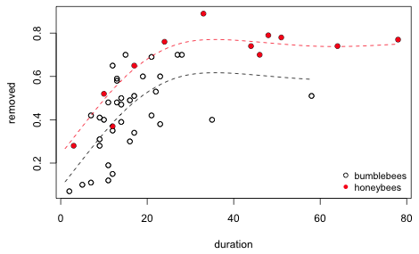
Fig. 7 Additive model with a factor variable and a smooth
We can also let the entire functional form of the smoother vary by bee type by including factor(code) as a predictor and in the by argument of the smoother.
A second way to fit this same model is to use the smoother twice each time selecting a different subset of the data using the by argument.
I graph this model and add it to the smooths of Fig. 7.
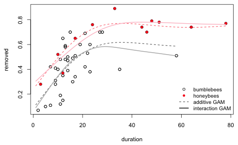
Fig. 8 Interaction model between a factor variable and a smooth
We can compare these models using AIC. I include the common smooth model fit in the previous section for a baseline comparison.
Because these models are fit using the GCV criterion, I'm not sure how seriously to take the AIC values reported here. To play it safe I refit the three models using maximum likelihood, method='ML'.
So based on the GAMs we should prefer a model in which the smooth for honeybees is the same as that of bumblebees except the smooth of honeybees is shifted upward. We can compare these results to the comparable parametric models. I write two new functions that allow the asymptote and/or the scale parameter of the exponential function to vary depending on the value of the code variable.
Model 1: removed ~ myfunc2(duration, I(code - 1), a, b, b1)
Model 2: removed ~ myfunc3(duration, I(code - 1), a, b, a1, b1)
Res.Df Res.Sum Sq Df Sum Sq F value Pr(>F)
1 44 0.72134
2 43 0.72096 1 0.00038147 0.0228 0.8808
Parameters:
Estimate Std. Error t value Pr(>|t|)
a -0.09472 0.01956 -4.842 1.62e-05 ***
b 0.59962 0.05696 10.527 1.34e-13 ***
b1 0.18386 0.05725 3.211 0.00247 **
---
Signif. codes: 0 ‘***’ 0.001 ‘**’ 0.01 ‘*’ 0.05 ‘.’ 0.1 ‘ ’ 1
Residual standard error: 0.128 on 44 degrees of freedom
Number of iterations to convergence: 6
Achieved convergence tolerance: 2.331e-06
Both AIC and statistical testing agree that the two kind of bees should have the same rate parameter a, but different asymptotes b. We can compare the parametric models to the GAMs using AIC. The parametric model ranks best.
I plot the best GAM and the best parametric model superimposed on a scatter plot of the data.

Fig. 9 Best parametric and GAM models for the bee data
As an example of using a GAM to determine transformations of predictors for a parametric model we examine habitat suitability data for the rare Corroboree frog of Australia. The data are from a student's Master's thesis at the University of Canberra, Hunter (2000), and can be found in the DAAG library as the data set frogs. Additional analysis of these data can be found in Chapter 8 of Maindonald and Braun (2003). The variables included in frogs.txt are the following:
The response variable of interest is pres.abs and to simplify things we'll look at just four of the nine predictors: distance, NoOfPools, meanmin, and meanmax.
I verify that there are enough unique values of each predictor to justify fitting a smooth.
Because the response is binary, I carry out logistic regression by specifying the family=binomial argument of gam.
The plot function has a method for gam objects. To see a list of available methods for plot use the methods function on plot.
Non-visible functions are asterisked
Notice that plot.gam is listed. This is a plot method for gam objects and has a number of options specific for displaying GAMs. To see these options bring up the help screen for the plot.gam method.
Fig. 10 Help screen for the plot.gam method
Two especially useful options are pages and select. To get all of the smooths to display on a single page we need to add the argument pages=1 to the plot.gam call.
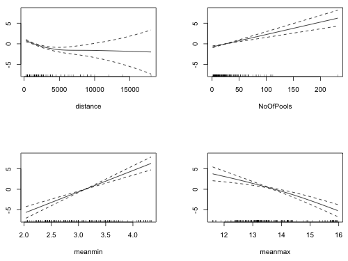
Fig. 11 Estimated partial response functions from the GAM
Each displayed object is the partial response function as estimated by gam. The graphs are analogous to plotting individual regression terms such as ![]() in an ordinary regression model. Fig. 11 suggests that the relationship of the logit with NoOfPools and meanmin is probably linear. The summary table provides additional information.
in an ordinary regression model. Fig. 11 suggests that the relationship of the logit with NoOfPools and meanmin is probably linear. The summary table provides additional information.
Formula:
pres.abs ~ s(distance) + s(NoOfPools) + s(meanmin) + s(meanmax)
Parametric coefficients:
Estimate Std. Error z value Pr(>|z|)
(Intercept) -0.9335 0.2341 -3.987 6.68e-05 ***
---
Signif. codes: 0 ‘***’ 0.001 ‘**’ 0.01 ‘*’ 0.05 ‘.’ 0.1 ‘ ’ 1
Approximate significance of smooth terms:
edf Ref.df Chi.sq p-value
s(distance) 1.794 2.247 8.455 0.018951 *
s(NoOfPools) 1.000 1.000 10.429 0.001241 **
s(meanmin) 1.000 1.000 16.145 5.87e-05 ***
s(meanmax) 1.772 2.224 17.418 0.000225 ***
---
Signif. codes: 0 ‘***’ 0.001 ‘**’ 0.01 ‘*’ 0.05 ‘.’ 0.1 ‘ ’ 1
R-sq.(adj) = 0.363 Deviance explained = 31%
UBRE score = -0.026688 Scale est. = 1 n = 212
The estimated degrees of freedom of the meanmax and distance smoothers exceed 1, while the edf of the smooths for NoOfPools and meanmin is 1, confirming linearity. The graph of the smooth of distance in Fig. 11 resembles an inverted logarithm suggesting log(distance) might be a good choice for a parametric term. (The large range of distance also suggests a logarithmic transformation might be appropriate.) I replace the nonparametric smooth of distance with log(distance) in the GAM.
I compare the two models using AIC.
The model with log(distance) has a lower AIC. We can perhaps obtain a better estimate of AIC by refitting the two models using maximum likelihood estimation, method="ML".
AIC still prefers the semi-parametric model with log(distance) instead of a smoothed distance. The coefficient of the log term is the second entry in the coefficient vector from the model.
We can compare the two fits by superimposing the log term on the graph of the smooth. Because these are marginal response functions the vertical scales are not be the same for these two terms. I choose a value of the intercept for the parametric term so that the two curves overlap. By inspecting the graph and plotting points by trial and error I discover that the first plotted point of the smooth is approximately (250, .8).
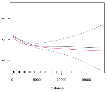
Fig. 12 Superimposing a parametric and a nonparametric smooth
A simpler way to overlay the two graphs is to use the shift argument of plot.gam (the plot method for gam objects) and to specify for this argument the intercept of the gam model.
For the breakpoint function we do the same thing.

Fig. 13 Superimposing a parametric and a nonparametric smooth, method 2
For meanmax I try a quadratic function.
So there is some evidence that we can replace the smooth with a quadratic. To obtain a more reliable result we should compare models fit with maximum likelihood.
Using the GAM we have obtained possible structural forms for the predictors for use in a parametric model: the logarithm of distance and a quadratic model for meanmax.
The data set carib.csv is taken from Selig and Bruno (2010) who compiled a comprehensive global database to compare long-term changes (1969 to 2006) in coral cover from 5170 independent surveys inside 310 MPAs (marine protected areas) around the world and 3364 surveys of unprotected reefs. Surveys were from 4456 reefs across 83 different countries, although a few well-surveyed countries were better represented in the data set. 993 of the surveys were repeated at least twice with 306 in the Caribbean and 687 in the Indo-Pacific. The surveys in the database were conducted across more than 40 years in the Caribbean and more than 30 years in the Indo-Pacific. In today's class we restrict ourselves to the data obtained from reefs in the Caribbean.
Only a few of the variables are of interest to us today. I extract those below and display the first four observations of each.
The data consist of annual surveys of coral reefs carried over various years in the Caribbean. At each survey an estimate was made of the percent of the reef occupied by living coral (HARD_COR_P). This was recorded as a number between 0 and 100. A bounded response can pose a challenge in regression models. To get around this coral cover was converted to an unbounded number by taking its logit.

Coral cover has been declining in the Caribbean over time. To see if the protection of coral reefs in marine sanctuaries is having a positive effect, the trend in coral cover was modeled as a function of the amount of time since the marine sanctuary was created (YEAR_MPA). This is the variable z in the data set.
z = YEAR – YEAR_MPA
When fitting regression models to these data we need to account for the structure of the data set. At its simplest this is a repeated measures design with multiple annual measurements coming from the same reef (REEF_ID_GR). The data are extremely unbalanced with most of the reefs providing only a single year of data. Still, 95 reefs provided 11 years of data and one reef provided 17 years of data.
Many of the reefs are located in the same marine sanctuary (MPA_UID). We might expect that because of their relative proximity and similar management strategies that reefs from the same sanctuary might have a similar response to protection.
The repeated measures design coupled with spatial clustering of reefs leads to observational heterogeneity at three levels. To account for the repeated measures aspect we can assign observations coming from the same reef the same random effect: u0ij, where j denotes the reef and i denotes the marine sanctuary containing that reef. To link reefs coming from the same marine sanctuary we can assign them a common random effect, u0i. In multilevel model notation we can write the three-level random intercepts model as follows.

where i denotes the sanctuary, j the reef in that sanctuary, and k the annual observation on that reef. Each of the error terms is assumed to be drawn from a normal distribution.
![]()
Written as a single composite model we have the following.
![]()
The gamm function of the mgcv package can be used to fit generalized additive mixed effects models. The gamm function calls the lme function of the nlme package to fit the model. In the nlme package there are two different ways to represent a 3-level model with random intercepts at each level. One version is the following.
random = ~1|MPA_UID/REEF_ID_GR
Notice that the larger grouping variable, in this case the marine sanctuary MPA_UID, appears before the smaller grouping variable, the reef REEF_ID_GR and the two of them are separated by a forward slash, /. This notation forces the same coefficient, in this case the intercept, to be random at each level. A more flexible notation also supported by lme that can be used to specify different random effects at each level is the following.
random = list(MPA_UID=~1, REEF_ID_GR=~1)
The second version of the notation is the only version supported by the gamm function. To fit a generalized additive mixed effects model for the logit in which we include a smooth of the predictor z we would enter the following.
Two components are returned: an lme component and a gam component. The lme component contains mostly details from the lme fit that are of little interest to us. It does contain the AIC and log-likelihood of the model though. The gam component contains information about the smooth and it is the component that we need to plot to visualize the smooth.

Fig. 14 Estimated partial response function for the predictor z
The plot suggests that initially coral cover continued its decline but that at approximately 15 years of protection things began to turn around. Then inexplicably at around 30 years of protection the decline began anew. The fitted smooth looks remarkably like a cubic although the reported degrees of freedom of the smooth exceeds six.
Formula:
logit ~ s(z)
Parametric coefficients:
Estimate Std. Error t value Pr(>|t|)
(Intercept) -1.94830 0.09755 -19.97 <2e-16 ***
---
Signif. codes: 0 ‘***’ 0.001 ‘**’ 0.01 ‘*’ 0.05 ‘.’ 0.1 ‘ ’ 1
Approximate significance of smooth terms:
edf Ref.df F p-value
s(z) 6.427 6.427 59.65 <2e-16 ***
---
Signif. codes: 0 ‘***’ 0.001 ‘**’ 0.01 ‘*’ 0.05 ‘.’ 0.1 ‘ ’ 1
R-sq.(adj) = 0.0157 Scale est. = 0.22176 n = 1990
The column labeled edf is the estimated degrees of freedom. This can be thought of as analogous to the degree of a polynomial. When edf = 1 the relationship is linear. If the reported estimated degrees of freedom approaches the default dimension for the spline basis, k = 10, as it does here one should refit the model with a larger value for k using the k= argument of the smooth.
Formula:
logit ~ s(z, k = 15)
Parametric coefficients:
Estimate Std. Error t value Pr(>|t|)
(Intercept) -1.95104 0.09785 -19.94 <2e-16 ***
---
Signif. codes: 0 ‘***’ 0.001 ‘**’ 0.01 ‘*’ 0.05 ‘.’ 0.1 ‘ ’ 1
Approximate significance of smooth terms:
edf Ref.df F p-value
s(z) 9.472 9.472 37.27 <2e-16 ***
---
Signif. codes: 0 ‘***’ 0.001 ‘**’ 0.01 ‘*’ 0.05 ‘.’ 0.1 ‘ ’ 1
R-sq.(adj) = 0.0205 Scale est. = 0.22003 n = 1990
The estimated degrees of freedom has increased substantially, but when we examine the smooth we see it has the same basic form as before but with more wiggles.

Fig. 15 Estimated partial response function for the predictor z using k = 15 knots
If we increase the dimension further, say k = 20, the edf continues to increase (edf = 13.64) and the curve wiggles even more. Part of this may be due to the fact that z is discrete.

Fig. 16 Estimated partial response function for the predictor z using k = 20 knots
I next try replacing the smooth with a cubic.
The cubic model has a lower AIC than the first GAM with a smooth with a basis dimension of 10 but a larger AIC than the second GAM with a smooth with a basis dimension of 15, suggesting that a cubic might be a more parsimonious model. Because there is a single predictor in the model we can compare the smooth with the cubic by plotting the predictions from each model on the same graph. I plot the population-level model for each, level = 0. In order for the plot to display properly we need to sort the predicted values in order of the x-axis variable z. This needs to be done for the predictions from both models.
Finally we can plot things.
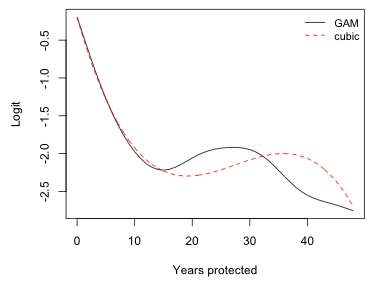
Fig. 17 GAM smoother (10 knots) and cubic function
But there's a problem here that becomes apparent if we add to the graph a bar chart that indicates the distribution of the data. Because the bar chart is on a different scale from the logit graph, I add it by overlaying a second plot on the top of the logit plot. This is accomplished with the global graphics parameter setting new=T to par which prevents a subsequent call to plot from erasing the current graph. To make sure the graphs line up I explicitly specify the same xlim argument for both. I use the ylim argument in the second graph to scale the height of the bars in the bar plot.

Fig. 18 Plot of the GAM along with distribution of the data
The graph shows that the point where the smooth begins its rebound in coral cover corresponds to a portion of the graph where we have very little data. So, it is quite possible the upturn is not real, or at least not reliable. This is one of the dangers of fitting generalized additive models when there are gaps in the data. An alternative to the GAM picture is one continuous decline or perhaps two separate declines but with different slopes. The latter is called a breakpoint regression model. To fit it we need to determine the location of the breakpoint.
A breakpoint regression term in the variable z with breakpoint at z = c has the following form: z + (z-c)*(z>c). From the graph the breakpoint appears to occur somewhere between z = 5 and z = 25. I fit a separate breakpoint model at each integer value in this interval. Because of a peculiarity in the way lme fits models, I need to add the putative breakpoint as a column in the data frame before I fit the model. This should not be necessary and is not required when fitting models using, e.g., the lm function.
Observe that the AIC of the breakpoint model is much lower than that of the cubic model and either GAM. (Note: the correct AIC of the breakpoint model is 4436.615 + 2 = 4438.615, because we should count the estimated breakpoint as a parameter.) I add the breakpoint model to Fig. 18.

Fig. 19 Plot of the GAM along with breakpoint regression model
| Jack Weiss Phone: (919) 962-5930 E-Mail: jack_weiss@unc.edu Address: Curriculum for the Environment and Ecology, Box 3275, University of North Carolina, Chapel Hill, 27599 Copyright © 2012 Last Revised--March 20, 2012 URL: https://sakai.unc.edu/access/content/group/2842013b-58f5-4453-aa8d-3e01bacbfc3d/public/Ecol562_Spring2012/docs/lectures/lecture26.htm |