This is a portion of the data set analyzed by Bruno et al. (2007). The abstract of their paper is given below.
Very little is known about how environmental changes such as increasing temperature affect disease dynamics in the ocean, especially at large spatial scales. We asked whether the frequency of warm temperature anomalies is positively related to the frequency of coral disease across 1,500 km of Australia's Great Barrier Reef. We used a new high-resolution satellite data set of ocean temperature and 6 yr of coral disease and coral cover data from annual surveys of 48 reefs to answer this question. We found a highly significant relationship between the frequencies of warm temperature anomalies and of white syndrome, an emergent disease, or potentially, a group of diseases, of Pacific reef- building corals. The effect of temperature was highly dependent on coral cover because white syndrome outbreaks followed warm years, but only on high (> 50%) cover reefs, suggesting an important role of host density as a threshold for outbreaks. Our results indicate that the frequency of temperature anomalies, which is predicted to increase in most tropical oceans, can increase the susceptibility of corals to disease, leading to outbreaks where corals are abundant.
The variables of interest in the data set are the following.
The data arise from repeated surveys of 48 reefs using 50-meter permanent transects. Although the selected reefs exhibit a marked spatial structure with a high degree of clustering and the data were collected repeatedly over time, we will ignore the issue of spatial and temporal correlation in our analysis.
The data file was saved from Excel as a comma-delimited text file. Such a file can be read into R using the read.table function by specifying the argument sep=',' to indicate that variable fields are separated by commas. I stored the file in the 'ecol 562' folder in my Documents folder. The Documents folder is my default R working directory so I only need to specify 'ecol 562/corals.csv' to reference the file
Alternatively there is another R function read.csv that automatically assumes the file is comma-delimited and doesn't require the sep argument.
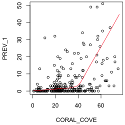
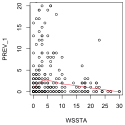
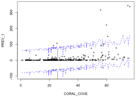
The response variable of interest is PREV_1. To assess the nature of its relationship to coral cover and WSSTA, I plot it against each of these variables in turn. To better see the nature of the relationship I superimpose a "locally weighted smooth". This is a non-parametric regression model that responds to local patterns in the data. We'll discuss non-parametric regression in detail later in the course so I'll spare you the details until then. I use the R lowess function to estimate the smooth and the lines function to draw the regression curve. (The lowess function returns a set of x- and y-coordinates of points that can then be connected with line segments.) I limit the y-range of the data so that the lowess curve is more visible. The lowess function doesn't have a data argument so I have to reference the data frame as part of the variable name.
The plot against coral cover suggests a segmented or even a quadratic relationship. The plot against WSSTA suggests a weak quadratic relationship. Of course these are just bivariate relationships. It is possible that when we control for other variables in the regression model the nature of the relationship with the response may change.
| (a) |
(b) |
| Fig. 1 Plots of disease prevalence against (a) coral cover and (b) WSSTA. A locally weighted regression smoother is shown to better indicate the nature of the relationship between the variables. | |
I start by assuming the response is normally distributed and based on Fig. 1 I model the mean as quadratic in WSSTA, linear in coral cover, with an interaction between coral cover and WSSTA.
To include a quadratic term in the model we could create a variable directly in the corals data frame that is the square of WSSTA. Alternatively we can just square WSSTA within the model call. For that we need to use the I function of R, which permits one to perform arithmetic on variables in a model. Without the I function the arithmetic calculations would be ignored.
Because all of the predictors are continuous, the output from the anova and summary functions here are similar. The anova function is still useful because it does variables-added-in-order tests in a logical fashion so that WSSTA is added before WSSTA2 and the interaction term is added last.
Response: PREV_1
Df Sum Sq Mean Sq F value Pr(>F)
CORAL_COVE 1 60212 60212 47.449 3.839e-11 ***
WSSTA 1 127 127 0.100 0.7520837
I(WSSTA^2) 1 19690 19690 15.516 0.0001038 ***
CORAL_COVE:WSSTA 1 14746 14746 11.620 0.0007500 ***
Residuals 275 348972 1269
---
Signif. codes: 0 ‘***’ 0.001 ‘**’ 0.01 ‘*’ 0.05 ‘.’ 0.1 ‘ ’ 1
Because this is a variables-added-in-order table, all the tests make sense. First we see there is a significant effect due to coral cover. Controlling for coral cover there is no linear effect of WSSTA, but there is a quadratic effect. Finally the interaction between coral cover and WSSTA is statistically significant.
The summary table provides variables-added-last tests so all but the tests of WSSTA2 and the interaction are silly. (For instance, it doesn't make sense to test the significance of WSSTA with both the quadratic term and the interaction term already in the model.) From the estimates we see that disease prevalence increases with coral cover and that the coral cover effect on disease prevalence is further increased by WSSTA (the interaction term). The quadratic effect of WSSTA is in the form of a parabola opening down. Without plotting the model we can't tell if the vertex of the parabola occurs at a value of WSSTA within the range of the data, but from Fig. 1b we would suspect that it does.
Call:
lm(formula = PREV_1 ~ CORAL_COVE * WSSTA + I(WSSTA^2), data = corals)
Residuals:
Min 1Q Median 3Q Max
-86.716 -11.684 -2.682 4.856 263.366
Coefficients:
Estimate Std. Error t value Pr(>|t|)
(Intercept) -10.71376 6.28473 -1.705 0.08937 .
CORAL_COVE 0.45081 0.17105 2.636 0.00888 **
WSSTA 1.32007 1.19505 1.105 0.27029
I(WSSTA^2) -0.16345 0.04140 -3.948 0.00010 ***
CORAL_COVE:WSSTA 0.07528 0.02208 3.409 0.00075 ***
---
Signif. codes: 0 ‘***’ 0.001 ‘**’ 0.01 ‘*’ 0.05 ‘.’ 0.1 ‘ ’ 1
Residual standard error: 35.62 on 275 degrees of freedom
Multiple R-squared: 0.2136, Adjusted R-squared: 0.2021
F-statistic: 18.67 on 4 and 275 DF, p-value: 1.365e-13
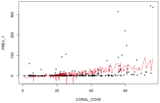
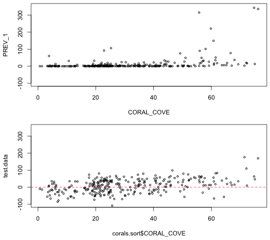
To assess the fit of the model we can plot the estimated model superimposed on the data. Because there are two continuous predictors in the model we really need three dimensions to fully visualize things, but it is possible to obtain a crude picture in two dimensions. Each observation in the data set has a different value of coral cover. The unique function extracts the unique values of a variable minus the duplicates.
We can use this to our advantage by sorting the data frame by coral cover and refitting the model. The model predictions we obtain are now ordered by increasing coral cover so that we can plot the predicted mean against coral cover and connect the predictions by line segments. The result will be a jagged line with the jags corresponding to adjustments in the predicted mean due to an observation's value of WSSTA.
The order function can be used to sort a data frame by one of its variables. To illustrate how order works I create a vector of the first 10 positive integers and then randomly permute them with the sample function. By default the sample function uses the internal clock seed to initialize its random number generator. I set the seed explicitly with the set.seed function so that I can generate the same "random" permutation again if desired. To use set.seed enter a positive integer of any size as its argument. Different choices of the integer will yield different seeds and hence different permutations.
The order function returns the positions of the entries that would appear first, second, etc. if the vector was sorted. So, we see that the element at position 7 would be first, the element at position 10 would be second, etc.
The output of the order function can then be used to sort the elements of x.
With a data frame we use the order function to sort the rows of the data frame. The following call sorts the rows of the data frame by coral cover and stores the result in a new data frame.
I now refit the regression model using this new data frame.
Next I plot prevalence against coral cover and then superimpose the predicted means connected by line segments.
 |
|
| Fig. 2 Plot of the predicted normal mean for each observation (red). The jags are due to variations in WSSTA for individual observations. | |
Notice that in a number of places the predicted mean prevalence is negative! We can get a slightly more informative picture if we include the likely range for observations that could be generated by this model. I construct confidence bounds within which we expect 95% of the observations to lie. For this we need the standard deviation of the estimated normal curve. This value is contained in the sigma component of the object created by the summary function.
 |
|
| Fig. 3 Repeat of Fig. 1 but with 95% confidence bands for individual observations shown (blue). | |
Notice that although there are some obvious outliers, most of the observations do fall within the 95% bands. Yet it's quite obvious given that the lower confidence band is almost entirely negative that this is a terrible model.
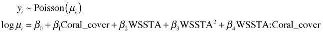
We can get a better sense of that by using the model to generate data and then assessing whether the data generated by the model look at all like the data we actually obtained. To do this I use the rnorm function to generate one observation from a normal distribution for each of the predicted means. In the call below, x corresponds to the mean that is obtained from the predict function applied to the model. In order to get a single value for each mean we need to use the sapply function.
We plot the simulated data and compare it against the actual data. To facilitate the comparison the graphs are placed one above the other in a single graphics window using the mfrow argument of the global graphics function par. In mfrow we need to specify the dimensions of the graph matrix we wish to create: the number of rows followed by the number of columns. After creating the graphs we then reset mfrow back to its default of 1 row and 1 column.
 |
|
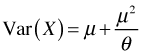
| Fig. 4 Display of actual data (top) and one realization of data generated from the estimated normal model. Clearly the two do not look at all alike. | |
It's pretty clear that the simulated data don't look anything like the actual data. Not only are there a lot of negative values in the simulated data set, the data form a wide band around the predicted mean. The actual data form a very narrow band with most of the observations having a prevalence of zero. Furthermore the normal model seems incapable of generating the large outliers that we see in the raw data.
The Poisson distribution is a natural choice for count data so we try fitting it next. The default choice is to use a log link for the mean.
Model: poisson, link: log
Response: PREV_1
Terms added sequentially (first to last)
Df Deviance Resid. Df Resid. Dev Pr(>Chi)
NULL 279 11827.0
WSSTA 1 36.6 278 11790.4 1.417e-09 ***
CORAL_COVE 1 4632.3 277 7158.0 < 2.2e-16 ***
I(WSSTA^2) 1 1967.7 276 5190.4 < 2.2e-16 ***
WSSTA:CORAL_COVE 1 278.1 275 4912.3 < 2.2e-16 ***
---
Signif. codes: 0 ‘***’ 0.001 ‘**’ 0.01 ‘*’ 0.05 ‘.’ 0.1 ‘ ’ 1
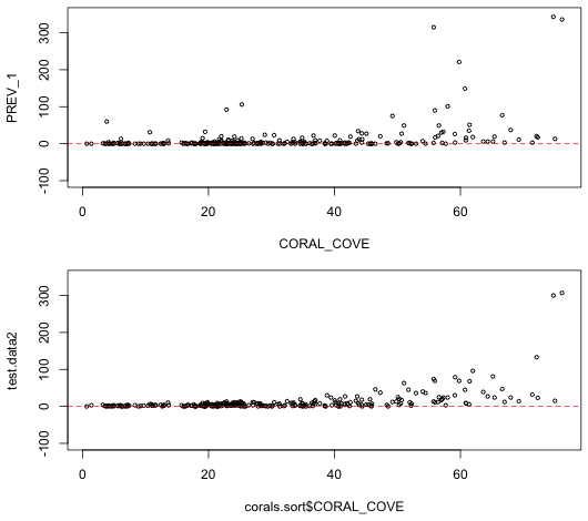
From the anova output we see that each variable added in order is statistically significant, agreeing with our conclusions from the normal model. The coefficient estimates have the same sign as in the normal model indicating the direction of the effects is also the same. We next try simulating data from the fitted Poisson model to see if the results more closely resemble what we observed. The rpois function generates random values from a specified Poisson distribution. Because we used a log link we have to exponentiate the predicted values to get the means.
 |
|
| Fig. 5 Display of actual data (top) and one realization of data generated from the estimated Poisson model (bottom). | |
The Poisson model appears to do a lot better than the normal in producing data that resemble what we actually observed. The Poisson model respects the lower bound of zero and is even able to generate a couple of the outliers. One noteworthy deficiency is that the spread in the Poisson data is too regular when compared to the actual data. In particular at low values of coral cover the variability in the predictions is extremely low whereas the actual data show far more spread. The regularity in the simulated data is a consequence of the fact that in the Poisson distribution the mean is equal to the variance.
We can compare the Poisson and normal models using log-likelihood and AIC. Because the Poisson estimates one less parameter than does the normal, AIC provides a fairer comparison.
Using either AIC or log-likelihood we conclude that the Poisson is a far worse model than the normal. Given what we saw in Figs. 4 and 5 this is somewhat surprising. Because we're comparing a density with a probability, perhaps the midpoint approximation of the normal probability is doing a poor job here. To check this we can write our own functions to calculate the log-likelihood and compare the midpoint approximation against using the actual area under the normal curve. Because the maximum likelihood estimate of σ2 uses a denominator of n rather than n – p, we need to calculate it explicitly in the function and use a denominator of n. The residuals function extracts estimates of the model errors that can then be used to construct the sum of squared errors (SEE).
The log-likelihood using the actual probabilities and the log-likelihood using the density approximation are nearly identical, so the poor performance must have to do with the Poisson model itself. The source of the problem is the inflexibility of the Poisson distribution. To see this I examine some of the large values predicted by the Poisson distribution here.
The second observation shown had a predicted mean of 85.2 that yielded a simulated random count of 79. The observed value for this observation was a count of 3. What's the probability of obtaining such a count under the Poisson model?
It's astronomically low. In fact the total probability of obtaining counts 69 or less is less than .05.
Under the normal model the predicted mean of this observation is 51.7, quite a bit lower than the Poisson, but still much larger than the observed value of 3. The probability of realizing a count of 3 under the normal model is 0.004, roughly 1029 times higher than for the Poisson. The probability of seeing a value of 3 or smaller is 0.088 (of course this includes negative values too). Extreme values are much more likely under the normal model than under the Poisson.
A negative binomial (NB) distribution is discrete and, like the Poisson distribution, is bounded below by 0 but is theoretically unbounded above. The negative binomial distribution is a two-parameter distribution, written ![]() , where the only restriction on μ and θ is that they are positive. Here μ is the mean of the distribution and θ is called the size parameter (in the R documentation), or more usually the dispersion parameter (or overdispersion parameter).
, where the only restriction on μ and θ is that they are positive. Here μ is the mean of the distribution and θ is called the size parameter (in the R documentation), or more usually the dispersion parameter (or overdispersion parameter).
A Poisson random variable can be viewed as the limit of a negative binomial random variable when the parameter θ is allowed to become infinite. So, in a sense θ is a measure of deviation from a Poisson distribution. Given that there are infinitely many other choices for θ, this is further evidence of the flexibility of the negative binomial distribution over the Poisson distribution.
The variance of the negative binomial distribution is a quadratic function of the mean.
Since 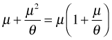 , this represents a parabola opening up that crosses the μ-axis at the origin and at the point μ = –θ. As
 ![]() ,
, ![]() , and we have the variance of a Poisson random variable. θ affects the rate at which the parabola grows. For large θ, the parabola is very flat while for small θ the parabola is narrow. Thus θ can be used to describe a whole range of heteroscedastic behavior.
, and we have the variance of a Poisson random variable. θ affects the rate at which the parabola grows. For large θ, the parabola is very flat while for small θ the parabola is narrow. Thus θ can be used to describe a whole range of heteroscedastic behavior.
Regression models with a negative binomial distribution can be fit using the glm.nb function of the MASS package. The MASS package is part of the standard installation of R but it does need to be loaded into memory with the library function.
The glm.nb function uses a log link by default, so we're fitting the following model.
The anova function carries out likelihood ratio tests on glm.nb models without the need for a test argument.
Model: Negative Binomial(0.3699), link: log
Response: PREV_1
Terms added sequentially (first to last)
Df Deviance Resid. Df Resid. Dev Pr(>Chi)
NULL 279 456.84
CORAL_COVE 1 108.066 278 348.77 < 2.2e-16 ***
WSSTA 1 2.518 277 346.26 0.1126
I(WSSTA^2) 1 64.895 276 281.36 7.899e-16 ***
CORAL_COVE:WSSTA 1 2.161 275 279.20 0.1415
---
Signif. codes: 0 ‘***’ 0.001 ‘**’ 0.01 ‘*’ 0.05 ‘.’ 0.1 ‘ ’ 1
Warning message:
In anova.negbin(model3) : tests made without re-estimating 'theta'
The statistical tests lead us to a final model that is different from before. The interaction of WSSTA and coral cover is not statistically significant in the negative binomial model. The Wald test of the interaction in the output of the summary function agrees with the likelihood ratio test.
Deviance Residuals:
Min 1Q Median 3Q Max
-1.8883 -1.1822 -0.6006 -0.0013 3.7642
Coefficients:
Estimate Std. Error z value Pr(>|z|)
(Intercept) -0.436147 0.321700 -1.356 0.1752
CORAL_COVE 0.039771 0.008451 4.706 2.53e-06 ***
WSSTA 0.372167 0.065724 5.663 1.49e-08 ***
I(WSSTA^2) -0.022375 0.002847 -7.861 3.82e-15 ***
CORAL_COVE:WSSTA 0.001884 0.001139 1.654 0.0982 .
---
Signif. codes: 0 ‘***’ 0.001 ‘**’ 0.01 ‘*’ 0.05 ‘.’ 0.1 ‘ ’ 1
(Dispersion parameter for Negative Binomial(0.3699) family taken to be 1)
Null deviance: 456.84 on 279 degrees of freedom
Residual deviance: 279.20 on 275 degrees of freedom
AIC: 1427.9
Number of Fisher Scoring iterations: 1
Theta: 0.3699
Std. Err.: 0.0379
2 x log-likelihood: -1415.8520
Comparing the coefficient estimates of the three models fit thus far, the Poisson and negative binomial fits return fairly similar estimates but different from the normal model. Both use a log link, while the normal model uses an identity link.
According to AIC, the negative binomial model is the clear winner.
The dispersion parameter is called theta and is returned as a component of the glm.nb model object.
Using it we can simulate data from our model using the rnbinom function.
I graph the generated data and compare it to both the raw data and the simulated data from the Poisson model.
 |
|
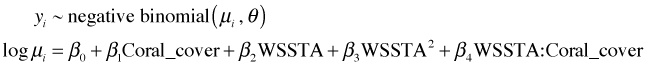
Fig. 6 Display of actual data (top) and one realization of data generated from the estimated Poisson model (middle) and negative binomial model (bottom). |
|
Notice that the data generated from the negative binomial model more closely resembles the actual data than does the Poisson. In particular the negative binomial data show a good deal of variability even at low coral cover values just like the actual data does.
The log-transformation has long been recommended for analyzing count data particularly when the counts are highly skewed. The usual assumption that is made is that the log counts are normally distributed.
By definition, if a log-transformed response is normally distributed the original variable is said to have a lognormal distribution.
If we try to fit a normal model to log-transformed prevalence we obtain an error message.
The problem is that are some zero values for the response in the data set and the logarithm of zero is undefined. The usual fix is to add a small constant, a number between 0 and 1, to each of the response values. I refit the model by adding 0.5 to each value of prevalence.
Recall that because the response variable has been transformed, the reported AIC is not comparable to the AIC of models fit to the raw response.
The choice of additive constant in a lognormal model can affect the results. We can formulate this as a maximum likelihood estimation problem and choose the value for the constant that maximizes the likelihood. I write a function that takes two arguments: the value of the constant and the response variable. The first line of the function shown below fits the model for the specified value of the constant. As was explained in lecture 10, the exact count probabilities when using a density are calculated as the area under the curve over the interval (log(y + k – 0.5), log(y + k + 0.5)). When y = 0, the boundary value, the interval is (–∞, log(y + k + 0.5)). Because the log-transformed response is assumed to be normally distributed, these probabilities are easily calculated with the pnorm function.
I test the function.
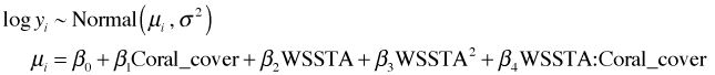
The warning message occurs because of the way ifelse is evaluated. Although in the function we choose the value of prob depending on whether y==0 or not, both alternatives are evaluated each time. So when k < 0.5 the evaluation of log(y + k – 0.5) is undefined. The message is annoying but it doesn't affect the results. I calculate the log-likelihood for a range of values for k and plot the results.
From the graph (Fig. 7a) the maximum appears to be occurring near k = 0.1. I recalculate things and plot over a smaller range.
(a) 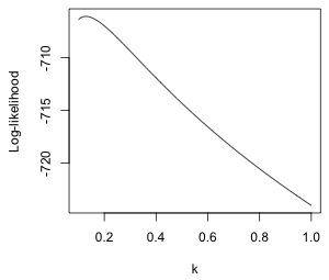 |
(b) 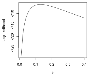 |
| Fig. 7 Normal log-likelihood for different choices of the additive constant k in log(y + k). | |
We can use the which.max function to locate the value of k that yields the maximum. The which.max function returns the position in a vector that corresponds to the maximum value.
So we should use k = 0.13. I refit the model with this choice of constant.
Response: log(PREV_1 + 0.13)
Df Sum Sq Mean Sq F value Pr(>F)
CORAL_COVE 1 262.96 262.964 80.9313 < 2.2e-16 ***
WSSTA 1 14.83 14.826 4.5630 0.03355 *
I(WSSTA^2) 1 97.32 97.317 29.9509 9.978e-08 ***
CORAL_COVE:WSSTA 1 0.15 0.152 0.0468 0.82881
Residuals 275 893.54 3.249
---
Signif. codes: 0 ‘***’ 0.001 ‘**’ 0.01 ‘*’ 0.05 ‘.’ 0.1 ‘ ’ 1
The results are in agreement with the negative binomial model. The interaction between coral cover and WSSTA is not significant.
I compare the estimates of the regression parameters for all the models we've considered.
There are differences in some of the magnitudes but the signs of the estimates are in agreement except for the interaction term which is not significant in the negative binomial and lognormal models.
I collect the log-likelihoods, AIC values, and number of estimated parameters of all four of the models in a single data frame. So that we have a general function for this purpose, I rewrite the log-likelihood function for a log transformation so that the fitted model is one of the arguments.
It's worth noting that using the density version of the log-likelihood here gives a different answer. This is because the probability of the zero category is poorly approximated by the midpoint approximation. The density used here is the one obtained from the change of variables formula for integration (lecture 10).
For the lognormal model the estimated parameters consist of the five regression coefficients, the variance σ2, and the additive constant k that we estimated separately making a total of 7 parameters. The Poisson has 5 estimated parameters, while the negative binomial and normal model have six parameters. (The negative binomial model has the additional dispersion parameter θ while the normal model has the normal variance σ2.)
So the lognormal model narrowly edges out the negative binomial model using AIC. The Poisson and normal models are not even in the race.
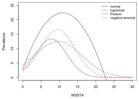
The final model contains two predictors, coral cover and WSSTA, so to fully fully visualize the model we need three dimensions. Because WSSTA is the variable of interest while coral cover is just a control variable, we can choose a convenient value for coral cover and plot the model prediction as a function of WSSTA in two dimension. The mean coral cover in the data set is 30.8%,
so a convenient value to use is 30%. I use the interaction model for all four probability distributions even though the interaction term was not significant in the negative binomial and lognormal models. I start by writing a function that returns the regression equation for a given model at a specified value of WSSTA and coral cover.
To draw the models I use the curve function. The curve function accepts a function of a single variable x as its first argument and draws the function over a range specified by the arguments from and to. Because curve is a high-level function it will erase the contents of the graphics window when it is used a second time. To prevent that I include the add=T argument to the subsequent calls to curve. The equations for the Poisson, negative binomial, and lognormal models are all exponentiated to place things on the scale of the raw response.
 |
|
| Fig. 8 Plot of predicted regression means for the normal, Poisson, and negative binomial models. The curve for the lognormal model represents its median, not its mean. | |
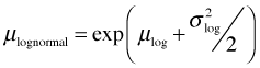
The graph of the lognormal model looks unusual. That's because exponentiating the lognormal model has not returned the mean, but instead has returned the median on the raw scale. (We'll discuss the reason for this next time.) The lognormal distribution is typically positively skewed so that the median and mean are very different. The mean of the lognormal distribution can be expressed in terms of μ and σ2, the mean and variance of the log-transformed variables.
I redraw Fig. 8 replacing the graph of the lognormal median with the graph of the lognormal mean.
 |
|
| Fig. 9 Plot of predicted regression means for the normal, lognormal, Poisson, and negative binomial models. | |
| Jack Weiss Phone: (919) 962-5930 E-Mail: jack_weiss@unc.edu Address: Curriculum for the Environment and Ecology, Box 3275, University of North Carolina, Chapel Hill, 27599 Copyright © 2012 Last Revised--February 7, 2012 URL: https://sakai.unc.edu/access/content/group/2842013b-58f5-4453-aa8d-3e01bacbfc3d/public/Ecol562_Spring2012/docs/lectures/lecture11.htm |