Assignment 2— Solution
Question 1
I read in the data, convert Density to a factor, and fit the two-factor analysis of variance model with Eggs as the response and Season, Density, and their interaction as predictors as in Assignment 1.
quinn <- read.csv( 'ecol 563/quinn1.csv')
quinn$Density <- factor(quinn$Density)
out1 <- lm(Eggs ~ Density*Season, data=quinn)
I extract the required coefficients and calculate 95% confidence intervals.
ests <- coef(out1)[2:6]
se <- summary(out1)$coefficients[2:6,2]
low95 <- ests+qt(.025,out1$df.residual)*se
up95 <- ests+qt(.975,out1$df.residual)*se
new.data <- data.frame(var.labels=factor(names(ests), levels=names(ests)), ests, low95, up95)
new.data
var.labels ests low95 up95
Density12 Density12 -0.0003333333 -0.6732704 0.6726038
Density24 Density24 -0.4166666667 -1.0896038 0.2562704
Seasonsummer Seasonsummer 2.7753333333 2.1023962 3.4482704
Density12:Seasonsummer Density12:Seasonsummer -0.9996666667 -1.9513434 -0.0479899
Density24:Seasonsummer Density24:Seasonsummer -1.4700000000 -2.4216768 -0.5183232
These match the values we could have obtained more easily using the confint function.
confint(out1)[2:6,]
2.5 % 97.5 %
Density12 -0.6732704 0.6726038
Density24 -1.0896038 0.2562704
Seasonsummer 2.1023962 3.4482704
Density12:Seasonsummer -1.9513434 -0.0479899
Density24:Seasonsummer -2.4216768 -0.5183232
Other than changing the labels and the number of y-axis tick marks and increasing the range on xlim, the code presented in class will work here almost unmodified. Using lattice we get the following graph.
mylabs <- c('Density 12', 'Density 24', 'Summer', expression('Density 12' %*% 'Summer'), expression('Density 24' %*% 'Summer'))
library(lattice)
dotplot(var.labels~ests, data=new.data, xlim=c(min(new.data$low95)-.3, max(new.data$up95)+.3), xlab='Estimated effect', panel=function(x,y){
panel.dotplot(x, y, col='white', cex=.01)
panel.segments(new.data$low95, as.numeric(y), new.data$up95, as.numeric(y), col="#0080ff")
panel.xyplot(x, y, pch=16, cex=1)
panel.abline(v=0, col=2, lty=2)
}, scales=list(y=list(at=1:5, labels=mylabs)))
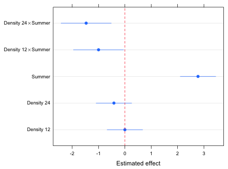
Fig. 1 Effects graph for the egg count model
Question 2
The easiest way to obtain the means is to trick R into giving them to us by fitting the following model in which we remove the intercept and include only the interaction term.
out1a <- lm(Eggs ~ Density:Season-1, data=quinn)
coef(out1a)
Density6:Seasonspring Density12:Seasonspring Density24:Seasonspring
1.1113333 1.1110000 0.6946667
Density6:Seasonsummer Density12:Seasonsummer Density24:Seasonsummer
3.8866667 2.8866667 2.0000000
fac.vals <- expand.grid(Density=c(6,12,24), Season=c('spring','summer'))
fac.vals
Density Season
1 6 spring
2 12 spring
3 24 spring
4 6 summer
5 12 summer
6 24 summer
confint(out1a)
2.5 % 97.5 %
Density6:Seasonspring 0.6354950 1.587172
Density12:Seasonspring 0.6351616 1.586838
Density24:Seasonspring 0.2188283 1.170505
Density6:Seasonsummer 3.4108283 4.362505
Density12:Seasonsummer 2.4108283 3.362505
Density24:Seasonsummer 1.5241616 2.475838
part1 <- data.frame(fac.vals, ests=coef(out1a), se=summary(out1a)$coefficients[,2], low95=confint(out1a)[,1], up95=confint(out1a)[,2])
part1
Density Season ests se low95 up95
Density6:Seasonspring 6 spring 1.1113333 0.2183934 0.6354950 1.587172
Density12:Seasonspring 12 spring 1.1110000 0.2183934 0.6351616 1.586838
Density24:Seasonspring 24 spring 0.6946667 0.2183934 0.2188283 1.170505
Density6:Seasonsummer 6 summer 3.8866667 0.2183934 3.4108283 4.362505
Density12:Seasonsummer 12 summer 2.8866667 0.2183934 2.4108283 3.362505
Density24:Seasonsummer 24 summer 2.0000000 0.2183934 1.5241616 2.475838
Alternatively we can use the predict function on the original model.
fac.vals$Density <- factor(fac.vals$Density)
out.p <- predict(out1, newdata=fac.vals, se.fit=T, interval="confidence")
out.p
$fit
fit lwr upr
1 1.1113333 0.6354950 1.587172
2 1.1110000 0.6351616 1.586838
3 0.6946667 0.2188283 1.170505
4 3.8866667 3.4108283 4.362505
5 2.8866667 2.4108283 3.362505
6 2.0000000 1.5241616 2.475838
$se.fit
1 2 3 4 5 6
0.2183934 0.2183934 0.2183934 0.2183934 0.2183934 0.2183934
$df
[1] 12
$residual.scale
[1] 0.3782685
part1a <- data.frame(fac.vals, ests=out.p$fit[,1], se=out.p$se.fit, low95=out.p$fit[,2], up95=out.p$fit[,3])
part1a
Density Season ests se low95 up95
1 6 spring 1.1113333 0.2183934 0.6354950 1.587172
2 12 spring 1.1110000 0.2183934 0.6351616 1.586838
3 24 spring 0.6946667 0.2183934 0.2188283 1.170505
4 6 summer 3.8866667 0.2183934 3.4108283 4.362505
5 12 summer 2.8866667 0.2183934 2.4108283 3.362505
6 24 summer 2.0000000 0.2183934 1.5241616 2.475838
Question 3
I obtain the numerical values of the Density categories.
part1a$density.num <- as.numeric(part1a$Density)
To produce the interaction graph requires only trivial modifications from the code presented in lecture. The changes to that code are highlighted. Because the error bars don't overlap I don't bother to jitter the profiles. (I set myjitter equal to zero.)
results.mine <- part1a
plot(c(.8,3.2), range(results.mine[,c("up95", "low95")]), type='n', xlab="Density", ylab='Mean egg count', axes=F)
axis(1, at=1:3, labels=levels(results.mine$Density))
axis(2)
box()
# Spring
cur.dat <- results.mine[results.mine$Season=='spring',]
myjitter <- 0
arrows(cur.dat$density.num+myjitter, cur.dat$low95, cur.dat$density.num+myjitter, cur.dat$up95, angle=90, code=3, length=.05, col=1)
lines(cur.dat$density.num+myjitter, cur.dat$ests, col=1)
points(cur.dat$density.num+myjitter, cur.dat$ests, col=1, pch=16)
# Summer
cur.dat <- results.mine[results.mine$Season=='summer',]
myjitter <- 0
arrows(cur.dat$density.num+myjitter, cur.dat$low95, cur.dat$density.num+myjitter, cur.dat$up95, angle=90, code=3, length=.05, col=2)
lines(cur.dat$density.num+myjitter, cur.dat$ests, col=2)
points(cur.dat$density.num+myjitter, cur.dat$ests, col='white', pch=16, cex=1.1)
points(cur.dat$density.num+myjitter, cur.dat$ests, col=2, pch=1)
legend('topright', c('Spring','Summer'), col=1:2, pch=c(16,1), cex=.8, pt.cex=.9, title=expression(bold('Season')), bty='n')
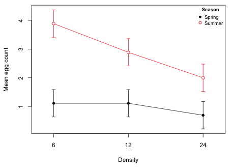
Fig. 2 Interaction plot
Course Home Page