Choosing a best model from a collection of candidates is a nontrivial task for which statisticians can only offer rough guidelines. The first step is to choose a suitable collection of candidate models. This is fundamentally a biological problem rather than a statistical one (although statistics can offer guidelines in, for example, the choice of probability generating mechanisms). In what follows I will assume a manageable set of models based on clear biological principles has already been assembled.
Having chosen the field of candidates the next problem is choosing a criterion on which to evaluate them. Methods based on significance testing have limited utility here.
We can compare non-nested models directly using log-likelihood as long as all the models in question estimate the same number of parameters, use the same response variable, and use exactly the same set of observations in fitting the model. The rule is simple. Models with larger log-likelihoods are better models although there is no real way to quantify how much better. When two models use the same response variable but in one model the response variable is transformed (log, square root, or the like) but in the other it is not, then these models cannot be compared directly using the log-likelihoods of the fitted models. Fortunately it is possible to reformulate the log-likelihood of the transformed model and use the reformulated version for model comparisons. The details for doing this are discussed lecture 20.
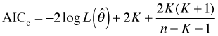
Information-theoretic approaches offer an alternative to significance testing and provide a way to extend log-likelhood comparisons to models with different numbers of parameters. There are a number of information-based criteria. I will mention three: AIC, AICc, and BIC. In what follows I use the following notation.
Using this notation the three information-theoretic criteria I mentioned are defined as follows.
![]()
![]()
Better models are those that yield the smaller values of these statistics. Observe that all of these statistics involve the log-likelihood. Since the likelihood is the probability of obtaining the data under the given model it makes sense to choose a model that makes this probability as large as possible. Taking the log doesn't change anything, but putting the minus sign in front flips things around. Now instead of maximizing you need to minimize. The model with the smallest value of one of these statistics is best.
All three statistics have the same first term but they differ in the remaining terms. Notice that in each case the terms being added to ![]() are positive. Thus these terms make the value of the corresponding statistic bigger which in turn makes it harder for that model to be chosen best. The terms being added to
are positive. Thus these terms make the value of the corresponding statistic bigger which in turn makes it harder for that model to be chosen best. The terms being added to ![]() are called penalty terms and it's often stated that the reason they are included is to prevent overfitting. Thus you'll often see it stated that AIC and BIC are more or less equivalent statistics differing only in that they use different "penalty" terms, 2K for AIC versus
are called penalty terms and it's often stated that the reason they are included is to prevent overfitting. Thus you'll often see it stated that AIC and BIC are more or less equivalent statistics differing only in that they use different "penalty" terms, 2K for AIC versus ![]() for BIC. Because the BIC penalty term grows in magnitude more quickly than the AIC penalty term as K increases, BIC favors smaller models than does AIC.
for BIC. Because the BIC penalty term grows in magnitude more quickly than the AIC penalty term as K increases, BIC favors smaller models than does AIC.
While it's useful to think of model building as a balance between improved fit (increased log-likelihood) and parsimony (fewer parameters), treating the additional term in the formula for AIC as just a penalty term is really incorrect and reflects a complete lack of understanding of how AIC is derived. As we'll see the 2K term is an essential part of the definition of AIC and is more than just a penalty term.
Among the information-theoretic criteria AIC is the most popular and certainly the most used among biologists. AIC has had two primary champions, David Anderson and Ken Burnham both of Colorado State University. Anderson is a wildlife biologist and Burnham is a statistician. These men have been promoting AIC as part of a comprehensive program of model selection in the biological sciences. They have done so through
Anderson and Burnham have been fairly successful in their mission. As an example, the Journal of Wildlife Management now actively promotes the use of AIC instead of significance testing for model selection in the manuscripts it solicits. Most of the editors of the journal are well-versed in information-theoretic approaches to model selection and are promoters of it.
The primary attraction of AIC over other methods of model selection is that it is not an ad hoc method but instead has a strong theoretical basis. Although the 2K in the AIC formula does serve as a penalty term by penalizing bigger models when the additional parameters don't sufficiently increase the log-likelihood, it is actually much more than a mere penalty term. In what follows I outline a bit of the theory that lies behind AIC. Additional details can be found in Burnham and Anderson (2002).
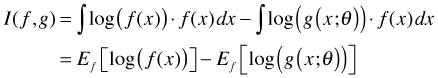
The Kullback-Leibler (K-L) information between models f and g is defined for continuous distributions as follows.
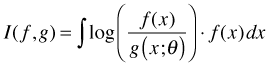
Here f and g are probability distributions. The verbal description of I(f, g) is that it represents the distance from model g to model f. Alternatively it is the information lost when using g to approximate f. Typically, g is taken to be an approximating model while f is taken to be the true state of nature. The quantity θ denotes the various parameters used in the specification of g. As a measure of distance, I(f, g) is a strange beast. Because of the asymmetry in the way f and g are treated in the integral, I(f, g) ≠ I(g, f).
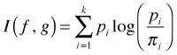
The form the K-L information takes for discrete probability models may be a bit more enlightening. Let the true state of nature be
![]()
and the approximating model be
![]()
The K-L information between models f and g is defined for discrete distributions to be
Because the log of a quotient is the difference of logs, the K-L information is also given by
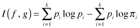
You may recognize that one of the two terms in this difference has the same form as H, the Shannon-Weiner diversity index, another information-based measure.
The logarithm function plays a key role in any formulation of information. This is the case because while independent bits of information multiply on a probability scale, they need to add on an information scale. Recall that for independent events A and B, the probability of observing both is the product of the individual probabilities.
![]()
But if the events are independent then the information accrued in observing both should be additive.
![]()
Because the logarithm turn products into sums: log(ab) = loga + logb, it is the natural candidate for transforming probabilities into information.
Using properties of logarithms the integral form for I(f, g) can be written as a difference of integrals.
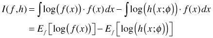
where in the last step I use the fact that the form of each integral is that of an expectation. Now suppose we have a second approximating model h for the true state of nature f. The information lost in using h to approximate f is given by the following.
Observe that ![]() is a common term in each expression. If we want to compare model g to model h it makes sense to consider the difference I(f, g) – I(f, h). If we do so then we find
is a common term in each expression. If we want to compare model g to model h it makes sense to consider the difference I(f, g) – I(f, h). If we do so then we find
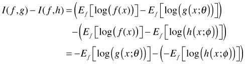
Observe that ![]() has canceled out. Thus if our goal is to compare models, truth drops out! The two terms that remain in the difference are exactly of the same form and we are just comparing their relative magnitudes when we calculate their difference. Thus for a generic model g all we need to estimate is the following
has canceled out. Thus if our goal is to compare models, truth drops out! The two terms that remain in the difference are exactly of the same form and we are just comparing their relative magnitudes when we calculate their difference. Thus for a generic model g all we need to estimate is the following
![]()
This last expression is called relative Kullback-Leibler information. Its absolute magnitude has no meaning. It is only useful for measuring how far apart two approximating models are. Relative K-L information is measured on an interval scale, a scale without an absolute zero. The true absolute zero corresponds to truth and is no longer part of the expression. This interval-scale property will later carry over to AIC.
Hirotugu Akaike (Ah-KAH-ee-key), who died in 2009, observed in a classic paper in 1973 that there is one further problem in trying to estimate relative K-L information. In our approximating model we typically won't know the exact value of θ. Instead we will have to use an estimate ![]() . Since this estimate is likely to be in error, another layer of uncertainty is added to the mix. So Akaike suggested that we should calculate the average value of relative Kullback-Leibler information over all possible values of
. Since this estimate is likely to be in error, another layer of uncertainty is added to the mix. So Akaike suggested that we should calculate the average value of relative Kullback-Leibler information over all possible values of ![]() . In terms of expectation we might call this quantity expected relative K-L information and write it (suppressing the reference to f) as
. In terms of expectation we might call this quantity expected relative K-L information and write it (suppressing the reference to f) as
![]()
The notation makes this expression look fairly intimidating but in fact Akaike found an unbiased estimator of it. The estimator is
![]()
Here ![]() is the log-likelihood function for model g evaluated at the maximum likelihood estimate of the parameter set θ. K is the number of parameters that are estimated in maximizing the likelihood. Strictly for historical reasons, Akaike chose to multiply this quantity by –2. The resulting quantity has come to be known as Akaike's information criterion or AIC.
is the log-likelihood function for model g evaluated at the maximum likelihood estimate of the parameter set θ. K is the number of parameters that are estimated in maximizing the likelihood. Strictly for historical reasons, Akaike chose to multiply this quantity by –2. The resulting quantity has come to be known as Akaike's information criterion or AIC.
![]()
Models with smaller values of AIC are better models than models with larger values of AIC. Because AIC estimates expected relative K-L information and, as explained above, the magnitude of relative K-L information is not interpretable, the magnitude of AIC also has no meaning. Fig. 1 illustrates this point. AIC is measured relative to numerical zero rather than to the absolute zero, which in the figure corresponds to the true state of nature. Because its reference point is arbitrary, the absolute magnitude of AIC is not interpretable.
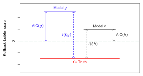 |
| Fig. 1 While the magnitude of K-L information is interpretable, the magnitude of AIC tells us nothing about the absolute quality of a model. AIC only provides relative information about models. (R code) |
AIC is typically positive, although it can be negative. If the likelihood is constructed from a discrete probability model, the individual terms in the log-likelihood will be log probabilities. These are negative because probabilities are numbers between 0 and 1. AIC multiplies these terms by –2 and hence AIC will be positive for discrete probability models. In continuous probability models the terms of the log-likelihood are log densities. Because a probability density can exceed one AIC can be negative or positive.
AIC is only an approximate estimate of expected relative K-L information an approximation that is only good when the number of observations is much greater than the number of estimated parameters. When this is not the case a correction is needed to AIC, called AICc.
Here n is the number of observations. The basic recommendation is to use AICc whenever ![]() . Although the expression for AICc was derived for normal models, it is routinely applied to other distributions as well.
. Although the expression for AICc was derived for normal models, it is routinely applied to other distributions as well.
Caveat 1. AIC can only be used to compare models that are fit using exactly the same set of observations. This fact can cause problems when fitting regression models to different sets of variables if there are missing values in the data. Consider the following data set consisting of five observations and three variables where one of the variables has a missing value (NA) for observation 3.
| Observation | y | x1 | x2 |
1 |
– |
– |
– |
2 |
– |
– |
– |
3 |
– |
– |
NA |
4 |
– |
– |
– |
5 |
– |
– |
– |
Most regression packages carry out case-wise deletion so that observations with missing values in any of the variables that are used in the model are deleted automatically. The lm and glm functions of R do this without telling you. Thus in fitting the following three models to these data, the number of observations used will vary.
Model |
Formula |
n |
1 |
y ~ x1 |
5 |
2 |
y ~ x2 |
4 |
3 |
y ~ x1 + x2 |
4 |
Models 2 and 3, being fit to the same four observations, are comparable using AIC, but neither of these models can be compared to the AIC of Model 1 which is based on one additional observation. The solution is to delete observation 3 and fit all three models using only the four complete observations 1, 2, 4, and 5. If model 1 ranks best among these three models then model 1 can be refit with observation 3 included.
Caveat 2. The response variable must be the same in each model being compared. Monotonic transformations of the response alter the probability densities at individual points so that the probabilities over the corresponding intervals can remain the same. The likelihood on the other hand only includes the densities at individual points. This means that the log-likelihoods and AICs of models with a transformed response, e.g. log y, cannot be directly compared to the log-likelihoods and AICs of models that are fit to the raw response, y. Fortunately there are ways around this problem as we'll see.
I reload the slugs data set and fit the six models we considered last time.
To calculate AIC we can use the AIC function of R. It is listable so we can just give it the names of the models as arguments.
Notice that model with the lowest AIC is NB4. Recall that this is not the model we chose using significance testing. There we chose NB3, which to be fair has an AIC that is only slightly larger than that of the NB4. If we redo the likelihood ratio test comparing models NB3 and NB4 to test H0: θ1= 0 we fail to reject the null hypothesis (p = 0.135).
AIC also prefers model NB2 over NB1. If we compare NB1 and NB2 using a likelihood ratio test to test H0: β1 = 0, we fail to reject the null hypothesis (p = 0.06) and thus should prefer the simpler model NB1.
Response: slugs
Model theta Resid. df 2 x log-lik. Test df LR stat. Pr(Chi)
1 1 0.7155672 79 -288.7961
2 field 0.7859313 78 -285.3500 1 vs 2 1 3.446124 0.06340028
This is not unusual. Because of the arbitrariness of the α = 0.05 cut-off AIC can prefer the more complicated model among two nested models even when a likelihood ratio test fails to find them significantly different. As a result the AIC-best model can contain some coefficients that are not significantly different from zero. The significance level at which significance testing will choose the same model that AIC does will vary with the sample size. A general statement we can make is that AIC will always prefer the more complicated model among two nested models when the additional terms are significantly different from zero, but AIC can also prefer the more complicated model even when they're not (although in this case typically 0.05 < p < 0.15).
Johnson and Raven (1973) provide data on plant species richness for 29 islands in the Galapagos Islands archipelago. Their paper was presented as a rebuttal to Hamilton et al. (1963) who claimed that a species-area effect is absent in the Galapagos Islands. Using an expanded data base, Johnson and Raven (1973) argued that the Galapagos Islands do exhibit a species-area effect. In their paper they considered only two forms for the species-area relationship:
We revisit the analysis of Johnson and Raven but consider an expanded set of possible species-area relations using statistical methodology that was not available in 1973. We consider eight models. In the model descriptions that follow S denotes species richness on an island and A denotes the area of that island.
The data set included in Johnson and Raven (1973) was missing some elevation data. I found a corrected version of the data set with these values supplied at
http://www.ibiblio.org/pub/academic/biology/ecology+evolution/teaching/weisberg/galapago.dat.
The cleaned up version of the data set, galapagos.txt, is at our class web site. The file is space-delimited with the variable names appearing in the first row.
I fit a linear model to Area on the raw scale using the lm function. We can extract the log-likelihood of the fitted model with the logLik function and the AIC with the AIC function.
I superimpose the fitted model on a scatter plot of the data.
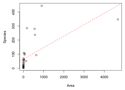
Fig. 2 Linear model for mean species richness as a function of area
From the scatter plot alone we would conclude that this is a terrible fit. This is the typical hot dog on a stick plot where a regression line emerges from a cloud of points and runs out to a single influential point that almost single-handedly determines the slope.
The second model, the Gleason model, uses log-transformed Area rather than Area as the predictor. Since the response in models 1 and 2 is the same, we can use the reported log-likelihood or AIC to compare the Gleason and linear models.
The AIC of the Gleason model is less than that of the linear Area model. I superimpose the fitted Gleason model on a scatter plot of the data.
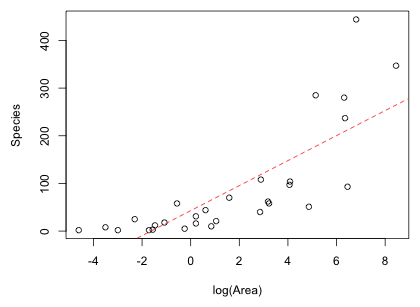
Fig. 3 Scatter plot of raw data showing the Gleason regression model
This too is clearly a bad model. Based on Fig. 3 the model underestimates species richness at low and high areas, and overestimates it at intermediate areas. Perhaps even more troubling the Gleason model predicts negative values for species richness even within the range of the data that were used to fit the model. When log(Area) drops below –2 species richness is predicted to be negative. This is obviously a nonsensical prediction.
Fig. 4 shows the residual plot with a lowess curve (a locally weighted smooth that reflects local patterns) superimposed. The residuals function is used to extract the residuals from a model object. As expected the lowess curve shows that there is still a pattern in the residuals unaccounted for by the model. The residuals are first positive, then negative, then positive which matches our interpretation of model fit based on Fig. 3.
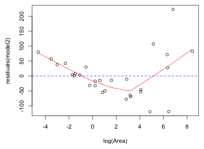 |
Fig. 4 Residuals from the Gleason model plotted against the predictor log(Area) with a lowess curve superimposed |
I carry out Poisson regression with a log link using log(Area) as the predictor. Poisson regression can be carried out with the glm function by specifying family=poisson.
Because the Poisson model has one fewer parameter than the other models, we should use AIC rather than log-likelihood to compare the models. As we can see from the AIC values the Poisson model is ranked last.
I carry out negative binomial regression with a log link using log(Area) as the predictor. The function for this is glm.nb from the MASS package.
The negative binomial model has yielded the lowest AIC obtained thus far. On the other hand the Poisson model has yielded the worst. The value of θ suggests that there is a modest amount of overdispersion explaining perhaps why the Poisson model has such a low ranking. I plot the predicted means from the negative binomial model and the Poisson model on the same graph. Because both models by default use a log link we need to exponentiate the regression equation in order to recover the mean.
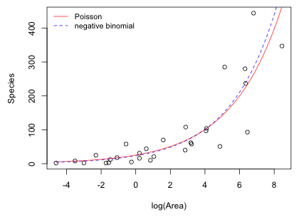 |
Fig. 5 Predicted means of regression models using Poisson and negative binomial distributions for the response |
The two models displayed in Fig. 5 look very similar. How is it possible that the model ranked best using AIC looks nearly indistinguishable from the model ranked worst using AIC? Keep in mind that the difference in AIC here (800 versus 274) is gigantic.
This apparent non sequitur illustrates the difference between assessing fit in the least squares approach and assessing fit from a maximum likelihood perspective. When we fit a probability model to data we are not trying to find some sort of best-fit curve in the same sense that least squares does. Instead we're trying to determine a plausible probability generating mechanism for the data. From this perspective a good model is one that could have generated the observed data. One way to assess model fit would be to use the model to generate simulated data sets and ask if the observed data set looks like the simulated data sets. This approach to model assessment is called predictive simulation and has been used previously in this course.
The reason the Poisson model is rejected by AIC in favor of the negative binomial model is obviously not due to a difference in the predicted means. Rather it's because given the same means, a Poisson model cannot generate the data we observed while the negative binomial model can. A major difference between the Poisson and negative binomial model is in their mean-variance relationships. A Poisson model assumes the mean and variance are equal, while a negative binomial model assumes that the variance is a quadratic function of the mean. Apparently the increasing spread in the data around the mean trajectory shown in Fig. 5 is more typical of a negative binomial distribution than it is of a Poisson distribution.
There is a second type of negative binomial model called the NB-1 model by Cameron and Trivedi (1998). (They refer to the model that is fit by the glm.nb function as the NB-2 model.) These two models differ in how the mean and variance of the negative binomial distribution are related. In the NB-1 model the variance and mean are linearly related while in the NB-2 model they are quadratically related.
Why there are two different negative binomial models will be explained at a later time. Both the NB-1 model and the NB-2 model can be fit using the gamlss function from the gamlss package. Unfortunately the gamlss notation for these distributions is the opposite of everyone else's. The gamlss package reverses the numbering and refers to the NB-1 and NB-2 models as the NBII and NBI models respectively.
So for these data the negative binomial with a quadratic variance-mean relationship has a lower AIC.
Although using AIC we've rejected a linear variance-mean relationship in favor of a quadratic variance-mean relationship, it would be nice to have an independent verification of this result. We can obtain one by grouping the data using the values of a predictor, calculating the mean and variance of the response in each group, and plotting the result. The regressor we've been using in the model is log(Area). Because it's a continuous variable a sensible way to group its values is to use quantiles. We need enough groups to detect the relationship between the variance and the mean while leaving enough observations within each group to accurately calculate a variance. With 29 observations choosing quintiles will give us approximately six observations per group. The first argument to the quantile function is the variable and the second argument is a vector of the desired quantiles.
Next we classify observations by the quantile they fall into. The cut variable can be used for this purpose. The first argument to cut is the variable to be cut and the second argument is a vector of cut points (in this case the quintiles including the minimum and maximum). By default the cut function constructs half-open intervals, (a, b], open on the left but closed on the right so that a < x ≤ b. To change the first interval so that it's closed on both ends I add the argument include.lowest=TRUE. This will force the minimum value of log(Area) to be included in one of the intervals.
As hoped we have roughly equal numbers of observations in each group. Next I calculate the mean and variance of species richness in each group using tapply.
Finally I plot the variance against the mean, estimate a regression model, and superimpose the regression model on a scatter plot of the data. We can carry out squaring the predictor beforehand or do it within the regression formula by enclosing the arithmetic operation in the I function. Without the I function the arithmetic operation will be ignored.
For comparison I add the linear relationship to the plot. As the plot indicates, the quadratic model appears to do a good job of approximating the observed pattern, better than the linear model. Of course with only five observations and four parameters (3 regression parameters and the variance) the AICc for the quadratic model is infinite suggesting that we are overfitting these data.
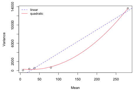 |
Fig. 6 Variance-mean relationship of the response variable species richness. |
Note: a number of David Anderson's papers can be downloaded from his web site.
…and a few words from the critics
A compact collection of all the R code displayed in this document appears here.
| Jack Weiss Phone: (919) 962-5930 E-Mail: jack_weiss@unc.edu Address: Curriculum for the Environment and Ecology, Box 3275, University of North Carolina, Chapel Hill, 27599 Copyright © 2012 Last Revised--October 31, 2012 URL: https://sakai.unc.edu/access/content/group/3d1eb92e-7848-4f55-90c3-7c72a54e7e43/public/docs/lectures/lecture19.htm |